Moleskinimal
by Niccolò Franceschini from italy
designer's own words:
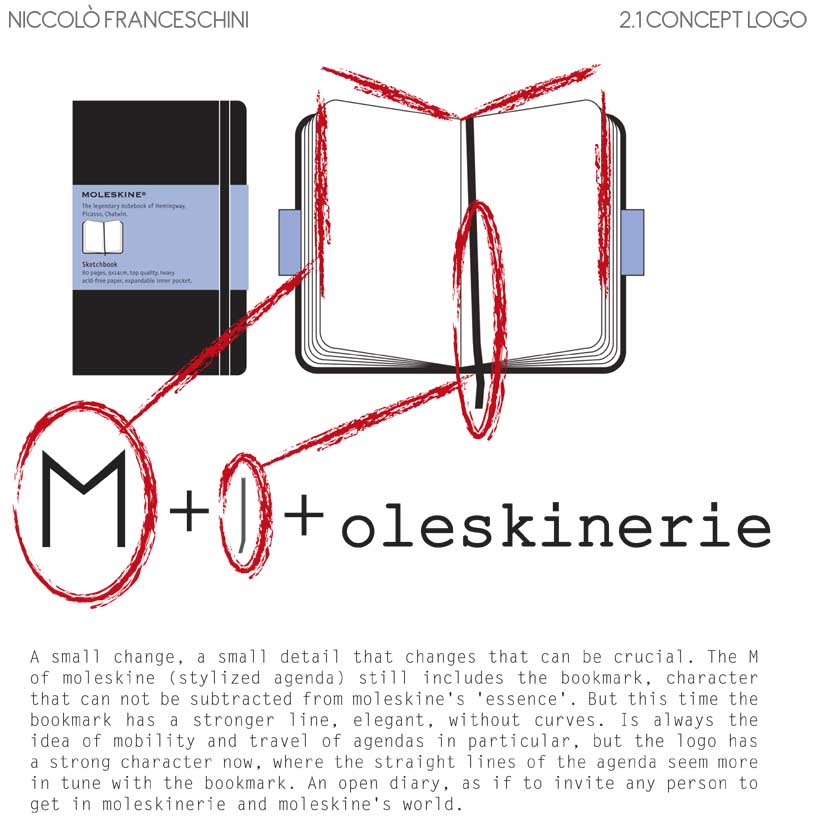
a small change, a small detail that changes that can be crucial. the m of moleskine (stylized agenda) still includes the bookmark, character that can not be subtracted from moleskine's 'essence'. But this time the bookmark has a stronger line, elegant, without curves. is always the idea of mobility and travel of agendas in particular, but the logo has a strong character now, where the straight lines of the agenda seem more in tune with the bookmark. an open diary, as if to invite any person to get in moleskinerie and moleskine's world.
Concept

Main Colour
One Colour
Red Logo
Change Colour
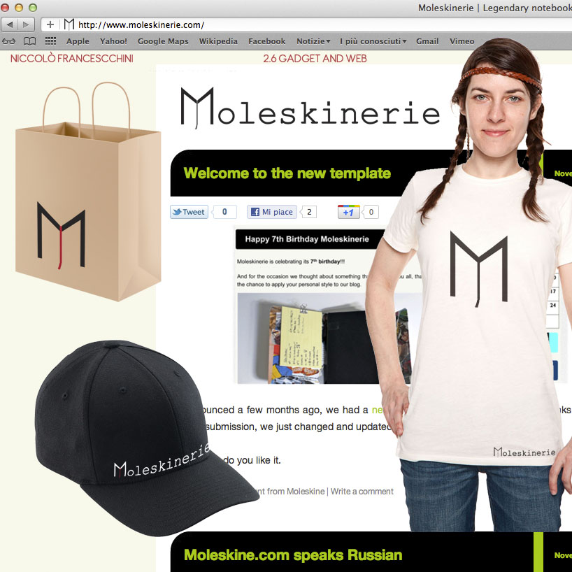
Gadget and Web