logo moleskinerie the M
by mario zoller from switzerland
designer's own words:
the logo is inspired by an opened moleskin sketch book. the doubled v form of the symbolised the front and the end wall of the book. also is the logo like an stemp, witch stands for the emotional relation with the paper.
logo m positiv
logo negative
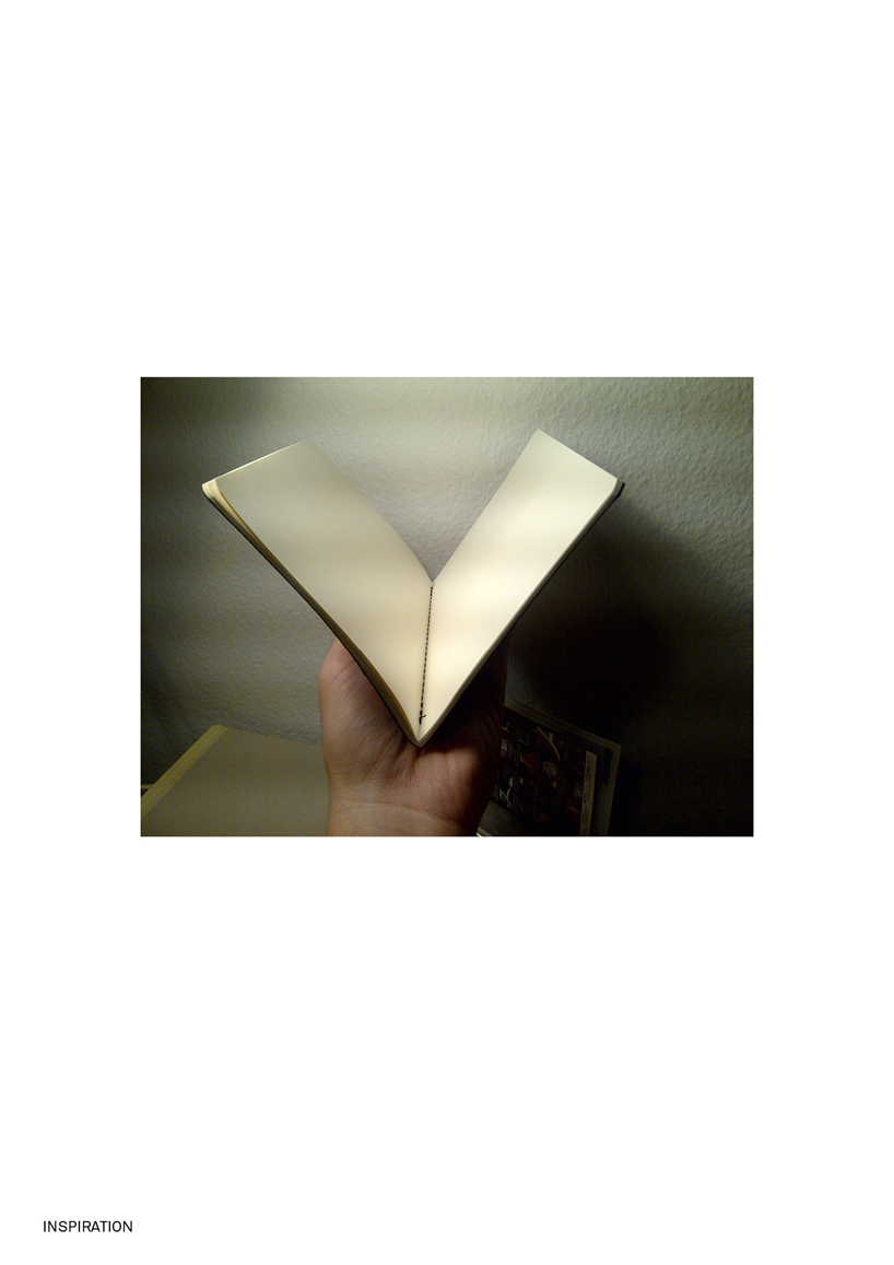
inspiration