My Moleskine by miha kosmac from slovenia
designer's own words:
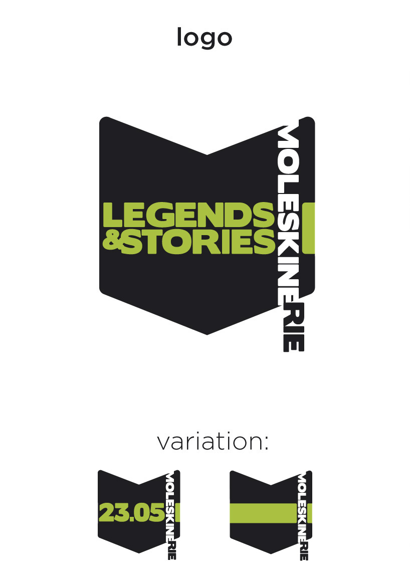
the idea behind this logo is the visual similarity between the capital m and an open notebook. to expand the idea i used the text as part of the visual language, moleskine becomes the recognizable rubber band the rie becomes the book index and legend&stories becomes the colour paper band which is also a trademark of moleskine notebooks. the logotype itself is simple and blank as the notebook itself, but is ready to be filled with different informations or ideas, also as the notebook. since the primary field of use is internet I dared to take the logo to the dynamic level making it a real notebook with pages turning. this also enables us to show the hour, date and year, data essential to all of those who record and plan their lives, like the notebook helps us plan our lives. the logotype works without the slogan also, it is just replaced with coloured object or the date.
Logo
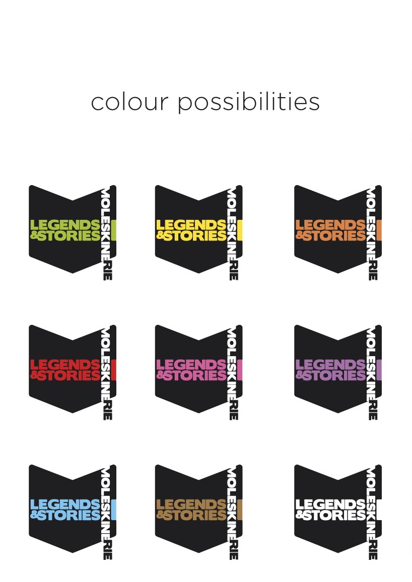 Colour diveristy
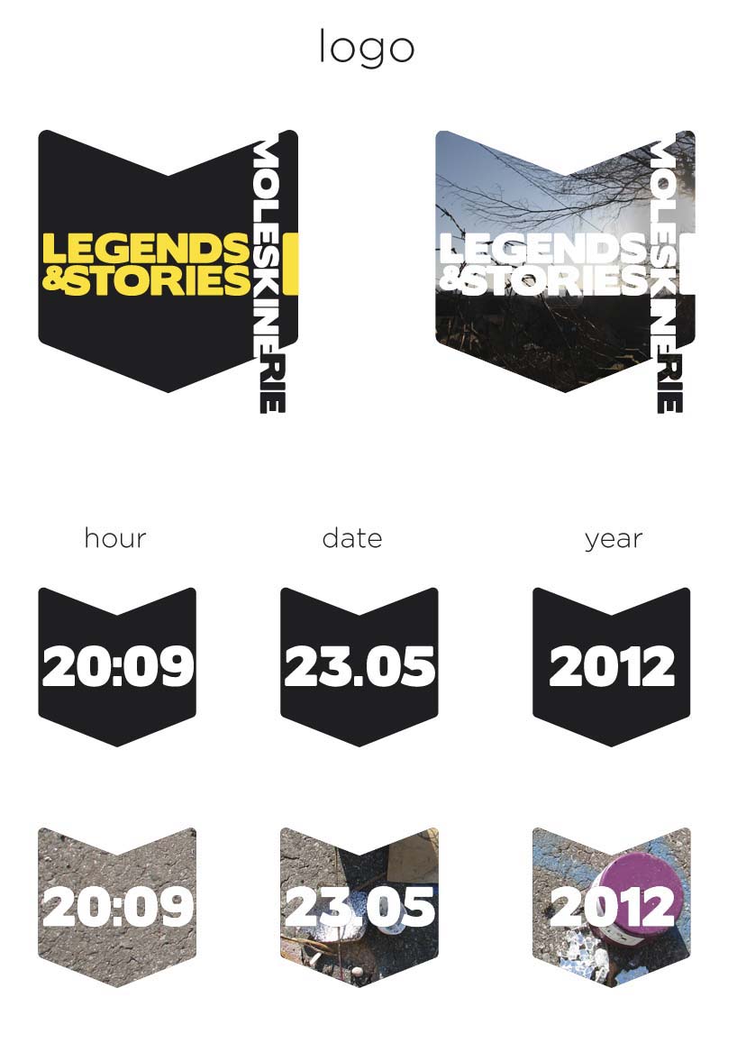 Logo variations
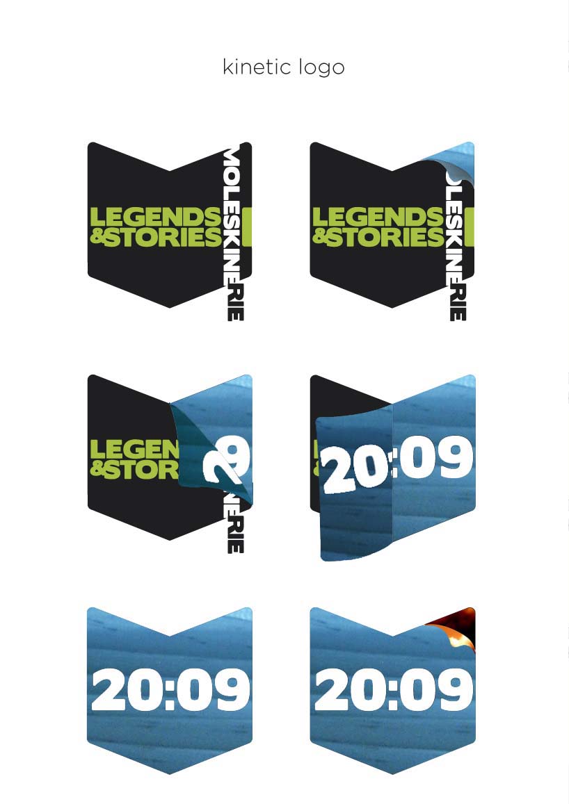 Kinetic logo
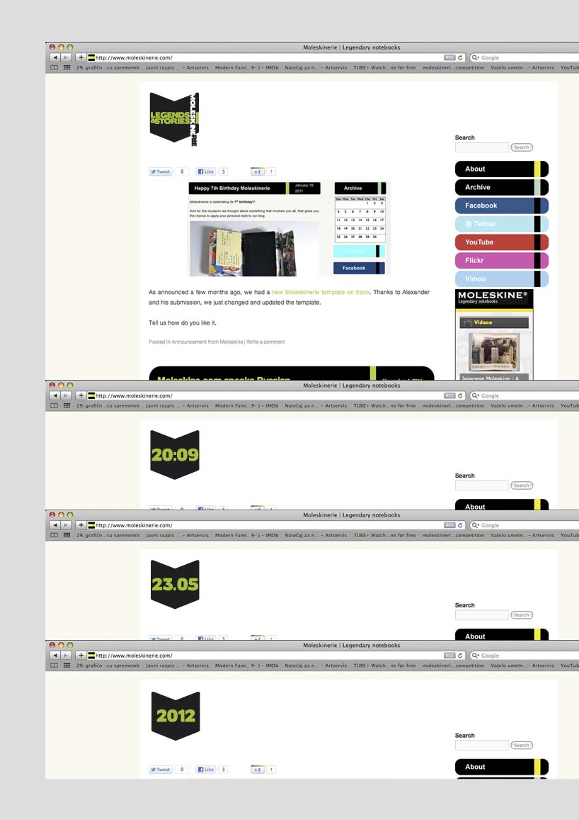 Web use
 Logo application