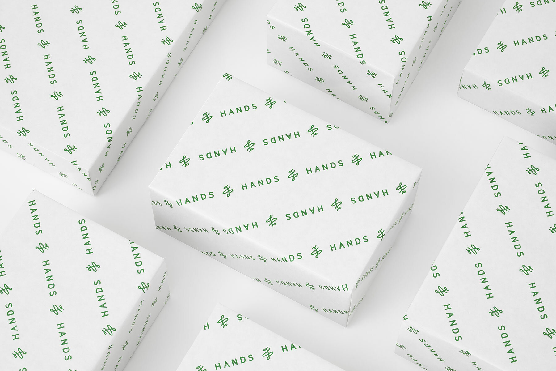
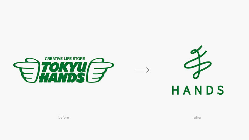
the new logo replaces the previous ‘hand wings’
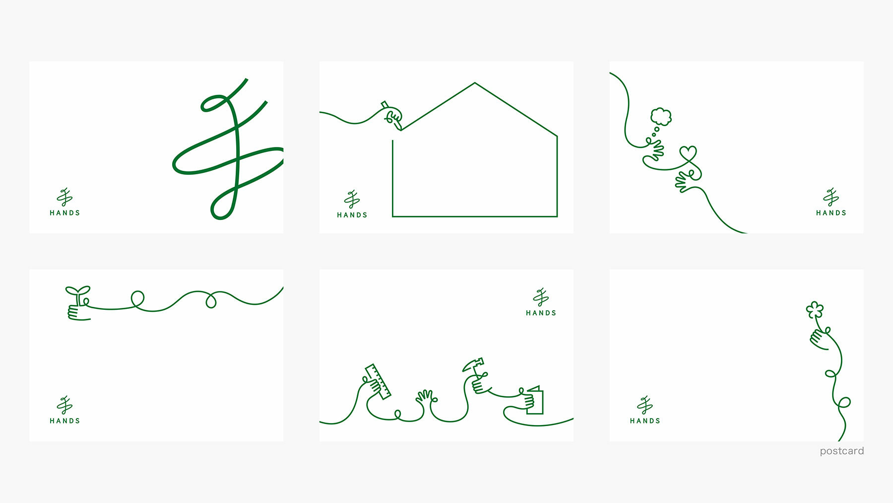
the designers at Nendo employ a calligraphic, single-stroke language
KEEP UP WITH OUR DAILY AND WEEKLY NEWSLETTERS
nik bentel studio scales down the lidl supermarket trolley into a stainless steel, wire-frame handbag dubbed the 'trolley bag.'
connections: +330
as designboom evolves into a creative studio, designboom needs a lab senior editor to manage our branded and organic campaigns.
each chair reflects an individual child’s input and imagination.
connections: +920
the spiral structure follows principles of fluid dynamics and thermodynamics to optimize heat distribution.
connections: 96
 images by Masahiro Ohgami, courtesy Nendo
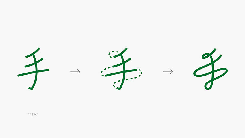 the japanese character meaning ‘hand’ is transformed into a single-stroke logo
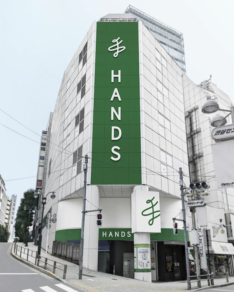
 Nendo has maintained the company’s iconic nickname and green color
 the minimalist design delivers a modern identity to the nearly fifty year-old company