
‘super mega underground church’ by beck group + gansam, seoul, south korea images courtesy of beck group
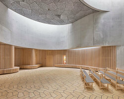
U.S. based architectural practice beck group and seoul-based firm gansam have collaborated to propose ‘super mega underground church’, a spiritual facility for the city of seoul, south korea. this urban site must accommodate over 40,000 people every sunday, the majority of whom arrive by subway. the design called for a 6,500 seat worship sanctuary, offices for the church’s global ministry, a 300 seat chapel, fellowship / classroom spaces, 250 parking spaces and a public plaza.
the design solution features the worship sanctuary underground, covered only by the public plaza, and sky above.
flanking the worship center on the north and south, the remaining program is projected upwards into two towers that are unified at three levels with a sky bridge. to give further emphasis on the sky above, the massing of the two towers and sky bridge is extruded at an angle about the elliptical plaza, and wrapped in clear vision glass to give unobstructed views inside and out.
 interior views surrounding sanctuary
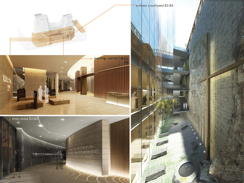 interior views of subway connection
 interior views of education tower
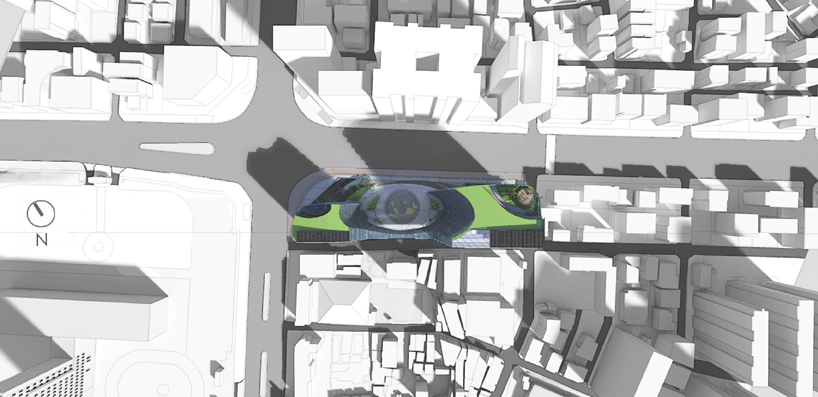 site plan
 section
 aerial view / site section
 cutaway plans
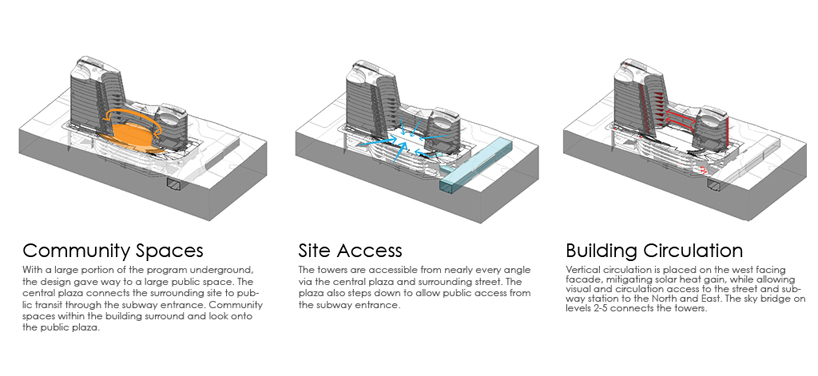 circulation diagrams
 sunscreen analysis
designboom has received this project from our ‘DIY submissions’ feature, where we welcome our readers to submit their own work for publication.
beck group (4)

church architecture and design (230)
 Jul 21, 2024
 Jul 17, 2024
 Jun 19, 2024
 Jun 04, 2024
 Apr 30, 2024
PRODUCT LIBRARY
 Jul 15, 2024
 Jul 09, 2024
 Jul 09, 2024
 Jun 20, 2024