cadena asociados creates graphic compositions that set the style at mexico’s el moro
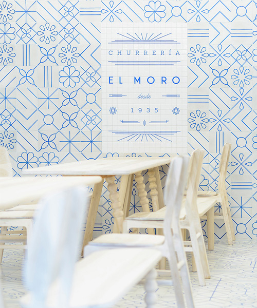
language and furniture align, forming a unique expression, reminiscent of the golden age in mexico, when an art deco style dominated the city’s poster ads, movies, fonts, and architecture.
cadena asociados creates graphic compositions that set the style at mexico’s el moro
(above) the guiding principle understanding the family values and history of this historic churrería
all images © moritz bernoully
‘el moro‘ has been one of the most popular images of daily life in mexico city since 1935, enthralling different audiences due to its unrepeatable authenticity and rich flavor which offers the best hot chocolate and churros in the country’s capital. to create the brand concept, cadena asociados knew that understanding their family values and their history, in order to merge and input them into a new strategic vision, was the guiding principle of this project. classic wall tiles, along with stained glass windows and their delicious churros have set ‘el moro’ as a reference point for delighted customers for generations.
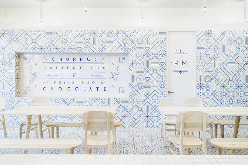
‘el moro’ offers the best churros and hot chocolate of the mexican capital since 1935
the new take on graphism translates into endless compositional possibilities that apply significantly to the brand’s identity, communication, architecture, and, interiorism. the chromatic palette, born from the unmistakeable mosaics that gave the brand its personality, are contrasted with a white hue inspired by sugar. language and furniture align forming unique expression, reminiscent of the golden age of mexico, when an art deco style dominated the city’s poster ads, movies, fonts, and architecture providing sufficient graphic elements, symbols, and even communication through different artistic means. thus, creating a new integrated concept that emotionally connects people today with the collective subconscious in a new brand experience, which projects the true DNA of ‘el moro’.
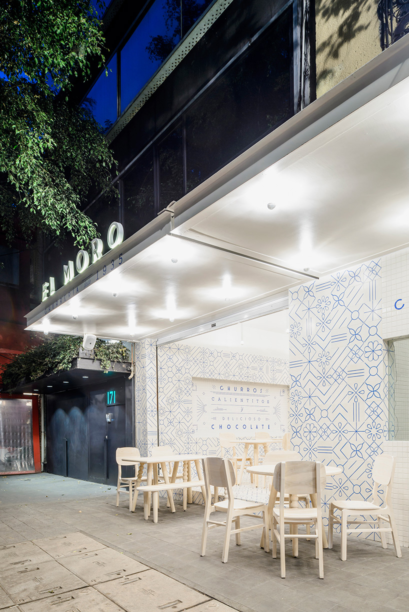
the new take on graphism translates into endless compositional possibilities that apply to the brand’s identity
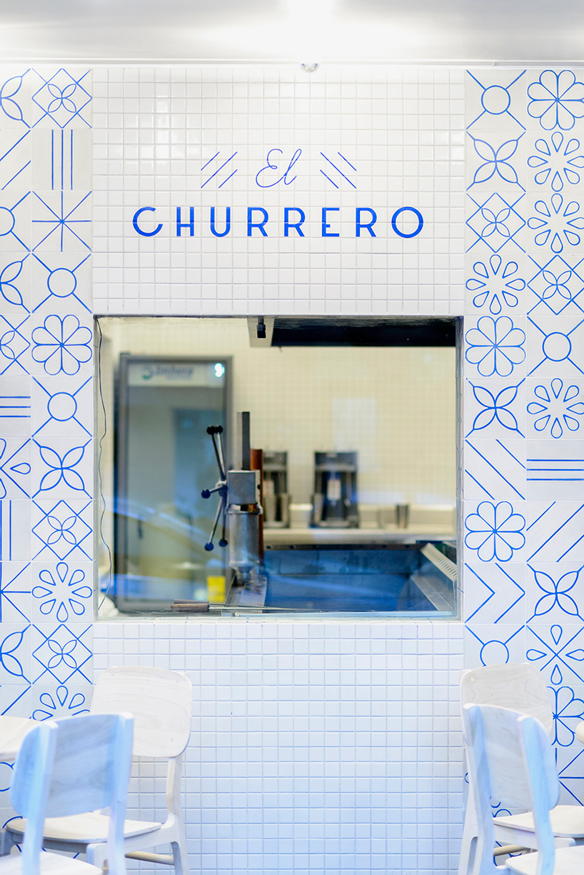
classic wall tiles, along with stained glass windows act as the main elements of the design
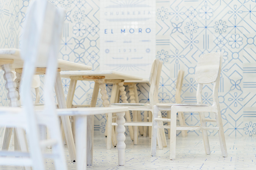
the furniture selection complements the tile design
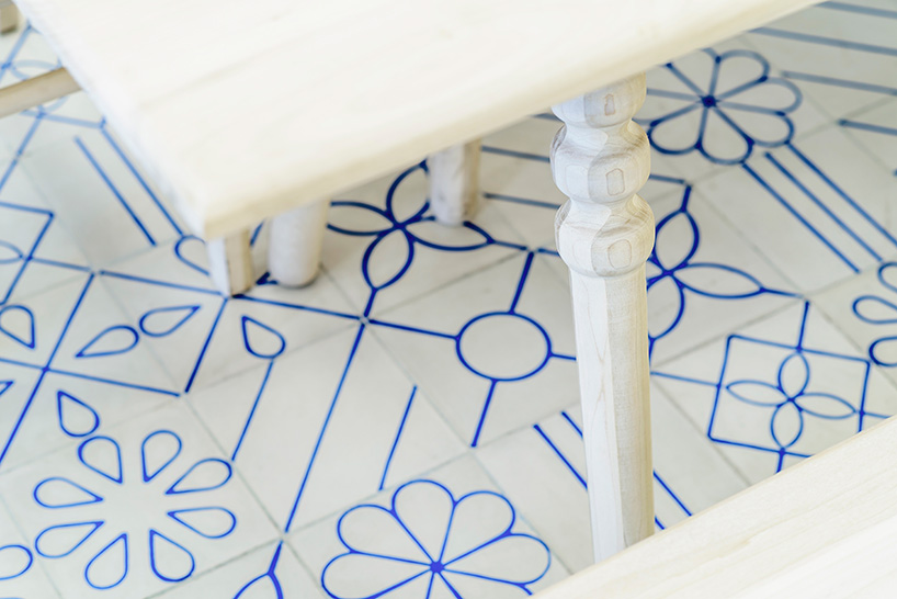
table detail
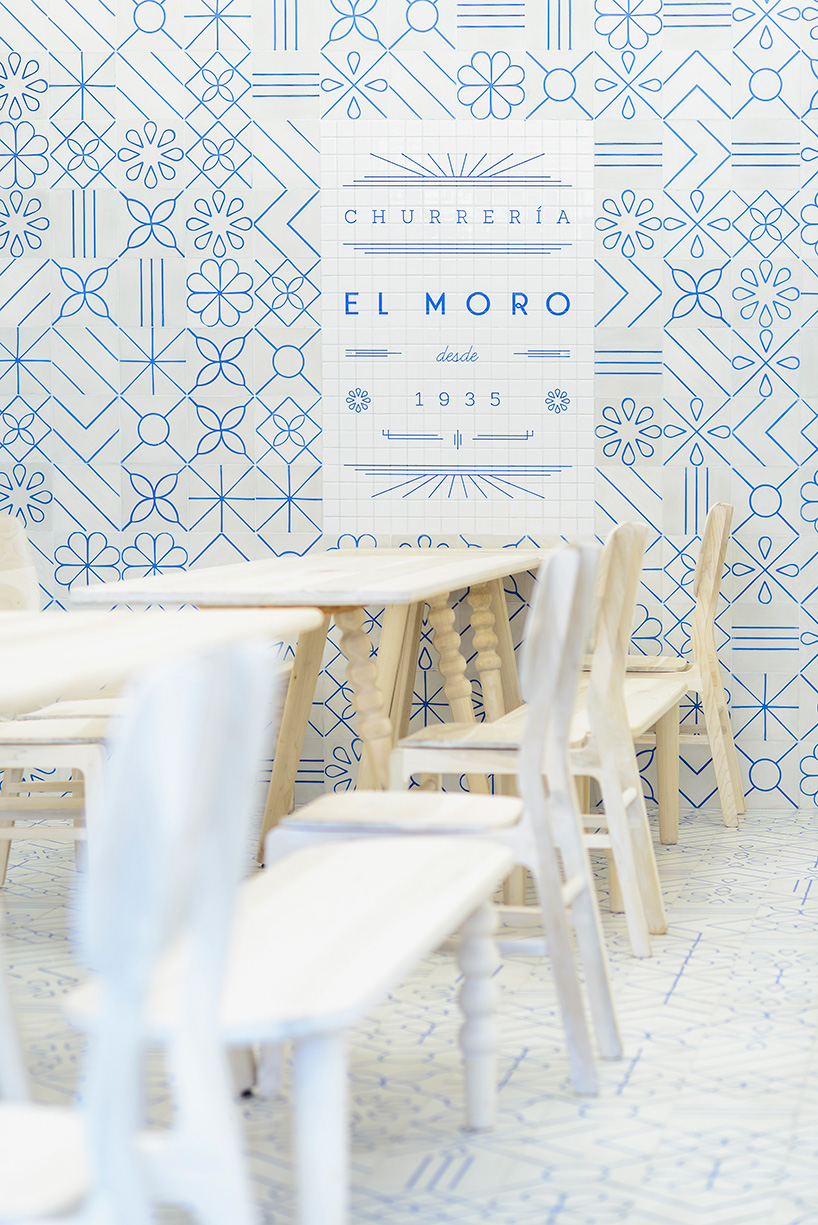
the chromatic palette gave the brand its personality and contrasts with a white hue inspired by sugar
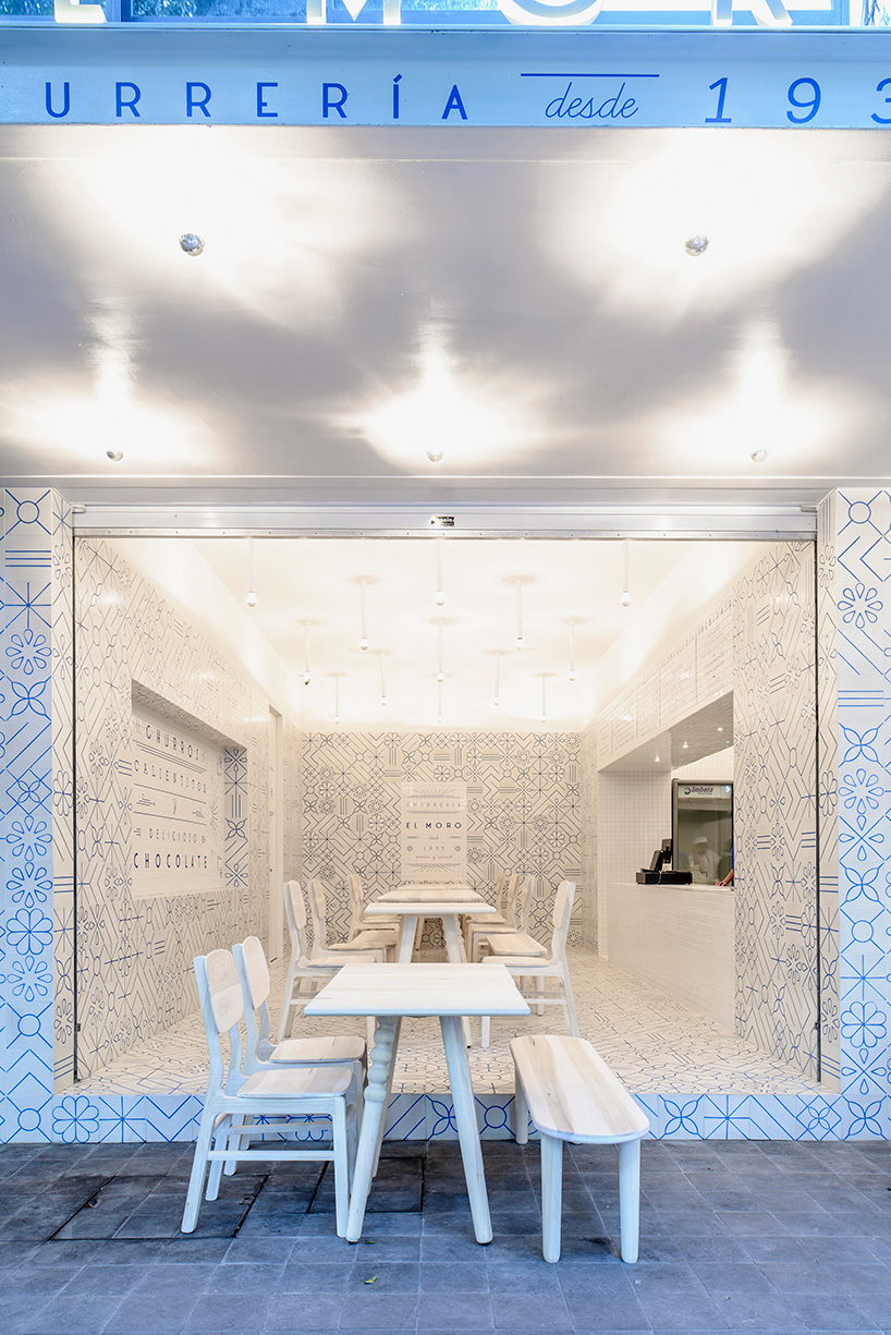
language and furniture align forming unique expression, reminiscent of the golden age of mexico
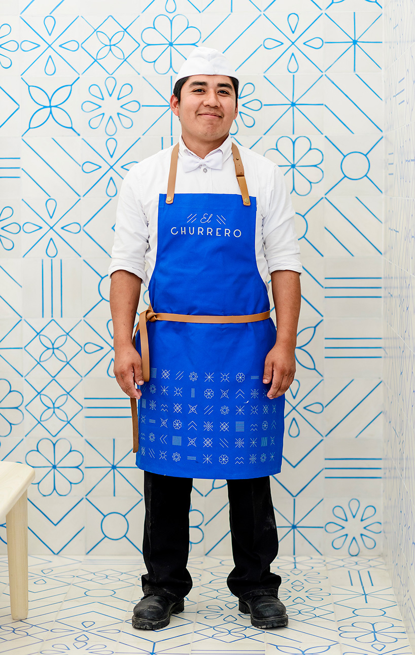
the apron’s used by the people who work at ‘el moro’, follow the interior design
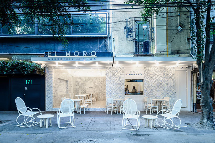
chairs and tables are set outside, embracing some public space
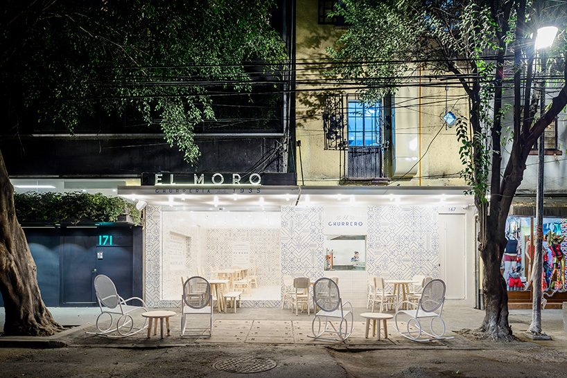
stree view
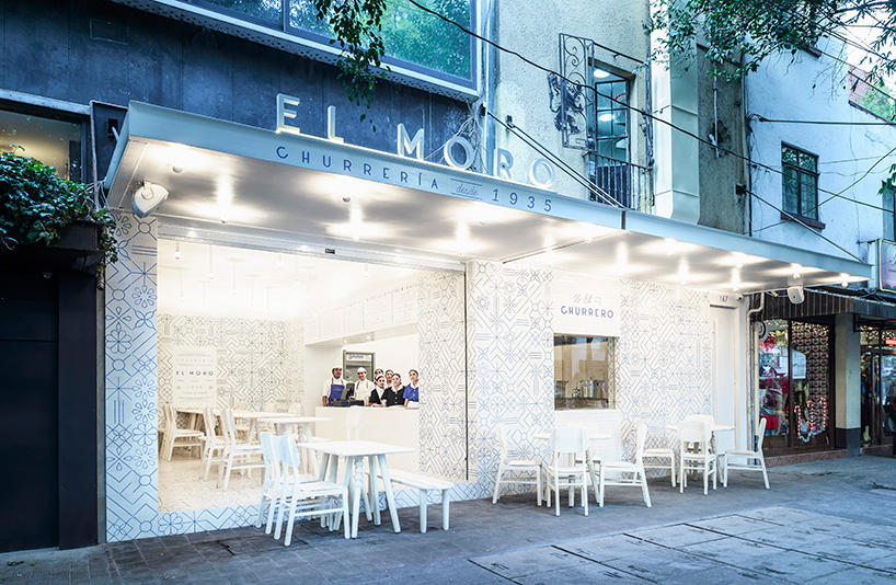
street view
designboom has received this project from our ‘DIY submissions‘ feature, where we welcome our readers to submit their own work for publication. see more project submissions from our readers here.
shop
your own online design shop — no sales commission collected