‘labels 2’, berlin by HHF architectsimage © iwan baan
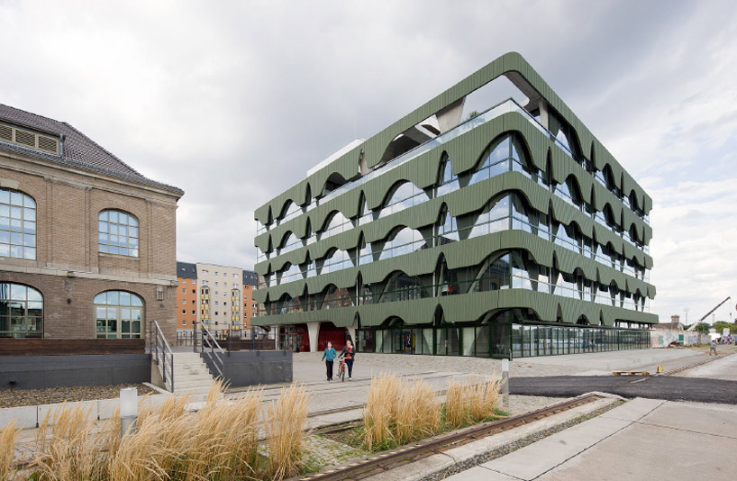
swiss HHF architects have sent in images of their project ‘labels 2’ taken by iwan baan the fashion center labels berlin 2 is a concentration of showrooms for international fashion brands in one building including public spaces such as an event hall, a restaurant and a lounge at the top floor. the design strategy is based on the adjacent warehouse building labels 1. the interior spaces of this historical building are strongly characterized by the repetition of arched windows used in the facade. this motif became one of the starting points for the design of the project.
the use of two differently cut sine curves generates a specific aesthetic for both the supporting structure and in a modified form with the sine waves for the façade. the result is that the structure and rhythm establish the formative motif for the perception of the new building and link it to the existing neighborhood.
connected by a heat exchanging device, the whole concrete structure of the building is permeated with water tubes and used as a radiator for heating as well as for cooling. the energy consumption for heating and cooling of labels 2 berlin is reduced by 40% due to this combined technique of activating the building mass and using water from the spree river. HHF architects won the international competition among selected architects in september 2007. the building opened in spring 2010.
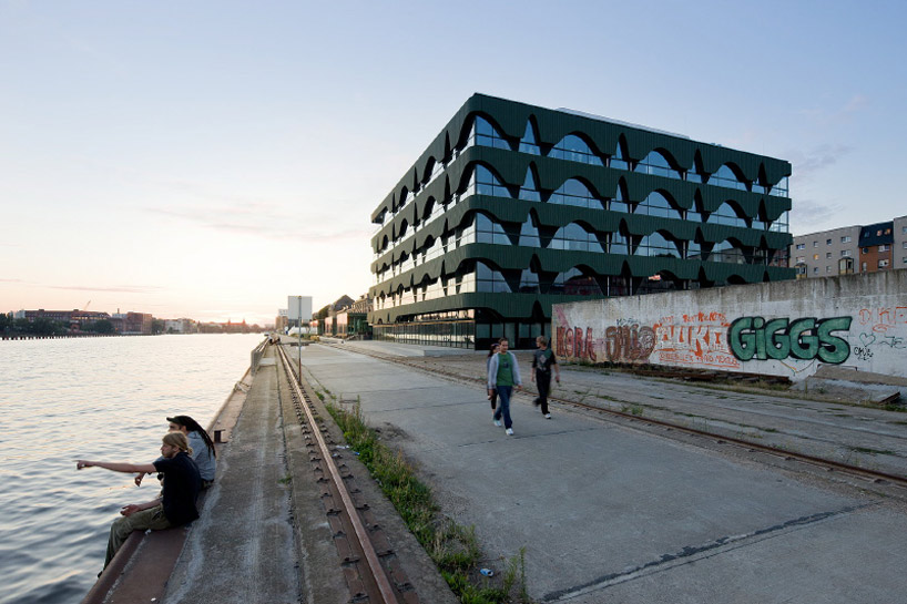 image © iwan baan
 image © iwan baan
 image © iwan baan
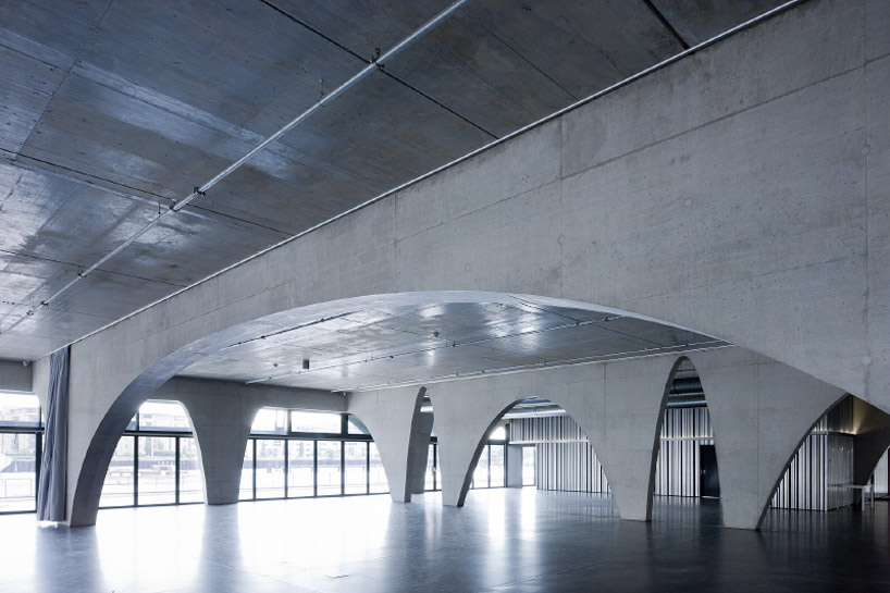 image © iwan baan
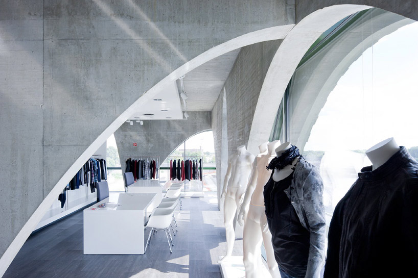 image © iwan baan
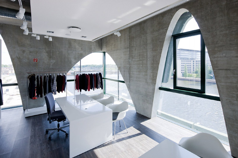 image © iwan baan
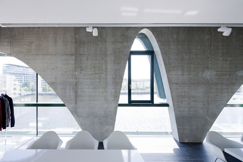 image © iwan baan
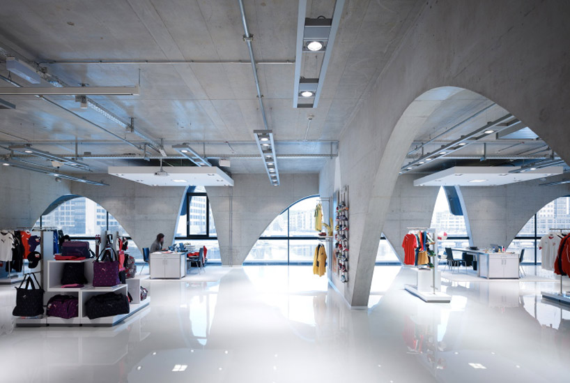 image © iwan baan
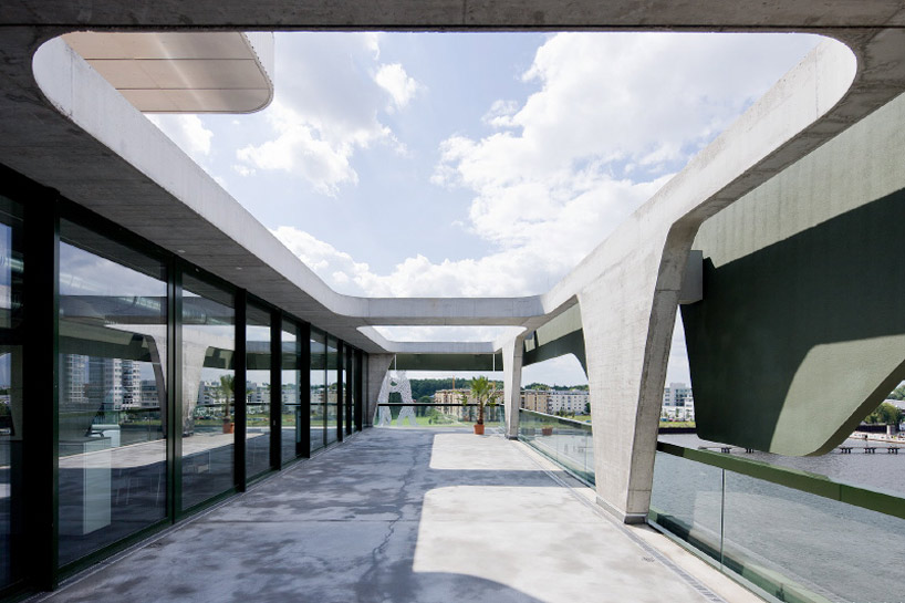 image © iwan baan
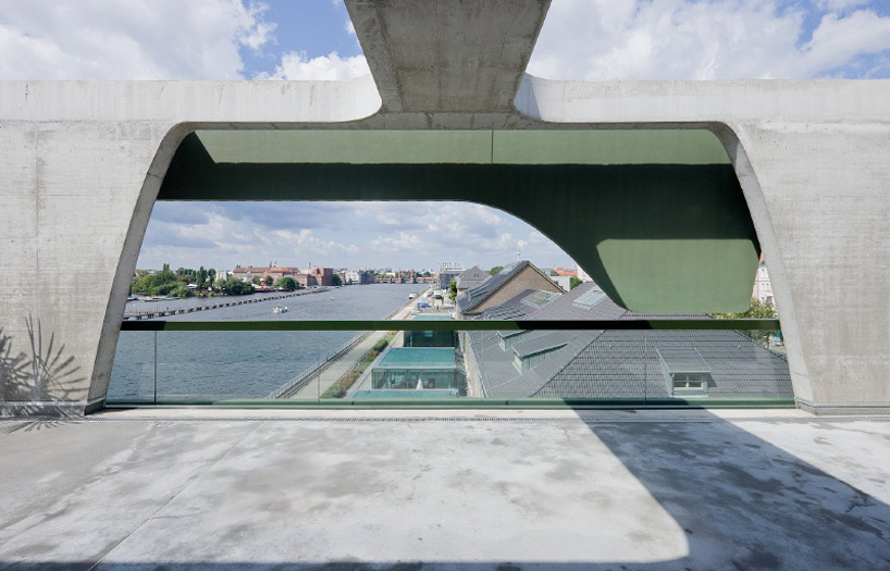 image © iwan baan
project info:
project: HHF architects programme: fashion center material: concrete competition and construction: 2007, 1st prize, 2007 – 2010 building footprint area: 1’537 m2 gross floor area: 8’191 m2 useable floor area: 6’630 m2 building volume: 32’930 m3 client: labels projektmanagement gmbh & co. kg location: osthafen, berlin photos: iwan baan
Save
architecture in germany (305)
 Jul 10, 2024
 Jun 27, 2024
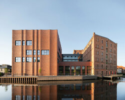 Jun 26, 2024
 Jun 19, 2024
HHF architects (15)
 Apr 07, 2021
 May 23, 2019
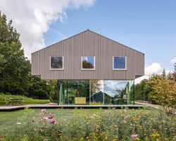 Dec 05, 2018
 Aug 16, 2016
 Mar 16, 2016
iwan baan (102)
 Mar 14, 2024
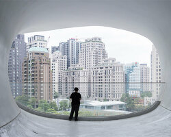 Aug 31, 2023
 Jun 05, 2023
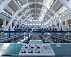 May 12, 2023
 May 07, 2023
PRODUCT LIBRARY
 Jul 15, 2024
 Jul 09, 2024
 Jul 09, 2024
 Jun 20, 2024