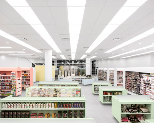
jean de lessard uses color + feng shui to organize montreal pharmacy
using an empathetic and color-based approach, the pharmacy and adjoining medical center use clarity and simplicity to instill a refined retro design.
jean de lessard uses color + feng shui to organize montreal pharmacy
photography by adrien williams
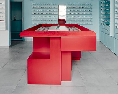
created by montreal-based firm jean de lessard, the uniprix pharmacy based by the outskirts of the city has used an empathetic and color-based approach to guide the final design of the space. following the principles of feng shui, the space was organizing to promote a smooth circulation, this lead to the the rounded nature of the booths and the laboratories being grouped in circles. to heighten the social dimension, the laboratory has been made the focus of the space, and consequently, a place for socializing.
jean de lessard comments: ‘we wanted the space to reflect the human side of the profession, that it becomes an empathetic place, simple and collective, unpretentious, allowing the pharmacists to be more accessible and be seen by their patients.’
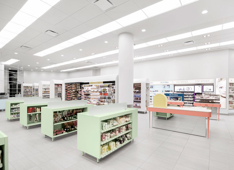
a pastel color palette has been used throughout
having also designed the center médical alexandre, owned too by the pharmacist, there is a consistency between the two clinacal spaces. internally, they are both animated the same spirit of clarity and simplicity, selecting similar volumes and materials for continuity and evoking a retro-like look. a sense of movement and the rounded walls energize the place in a non-aggressive manner. meanwhile, the round scheme is used for furniture, just as it was used in the pharmacy. the wooden slats seen on the ceiling of the waiting room is another auspicious architectural detail- using the wood to bring texture, warmth and brightness without oppressing the ‘ch’i’ in feng shui.
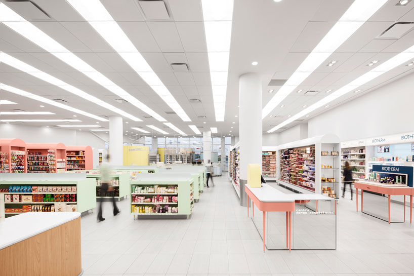
the design was modulated by some feng shui principles; to promote a smooth circulation of the energy flow (ch’i)
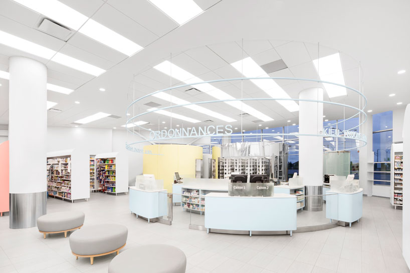
the focus of the store is the pharmacy
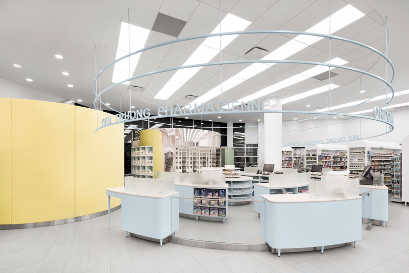
the pharmacy promotes social activity and a community spirit

high furniture positioned at the periphery and low-profile units offer an unobstructed line of view of the laboratory
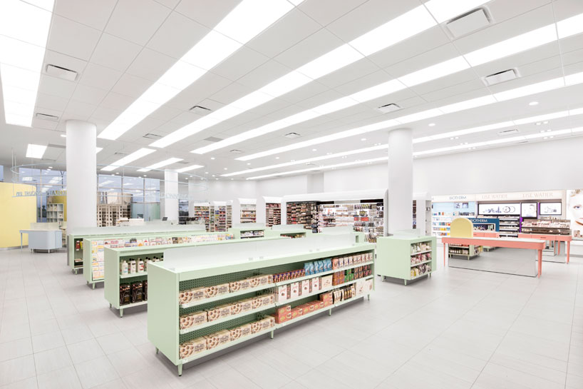
a clean and refined look has been created for the montreal-based pharmacy
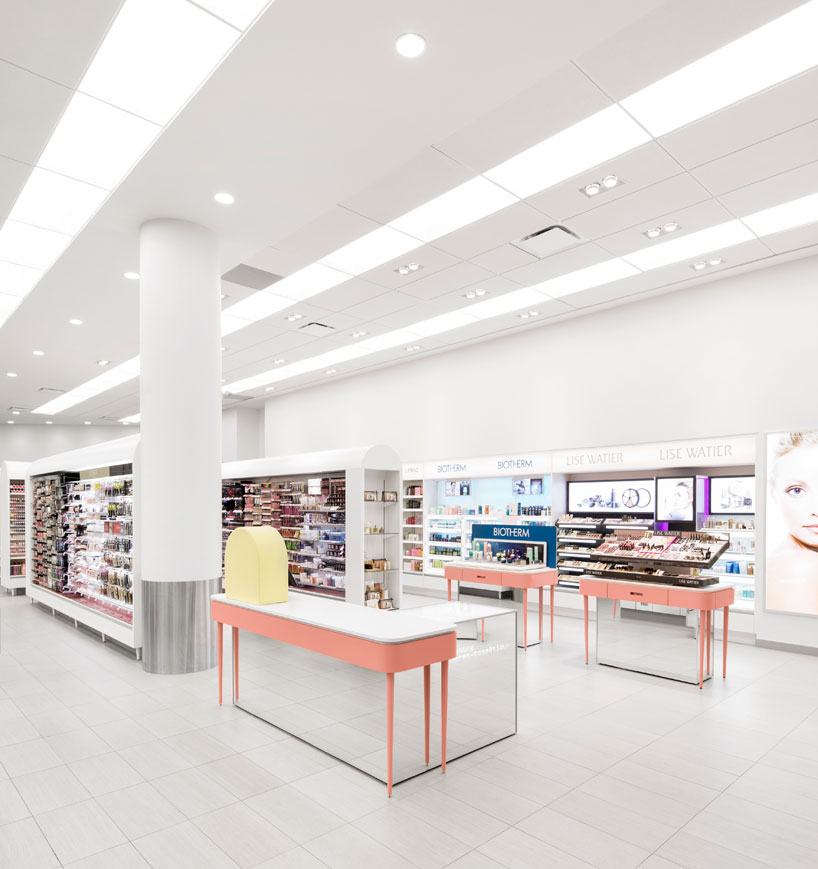
a cosmetics section has been established
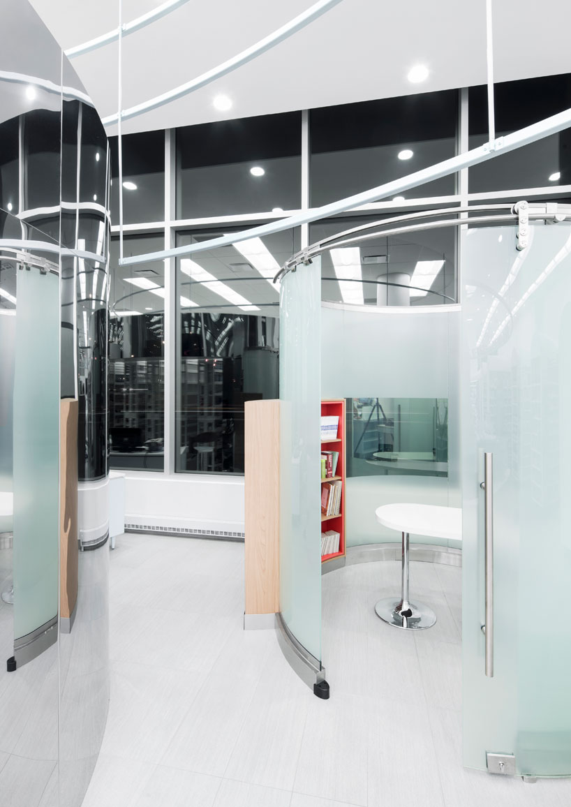
pods have been installed for consultation
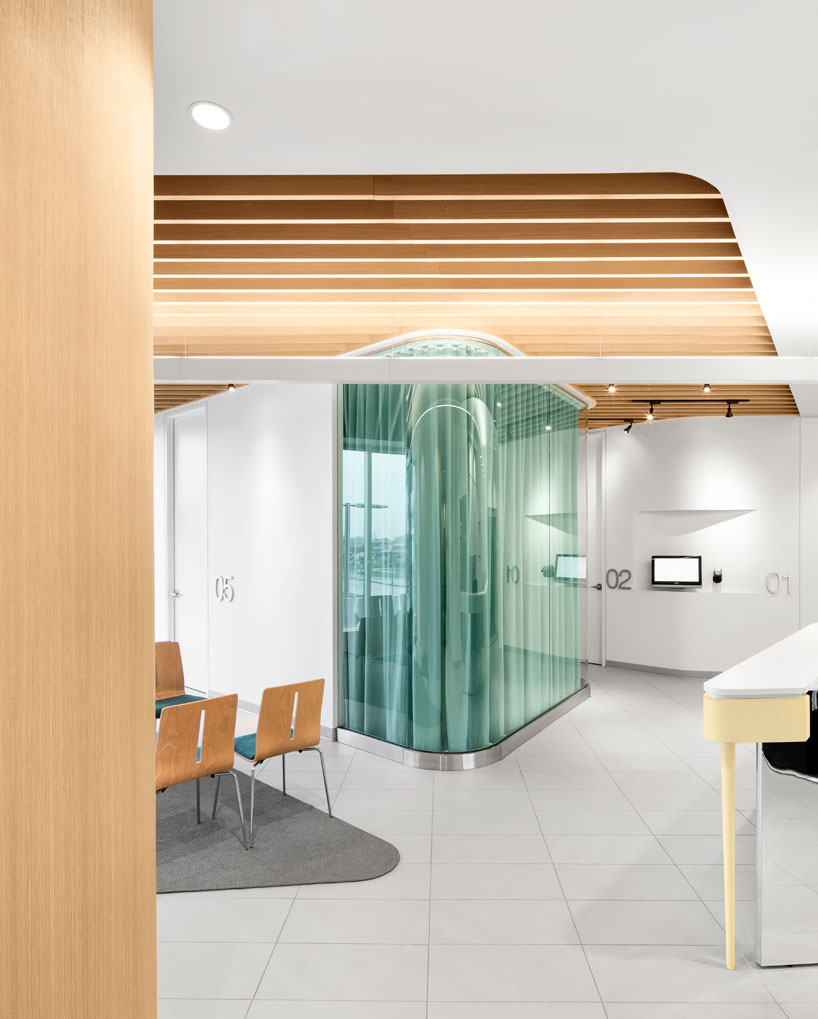
a sense of movement and the rounded walls energize the place in a non-aggressive manner
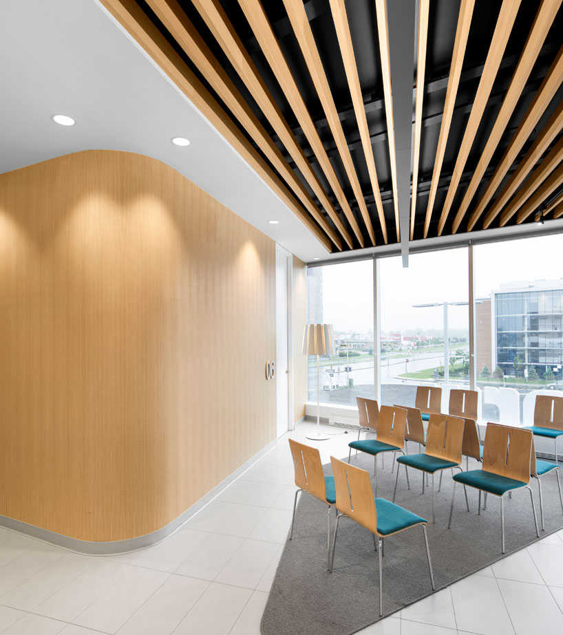
the wooden slats seen on the ceiling of the waiting room is another auspicious architectural detail
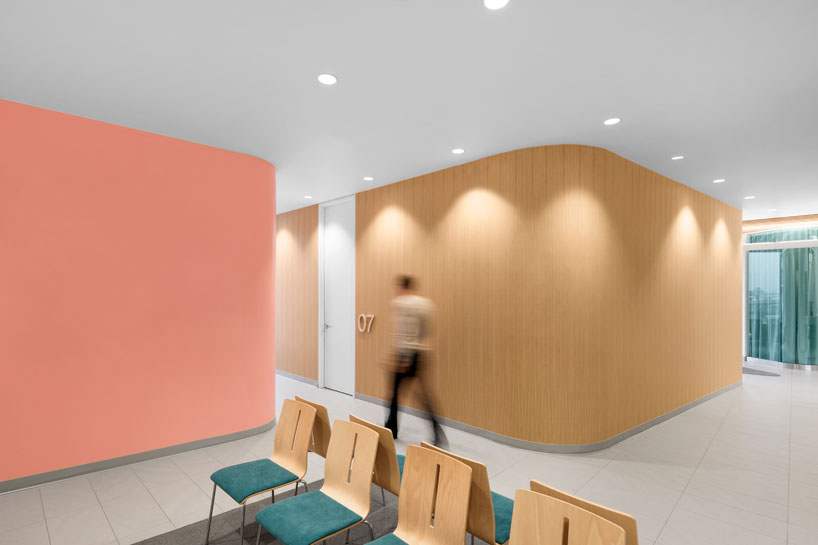
the rounded nature of the clinic is consistent to the pharmacy
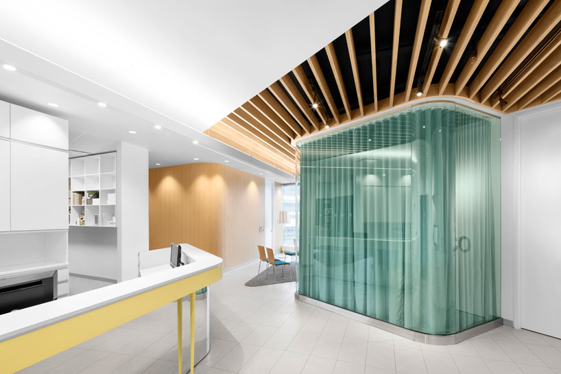
ceramic tile, laminate, fabric, glass, wood, carpet were the material palette used
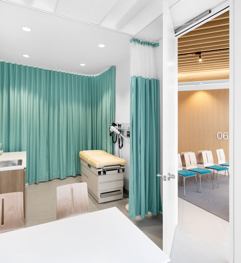
treatment room