
CEPSA is spain’s fourth largest industrial group operating for over 80 years. in recent years, it has become a major player in the global energy market, yet it is their petrol stations that are the crucial touch-point that connects the brand with society. during the brand strategy process, saffron brand consultants identified the highly technical and service-orientated aspects of CEPSA as being the essence of its brand, so they encapsulated them in the brand idea ‘adaptable engineering’.
the problem then was how to communicate this, creating a new and relevant service station concept that would improve the service experience, reduce the cost of maintenance, and create visual impact while representing the brand.

at night, flooded with a red glow, ETFE cushions turn the canopy into the jewel of the concept
all images courtesy of saffron brand consultants
saffron, together with partners tangerine and M+P arquitectos went through rethinking every brand touch point that customers interact with within the station: canopy, shop, pumps, lighting, and signage. the forecourt canopy was transformed using a high-tech ETFE material that is self-cleaning, lightweight and recyclable. its structure is assembled in a modular fashion to be adapted to varied station formats. ETFE’s 100% transparency delivers a reduction in the use of artificial lighting thereby reducing station costs. the innovative plastic cushions also transform the forecourt into a light and airy place.

the forecourt canopy has a high-tech ETFE material that is self-cleaning, lightweight and recyclable
at night, flooded with a red glow, ETFE cushions turn the canopy into the jewel of the concept. the bright red cladding of the c-store building also reinforces the beacon effect of the station, gently drawing travelers in. together with tangerine, they carefully considered the refueling experience and thus proposed separating the display from the pump to allow a more intuitive and natural operation. lighting parasols were placed above the refueling islands to provide light at exactly the point where it is needed, thus giving a more localized experience for the person at the pump and reducing wasted energy.

ETFE’s 100% transparency delivers a reduction in the use of artificial lighting thereby reducing station costs
the signage system, inspired by CEPSA’s logo shapes and angles, complements the powerful visual language of this state-of-the-art service station. this reflects a powerful collaboration from brand, architecture, product and service design.

the bright red cladding of the c-store building reinforces the beacon effect of the station, gently drawing travelers in

the innovative plastic cushions also transform the forecourt into a light and airy place.

CEPSA brand
designboom has received this project from our ‘DIY submissions‘ feature, where we welcome our readers to submit their own work for publication. see more project submissions from our readers here.
edited by: juliana neira | designboom
architecture in spain (644)
 Jul 26, 2024
 Jul 23, 2024
 Jul 19, 2024
 Jul 18, 2024
 Jul 17, 2024
gas and petrol stations (17)
 Aug 16, 2023
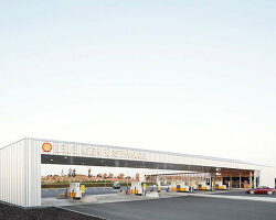 Dec 20, 2022
 Nov 19, 2021
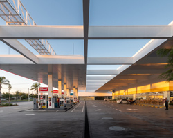 Aug 09, 2020
 Nov 13, 2019
PRODUCT LIBRARY
 Jul 15, 2024
 Jul 09, 2024
 Jul 09, 2024
 Jun 20, 2024