masquespacio paints valencia lifestyle store with block colors + bold lines
masquespacio gives this spanish store a face-lift, using bright block colours and playful curving lines.
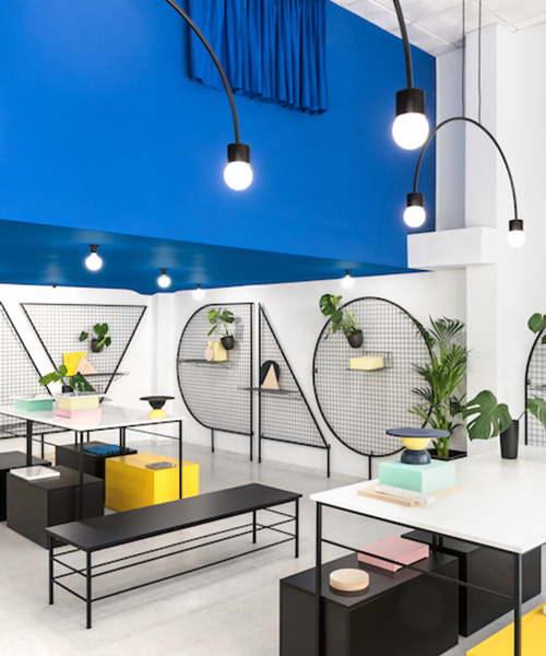
spanish consultancy firm masquespacio has reimagined a valencian lifestyle store as a clean, white space punctuated with block colour and bold lines. the redesign marks the store’s sixth birthday, and celebrates the company’s recent relocation to the city’s well acclaimed ruzafa quarter.

the redesign marks the store’s sixth birthday
the store — called ‘gnomo’ — stocks a variety of homeware, lifestyle, furniture and interior design goods. preserving the building’s retro feel and adding a contemporary flare, masquespacio has created a simple but sportive new face for the store. ana hernández, creative director of the company, wanted to create a space in which each product would be displayed with simple vibrancy, without resulting in a clamorous or crowded atmosphere: ‘taking into account that gnomo sells different kind of objects from a wide set of brands, it was important to create a funny and happy feeling, but without creating a visual disorder.’
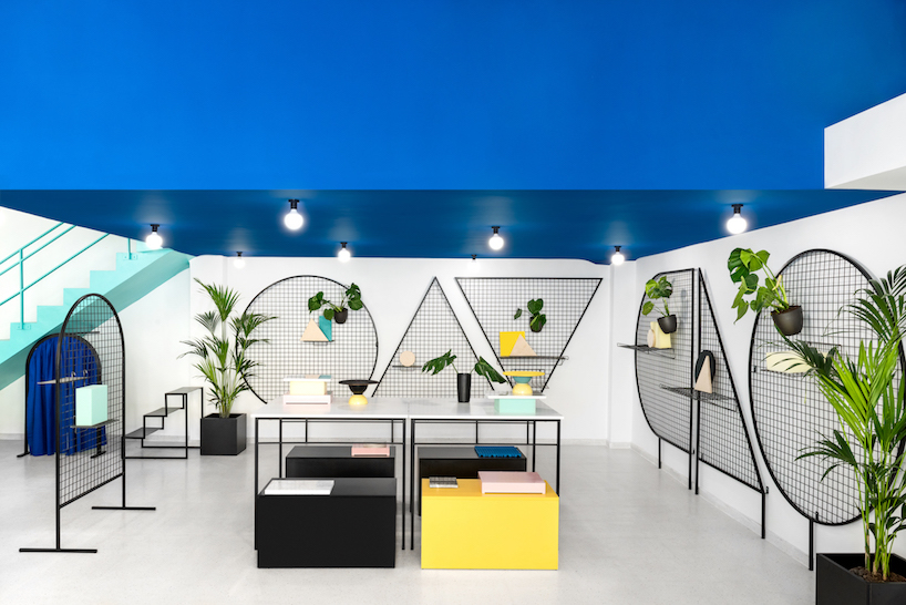
‘gnomo’ is located in valencia’s well acclaimed ruzafa quarter
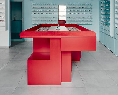
a granite floor with a speckled grey colour was added to the original building, a base palette echoed on the walls and ceiling. basic 2D shapes are inscribed in large scale metal frames on the wall, their gridded interior acting as a surface from which pots, plants and products can be hung. on the ceiling and throughout the store, bold blocks of colour are used to breathe a playful vitality into the white space: pale turquoise, royal blue and bright yellow all making an appearance. U-shaped curved lights hang in sequence on the ceiling, adding a new dimension to the space by playing straight and curved lines off each other. as for every project, masquespacio designed all the elements exclusively for gnomo, with exception of the counter desk.
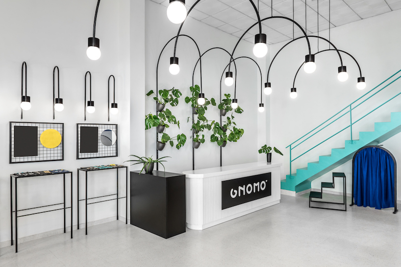
masquespacio has created a simple but sportive new face for the store
the custom-made display elements were designed to be easy to move, stack, repurpose and rearrange to accommodate the huge variety of products on show. more like a showroom than a store, the physical space is easily altered, moving and growing with the identity of the gnomo brand.
‘in this space continuously reinvented, above selling design objects, stories are gifted’, say álvaro zarzuela and esther martín, the founders of gnomo. ‘more than a store, for us gnomo is a space to share experiences. all the objects we sell have their own history. sometimes it’s the history of their brand, sometimes it’s the history we are living and most of the time it is a history told by our clients.’
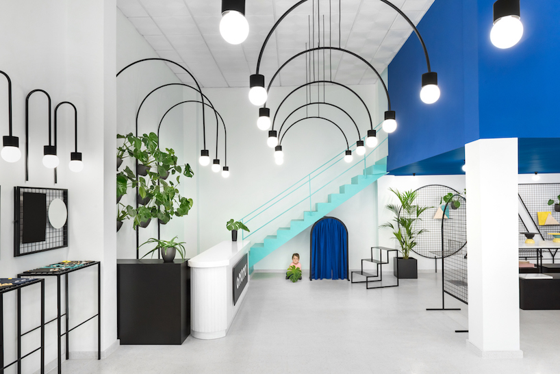
ana hernández wanted to create a space in which each product would be displayed with simple vibrancy

a granite floor with a speckled grey colour was added to the original building
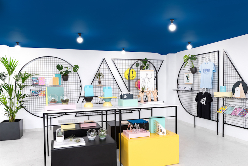
basic 2D shapes are inscribed in large scale metal frames on the wall
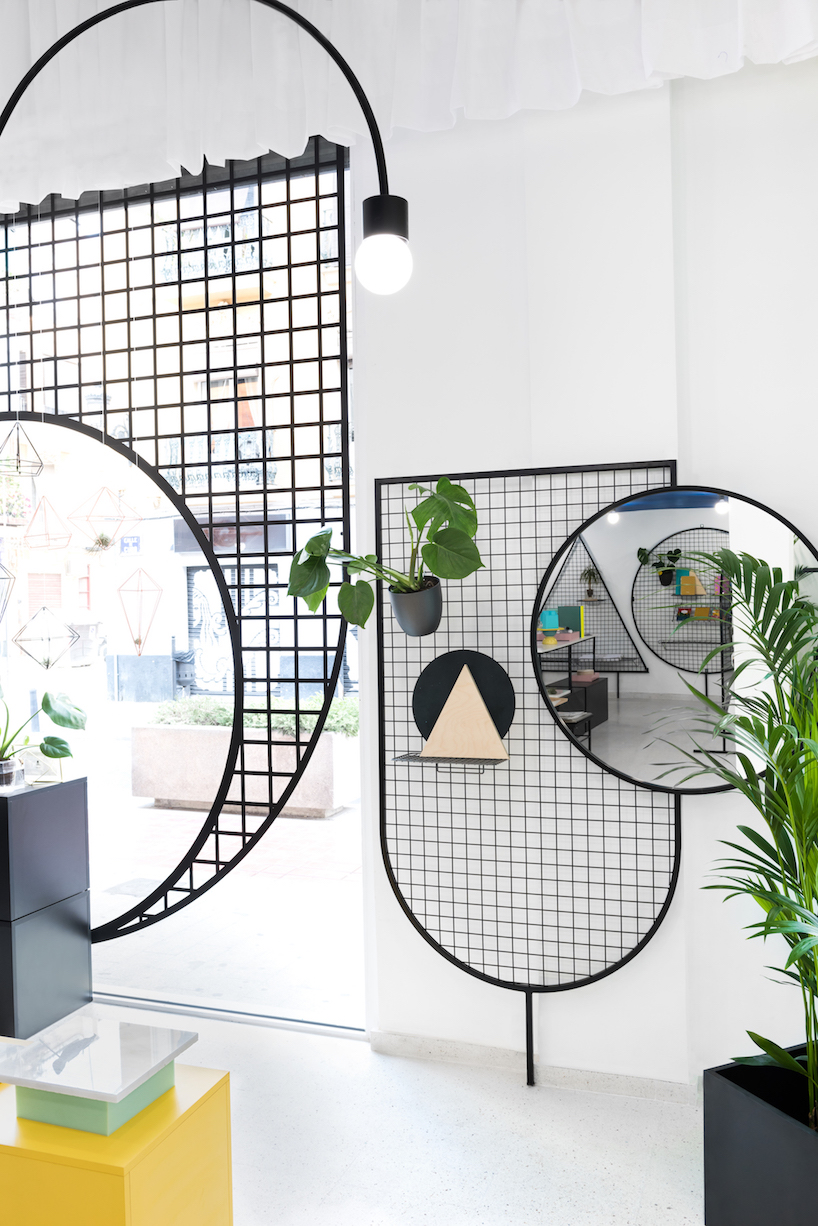
the design plays straight and curved lines off each other
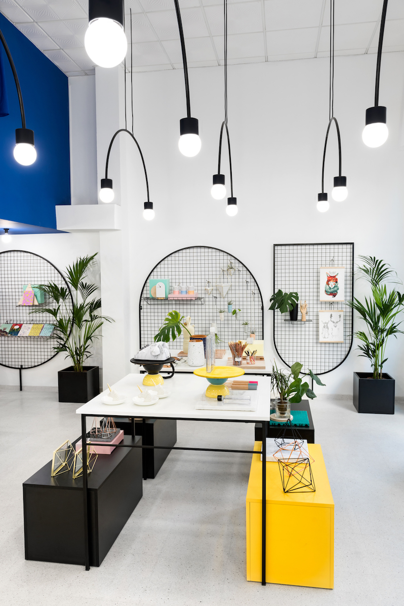
almost all the pieces were custom made by masquespacio
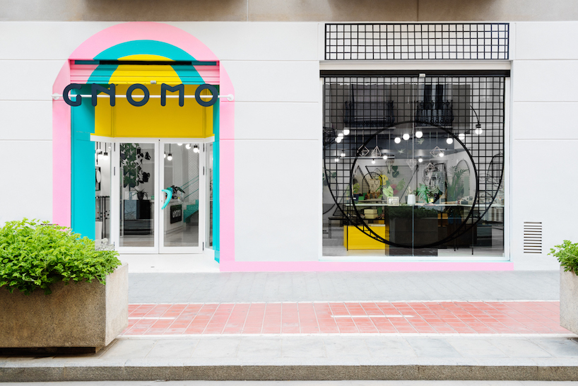
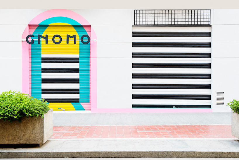
a playful pastel rainbow was added to the face of the building
‘in this space continuously reinvented, above selling design objects, stories are gifted’
designboom has received this project from our ‘DIY submissions‘ feature, where we welcome our readers to submit their own work for publication. see more project submissions from our readers here.
shop
your own online design shop — no sales commission collected