‘penleigh and essendon grammar school’ by mcbride charles ryan in victoria, australia all images courtesy mcbride charles ryan
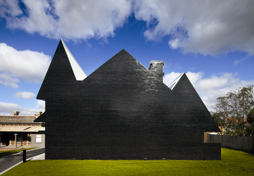
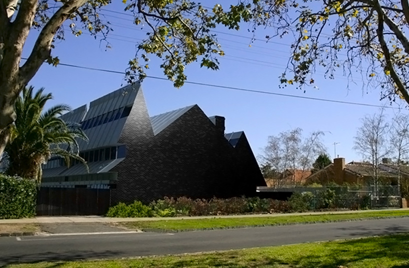
australian architects mcbride charles ryan have just completed the ‘junior boys building at penleigh and essendon grammar school’, a two-storey educational facility in victoria, australia. located adjacent to a residential street, the design features a very discernible silhouette of a typical australian heritage home, referencing the local structural typology of the site.
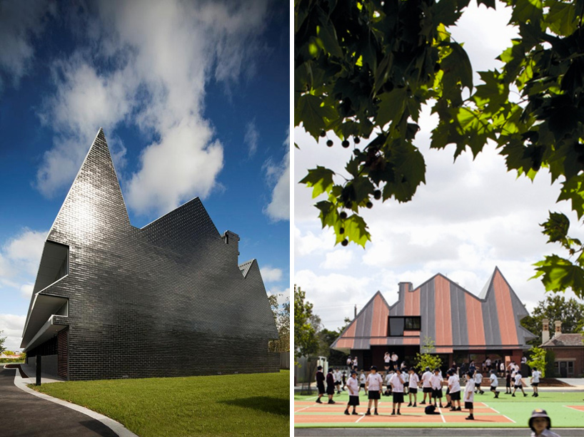 (left) east facade (right) west facade
blocked out in black brickwork, the east facade is characterized by multiple peaks of varying heights. the overall form of the school is extruded from this outline and terminates at a low angle slope on the opposite side of the lot which opens up to an outdoor area for the students. the facade treatment of the main entrance employs a noticeably different effect of stripes and colours, a language that continues into the interior flooring.
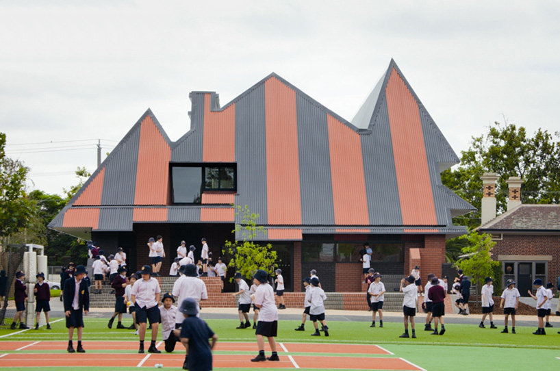 main entrance and outdoor area
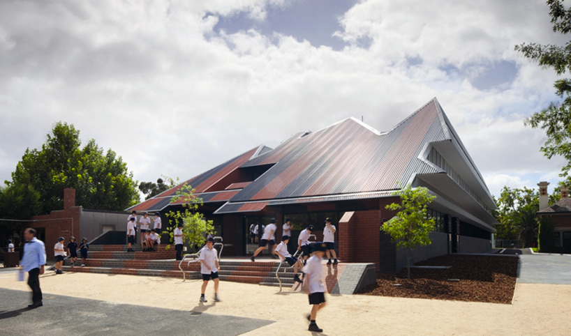 approach
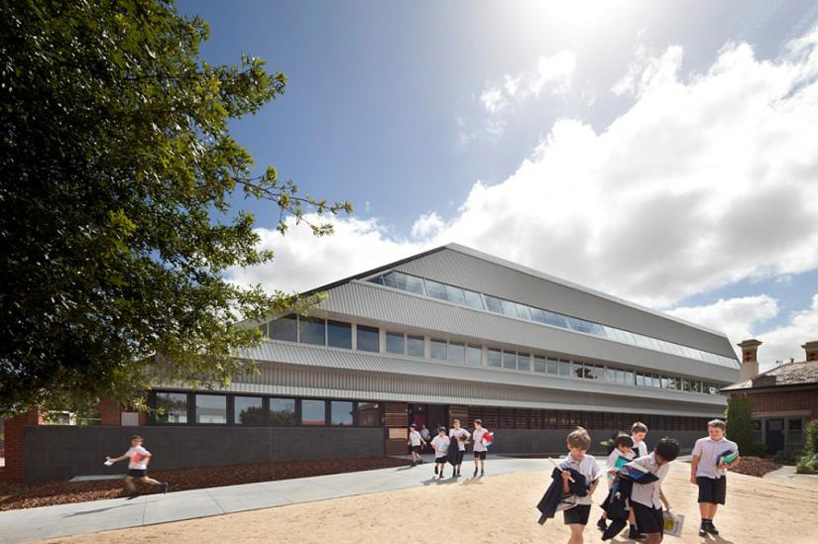 street view
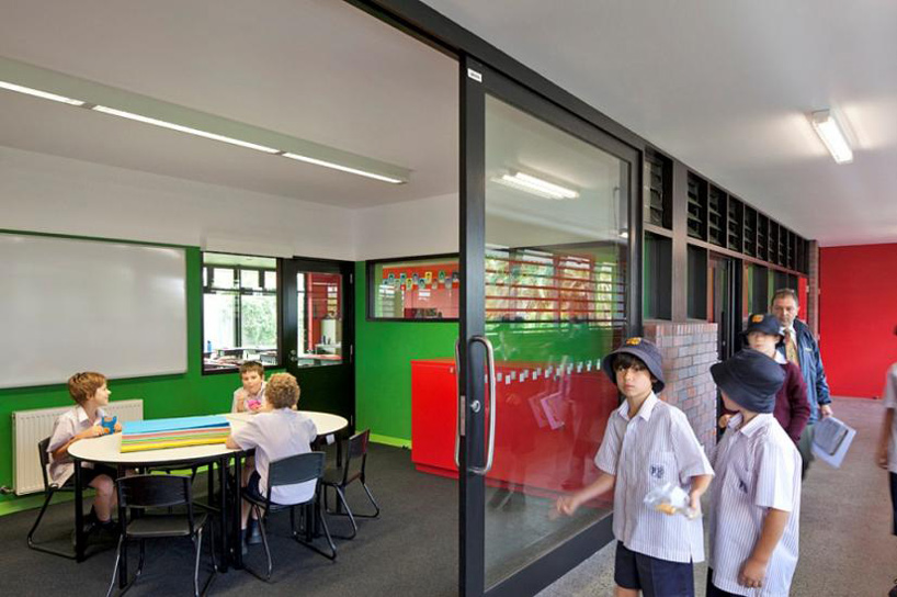
contrary to the blunt angles of the exterior, the ceiling is formed in a continuous, cloud-like surface. shaping the hallway as well as the classrooms, the resulting effect is a playful sculpting of the interior space.
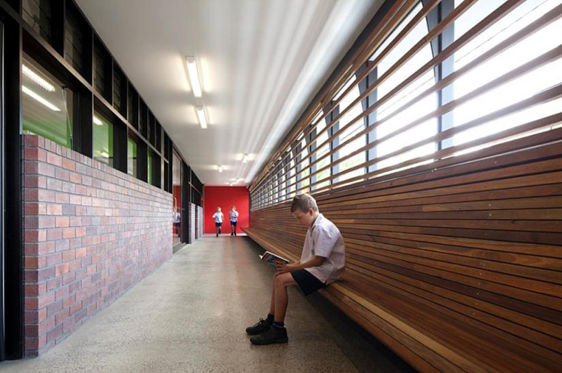 hallway
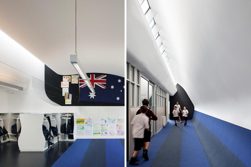 (left) classroom (right) circulation
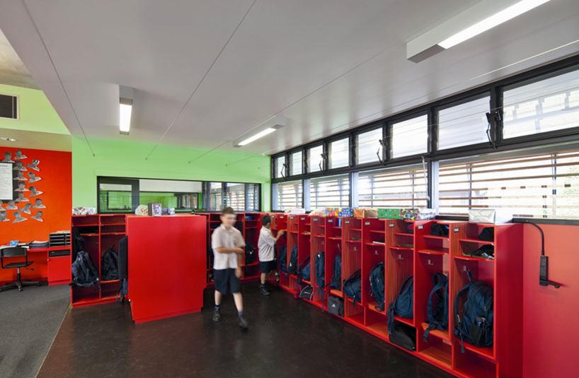
 working room
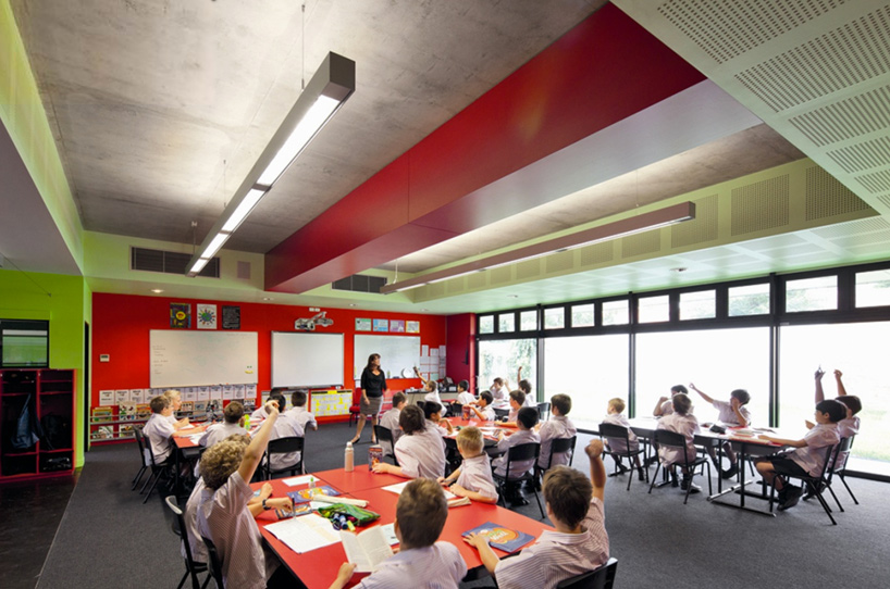 classroom on ground level
 exterior profile
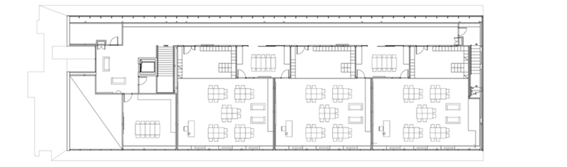
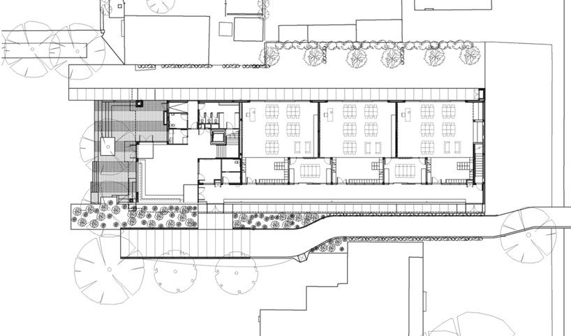 site and floor plan / level 0
 floor plan / level +1
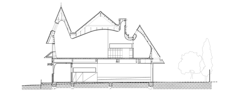 cross section
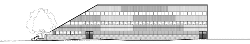 south elevation
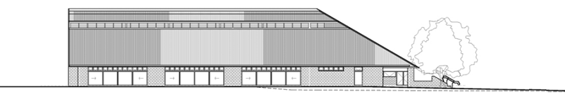 north elevation
mcbride charles ryan (5)
 Jun 25, 2012
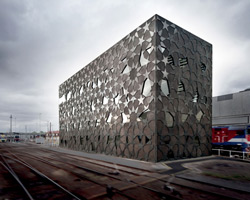 Feb 21, 2011
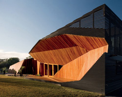 Nov 08, 2010
 Nov 05, 2009
school architecture and design (700)
 Jul 24, 2024
 Jul 12, 2024
 Jun 30, 2024
 Jun 23, 2024
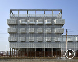 Jun 19, 2024
PRODUCT LIBRARY
 Jul 15, 2024
 Jul 09, 2024
 Jul 09, 2024
 Jun 20, 2024