design studio haal recently completed a family restaurant in vila nova conceição, brazil, with a raw materiality and a bold use of color. the designers were tasked with expanding the space into a new site and developing a new visual and spatial identity for the ‘torta da vila’ restaurant. the clients wanted their locale to become recognizable and easily replicated for future locations, and the result is a color-infused minimal design that is contemporary yet memorable.

all images © manuel sá
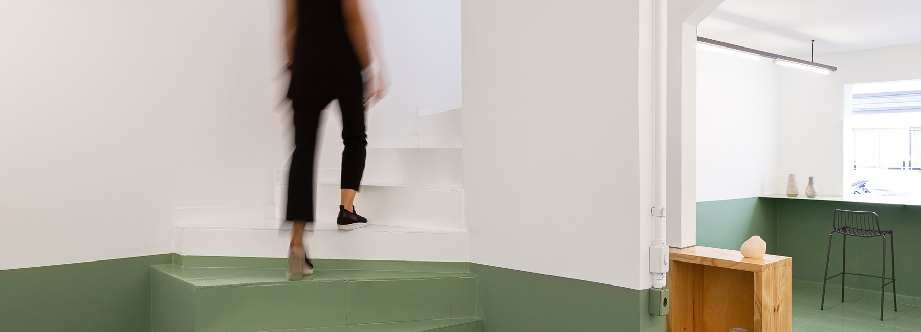
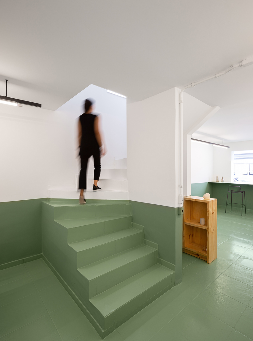
haal extracted the essential graphic elements from the existing logo, including the colors and forms, to develop the new concept. the green and gray hues were kept as the main color palette, and the pie symbol became the foundation of the new visual, spatial and brand identity. applying green and gray both in the walls and floors allowed for the distinction between exterior and interior spaces.

the minimal color scheme maintains a unity in the design and creates a relaxed atmosphere for guests. the designers only painted the bottom half of the walls with either of the main colors and kept the top half white, creating a linearity that takes the eye across different spaces. the stark line between the colors creates a clean space that provides dialog and fluidity between public and private, inside and out.

the different spaces become connected by the eye-catching architectural details. haal deliberately designed the hollow concrete blocks in the facade, the thin green steel counter, and the elongated light fixtures. even the stairs get graphically cut through with the change in color mid-step.
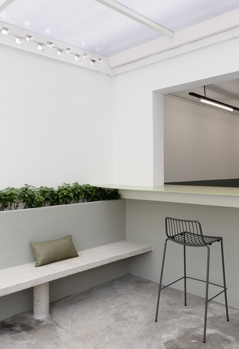
the spatial flow is reinforced with the big openings that not only integrate spaces, but also bring in natural light and ventilation. the new logo was painted with the same green tones on the facade, following the premise of what is essential, as cement, concrete and wood are used in their raw form. the restaurant’s simple aesthetic draws the eyes across the rooms and the mind to a calm state ready for the food.


project info:
project name: torta da vila restaurant
location: são paulo, brazil
architecture firm: haal
lead architects: edson maruyama and wanessa simoe
collaborating architects: luis felipe curtolo and rodrigo de moura
client: torta da vila
completion: 2019
photography: manuel sá
designboom has received this project from our ‘DIY submissions‘ feature, where we welcome our readers to submit their own work for publication. see more project submissions from our readers here.
edited by: cristina gomez | designboom
ARCHITECTURE IN BRAZIL (341)
 Apr 25, 2024
 Apr 17, 2024
 Apr 17, 2024
 Apr 10, 2024
 Apr 01, 2024
RESTAURANT AND CAFé DESIGN (780)
 Mar 20, 2024
 Mar 15, 2024
 Mar 11, 2024
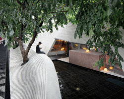 Mar 08, 2024
 Mar 04, 2024
PRODUCT LIBRARY
 Apr 02, 2024
 Mar 31, 2024
 Mar 21, 2024
 Mar 20, 2024