
‘el ‘B” by selgascano, cartagena, spain image © iwan baan all images courtesy of selgascano
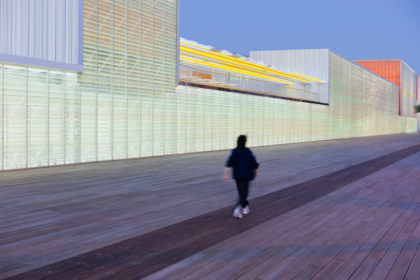
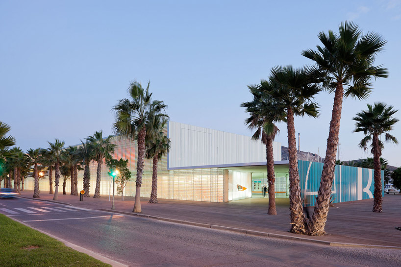
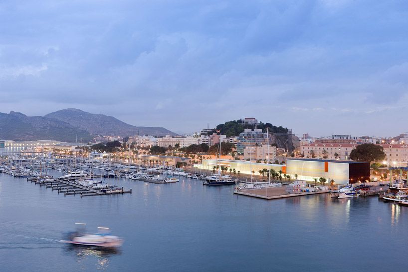
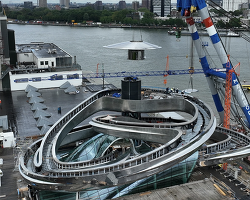
recently completed, the auditorium and performing center ‘el ‘B” designed by madrid-based practice selgascano is placed along the docks of the harbor city of cartagena, spain. spanning the 1 kilometer long alfonso dock, a 20 meter void between the building and water serves as a promenade, maintaining the artificial waterfront of the port. the translucent exterior of the linear volume stretches 210 meters and projects the orthogonal edges found in the man-made environment.
as visitors enter the interior, a delicate and light space is presented, evoking a soft aquatic ambiance that is decidedly missing from outside the building’s walls. aluminum and plastic manufactured from a single extruded section are placed in diverse ways and tinted with pigments to appear as different elements. set parallel to the pier’s edge, the horizontality of the low-profile facade accentuates the structures length, with a roof terrace offering panoramic and unobstructed views to the sea.
 linear facade faces harbor along dock image © iwan baan
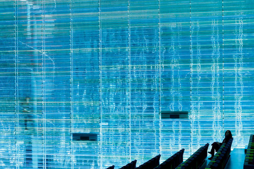
 translucent street elevation image © iwan baan
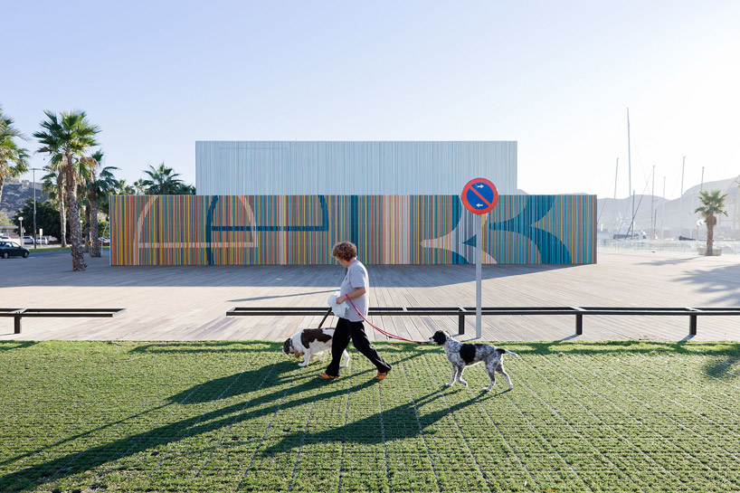 graphic facade image © iwan baan
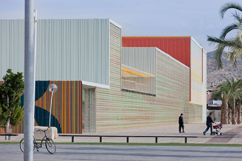 corner of building image © iwan baan
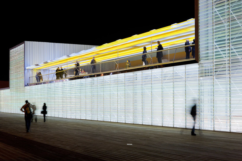
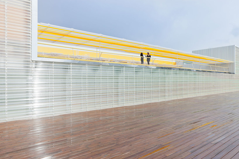 roof terrace overlooking harbor image © iwan baan
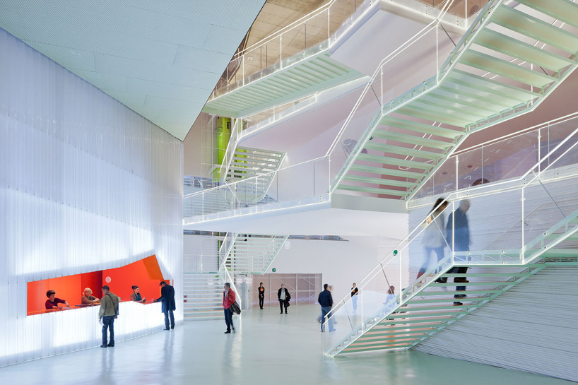 atrium and lobby image © iwan baan
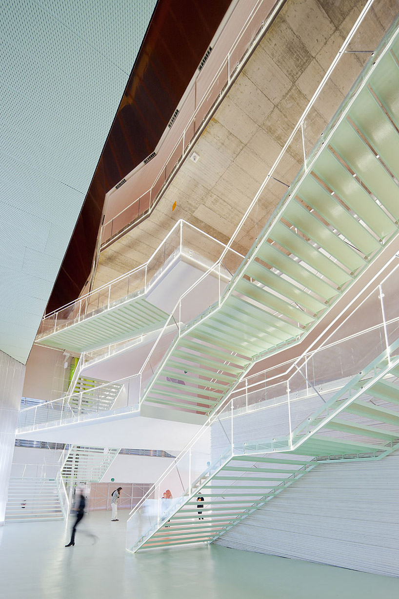 floating stairs become focal element image © iwan baan
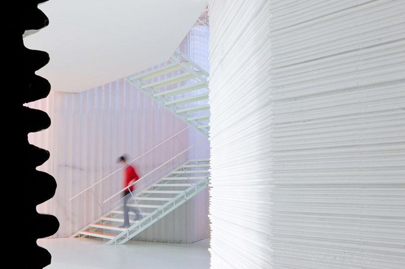 juxtaposition of matierals image © iwan baan
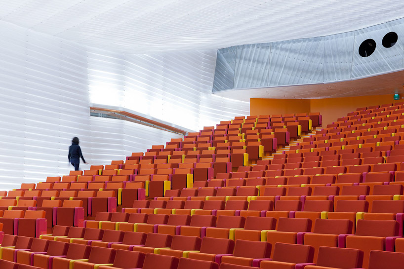
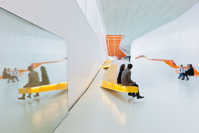 ground level seating image © iwan baan
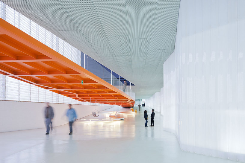 ground level seating and ramp image © iwan baan
 ground level seating image © iwan baan
 ground level seating image © iwan baan
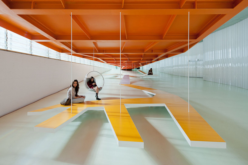
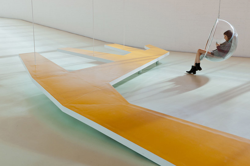
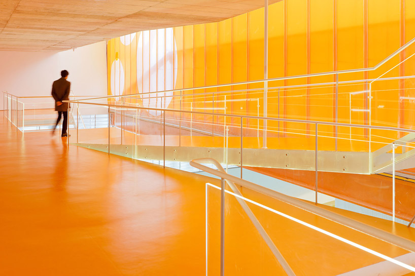
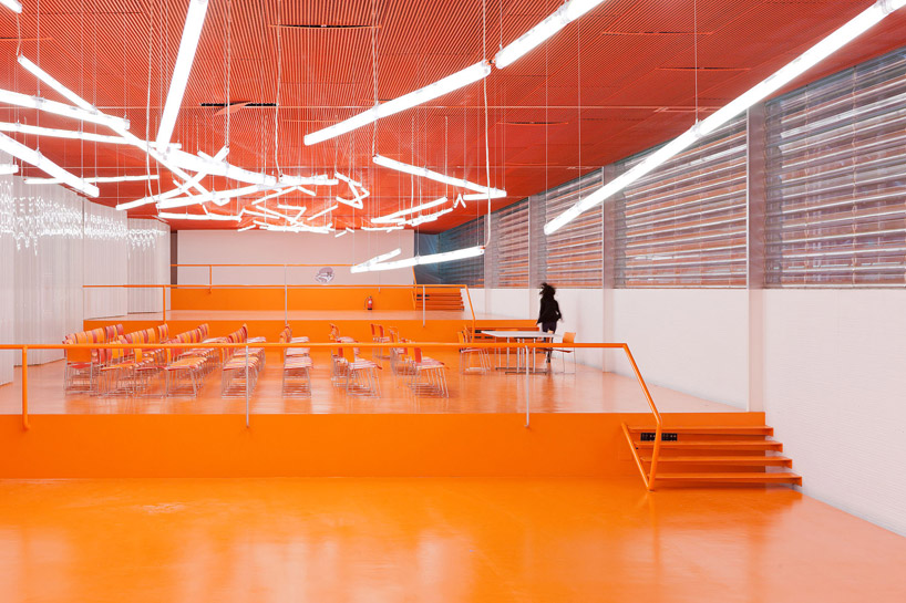
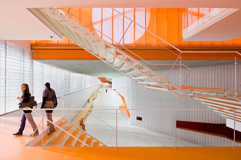 surfaces of upper floors become a vivid orange once visitors reach each level image © iwan baan
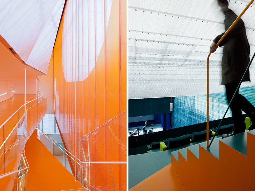 (left) corridors leading to auditorium spaces (right) auditorium images © iwan baan
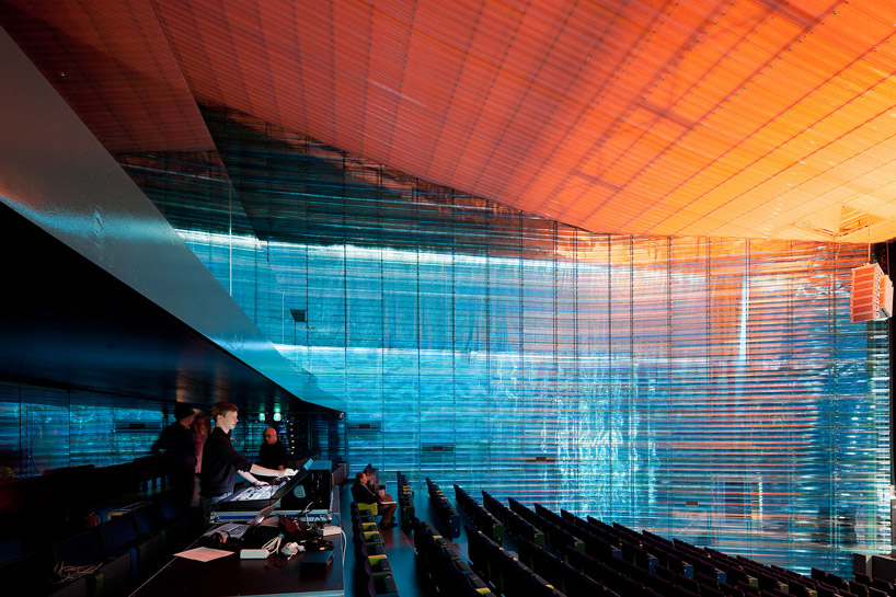 auditorium image © iwan baan
 auditorium image © iwan baan
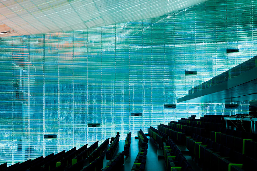
 texture of auditorium’s walls image © iwan baan
 vivid material palette continues into stepped seating image © iwan baan
 corridors image © iwan baan
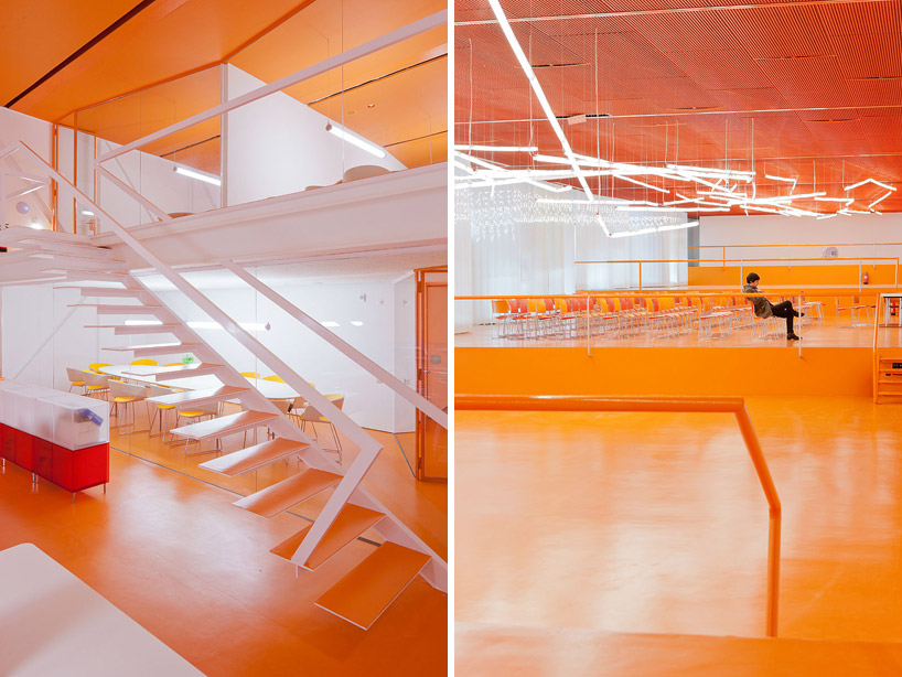 (left) employee area (right) additional flexible auditorium space images © iwan baan
 flexible auditorium image © iwan baan
 glowing at dusk image © iwan baan
 at night image © iwan baan
 linear volume parallels harbor image © iwan baan
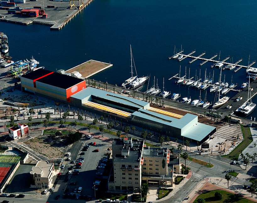
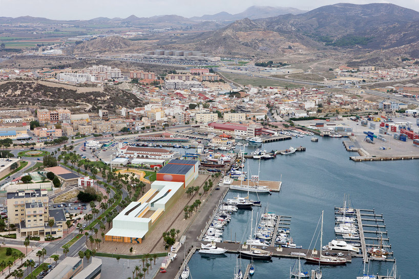 aerial view of complex and harbor image © iwan baan
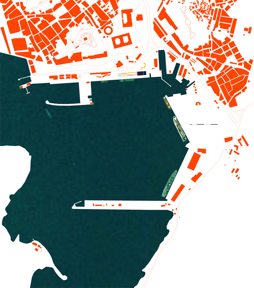 site plan
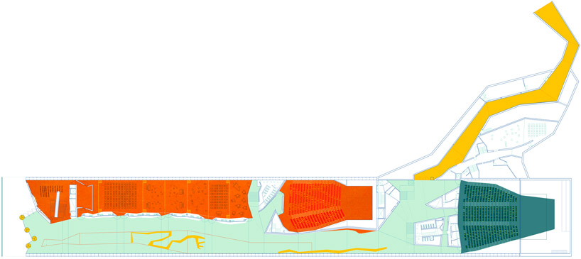 floor plan / level 0
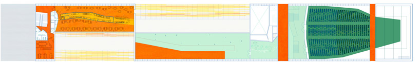 floor plan / level 1
 roof plan
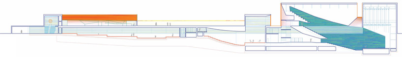
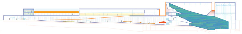 section
 section
 section
 section
 section
 section
 section
 section
 elevation
 elevation
 elevation
 elevation
project info:
project name: el ‘b’ location: cartagena, spain site of the building: paseo de alfonso xii sn 30202 cartagena owner: cartagena council architecture firm name: selgascano head architects: josé selgas (madrid 1965), lucía cano (madrid 1965) architecture project team: lara resco, josé de villar, josé jaraiz, lorena del río, blas antón, miguel san millán, carlos chacón, julián fernandez, beatriz quintana, jaehoon yook, jeongwoo choi, laura culiañez, bárbara bardín. interior design firm name: selgascano architectural assistant: antonio mármol, joaquín cárceles, rául jiménez. photographer: iwan baan structural engineer: FHECOR mechanical, electrical, plumbing (mep) engineer: JG acoustic engineer: arau acustica textil arquitectures: lastra y zorrilla general contractor: dragados general contractor: intersa plastic manufacturer: polimertecnic auditorium seating: figueras floors manufacturer: prialpas lighting manufacturers: idealux lighting manufacturers: talleres zamora wall manufacturers: ata aislamientos tecnicos agroalimentarios model: gilberto ruiz lopes date project completed: november 2011 design phase: 2002-2004 construction phase: 2006 – 2011 total square footage: 18.500 m2 site area: 5628 m2 number of floor levels: 2 budget: 34.5 euro millions brief: hall a 1420 seats, hall b 470 seats, 10 conference rooms 1000 seats, exhibition zone 850m2, restaurant zone 560 m2, outdoor terraces 1400m2, foyer-distributor 1500m2, dressing rooms 120 seats, rehearsal room 120m2, hall a stage 500m2, hall b stage 200m2. project: 2004 construction: 2006-2011 budget: 34 million euros
selgascano (22)
 Oct 18, 2024
 Mar 14, 2024
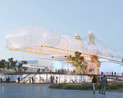 Sep 13, 2023
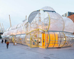 Oct 25, 2022
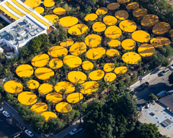 Nov 20, 2019
staircases (73)
 Oct 03, 2024
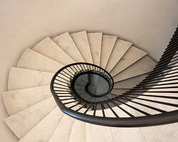 Jul 15, 2024
 Jul 10, 2024
 Jul 10, 2024
 Dec 31, 2023
PRODUCT LIBRARY
 Oct 17, 2024
 Oct 16, 2024
 Oct 08, 2024
 Oct 04, 2024