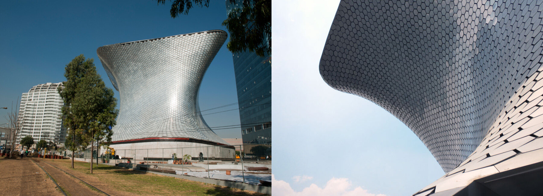
this week saw the soumaya museum in mexico city open its doors to the public. designed by fernando romero enterprise, the museum is the new home for carlos slim’s extensive collection of works by rodin. to learn more about mexico’s newest landmark, designboom met with fernando romero in mexico city.

fernando romero with a rapid prototype of his soumaya museum design
portrait © designboom
designboom (DB): what were your aims at the start of the soumaya museum project?
fernando romero (FR): in 2005 we were approached by a representative from a group comprised of 24 private collections. collectively these owners had decided to combine their collections in order to create a new museum and they invited us to propose a solution. the collections feature art works from the 11th through the 20th century, from both latin-america and europe. the collection is very diverse and includes: furniture, paintings, sculptures, fashion, coins and much more. we thought it was interesting to build something for such a diverse collection.
in our opinion, there were 2 different approaches to the building. one would be to do an invisible building, completely modern where the art was the fundamental presence. the other approach was to use the architecture in a more contemporary way using design and the latest technologies to make a memorable structure. we were fortunate that at a certain moment everybody involved realized this was a great opportunity to achieve a unique project for mexico city.
we presented different schemes and were asked to develop one, in which the building emerged from the plaza and organized all the exhibition spaces on 6 floors. the most important part of the collection, containing numerous sculptures by rodin is displayed on the top floor. the structure is a continuous skin that wraps a very economical substructure which is connected by a series of ramps.
DB: did any existing museums have a strong influence on the design?
FR: certainly there are some european museums that have similar environments in terms of scale as well some american museums in terms of the circulation. we analyzed many existing museums but in the end we were convinced that this building needs to be connected to this specific environment and mexican culture.
we thought the museum should have a circulation that doesn’t expose all the content at once in a grand vestibule instead we wanted to allow the collection to be discovered slowly. the museum is a filter between the experience of the city outside and that of the art inside, so we wanted the vestibule to give you the opportunity to pause for thought. a continuous ramp connects all the museum facilities, like the cafeteria and research center while allowing you to make your way through the six floors of exhibition space.

image courtesy of fernando romero enterprise
DB: what’s has been the most challenging aspect of the project?
FR: in recent times mexico has suffered some political and economic crises and as a result of that architectural exploration has suffered in the country. for the most part architecture was in the hands of developers and a lot of post-modern buildings were built that didn’t add much value to the city. it’s a pity because from the fifties until the seventies mexico was a really interesting place for modern art, design and architecture. the country had a vision and was actively building its identity. but now the current political and social conditions mean that the government has completely different priorities and this made the soumaya museum a much more challenging project. the museum is privately owned however it is open and free. no one will be charged to go and see a universal collection of art. at the moment when not everybody can afford to travel, I think this a very interesting proposal. of course there were technical challenges as well, such as managing successful collaborations with the many teams of engineers to build the museum efficiently, and how to build arguments for all the people involved to accept our solution.
DB: did your vision for the museum change much over the last five years?
FR: we were very convinced that the project should translate all the information that was stated in the brief when we were invited to work on the project; including the ambition of trying to use specific companies also owned by the same client. we had a lot of freedom during the conceptual stage. and the core skeleton was constructed without any problems. when it came down to materials things were a bit more challenging for everybody. the facade is a good example, we had to build strong arguments in order for everybody to understand it and accept that solution. the facade is composed of 15,000 aluminum plate hexagons, made up of 1,000 different families that vary in their dimensions. this pattern basically translates into a very ornamental skin, so even if the building is completely contemporary, the skin of the building is really connected to the historical content inside.

image courtesy of fernando romero enterprise
DB: how do you feel about the end result?
FR: there is a lot of gratitude and a very positive perception in general. we feel really proud to be part of the team that developed the project. however, in architecture, you never really have any kind of satisfaction until you see the building in its proper use. so far there have only been openings and this is not the fundamental way of using the building. once it opens publicly and people can enter from the street and explore the building – this will be a nice moment to see.
as a designer you always have the perception that some things could have been much better when you see the end result (laughs), but i think that’s part of the challenge. considering the specific environment and the challenging timescale in which the project was completed (ca. 2 years), i think everybody is extremely proud and happy to have been a part of this project.

image courtesy of fernando romero enterprise

image courtesy of fernando romero enterprise
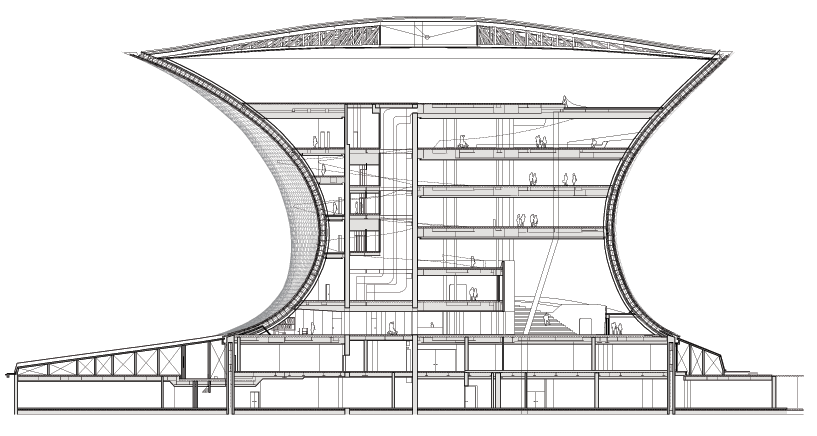
cross section view of the soumaya museum
image courtesy of fernando romero enterprise
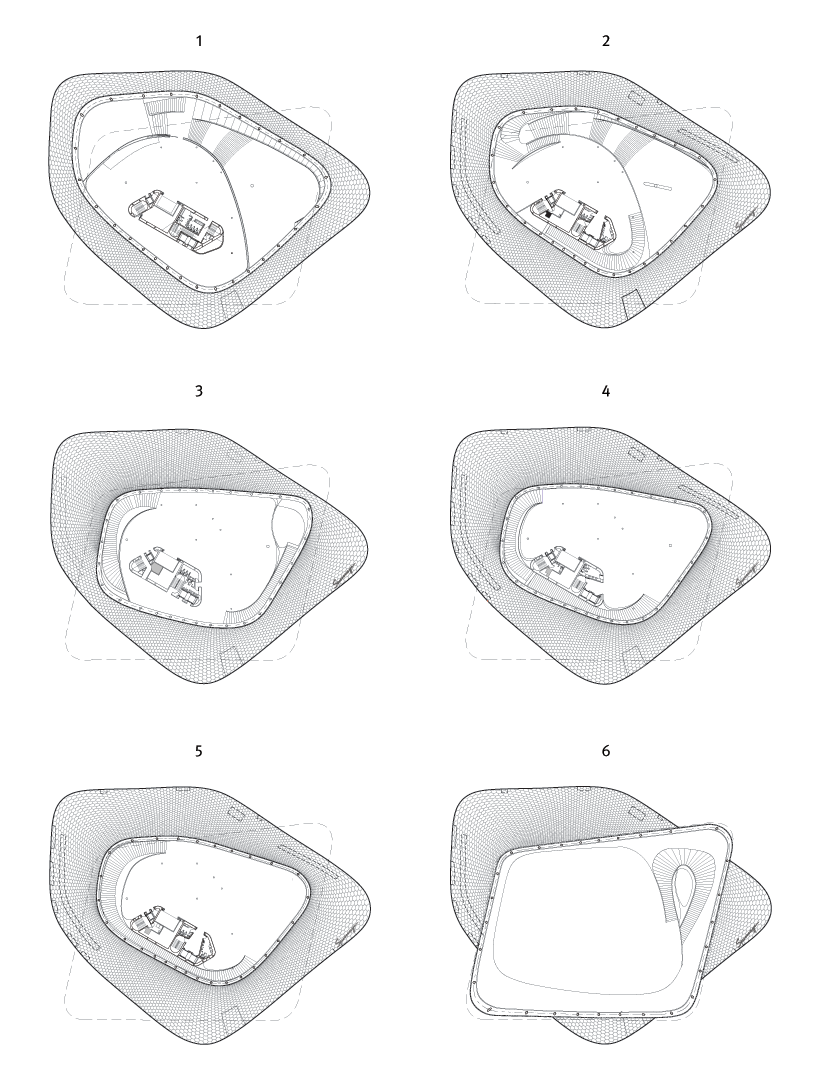
plan view of the floors
image courtesy of fernando romero enterprise

facade of the soumaya museum
image courtesy of fernando romero enterprise

entrance of the museum
image © designboom

image © designboom
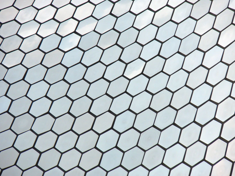
image © designboom

image © designboom

image © designboom
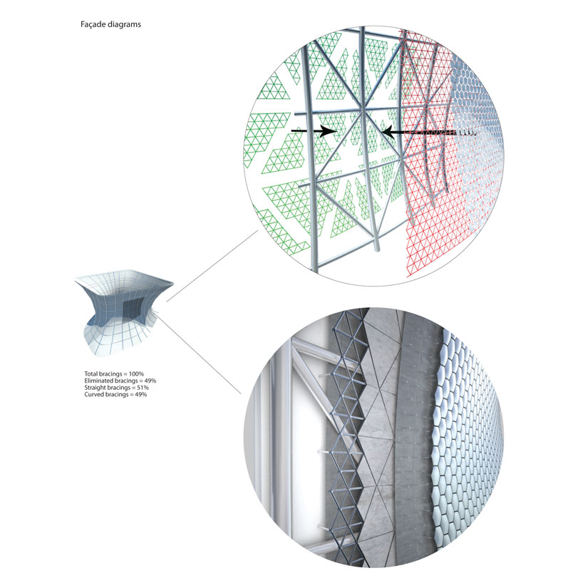
diagram illustrating the layers of the facade
image courtesy of fernando romero enterprise + gehry technologies
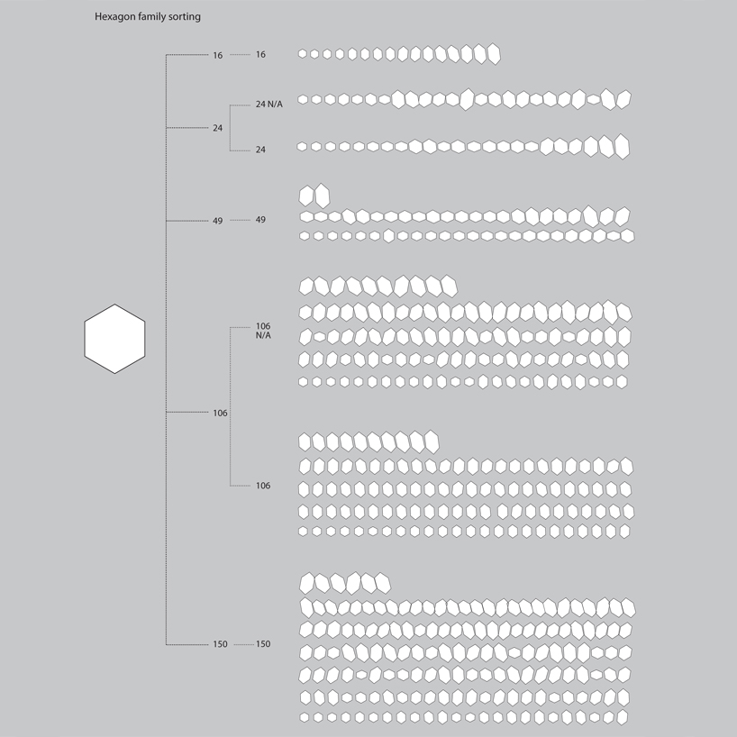
diagram illustrating the various shapes of aluminum tiles used for the facade
image courtesy of fernando romero enterprise + gehry technologies

museum a few days prior to its opening, rodin’s thinker can be seen wrapped up and cordoned off
image courtesy of fernando romero enterprise

artworks being unboxed
image courtesy of fernando romero enterprise

the museum opened its doors on march 29th, 2011, entry is free
image © designboom

a visitor observes the thinker
image © designboom

stairs and ramp provide access to the first floor
image © designboom
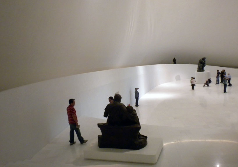
image © designboom

continuous ramp connects each floor of exhibition space
image © designboom

image © designboom
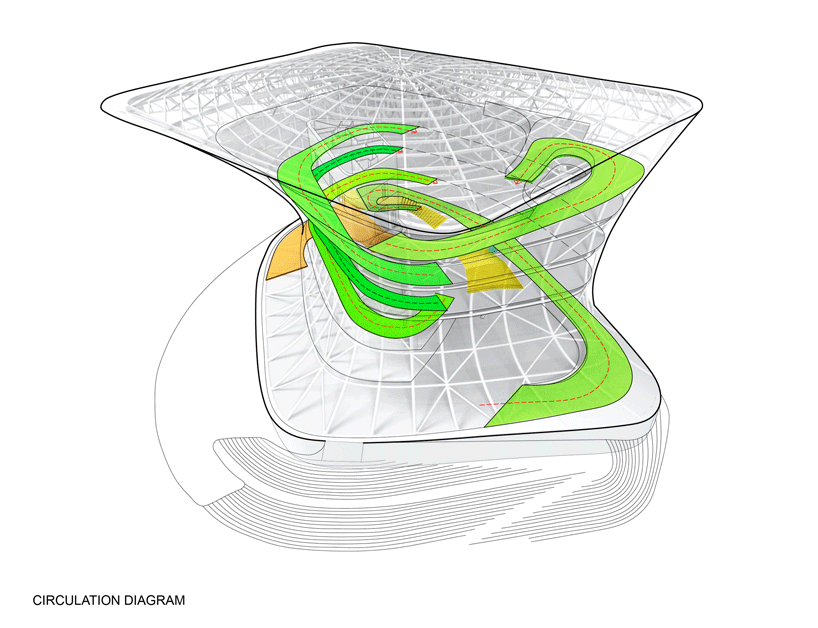
image courtesy of fernando romero enterprise

image © designboom

the museum features over 6000 artworks
image © designboom

image © designboom
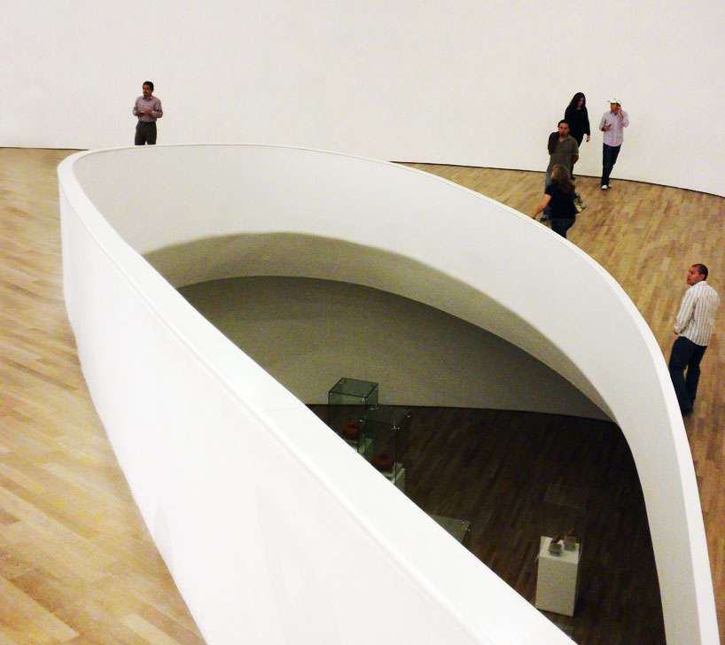
image © designboom
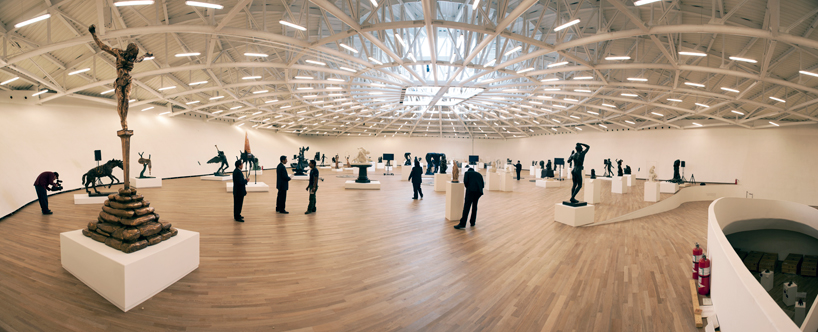
view of the sixth floor which features numerous sculptures by rodin
image courtesy of fernando romero enterprise

image © designboom
architecture in mexico (613)
 Jul 26, 2024
 Jul 22, 2024
 Jul 20, 2024
 Jul 18, 2024
 Jul 16, 2024
FR-EE / fernando romero enterprise (33)
 Nov 29, 2021
 May 25, 2021
 Dec 03, 2020
 Jan 18, 2020
 Oct 29, 2018
plaza carso (2)
PRODUCT LIBRARY
 Jul 15, 2024
 Jul 09, 2024
 Jul 09, 2024
 Jun 20, 2024