
nousfit warehouse uses lively wood pillars to express brand identity by hideo horikawa architect + associates
image © katsuhisa kida
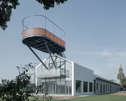
using a whimsical tectonic sensibility, hideo horikawa architect + associates have designed a warehouse and workshop for a professional shampoo manufacturer that manifests the company’s fundamental aim to create strong healthy hair. raw wooden pillars exuberantly cross, soar and dance to robustly express brand identity as well as evoke the abstracted image of hair akimbo. the form is streamlined into a angular composition of structural tendrils that puncture the roof and obliquely meet the ground. the metaphor-ridden framework remains laden with architectural ideas; light moves across the beams-turned-filaments and creates a layered skin of shadows that penetrates interior spaces. interiors are fitted with simple, cross joined shelves that allow a different perspective of the pillars and break up the otherwise industrial landscape. the structural members literally connect interior and exterior spaces as they move through several building systems, including the shattered orthogonal pattern of metal grooves that characterize the second level glazing. in creating a relationship between the built form and the conceptual crux of the company’s operations, the architecture supersedes ideas about enclosure and becomes a tool for communication.

the whimsical building is distinct in the industrial landscape
image © katsuhisa kida

the warehouse and workspace has quickly become a communicative tool about brand identity
image © katsuhisa kida

pillars mimic hair akimbo
image © katsuhisa kida

some of the structural tendrils puncture the second level of glazing
image © katsuhisa kida

beam detail shows an abstracted version of hair growth and form
image © katsuhisa kida

interior shelving allows a different perspective of the bolstering system
image © katsuhisa kida

some beams invade interior spaces
image © katsuhisa kida

image © katsuhisa kida

simple interior joinery remains in dialogue with the complex angled system on the exterior
image © katsuhisa kida

the directness of the architectural metaphor is still laden with ideas about movement and light
image © katsuhisa kida

the built form becomes a vehicle for communication
image © katsuhisa kida

sunset reflects off of the punctured glazing
image © katsuhisa kida

strategic lighting lends the beams a new level of layering
image © katsuhisa kida

night view
image © katsuhisa kida

image © katsuhisa kida

a warm yellow glow catches the facets of the beams
image © katsuhisa kida
warehouse architecture and design (20)
 Jul 14, 2024
 Jan 31, 2024
 Nov 29, 2023
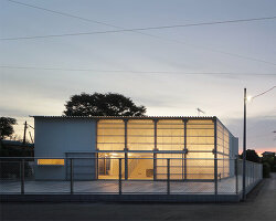 Jul 22, 2023
 Apr 11, 2022
PRODUCT LIBRARY
 Jul 15, 2024
 Jul 09, 2024
 Jul 09, 2024
 Jun 20, 2024