andrew byrom adds typographic installations to university campus in england
at the university of cumbria in north england, designer andrew byrom has created two typographic works that draw from the local countryside as part of an artist-in-residence. following the program, byrom presented the installations on campus in an exhibition he titled ‘field work’.
the project has been created alongside the university of cumbria in north england
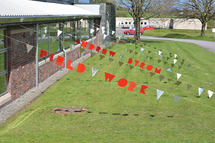
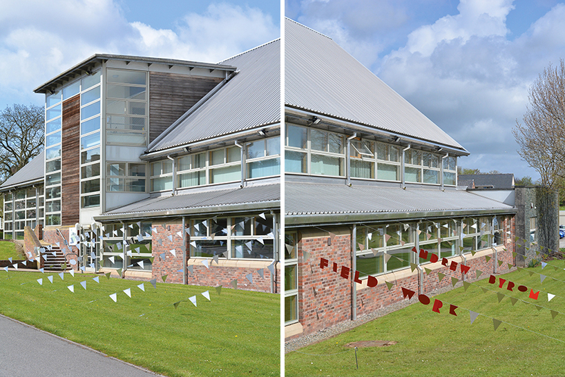
byrom‘s ‘field work signage’ comprises a designed and fabricated aluminum ‘bunting’, installed outside the gallery that faces the main road of the campus. tethered from the grass to the school building’s roof, a sequence of colorful hanging letters spell out the designer’s name and the words ‘field work’. each character is constructed from layered, basic geometric forms that move independently as the wind catches them, producing a shimmering typographic spectacle as well as a pleasant noise.
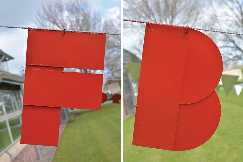
each character is constructed from basic geometric forms that move independently as the wind catches them
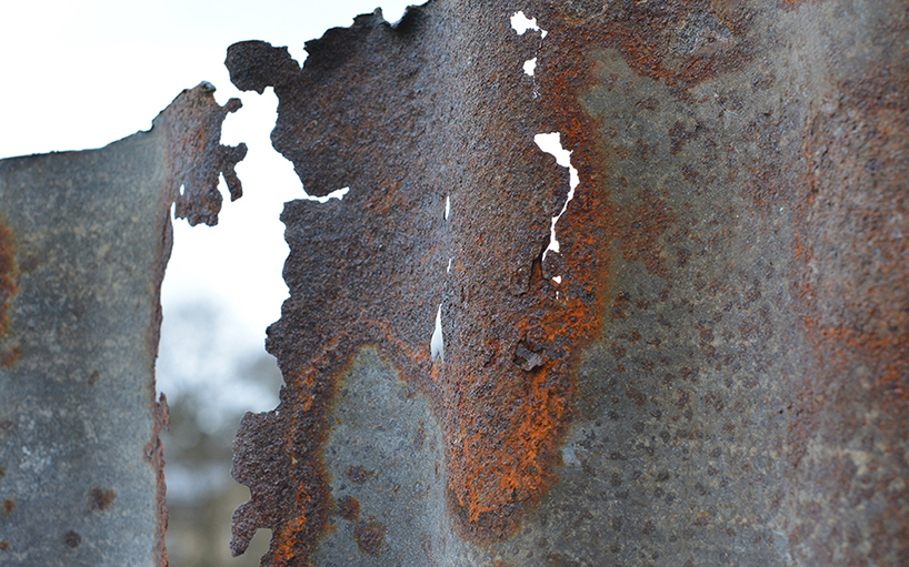
also at the university of cumbria, byrom has created a typographic sculpture in a farmers field from local materials. finding inspiration from both the natural landscape and man-made materials, byrom’s installation sees old corrugated metal sheets spell out the word ‘true’. rust stained patina and flaky textured panels form larger-than-life letterforms in the landscape, channeling the community and culture of the countryside.
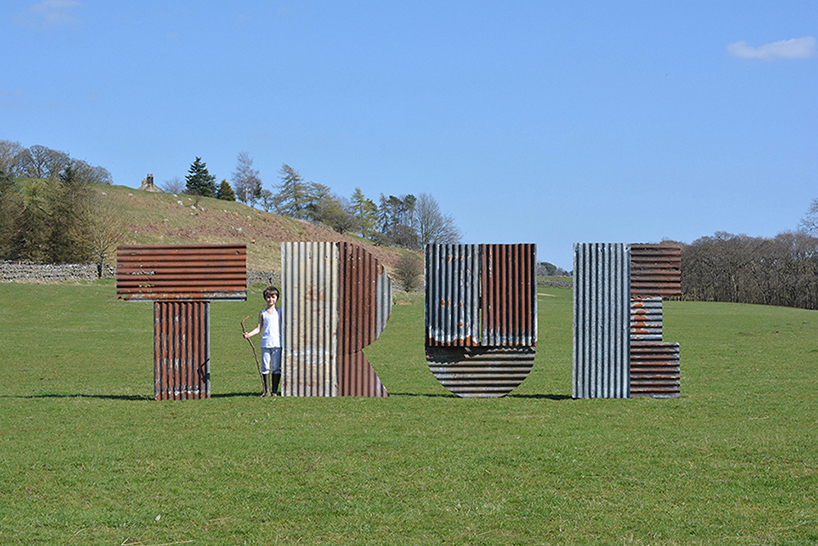
the typographic sculpture is placed in a farmers field
byrom explains: when I was a child I went camping with my cub scout pack in the english lake district. to earn a badge we were each given a pan and a match, and asked to go into the woods and boil a pint of water. I soon found a pile of litter and a rusty metal sheet and quickly had my water boiling away. when I went to show the rest of the group I found they’d all fashioned traditional stick tripods, with their pans hanging over neat little fires — putting my smoking mound of trash to shame.
a similar thing happened when I came to england earlier this year when I began to think of the work I’d produce for this residency. I arrived from the states imagining my reaction to living in the english countryside would be that of a graphic design version of andy goldsworthy — finding inspiration from plants and natural landscapes. but again, the pull of man-made materials trumped nature.
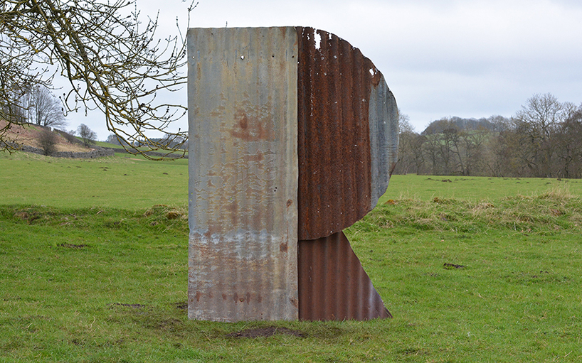
rust stained patina and flaky textured panels form larger-than-life letterforms
the installation channels the community and culture of the countryside
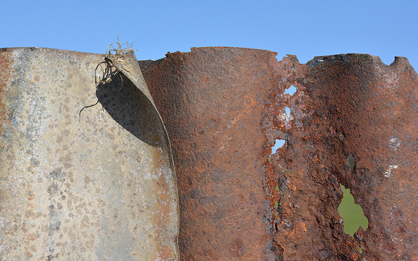
old corrugated metal sheets spell out the word ‘true’
andrew byrom (7)
 Jun 05, 2016
 Dec 16, 2013
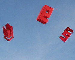 Jul 08, 2010
 Jul 07, 2010
typography design (133)
 Sep 13, 2023
 Feb 23, 2023
 Jan 24, 2023
 Jan 19, 2023
PRODUCT LIBRARY
 Jul 15, 2024
 Jul 15, 2024
 Jul 12, 2024