burro studio matches emoji colors to pantone hues
all images courtesy of burro studio
pantone mashups have been popular this month, from a saturated smoothie series to a color-coordinated fine art crayon set. continuing the trend is burro studio, where the two young italian designers have matched pantone tones to popular emoji icons.
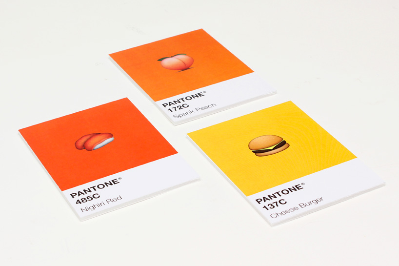
the series of 12 cards that comprise the ‘moji itten’ project (a clever homage to twelve-part color circle theorist and artist, johannes itten) feature miniature emoticons set on a solid, saturated square, positioned just above the matching system’s unique index number and a fictional name. ‘nighiri red’, the tone chosen to represent the popular sushi emoji, is matched to 485C, ‘fortune purple’ is paired with 2602C and the lovable octopus icon is coupled with 215C ‘marine plum’. take a look at the full set of vibrant graphic illustrations below.
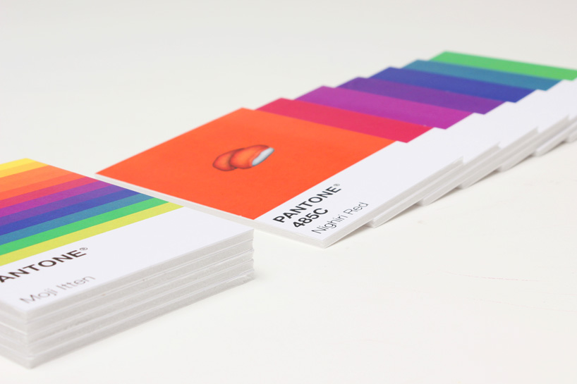
the series of 12 cards comprise the ‘moji itten’ project
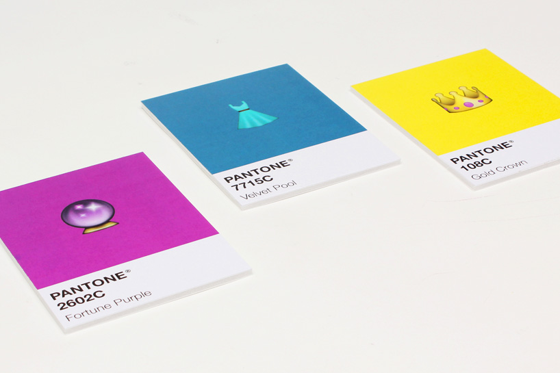
‘fortune purple’ 2602C, ‘velvet pool’ 7715C, and ‘gold crown’ 108C
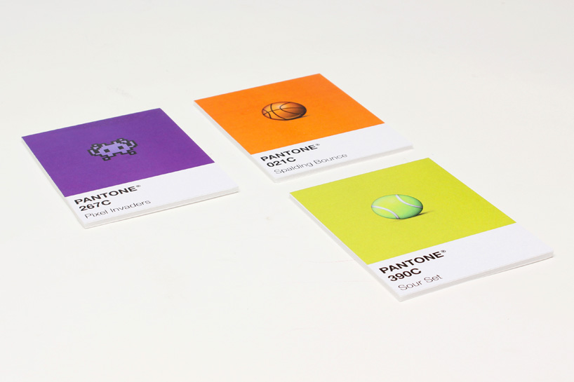
‘pixel invaders’ 267C, ‘spalding bounce’ 021C, ‘sour set’ 390C

three emojis are paired against a solid saturated square
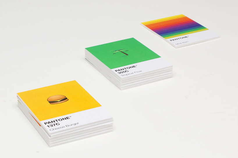
‘cheese burger’ 137C and ‘tropical flow’ 355C
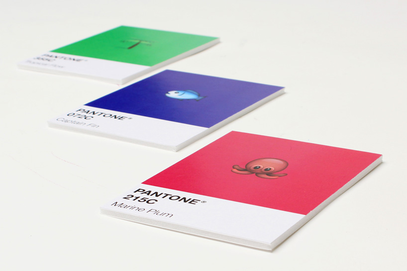
the octopus icon is matched to a color called ‘marine plum’

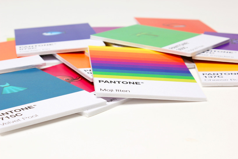
the full set with the collection cover
burro studio matches colors from emoji icons to pantone hues
emoji art and design (38)
 Feb 17, 2023
 Mar 09, 2021
 Feb 17, 2021
 Oct 05, 2020
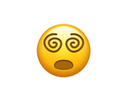 Sep 23, 2020
pantone (43)
 Dec 07, 2023
 May 07, 2023
 Dec 02, 2022
 Dec 09, 2021
 Dec 10, 2020
PRODUCT LIBRARY
 Jul 15, 2024
 Jul 15, 2024
 Jul 12, 2024