only connect festival of sound 2014 identity by non-format
non-format has designed the identity for the only connect festival of sound 2014, whose theme this year was the writer J.G. ballard.
prefer designboom on google[FEATURED]
only connect festival of sound 2014 identity by non-format
graphic design duo non-format has just updated their site with several new projects. a highlight is their identity for the only connect festival of sound 2014, whose theme this year was the british science fiction writer J.G. ballard.
—
following text from non-format:
‘the only connect festival of sound 2014 is all about british science fiction writer and predictor of the near future J.G. ballard, as seen through the lens of oslo’s contemporary urbanisation. designed items include a special catalogue which gathers together essays, photography and various printed ephemera relating to ballard.’
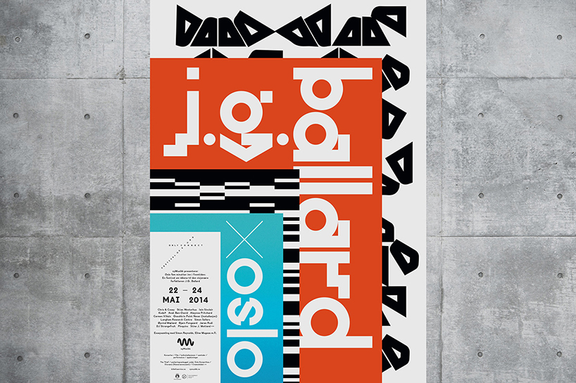
poster
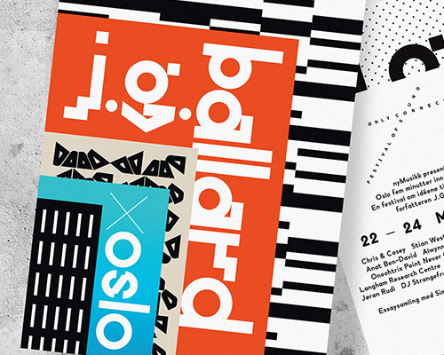
‘our design borrows from the architectural detailing of an urban redevelopment in the heart of oslo, which we reduced to logo simplicity and then layered on top of each other to create our own ballardian vision of oslo’s new skyline.’
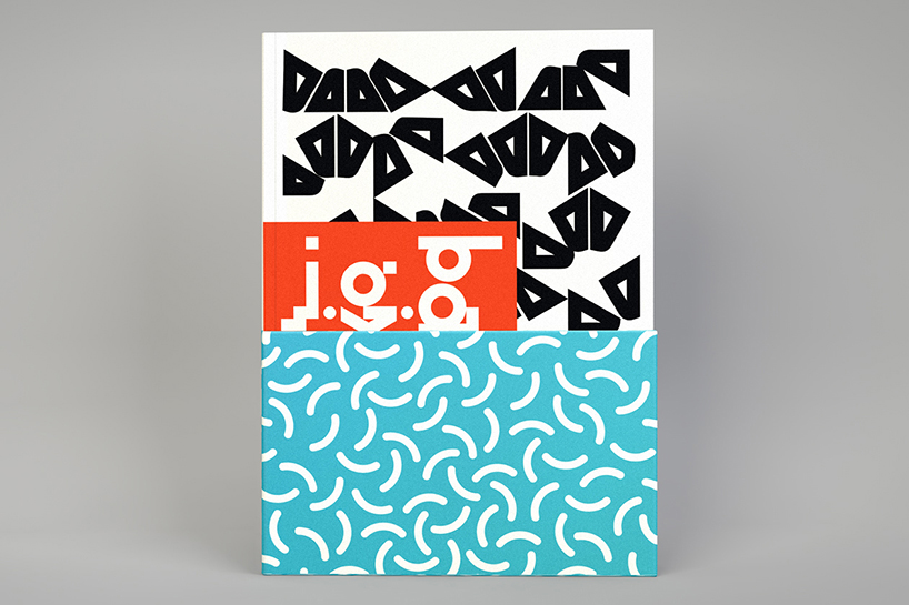
catalog
‘we also created a custom typeface for this project, which takes paul renner’s early sketches for futura as a starting point. rather than simplifying the typeface towards modernist idealism, we built upon the quirkiest of renner’s letterforms, creating a typeface that has more of a postmodernist vibe.’
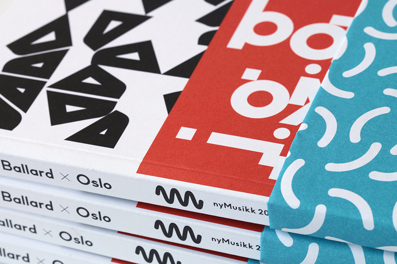
catalog detail
‘shown here are images of the flyer, poster, catalog and the festival program, some of which were refolded to create the catalog’s bellyband which depicts a romanticized vision of water, as though in willful denial of the menace of rising sea levels.’