interview with illustrator karan singh
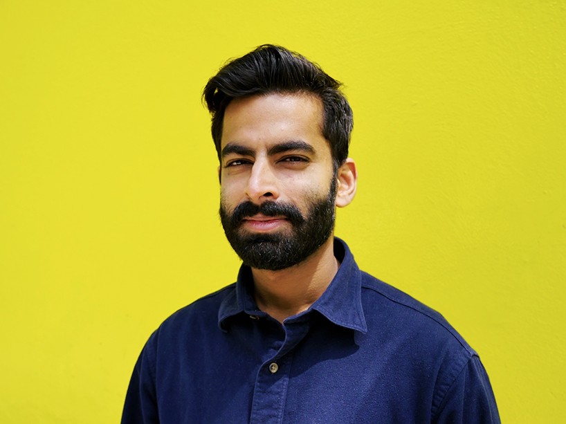
portrait © designboom
karan singh is an australian artist and illustrator. his bold and vibrant work is a playful interpretation of minimalism particularly focusing on depth and dimension through pattern and repetition. his clients include adobe, IBM, heineken, intel and asics among others. he told designboom more about his work and influences…
designboom: what made you want to become an illustrator or artist?
karan singh: growing up, I never really knew what I wanted to do. it wasn’t until I had to choose a university course that I started thinking about design properly. I decided to take a course called ‘design computing’ at the university of sydney. the decision was based on what I liked rather than thinking of where it might take me in terms of my career; I knew I liked animation and design and wanted to learn more. the course was very progressive, lots of coding, interaction design, spacial design and that kind of stuff, it was great – but right up until the end of the course I wasn’t sure what job I would end up with!
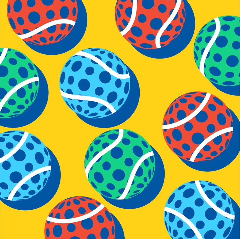
IBM open sessions pattern – IBM was an official partner of the 2014 US open as part of this partnership they asked james murphy of LCD soundsystem to create original tracks based on data gathered from each individual match of the tournament. in turn singh was commissioned by ogilvy new york to create original pattern illustrations that would feature as the artwork for the tracks.

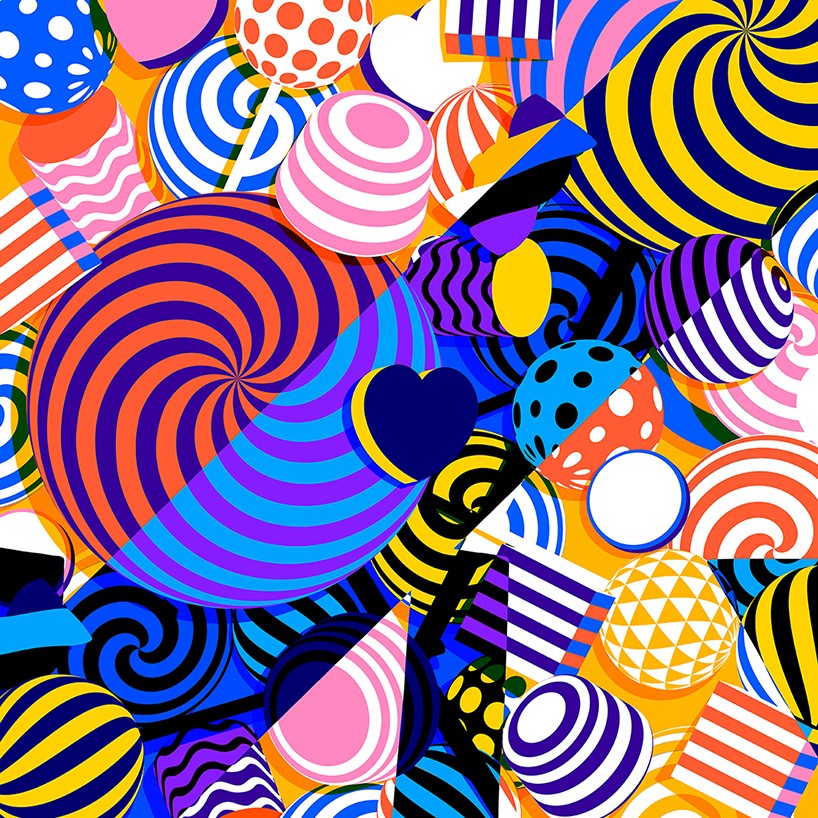
IBM open sessions pattern
DB: how did you end up working as an illustrator?
KS: in my last year of uni I studied interaction design, in sweden and started illustrating in my spare time, I quickly realized that I loved it. I started publishing my work online and eventually got my first commission for computer arts magazine.
when uni ended I moved to melbourne, australia and started working for a studio called qube konstrukt where I began working as a graphic designer / illustrator for them.
it was a dream job out of university and it showed me that your degree isn’t always what’s important – at least in design and illustration. it’s more about putting together a portfolio of work that represents what you want to do.
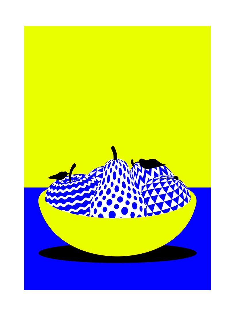
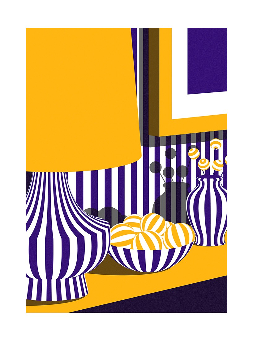
forbidden fruit, personal project
DB: can you remember some of your earliest influences?
KS: thinking back to when I was a kid, I’d always liked art and design, I would watch a TV show called ‘art attack’ and try to replicate the things they made – I don’t think I was very good but I enjoyed making stuff. also, from a very young age I’ve been drawn to computers and technology – so looking at the overall picture, what I do today all makes sense – I’m just not sure how ‘planned’ it all was!
having said that, I can see traits from both my parents in who I am and what I do today; my dad is a very restless guy, he’s always working on something, making and fixing things and I’m the same. my mum’s really into art music to visual art, so I have picked that up from her.
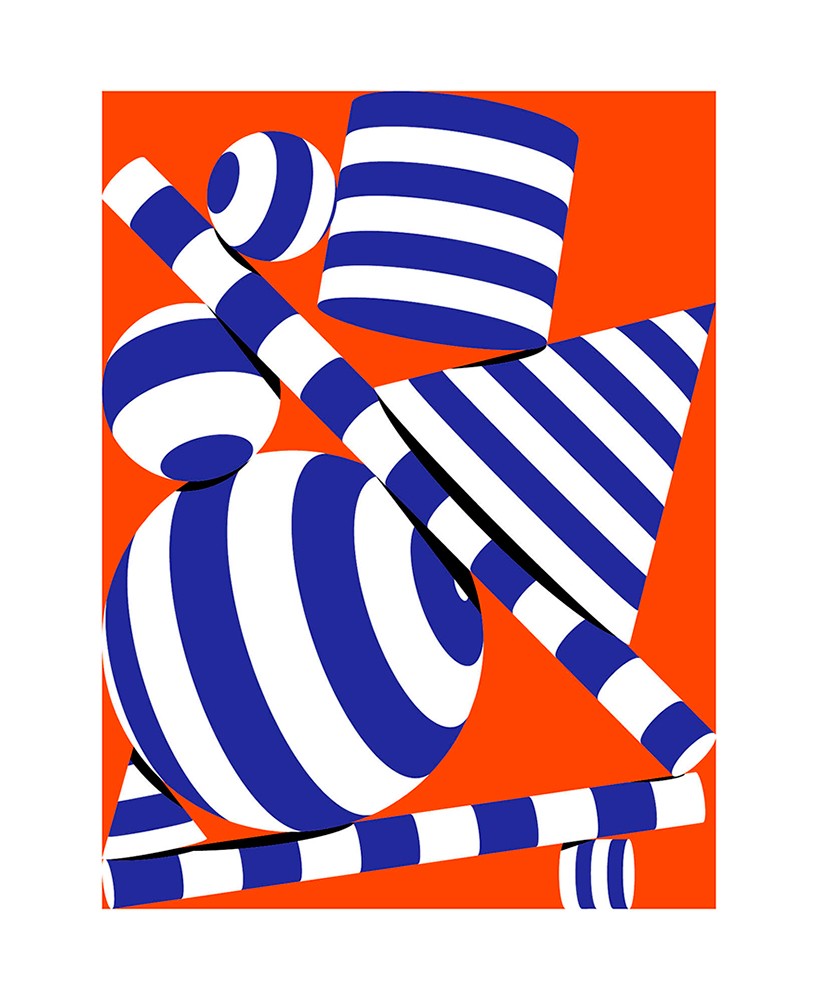
milieu, personal project
DB: which of your projects has been most important to developing your personal style?
KS: a project I started when I was in melbourne called ‘daily quickies’ – one or two hour projects that I’d do at the end of the day after work, just to do something for myself that had no client brief. slowly these received quite a bit a bit of attention online and brought in some nice freelance work.
the series set me on a path, not so much aesthetically but in terms of thinking and learning how to tell a story in a simple way. it helped me understand the type of work I enjoy most – simple and impactful pieces.
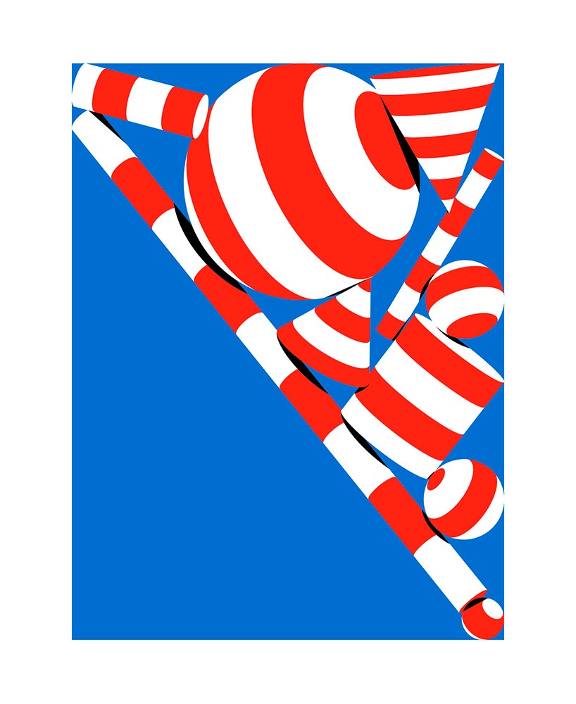
milieu, personal project
DB: would you say that keeping things simple is your strongest skill?
KS: I hope so! it’s what I want to do. I don’t know if it’s a skill as such, but rather an approach or exploration. when I have an idea and I’m constantly refining it and trying to see how I can express it in the most impactful way. I use simplicity as a sort of gauge – I’m always adding things to a piece then taking things out – trying to find the balance of what works. always asking if something adds or dilutes what I’m doing.
mural for the bully project, client: adobe
DB: which illustrators or artists working today do you admire the most?
KS: it changes from time to time – as I develop and my work develops, I am looking for different things in the work I come across. there’s a lot of great work around but one constant favourite of mine is parra, a dutch artist. I love his sense of style and the simplicity of his work. it always seems to me like he has a lot of fun making his art.
he’s very expressive and playful but at the same time limits himself to a strict color palette – the blue and red are almost always constant in his work and that’s helped make it very recognisable and helped him create a strong identity.
I admire that level of restraint and commitment because it’s not easy to maintain – especially over many years. it shows he’s comfortable and confident with his style and that’s a point I’m trying to arrive at now with my work.
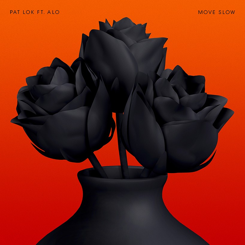
cover for pat lok’s single ‘move slow’
DB: please can you tell us about your new exhibition ‘confine’ now showing at chasm in new york…
KS: it’s a show I have worked on with another artist, a photographer called ward roberts. the concept comes from two key situations I’ve faced in my life where I’ve felt confined – the sense of feeling trapped. in those moments it’s all about how you deal with it, the delicacy of the situation and the components involved. the work is represented by geometric shapes confined in a rectangular space in different compositions.
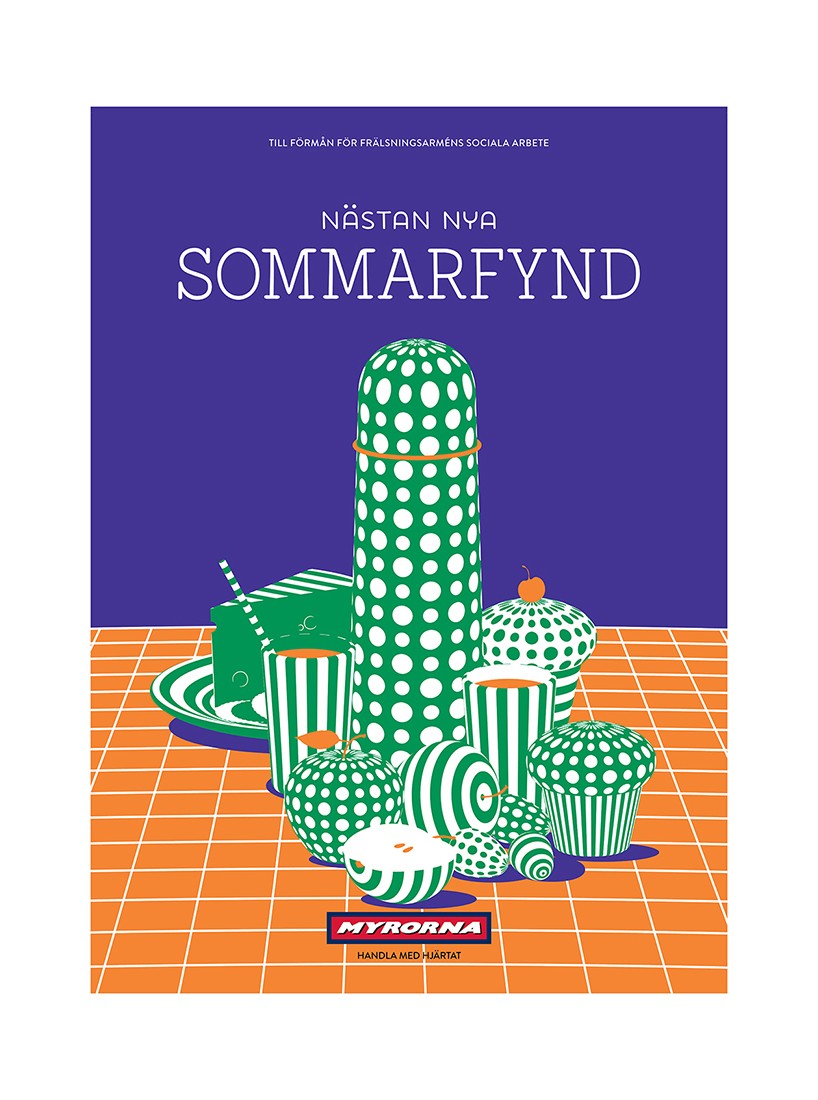
illustration for myrorna
DB: how does the ‘confine’ show build on themes previously explored in your work?
KS: aesthetically the new work is close to what I’ve been doing over the last few years. what’s been the most interesting aspect of the project for me though, was creating a body of pieces that works as a ‘show’. curating the content and understanding what each piece gives to the experience as a whole. ‘how do the works play off each other? what’s missing in one? how can another piece support it in some way?’ all of that thinking has been fascinating. I feel like I got a lot out of this project.
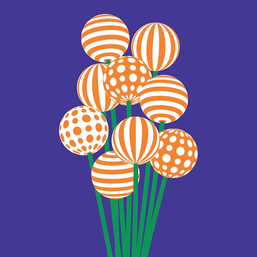
illustration for myrorna
DB: what criteria do you use to critique your work?
KS: it’s a pretty simple one, ‘would you put your name to it?’
I think that’s the only one you can use as an artist – you can’t afford to get dragged into issues with style and so on because you’ll paralyse yourself. I find the best thing to do is simply ask yourself ‘do you want the world to see this and know it was by you?’ if you’re not sure then better not to show it and get back to work.
untitled piece from the exhibition confine, in collaboration with ward roberts
DB: how much attention do you pay to the feedback of others on your work?
KS: it really depends… I personally don’t ask for much feedback and won’t show people work that’s still being developed. I trust in my girlfriend’s opinion and some close friends – and of course if you are working for a client their input is important, but I believe art has a lot to do with a belief in one’s ideas.
you know yourself when you have something good and when something can be better… not all feedback is good. sometimes when you feel strongly about something you just have to stick your neck out and go for it. and if it fails there’s a lesson to learn.
working in consensus can be frustrating. you can end up diluting the work trying to make it bland enough for everyone to swallow.
untitled piece from the exhibition confine in collaboration with ward roberts
DB: do you have any superstitions or self enforced rules that you live by?
KS: I do have some weird superstitions that I’ve inherited from my dad but they’re too embarrassing to share, ha!
personal rules… well, I have some practical ones – such as ‘don’t get excited about a new project until you have your purchase order’ – which is just common sense really!
DB: what’s the best piece of advice you’ve been given?
KS: just do you. over the years I have come to learn it’s all about being yourself and pursuing what you want to do – especially when it comes to work, since that’s something you are going to be doing day-in, day-out.
personal rules… though they’re quite cliche are rules to live by:
‘don’t count your chickens before they hatch’
‘ a stitch in time saves nine’.
—
more
confine by karan singh and ward roberts is on show now at chasm gallery in new york until june 28, 2015.
graphic studio interviews (193)
 Nov 21, 2022
 Feb 10, 2019
 Jun 21, 2018
 May 17, 2018
 Oct 04, 2017
illustration (116)
 Jul 03, 2024
 Jun 12, 2024
 Jun 01, 2024
 Apr 08, 2024
 Feb 08, 2024
PRODUCT LIBRARY
 Jul 15, 2024
 Jul 15, 2024
 Jul 12, 2024