whether weaving epic stories for bold brands, or reflecting on personal considerations and concerns, tim tadder shares powerful stories about society and contemporary culture through his lens. tadder — the photographer who engages in the filed of advertising, fashion, fine art, and commercial directing — has given photographic form to everyone from indoor sky divers to astronauts, each underscored by a striking use of saturation and a crisp color palette.
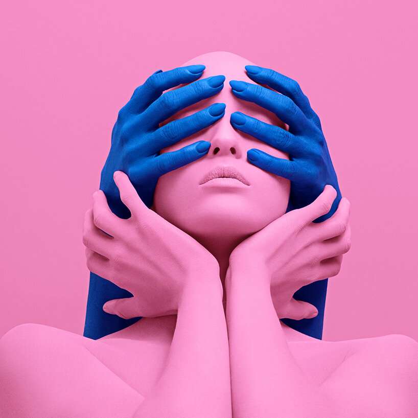
tadder’s fine art repertoire responds to political events in america, and draws attention to the ongoing division and uncertainty faced by the nation. with powerful imagery and a vibrant use of color, his recent personal project, ‘nothing to see’, seeks to compel viewers to break free from political and media narratives to reflect on social currents with fresh eyes. ‘this collection resonates with viewers to inherently ask whether they will recognize the policies and propaganda meant to divide us or choose to remain blind,’ tadder shares. meanwhile, for ‘united states of purple’ tadder searched for moments of truth and equality, suggesting ‘a persistence of integrity and unity despite governmental failings and recent attacks on these fundamental notions.’
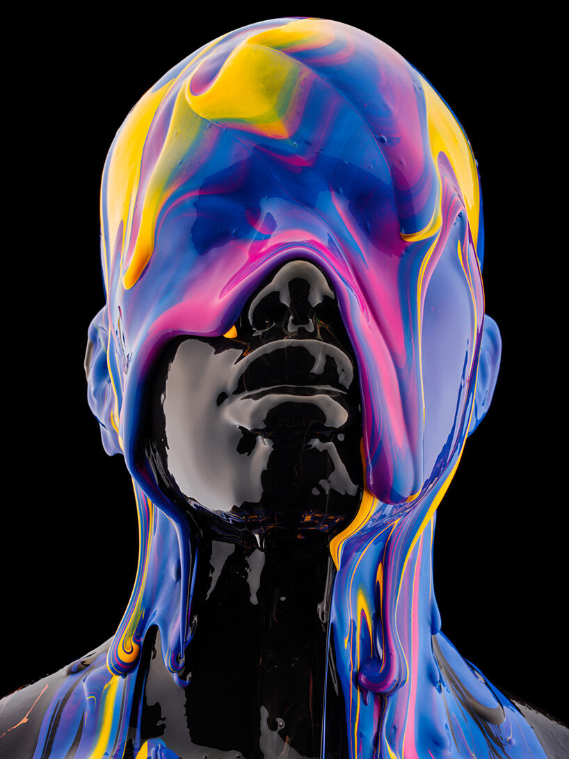
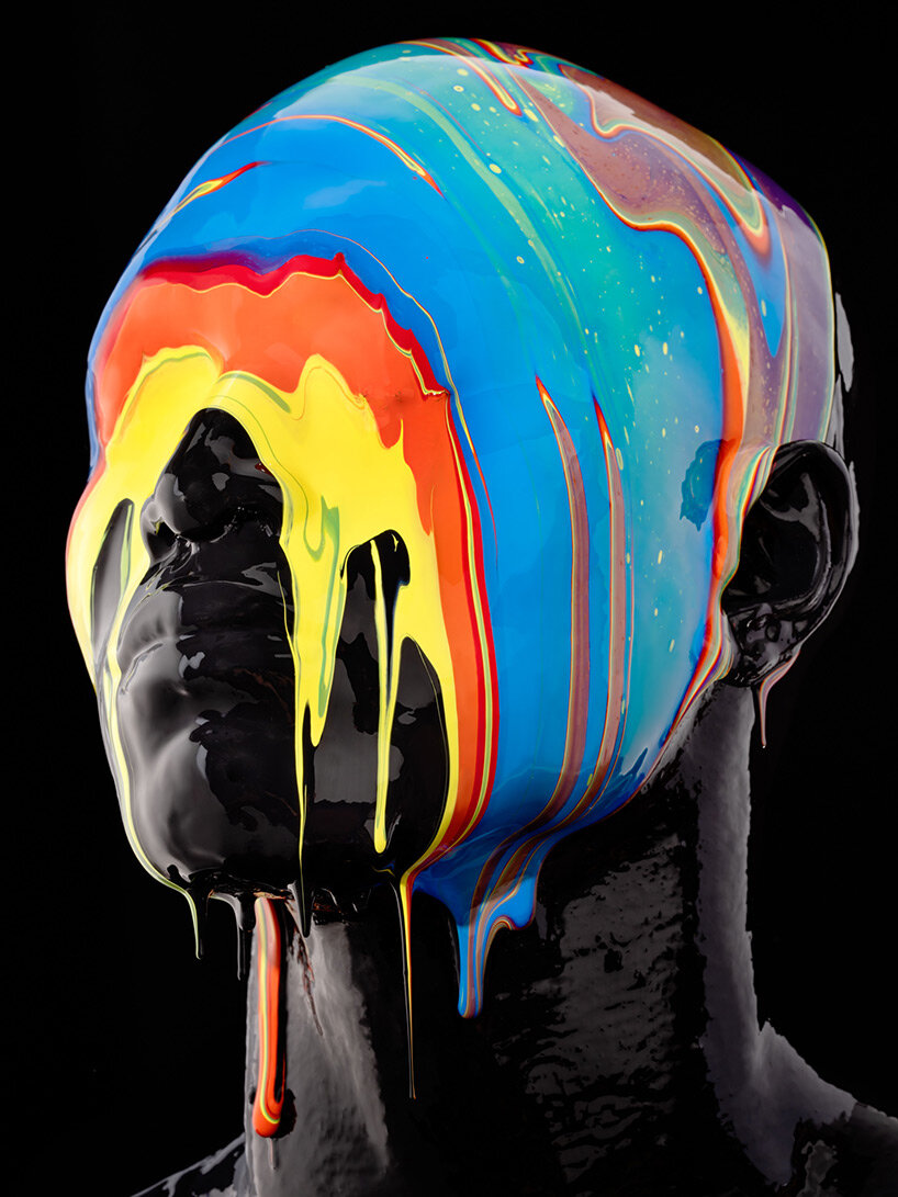
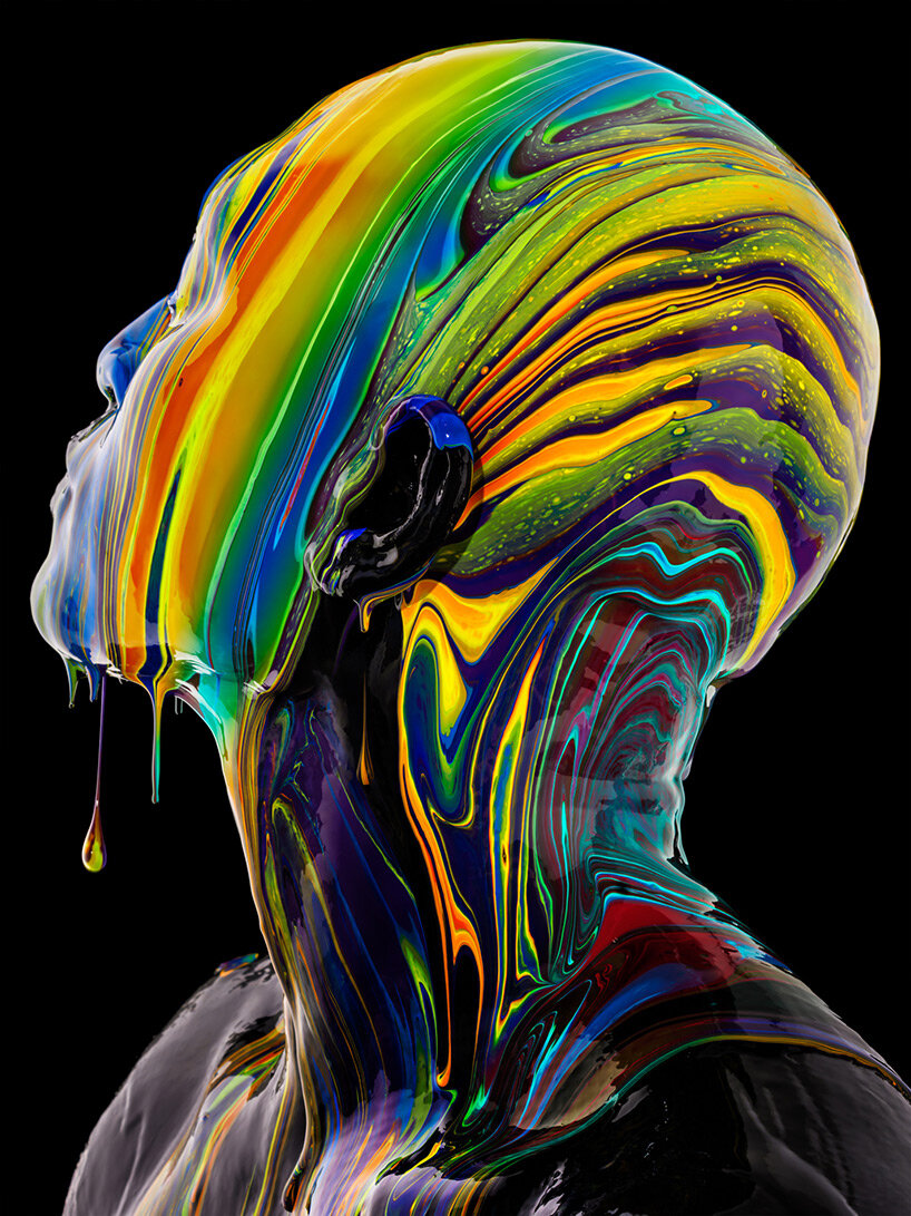
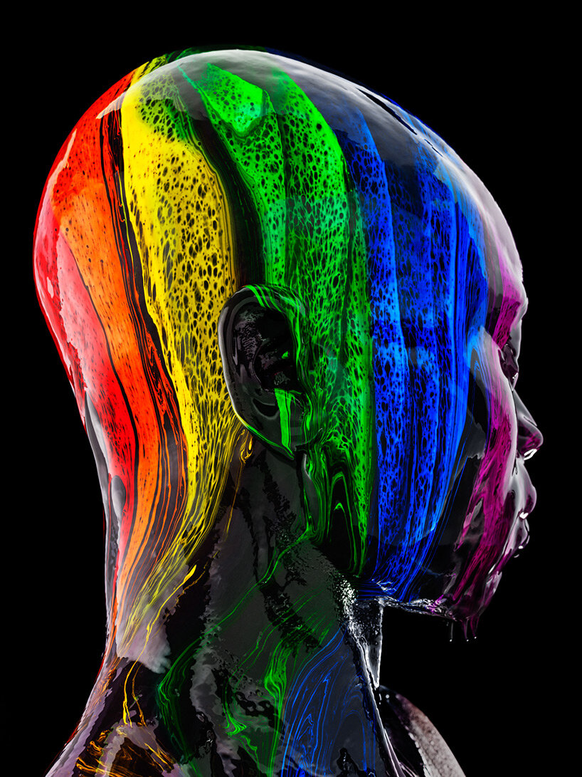
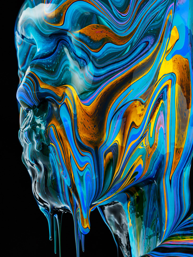
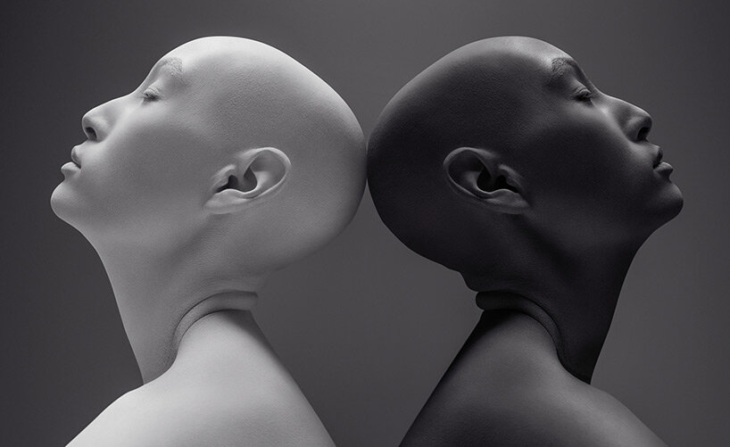
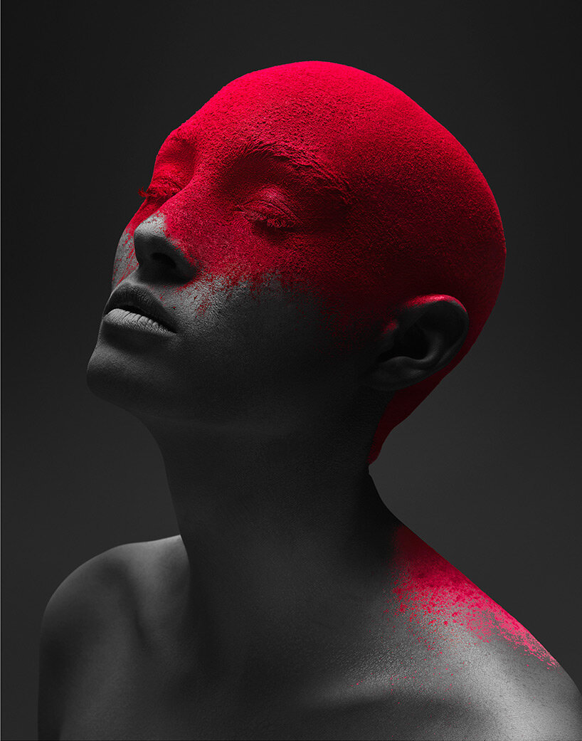
from the series ‘black is a color’
tadder’s latest work is a further elaboration of his perspective on the human experience — ‘black is color’. when primary colors are mixed at equal parts, black is ultimately the precipitating color. during the process, an magnificent display of tones appear, mirroring powerful structure and emotion from the subjects. ‘at a crucial time for the nation to unite, I hope this collection encourages empathy, unity and a non-binary view of race,’ tadder shares. ‘black is a color challenges one to see past profiling and foresee the beauty that is capable of elevating the human experience. ‘black is a color’ demands that we look past skin tone, and into beautiful, infinitely complex humans.’
designboom spoke with tim tadder about the motivation to create this series, the challenges in capturing the images, and the common threads that underpin his work. see behind-the-scenes of the shoot in the video above, and read on for the interview below.

from the series ‘black is a color’
designboom (DB): what was the catalyst in embarking on creating the series ‘black is a color’?
tim tadder (TT): at the height of the black lives matter movement and post-george floyd, I had spoken about the assault on freedoms and the division, but I hadn’t created anything that spoke to how I felt about systemic racism and social injustice, or the way society perceives race as a binary stem. I wanted to explore a non-literal and unconventional way to share with people a different point of view. a view that boldly illustrates a slice of what is missed by a binary approach to race.
from the series ‘black is a color’
DB: what meaning does the project’s title seek to convey?
TT: ‘black is a color’ exemplifies the strong desire for unity during an unprecedented time in our nation. when primary colors are mixed at equal parts, black is ultimately the result. during this complex process, an imperial display of tones appears in the swirling to mirror powerful structure and emotion from the subjects. the inspiration truly came at a crucial time for the nation to unite. I hope this collection encourages empathy, unity, and a non-binary view of race. ‘black is a color’ challenges one to see past profiling and foresee the beauty that is capable of elevating the human experience.
from the series ‘black is a color’
DB: can you briefly explain the process of capturing the images? what were the primary challenges in terms of production?
TT: the process for this concept took numerous attempts before we got it right. we experimented with a lot of different paint viscosities and dilution techniques, and that created some serendipitously beautiful colors that really enhanced the process. we discovered as we went along and got better as we executed the concept more and more. the specific colors I incorporated provide vividness, boldness, and a contemporary art color scheme to pique the interest of others and to ultimately elicit a response. the colors are highly methodical and deliberate.
from the series ‘black is a color’
DB: how planned was the outcome of each image in advance? does spontaneity and improvisation on set hinder or help express your vision?
TT: the technique was thought out in advance, but there was spontaneity in the paint drips and color blending. with this project, there’s no way to control the paint drips, therefore, the results are always unique. we ultimately keep executing until we see the vision as it should be.
from the series ‘black is a color’
DB: what do you hope audiences take away from the series? what themes do you hope the project provokes discussion about?
TT: I hope this project provokes discussion about race, stereotyping and ignorance of people’s perception of race. to look at it as solely binary — to look at people as beautifully colored unique individuals.
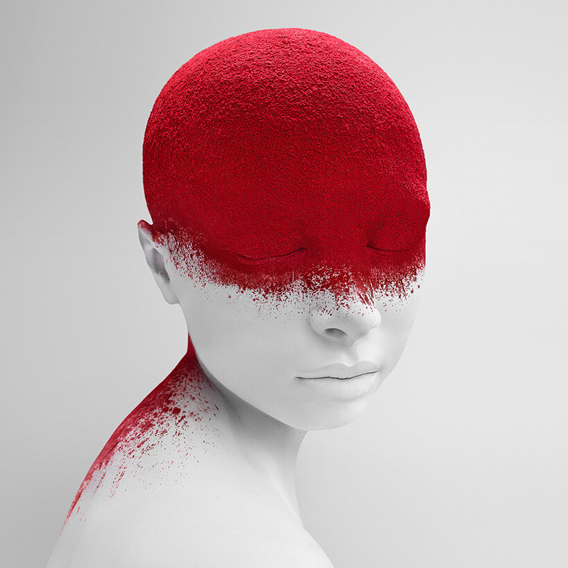
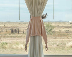
from the series ‘nothing to see’
DB: thematically, is there a common thread that underpins your work overall?
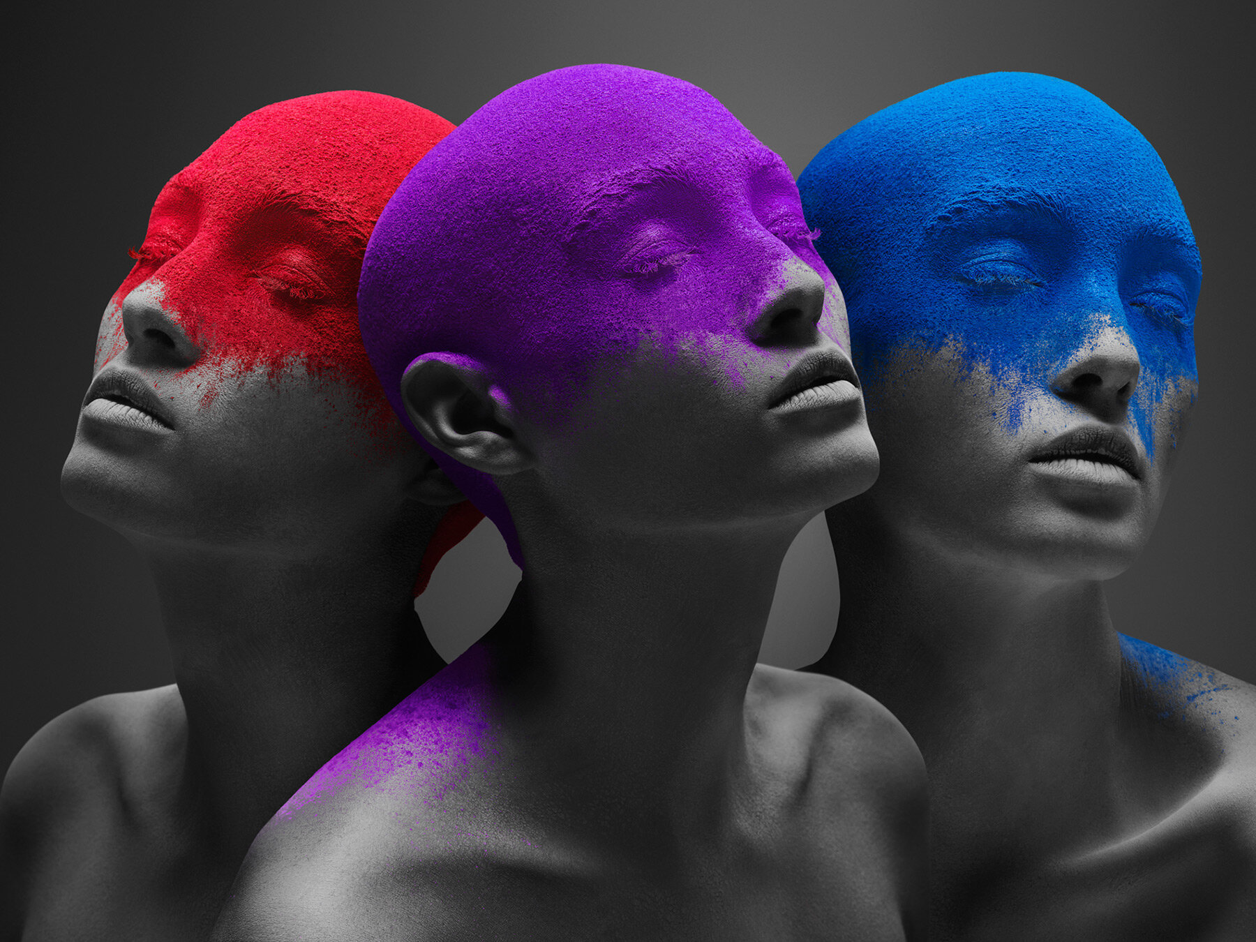
TT: this series is an unintentional trilogy to my ‘nothing to see’ and ‘united states of purple’ series by incorporating bald subjects as highly conceptual pieces of my work. this has become the framework behind my artistry. from that standpoint, I always look at bald subjects as representative of mankind, and I want to strip it down to the absolute most simplistic form so that the subjects in the art represent humanity, not just the person in the image. the images are not portraits but rather graphic representations of the concept.
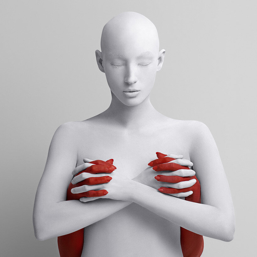
from the series ‘united states of purple’
DB: which of your projects has given you the most personal satisfaction?
TT: the nothing to see series because it was a strong vision and the result of the vision lined up perfectly with the execution. when you have a very clear vision sometimes the execution doesn’t line up and therefore it can be disappointing — the lack of aligning with your imagination. the result really lined up.
from the series ‘united states of purple’
from the series ‘nothing to see’

from the series ‘nothing to see’

from the series ‘nothing to see’
from the series ‘united states of purple’
tim tadder’s work is exclusively represented and available at avant gallery in hudson yards, new york, in miami, and dubai.
art interviews (138)
 Jul 15, 2024
 Jul 15, 2024
 Jul 04, 2024
 Jul 04, 2024
dbinstagram (2250)
 May 22, 2024
 Nov 10, 2023
 Dec 20, 2022
 Dec 13, 2022
 Oct 26, 2022
photography (389)
 Jul 18, 2024
 Jul 16, 2024
 Jul 15, 2024
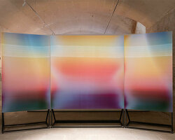 Jul 08, 2024
 Jul 02, 2024
portraits (156)
Jul 04, 2024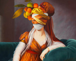 May 08, 2024
 Feb 22, 2024
 Aug 03, 2023
 Jun 28, 2023
PRODUCT LIBRARY
 Jul 15, 2024
 Jul 15, 2024
 Jul 12, 2024