
‘diamond jubilee colour guide’ by pantone and leo burnett london, 2012
for queen elizabeth II’s diamond jubilee, celebrating 60 years of her reign over england, advertising agency leo burnett london and pantone have developed a numbered shade guide to her majesty’s most memorable choices of color for her stately ensembles. the creative companies have collaborated in order to assemble a limited edition pigment manual picturing the queen’s six decades on the british throne. leatrice eiseman, the executive director of the pantone colour institute reflects upon her majesty’s notable shade selections, including ‘pantone 13-0755 primrose yellow’ of queen elizabeth II’s outfit worn in april of 2011 to the wedding of her grandson, prince william to kate middleton or ‘pantone 13-4411 crystal blue’ for which eiseman notes, ‘blue is a colour staple in the queen’s wardrobe, it’s a colour that communicates constancy and it is also symbolic of her devotion to the british people. blues traditionally have calming properties and she is often seen wearing them during difficult times…‘.
the small, queen-shaped book contains sixty years of queen elizabeth II’s most memorable wardrobe shades, printed by precision imaging using HP indigo technology and is comprised of sixty separate images picturing varying pigments. beginning with color choices dating back to the queen’s coronation, each of the individual shade references include the date and location of that particular ensemble. images of her majesties wardrobe selections were matched by pantone’s emulation system, achieving exact color matching from the pantone shade range.
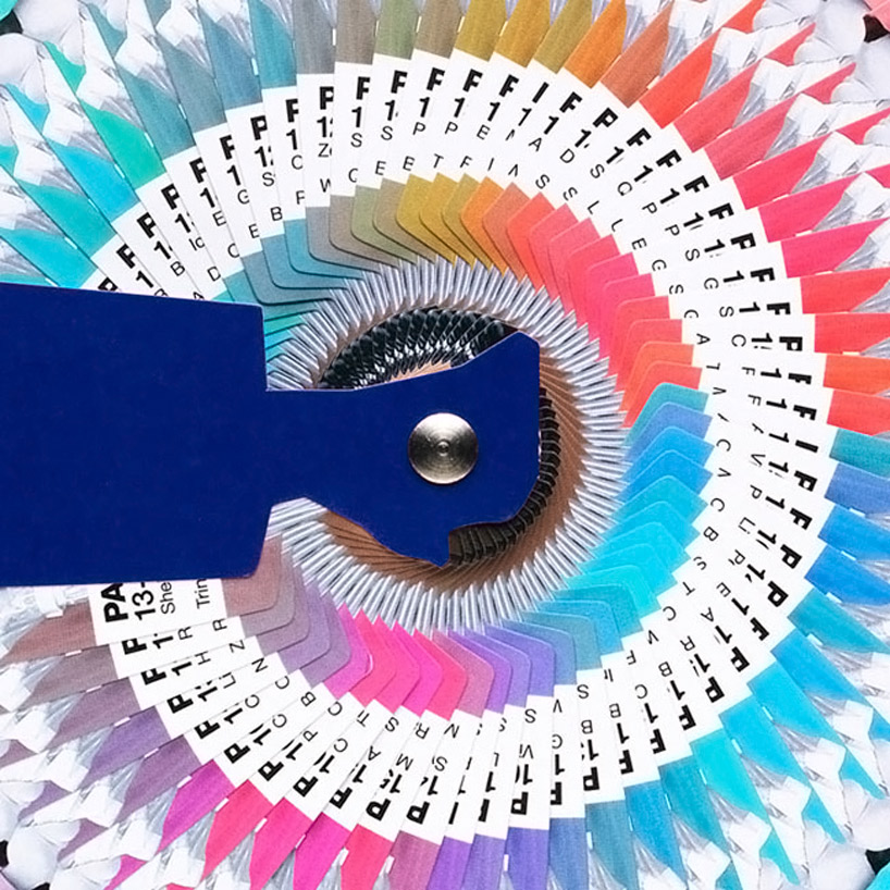 detailed perspective of the fully opened pantone book
 research found that the queen’s preferred palate drew mostly from blue
 the vibrant outfit colour choices of the queen are contained in the shape of the queen
via plenty of colour
pantone (43)
 Dec 07, 2023
 May 07, 2023
 Dec 02, 2022
 Dec 09, 2021
 Dec 10, 2020
PRODUCT LIBRARY
 Jul 15, 2024
 Jul 15, 2024
 Jul 12, 2024