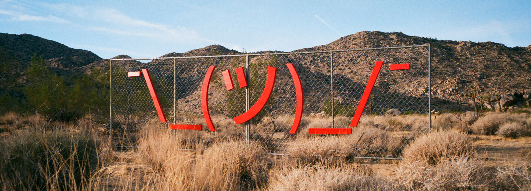
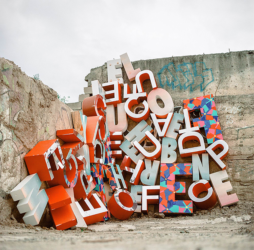
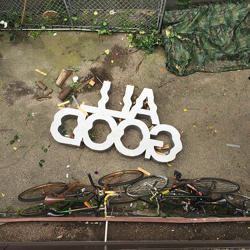
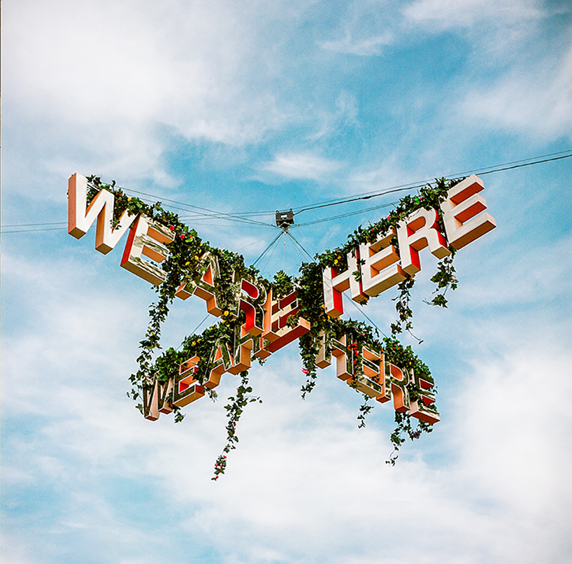
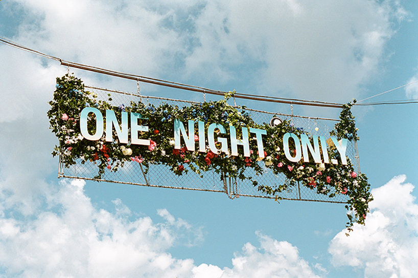
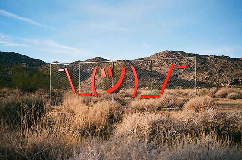
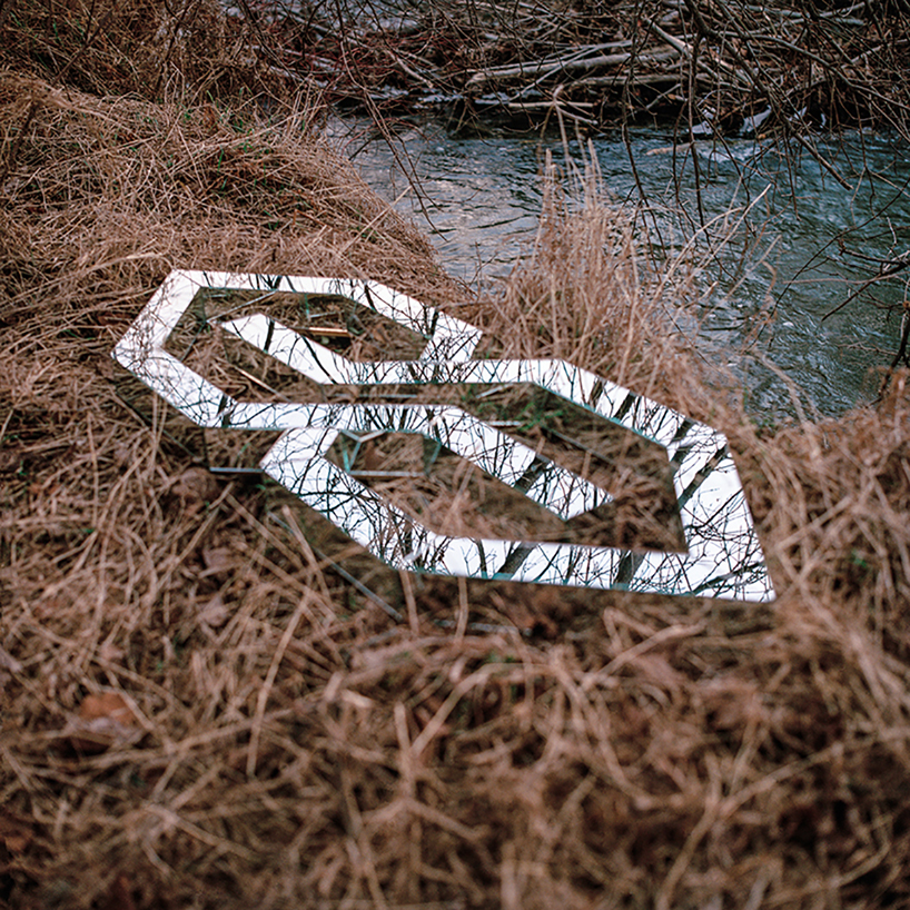
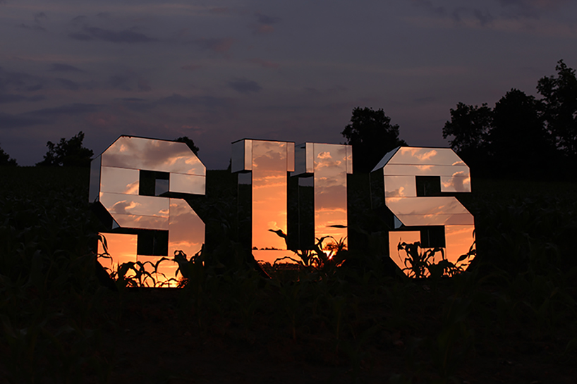
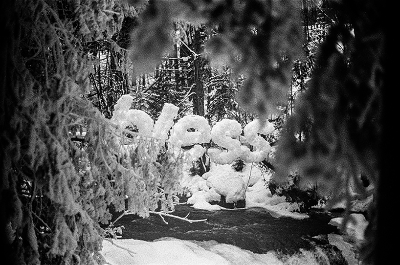
trevor wheatley and cosmo dean are best known for embedding commonly used phrases — ‘all good,’ ‘bless,’ ‘¯\_(ツ)_/¯,’ — in public, natural environments. the world is their InDesign file, for which frozen rivers, fields and fences are their selected, background layers. designboom had the pleasure of talking typography, language, process and inspiration with both of them. they did not disappoint — sans one comical comment by trevor (see question 3).
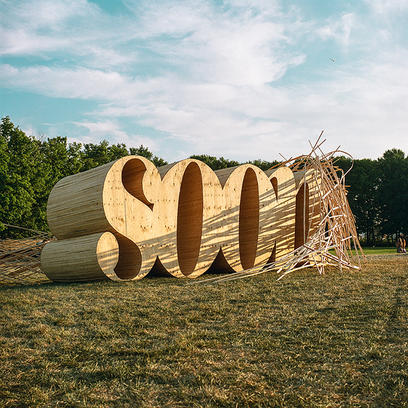
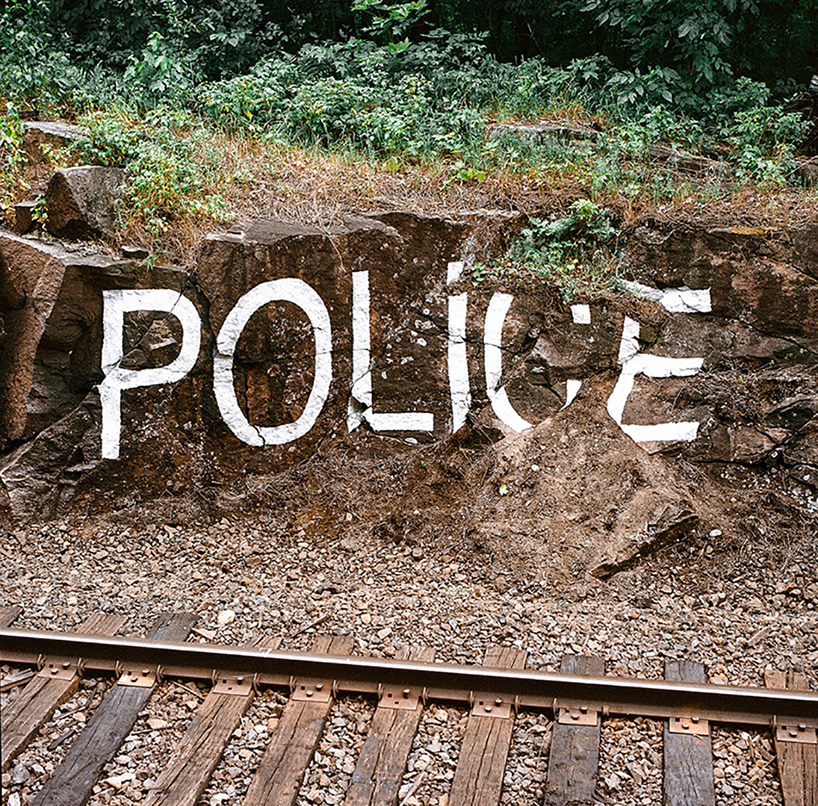
all images courtesy of trevor wheatley and cosmo dean
designboom (DB): lexicon is something that evolves as quickly — if not quicker — than design languages, what’s your choice slang word/phrase of the week and why?
trevor wheatley (TW): you’re right it definitely evolves very quickly. this pace is actually something that put us off using slang. originally we picked words that had a duality, so people our age could view them as slang, while our parents or grandparents would look at the more conventional meaning. we’ve shifted our focus towards re-contextualizing other popular language, advertising and marketing language.
cosmo dean (CD): I don’t really pay attention to the weekly changes in the slang lexicon. I’m more interested in deeper rooted slang, and even then, more in the implications of it’s popularity and ulterior meanings than it’s intended use.
DB: what’s your favorite typeface?
TW: I don’t have one favorite. different typefaces are useful for different applications, some don’t work for sculptures but lend themselves well to murals or paintings. we try to switch it up regularly. the last few projects I hand painted and wanted a typeface that historically had been used for sign and poster painting. I found a good typeface called sharp grotesk black, because it had been based on hand lettering. it was forgiving to the imperfections of my hand and the results had a lot of personality.
DB: if you were a typeface what typeface would you be?
TW: it would be difficult to be just one! a typeface that had many widths, weights, roman and italic would be good. then I would be versatile and cool for all occasions.
DB: what’s your least favorite typeface (comic sans and papyrus don’t count)?
TW: comic sans isn’t so bad!!! I always disliked using stencil typefaces. we would be forced to use them out of structural necessity. however, recently we were in mexico city and the stencil typefaces were being used at many of the big institutions, most notably at the jumex museum. it got me thinking about how we could apply the typefaces in creative ways to our art practice. typefaces come in and out of vogue but its important to think of how the right context can make a typeface you dislike into something special.
DB: what’s your creative process like? is the final image something you figure out as you go, or do you have a strong vision that you see and work towards?
CD: generally we envision something quite simple in the beginning. a scale, location or movement, and then add to it as it develops. how it comes to actually be built always depends on what it’s for. if it’s commissioned then often the client will want a render before we begin. this is always the worst case scenario for me. in a perfect world, the work can adapt to the material and circumstantial limitations or opportunities. if we’re locked in to a design we often end up making more concessions trying to adhere to the proposal then we would like.
DB: what is your least favorite slang word / phrase?
CD: slaps.
TW: ting.
DB: if time and money did not exist, where would you install 2018’s most said phrase…and what do you think that phrase would be?
CD: it might seem unexciting, but if I had the time, money and opportunity I would likely make large scale land art. architectural. conceptual. I’m not sure there would be a phrase, but as for what I think 2018’s most said phrase is… I imagine it would likely be more of an incessant clicking on a device, a caption, something like: ‘lmao facts,’ ‘mood’ or ‘goals.’
TW: last year at the venice biennial, an italian artist, lorenzo quinn showed two giant hands coming up out of the canal to physically hold the side of a historic building. the piece titled support presents a climate change warning. I saw the sculpture in person and hoped that opportunities, time and money in the future would present themselves to cosmo and I to create works as impactful as support. as for the most said phrase, I agree with cosmo.
DB: can you tell us about any projects you’re currently working on that you’re especially excited about?
TW: we are showing work at the art gallery of ontario next month, we both grew up very close to the museum, so to show there is exciting. bit of a dream come true situation! we are also showing work in vietnam at the end of the summer. looking forward to that.
DB: you often recreate logos in giant, fantastical ways. if you were going to recreate the designboom logo, what would it look like? what environment would you install it in, how big would it be, and why?
CD: monstrous scale, on the ridge of a mountain, in the background of a beautiful piece of modern architecture. so much of what I see on designboom makes me double take to see if it’s a render or real. I would want the logo to reflect that experience.
designboom’s respect for trevor and cosmo definitely isn’t a render. their design, contracting and studio art backgrounds combine to create a mastermind of passion, at the crosshairs of surrealism, nature, language, design, architecture, illusion, typography, and the list goes on. when encountering photos of their graphic work, you might first write it off as fake. then you might think it’s real. then fake. then oh, wait, no, it’s real. bless. they’re the ones making us double take ¯\_(ツ)_/¯. find more of their work on their instagrams: @treverferever and @cchdean
public art (748)
 Mar 16, 2026
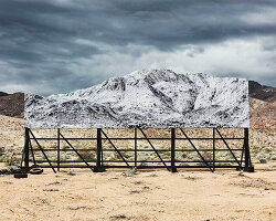 Mar 11, 2026
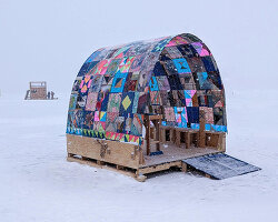 Mar 03, 2026
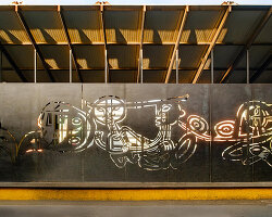 Feb 26, 2026
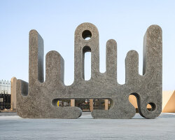 Feb 18, 2026
typography design (135)
 Oct 23, 2025
 Jul 24, 2025
 Sep 13, 2023
 Feb 23, 2023
 Mar 01, 2026
 Feb 05, 2026
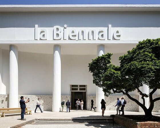 Jan 22, 2026