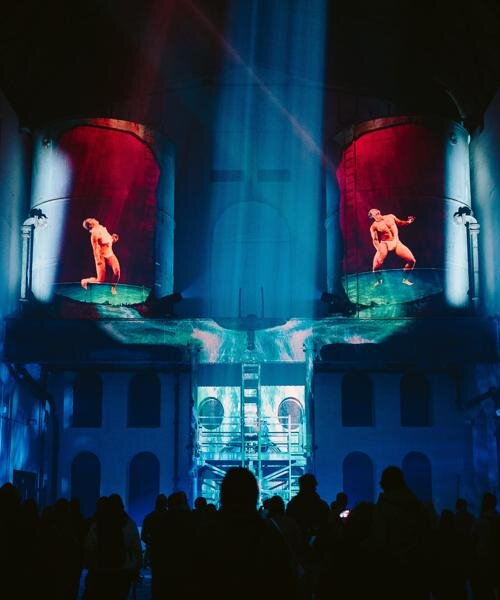

designers visualize font weights of the arial typeface as human flesh
changes in the font 'weight' are imagined as physical sizes of the human body, spelled out using the 'arial' typeface.
prefer designboom on google[FEATURED]
designers visualize font weights of the arial typeface as human flesh
(above) arial black
all images courtesy of alex palazzi
barcelona-based designers alex palazzi, eudald carré and mio ouchi form the project ‘arial family’ as an experimental series that investigates a proposed relationship between typography and the human body. changes in the font ‘weight’ are imagined as physical sizes of the human body, spelled out using the ‘arial’ typeface. black, bold, regular and light variations are visualized with a realistic texture that mimics the skin, with wrinkles, folds, moles and bones intricately spelling out the typeface name.

arial bold

arial regular

arial light

detail of the A for arial bold

detail of the A for arial regular

detail of the A for arial light

letters sculpted from clay

clay letterforms were sculpted for reference

sculpting the letters


carving the arial light letter
shop
your own online design shop — no sales commission collected