andreu balius interview
designboom spoke to typeface designer andreu balius, founder of typerepublic about his work.
DB: why did you decide to specialize in typography?
AB: I have always considered type design and typography to be at the core of graphic design and graphic communication. I am more conscious about this idea now than the time I was finishing my graphic design studies. I looked at typography as a powerful tool to communicate ideas throughout the shapes of letters themselves. something beyond the message the text conveys. type is everywhere. even, you can solve any piece of graphic communication only with type.
I was so fascinated about type that I decided to learn more about it by myself and delved further into type design. I was first inspired by the type artworks of avant-garde artists, russian constructivist and italian futurists, mainly. while at school, I did some type design on my own using pencils, grid paper, rulers, coated paper, brushes and ink. that was the mid eighties. I learned drawing letters from all this experience before I became a macintosh enthusiast.

carmen typeface
DB: how many people work in your studio?
AB: my studio is a nice very lighten open space in an old re-modeled factory, in barcelona -I work alone but share the space with other designers that also run their own businesses. it is more fun and affordable. sometimes I have interns, students or junior designers, but I decided not to become a large studio in order not to loose control of the process and guarantee quality good typefaces.

carmen typeface

carmen typeface
DB: how do you justify the time and cost of designing a new typeface to the client?
AB: it always depends on two factors: the level of difficulty of the project itself and the amount of time it involves. time can be extensive or intensive. it depends on deadlines. I always try to stick to a clients’ deadlines, if they are reasonable. there are custom type projects that leave some time for research, and that’s great. but more than often, custom corporate type designs have a very tight deadline and decisions are made very quickly and on the spot.
the time and cost of designing a typeface is justified by the difficulty of the project, which usually is determined by the purpose of the typeface: is it for reading text? for display purposes? and, if it will be used for running text, which sort of text, newspapers, books, screen devices? how many styles within the family? which encoding is the most appropriate? which script, latin, arabic, cyrillic? which languages are needed to cover? which are the values the typeface should convey? there are lots of questions to be made. the brief is important since it determines the difficulty of the project and, therefore, the time that is needed. that’s the basis for an estimate of the cost of designing a new typeface. in addition to that, there is also the level of exclusivity and kind of licensing for the font.

carmen typeface

carmen typeface
DB: what influences you more, contemporary trends or historical preferences of your own?
AB: as any other designer, I’m influenced by whatever happens within the context where he/she lives. of course I have my likes but I try to be open to whatever is around. I look at the past as a way to learn from type masters and learn the reasons why. how technology was related with type achievements in the past and how trends and needs influenced the improvement of technology. everything goes on as a mutual feedback. history is a really interesting playground where you can get both inspiration and knowledge. pradell typeface, for example, is the result of some years of personal research on spanish 18th century typefaces.
I’ve been lucky to visit many countries, from asia to america, giving workshops, making friends, enjoying food and life experiences. all this has provided me with a very open landscape of the world where I live. I love street lettering, signboards, handmade lettering, graffitti… I like to observe contemporary trends. internet has globalized trends. I believe that authenticity is more difficult to achieve, but that’s the goal. authenticity is what really inspires me most.

pradell typeface
DB: what mistakes or ‘traps’ should a young designer avoid when designing a new typeface?
AB: when I teach type design (in a workshop, for example) I give the students the chance to make mistakes. I believe that is good for any learning process. I think the preliminary stages of the process are very important. the better you make your decisions at the beginning, the better the result is. the better you define your purposes at first, the quicker the process is. so, think first and, then, start drawing your letters. characters depending on the script you are designing. this could be very subjective. when designing latin script, lowercase ‘a’ , for example, is quite difficult but it is one of the most important characters in a font and, therefore, it is important to define it at the very beginning. for any script, defining proportions is paramount at the beginning. so, it is better to start with those characters that help to establish all proportional guides.

pradell typeface
DB: have you ever been impressed or upset with how somebody has used one of your typefaces?
AB: sure! but I cannot control what happens to them after they have been licensed. designers are supposed to use them as they like. I have observed some graphic designers doing great work with my fonts. some of this work is published here.

dsignes typeface
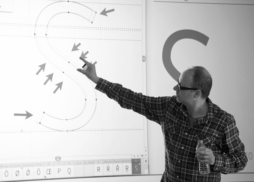
DB: which characters do you find the most difficult to design?
AB: well, it is also a bit subjective. character ‘s’ is quite tricky to solve. a lowercase, two storey ‘g’ is difficult, but it is one of my favorites as well.

taüll typeface
DB: do you think it’s important for a graphic designer to be able to draw?
AB: certainly, it helps. but I know many great graphic designers who are not very good at it. also I should say that my handwriting is not very nice! but you do not need to be a calligrapher in order to be a type designer, although some calligraphic knowledge is advisable. I believe that the most important thing is how you achieve ideas, how you communicate ideas using the graphic language and the tools available. I know some good cartoonist whose drawings are ‘academically’ deplorable but they are recognized because of their good ideas and how they put them into a visual image despite the quality of the outlines. I mean, in that case the idea is what really matters and the way you put it into work, despite the aesthetics.

super veloz typeface
DB: how do you think the popularity of online design resources have influenced the design being produced today?
AB: it is great how internet has democratized the access to desktop publishing. we are at the very beginning of a new revolution that will change the way we see the world. the danger is to misunderstand global for uniformity. we should see globalism in an opportunity for a more plural view of the world.

andreu balius
DB: besides design, what are you passionate about and why?
AB: I love travelling, while designing typefaces or giving workshops; I enjoy hiking, riding on my mountain bike and listening to jazz or antique baroque and renaissance music. music is an important part of my type design process, too.
graphic studio interviews (193)
 Nov 21, 2022
 Feb 10, 2019
 Jun 21, 2018
 May 17, 2018
 Oct 04, 2017
PRODUCT LIBRARY
 Jul 23, 2024
 Jul 01, 2024
 Jun 13, 2024
 Jun 06, 2024