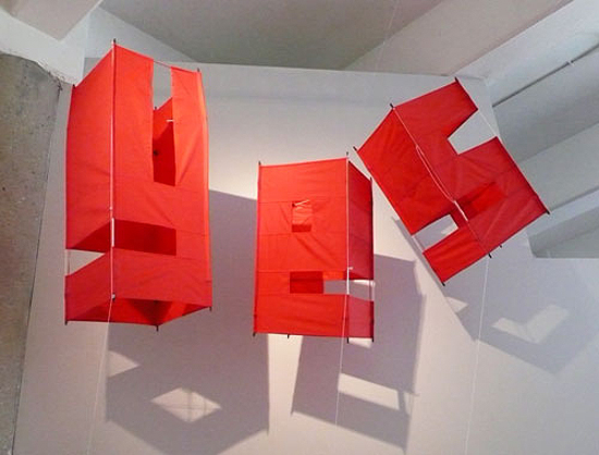
andrew byrom: letter box kite + st. julian
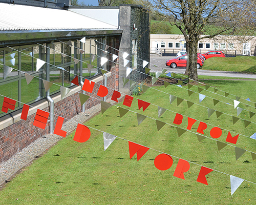
the experimental 'letter-box-kite' design is a series of 26 typographic kites fabricated from thin nylon fabric and fiberglass poles.
prefer designboom on google‘letter-box-kite’, 2008
in continuation of our coverage of british born, california based andrew byrom‘s work which takes a three-dimensional approach in creating and building letters, here are a few more projects developed by him. to see our previous article on byrom’s design, click here.
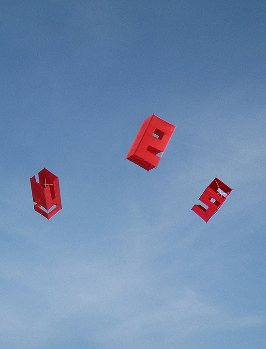 byrom and his family tested out his ‘letter-box-kites’ at seal beach, california, 2008
the experimental ‘letter-box-kite’ design is a series of 26 typographic kites fabricated from thin nylon fabric and fiberglass poles.
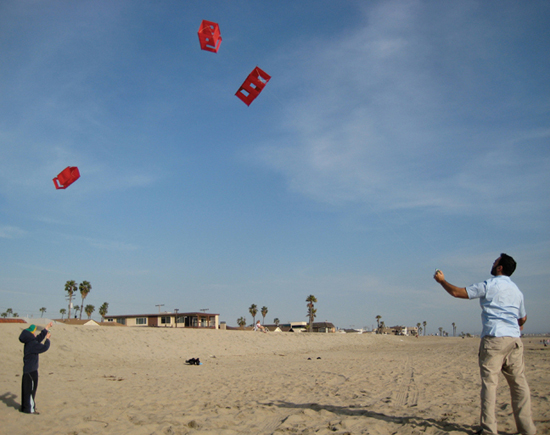 auden byrom and aubry mintz flying ‘letter-box-kites’, seal beach, california, 2008
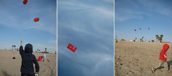
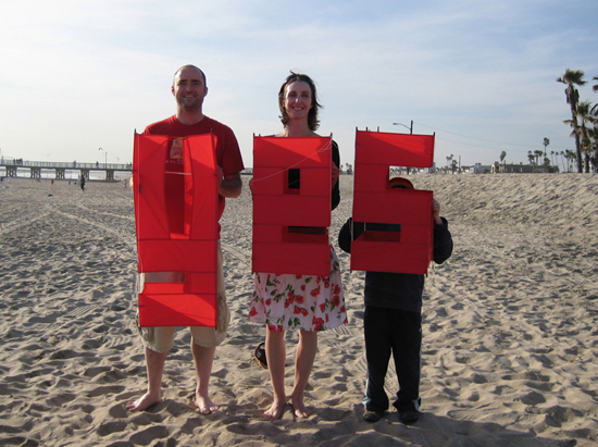 andrew, victoria and auden byrom with ‘letter-box-kites’, seal beach, california, april 2008
standard chartered bank commercial
in 2010, the design was used in a TV commercial for standard chartered bank, directed by stefan sagmeister.
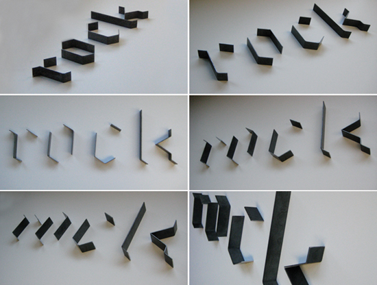 ‘st. julian’, 2010
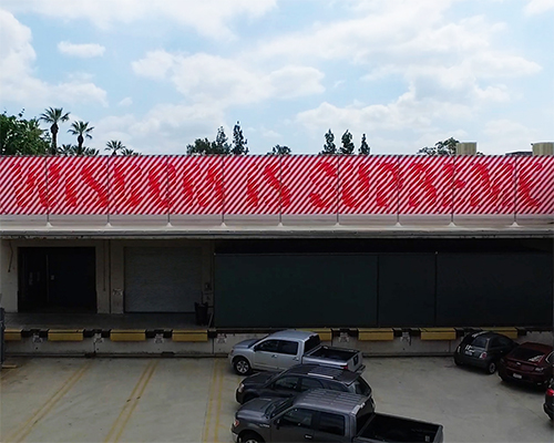
‘st.julian’ is a 2D/3D black-letter stencil typeface. the wall-mounted 3D version is constructed from steel. its message comes in-and-out of recognition as the viewer moves past. this typographic project took its creative cue from byrom’s youngest son and is also named after him.
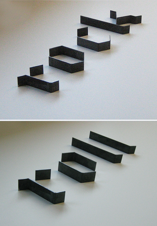 wall-mounted, 0.25” steel
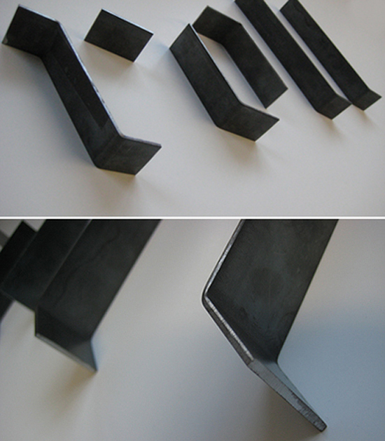 detail
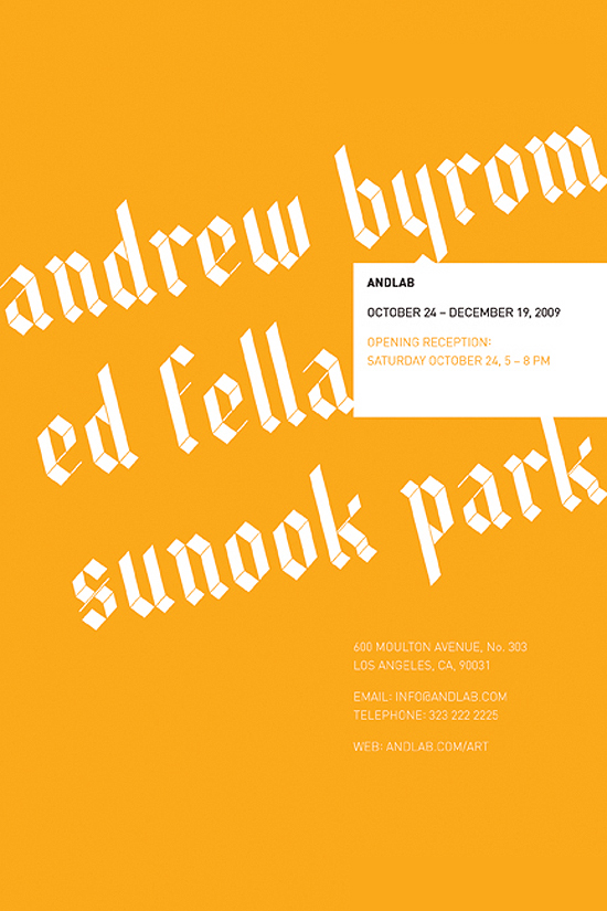 ‘st. julian’ poster
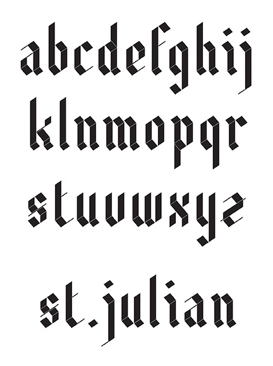 ‘st. julian’ typeface (full set)
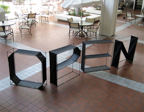 ‘byrom TSS’, 2007 temporary signage system (open)
‘byrom TSS’ is a ‘pop-up’ temporary signage system. each letter is fabricated from waterproof nylon wrapped around a fiberglass pole frame (similar to the construction of a modern dome tent). an elastic cord running inside the hollow poles allows the design to collapse into a small bag for storage. the design is intended for use in shops, galleries, conferences.
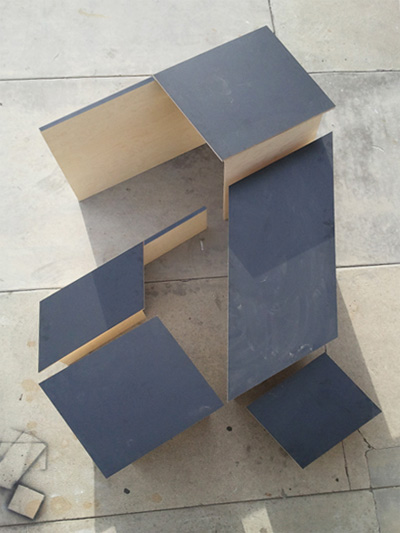
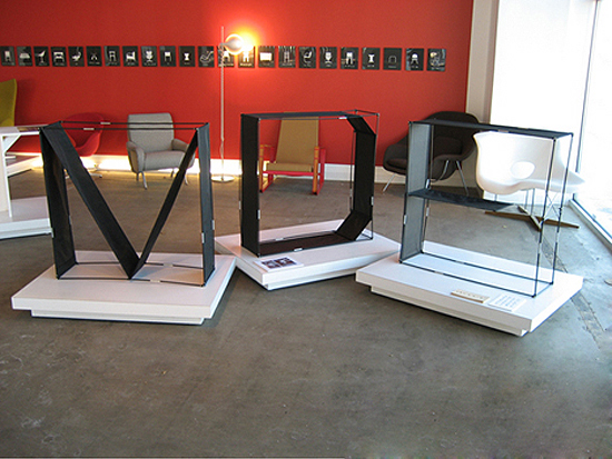 temporary signage system (MDF)
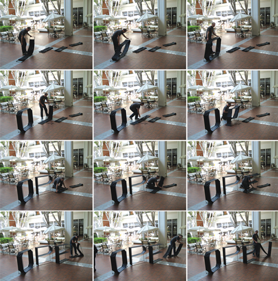 pops up from small bag using the same principle as a modern dome tent
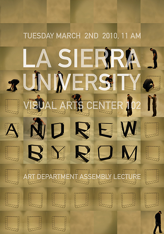 early TSS prototype
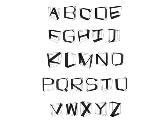 temporary signage system (full set)
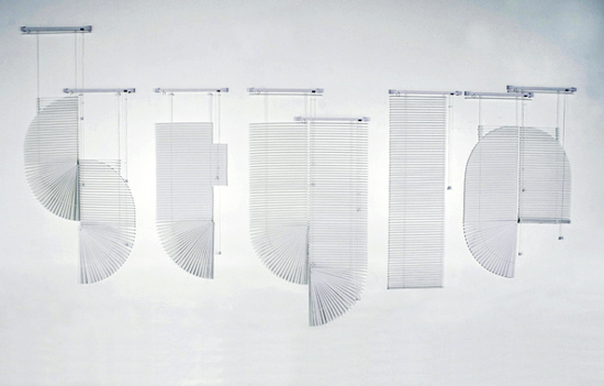
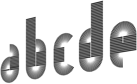
finally, ‘venetian’ is an experimental design derived by the forms created when opening and closing a venetian blind.
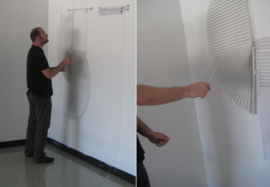 byrom’s ‘venetian’ typeface translated into three dimensional blinds
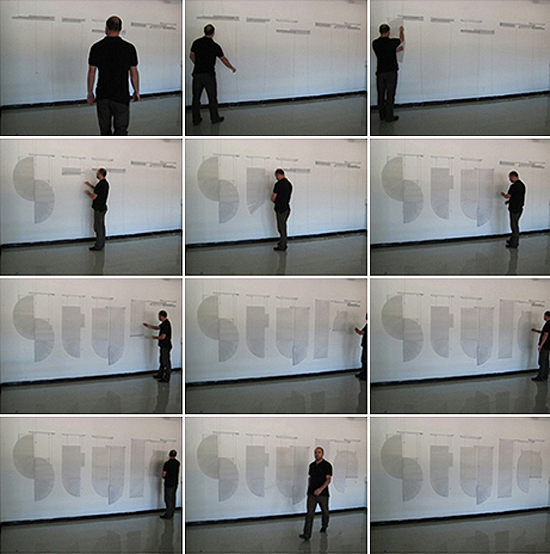 ‘style’
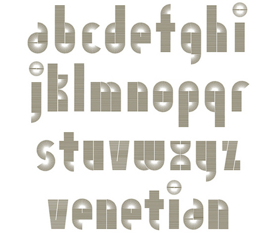 ‘venetian’ typeface (full set)
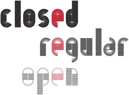 applications of ‘venetian’ typeface (closed, regular, open)
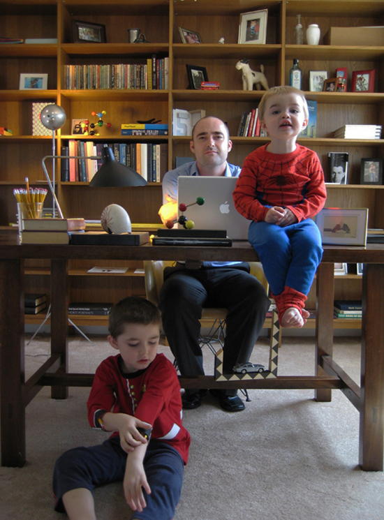 portrait of auden, andrew and louis in the office, long beach, july 2008
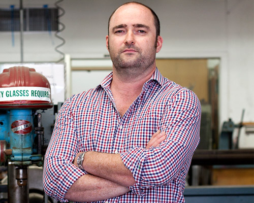
designboom met andrew byrom at kuala lumpur design week 2010 where he has been a presenter discussing the subject of modern typography design, ways of using it, as well as how to implement each kind of type into printing form.
shop
your own online design shop — no sales commission collected