apostrophy’s saturates apos² office in thailand with primary colors
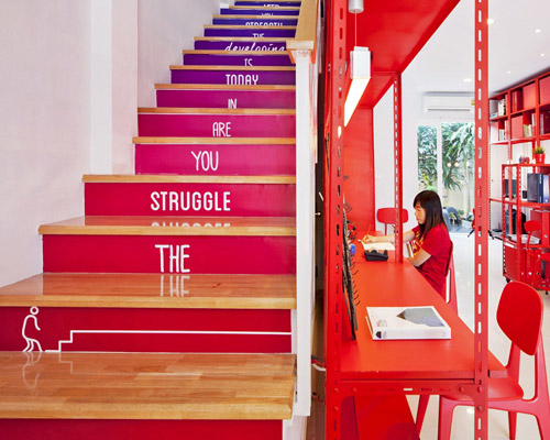
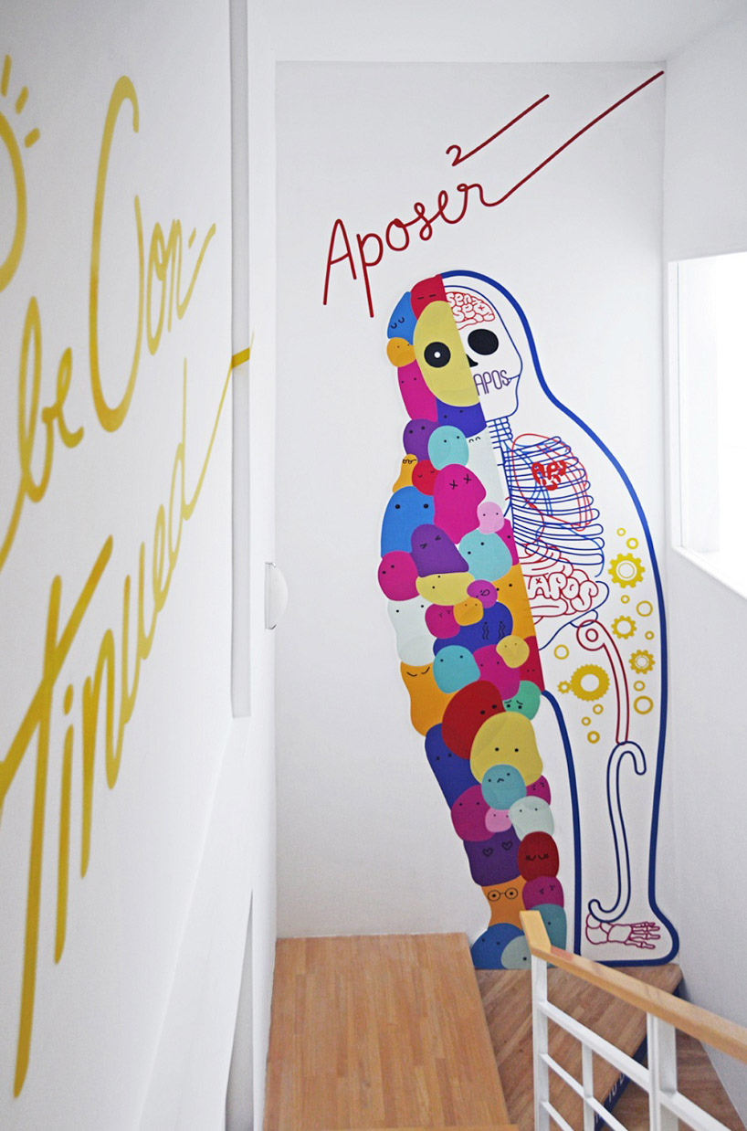
rainbow-toned staircases lead staff from floor-to-floor, while free-hand, typographic illustrations line the surface of the colorful, surrounding walls.
prefer designboom on google[FEATURED]
apostrophy’s saturates apos² office in thailand in primary colors
all images courtesy of apostrophy’s
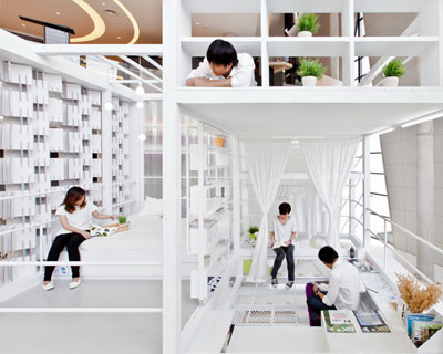
fulfilling the need for additional work space for their increasing number of multi-disciplinary, creative professionals, bangkok-based design firm apostrophy’s has completed the renovation of their thailand office. ‘apos²’ has been completely rethought from its original scheme, previously featured by designboom here, and incorporates new, essential facilities such as a learning-media center, design material lab and shared spaces for coworker interaction.
apostrophy’s considers the housing-development-turned-workspace as ‘the prototype of an ‘instant office’ by using ‘knock down’ structure assembly with simple techniques and general building materials such as angle bars, plywood, basic fittings and finished with general painted color. there is not any part of this design that effects or attaches to the existing building surface, so it is a flexible space for mobility and easy to renovate in the future.’
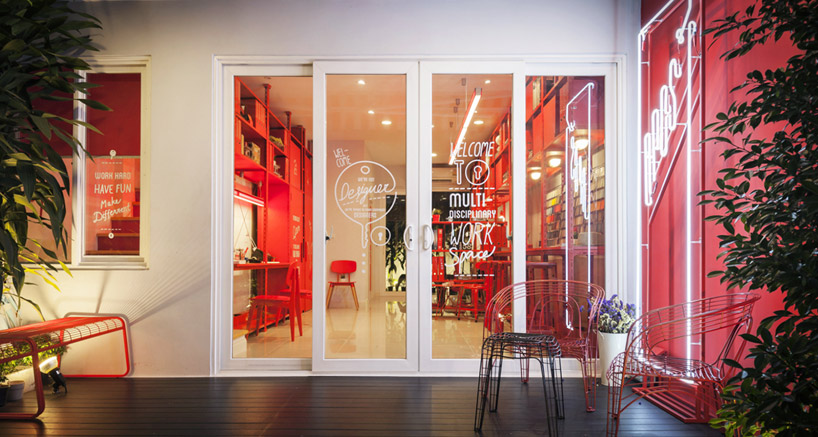
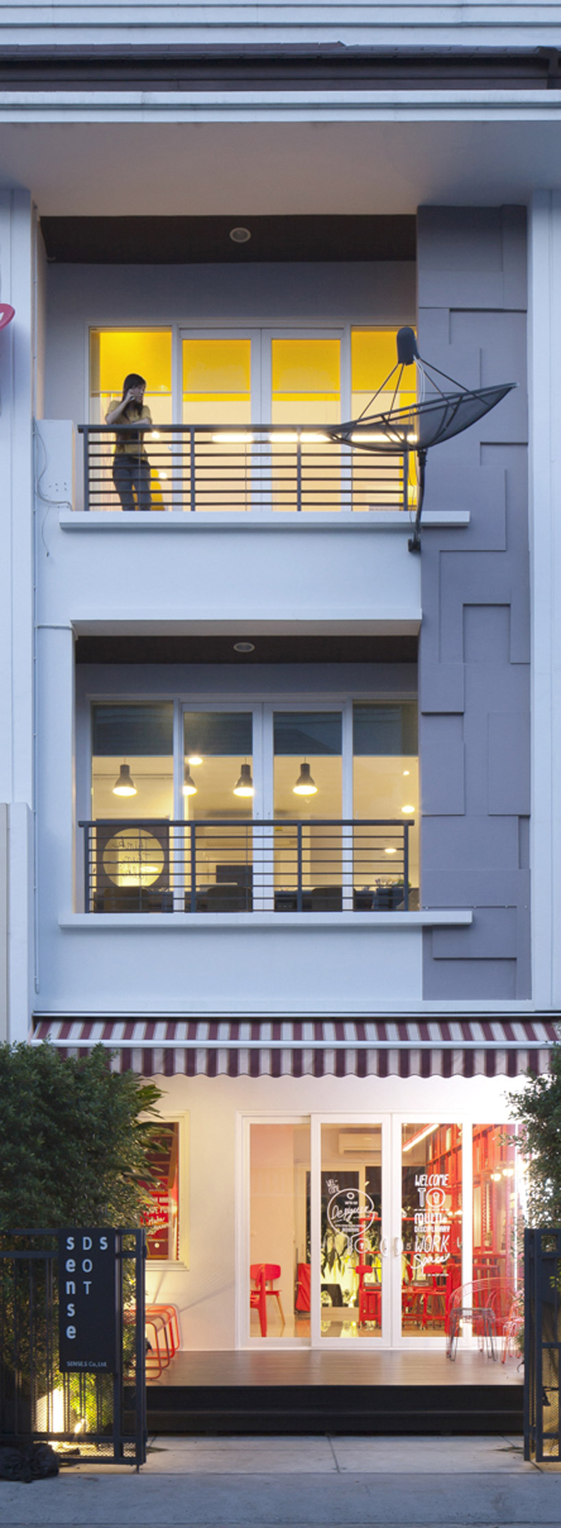
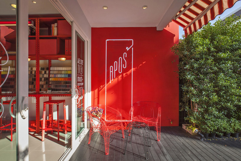
the patio and entrance to the ‘apos²’ office
vivid, primary color has been used as a core feature of the design, consisting of three hues — red, blue and yellow — saturating each level. a rainbow-toned, spectrum staircase leads workers from floor to floor, and free hand typographic illustration about design philosophy is drawn onto the surface of the surrounding walls.
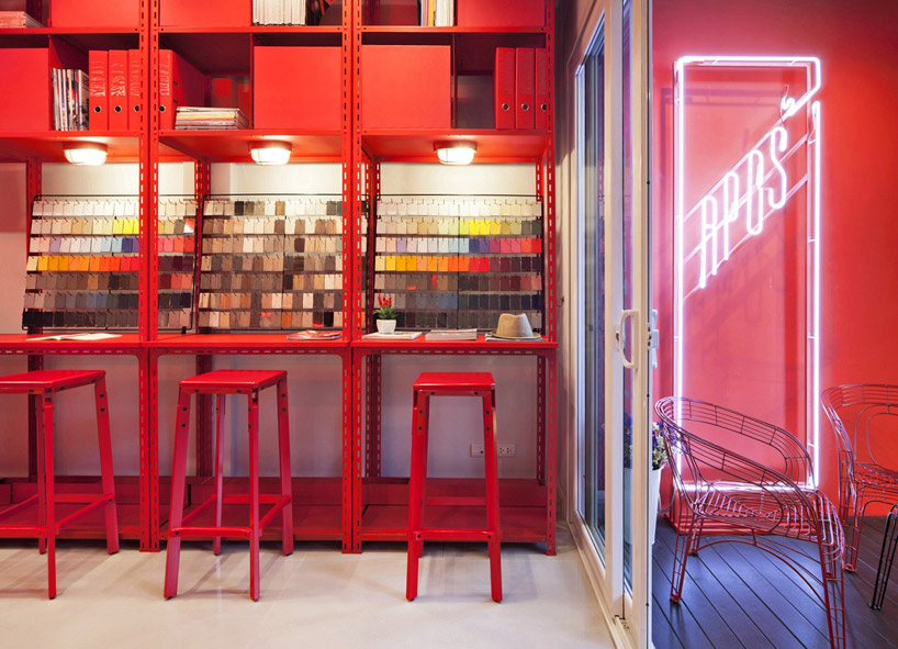
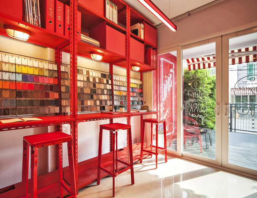
a red-colored materials lab for office employees to experience various textural and colorful design elements
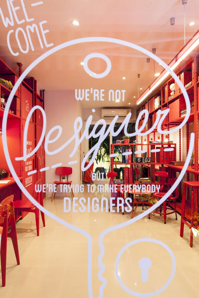
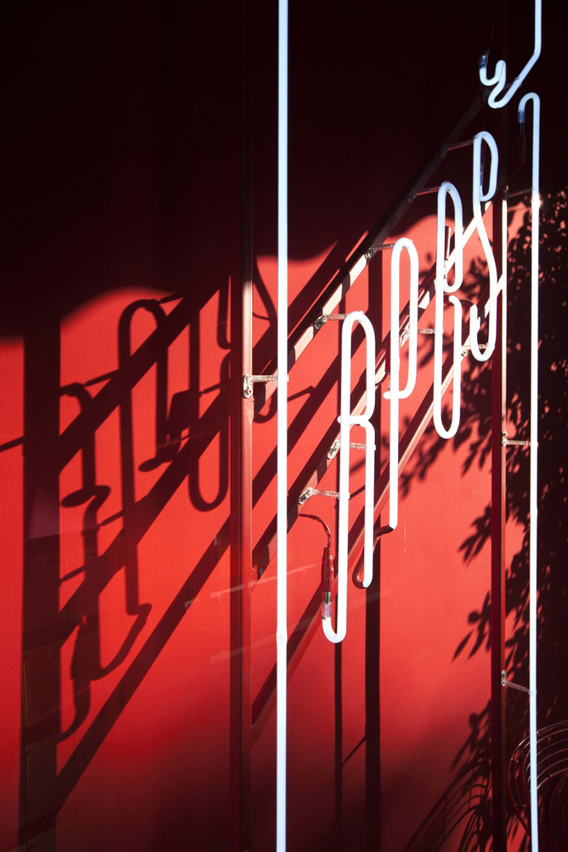
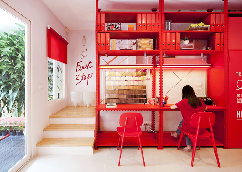
space planning is organized into three parts. upon entrance, a retro, neon sign greets employees and visitors on a hot red wall near the door. the first floor has been designed as a reception hall and cafe; chairs and a long desk sited along the wall beneath a lofted steel cabinet. red been use to energize and stimulate staff, expressing enthusiasm at the first step.
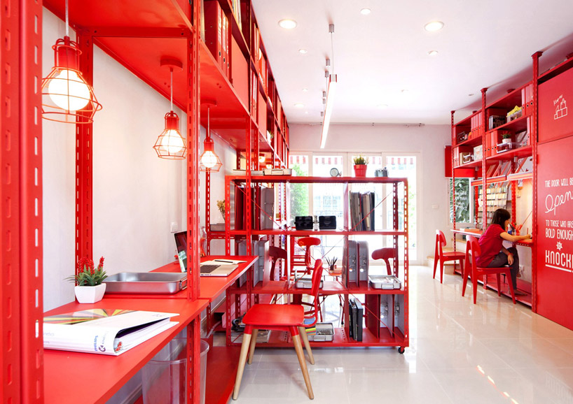
red been use to energize and stimulate staff, expressing enthusiasm at the first step
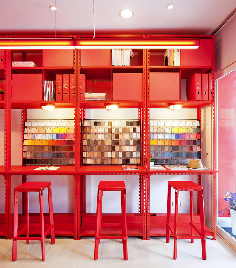
the first floor has been designed as a reception hall and cafe
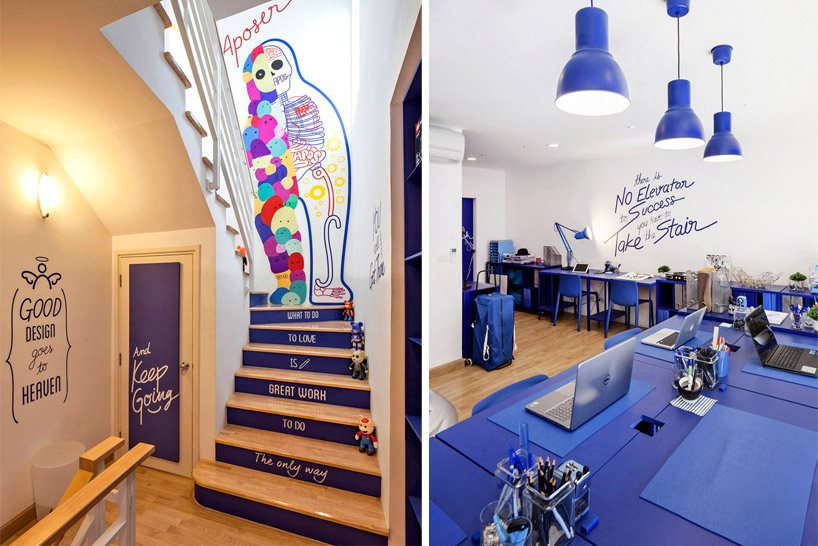
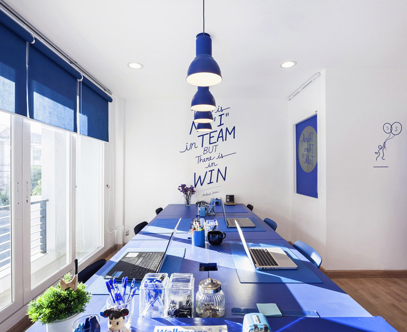
the second floor has been designed as a working area called ‘aposer room’
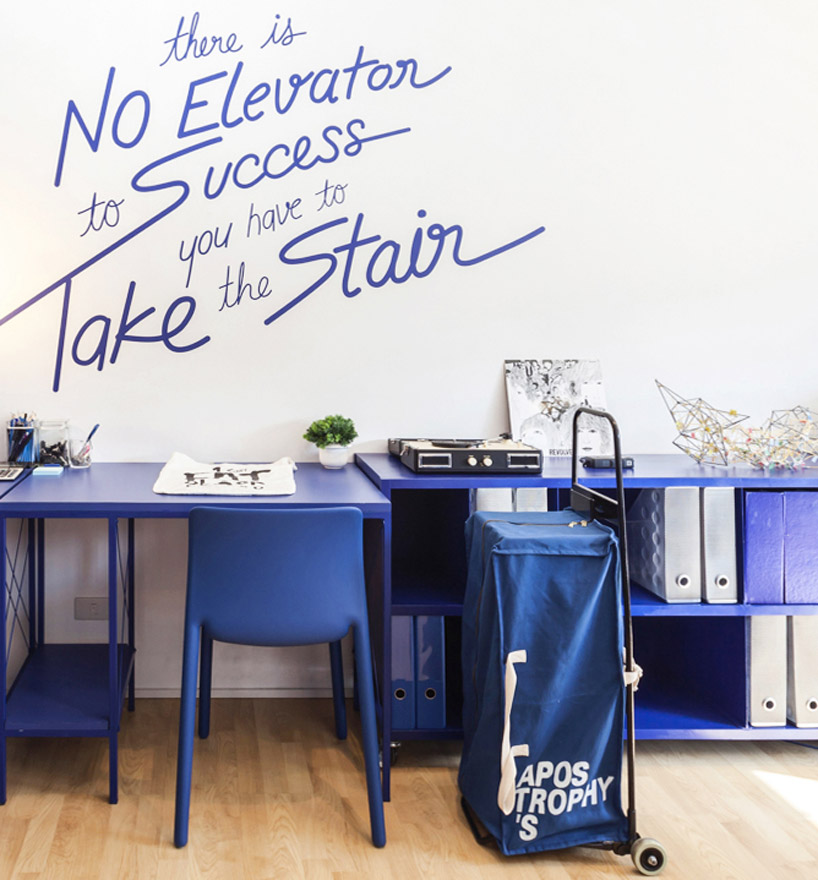
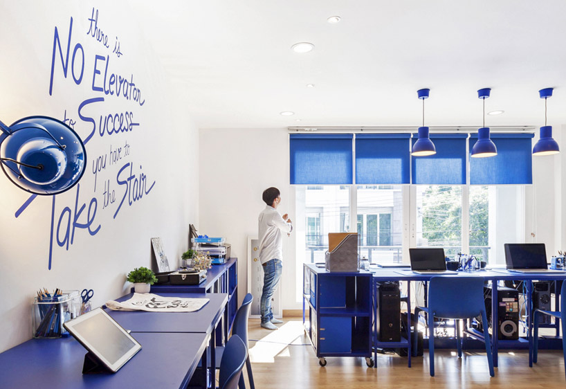
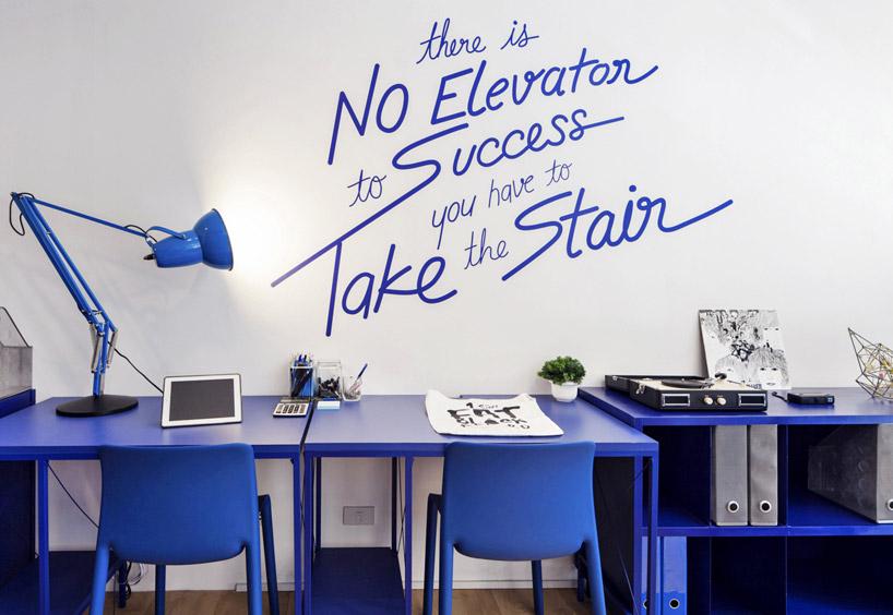
the second floor has been designed as a working area called ‘aposer room’, marked by an overall blue color, to make this space calm, tranquil and stable. as an open plan office, all working desks have been placed facing each other to allow staff interaction. a huge typographic phase spells out ‘there is no ‘I’ in team, but there is in win’ on the wall to remind all staff to collaborate and solve problems together.
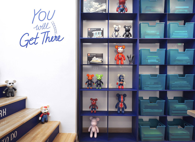
blue stairs and cabinets lead staff to the second level
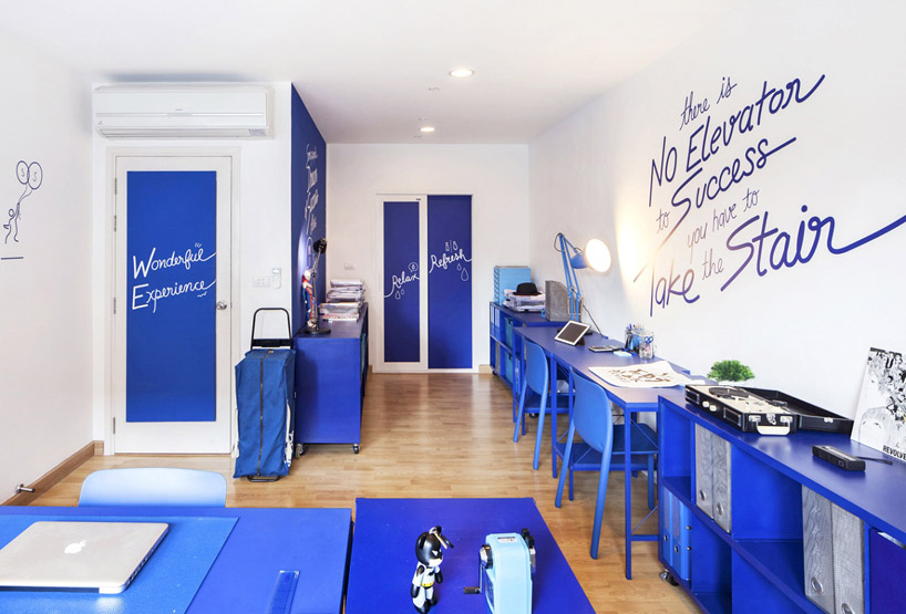
the scheme invites discussion and participation among employees
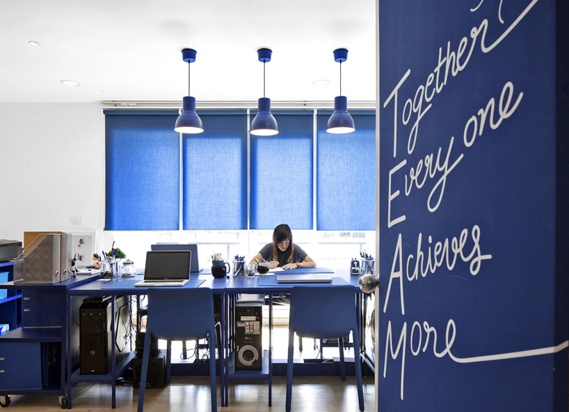
the blue color evokes tranquility and stability
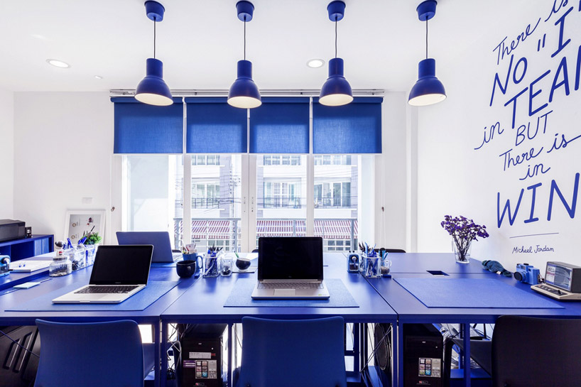
a typographic illustration pierces the surface of the wall
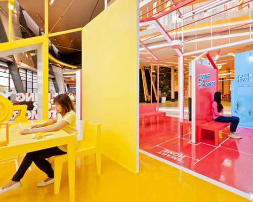
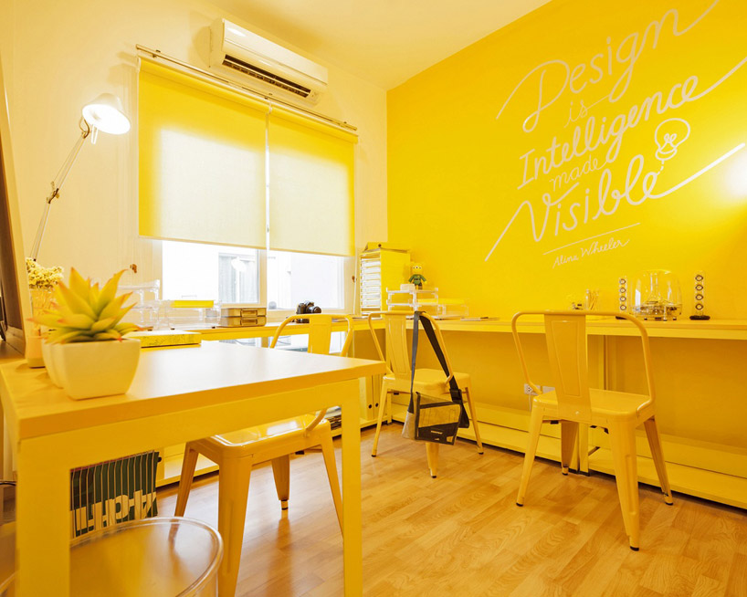
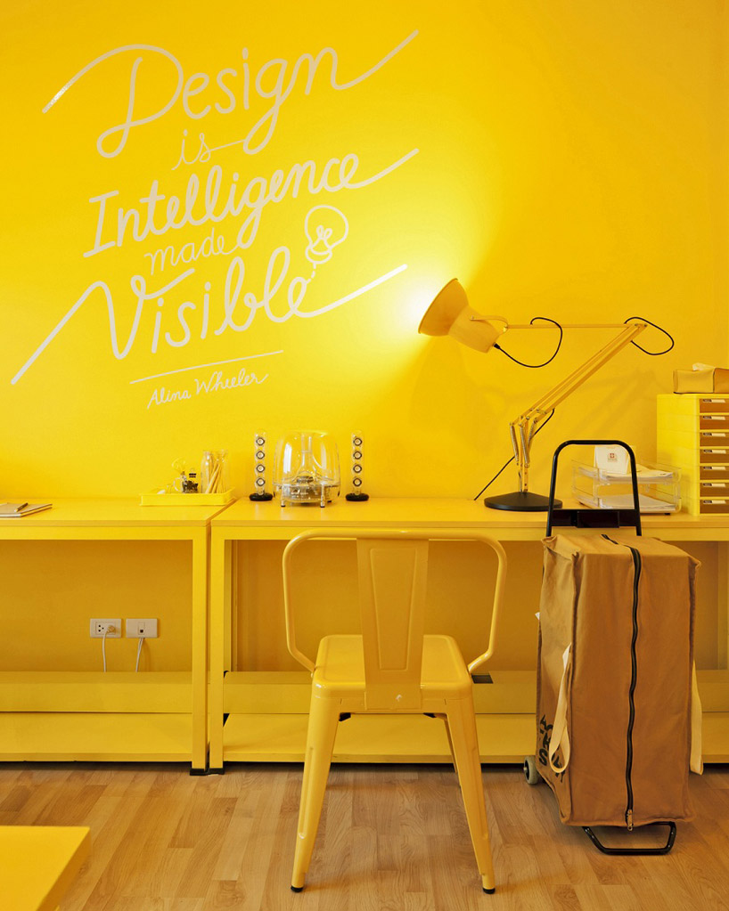
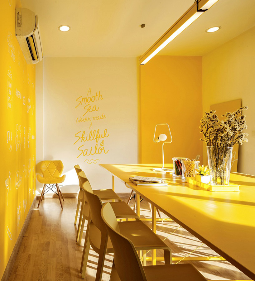
the third floor has been realized as a brain storming room and executive meeting space. it is marked by a bright yellow hue, saturating every inch from the walls to seats and lighting fixtures. the vibrant tone is intended to illuminate the space and spark creative thinking, while a typographic phase about working development informs both beginner staff and executive officers.
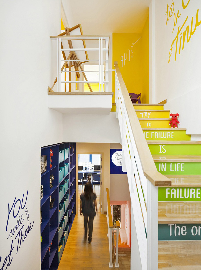
rainbow stairs lead the staff to the top floor
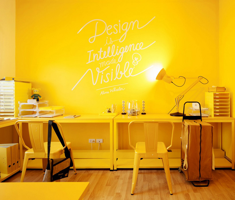
a completely yellow interior lines the third floor workspace
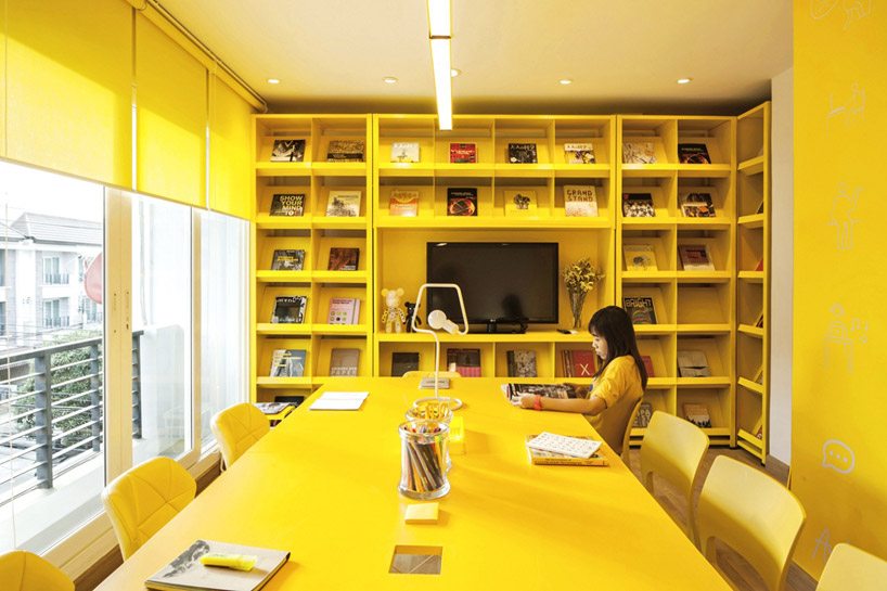
staff is invited to brain storm in this completely yellow interior
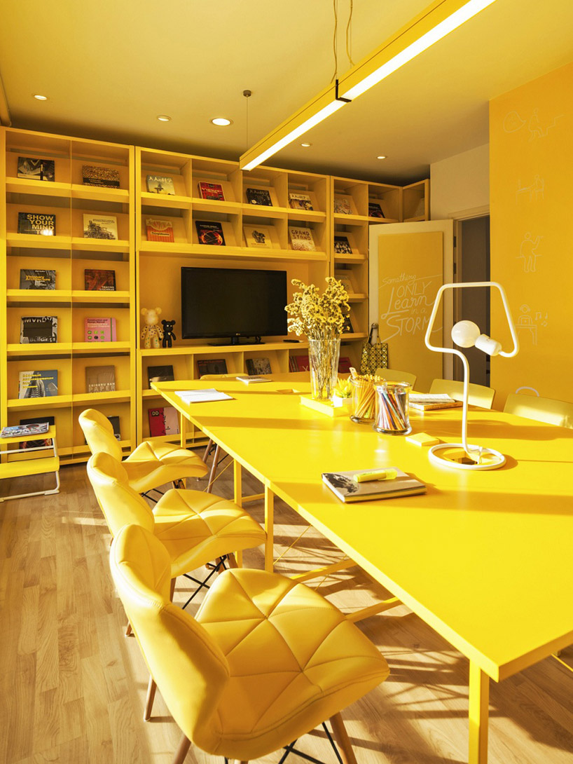
the room is designed as a creative co-working space, and meeting room for executives
1/14
shop
your own online design shop — no sales commission collected