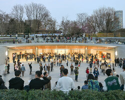
on april 20, 2021, apple unveiled a plethora of new products, including the new iMac M1 in seven different vibrant colors. the event not only added color to the computers, but also saw the revival of apple’s 1977 rainbow logo, but as many have noticed, the colors don’t match with the original one.
![]()
image by apple
designed in 1977 by graphic designer rob janoff, the classic bitten apple logo was introduced together with the brand’s first personal computer, the apple II. when asked how he designed it, he explained that: ‘it was very simple really. I just bought a bunch of apples, put them in a bowl, and drew them for a week or so to simplify the shape.’ the rainbow color scheme was a nod towards the apple II which was the world’s first to feature a color display.
more than 40 years later, seems like apple is again nodding to their latest range of computers. the altered colors, which look darker and duller, match exactly the colors of the new iMac. and if we take this into consideration, probably this logo is a one-off for the iMac launch rather than a complete remake of their rainbow logo.
project info:
name: updated colors on rainbow apple logo
company: apple
apple (170)
 Apr 03, 2024
 Feb 05, 2024
 Dec 13, 2023
 Nov 18, 2023
 Sep 13, 2023
logo design (244)
 Aug 14, 2023
 Aug 02, 2023
PRODUCT LIBRARY
 Apr 17, 2024
 Apr 15, 2024
 Apr 15, 2024
 Apr 12, 2024