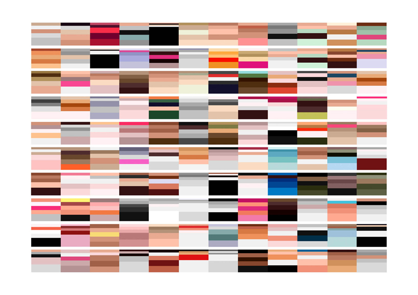
‘british vogue covers 2001 – 2011’
arthur buxton has developed a new way of looking at color schemes. removing the figurative and compositional elements from an image, what is left behind is the color, allowing one to more objectively appreciate the palate and its harmonies. using color extraction software and adobe illustrator, buxton has created a number of charts that reveal a surprising amount of information, imparted by the colors alone.
the first is ‘british vogue covers 2001 – 2011’ which in reverse chronological order, from left to right, each block is a british vogue magazine cover. within each block, the strips of color that vary in width, represent the five most common colors proportionally found within that specific issue. the larger bands represent the years, starting in may and moving backwards.  van gogh visualization
the next is a series of pie charts which represent 28 significant paintings each, of a famous artist. again, each pie represents the five most prominent colors within the painting, portraying each one as a percentage.
for example van gogh read from left to right, top to bottom:
1.starry night / 2.self portrait / 3.van gogh’s room at arles / 4.bandaged 5. reaper / 6. church at arles / 7. self portrait with bandaged ear / 8. sunflowers 9. portrait of dr. gachet / 10. the night café / 11. coal barges / 12. wheat fields 13. sheaves of wheat / 14. the sower / 15. old man in sorrow / 16. the exercise yard 17.mulberry tree / 18.pollard willows / 19. chair / 20. the potato eaters 21. shoes / 22. almond tree / 23. thatched cottage in cordeville / 24. noon rest from work 25. scull with cigarette / 26. a field of yellow flowers / 27. irises / 28.field with cypress 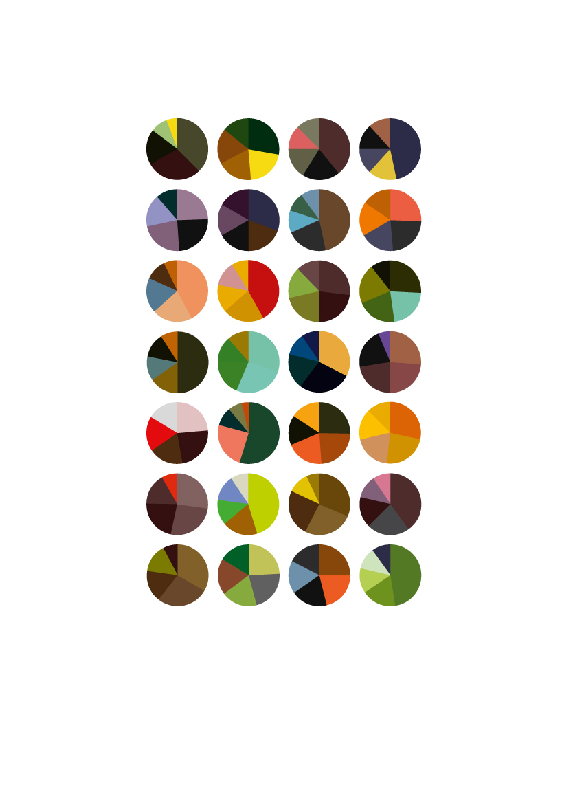 gauguin visualisation
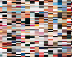
 matisse, monet and macke visualizations
designboom has received this project from our ‘DIY submissions‘ feature, where we welcome our readers to submit their own work for publication.
arthur buxton (2)
 Jun 01, 2012
infographics (19)
 Aug 06, 2020
 May 02, 2019
 May 07, 2018
 Apr 10, 2016
 Sep 08, 2015
PRODUCT LIBRARY
 Jul 23, 2024
 Jul 01, 2024
 Jun 13, 2024
 Jun 06, 2024