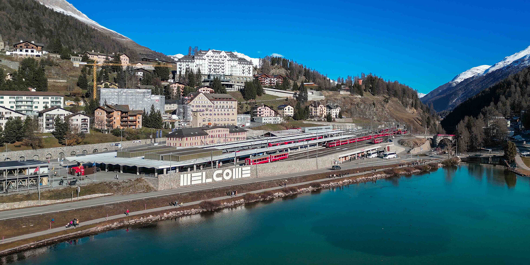
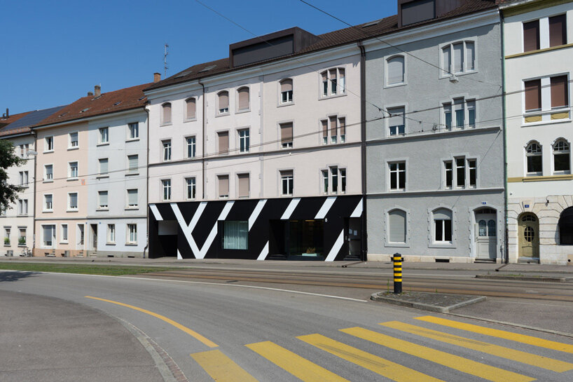
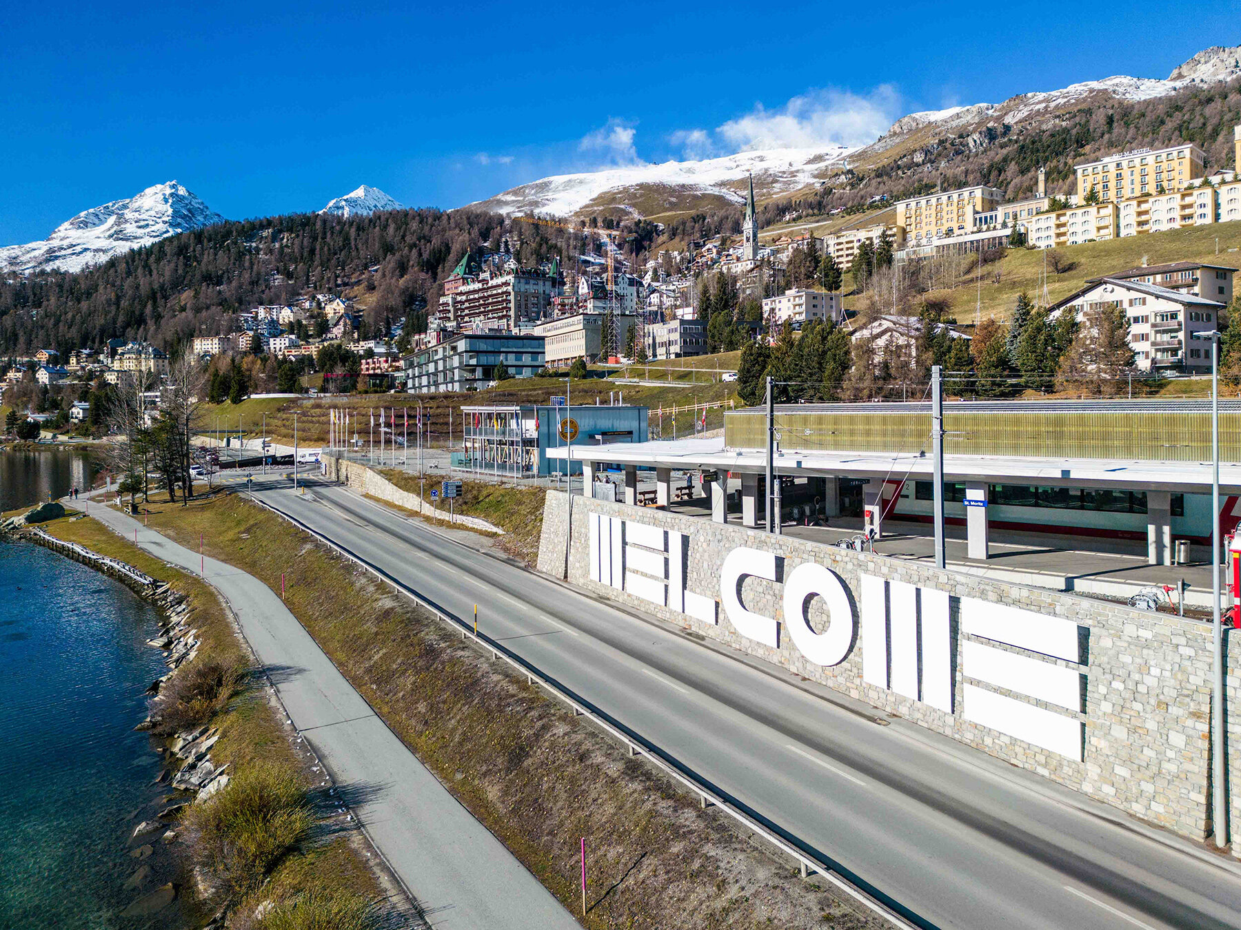
a welcoming threshold for st. moritz
Barbara ‘Bobbie’ Stauffacher Solomon brings her larger-than-life ‘supergraphics’ lettering to San Moritz with a new public art commission at the doorstep of the Swiss mountain town. It was just nearby this postcard landscape where, a half-century ago, the young student embarked on a change from artist to graphic designer, under the guidance of Armin Hoffmann — an acclaimed designer known for his instrumental role in the development of the clean and minimal Swiss style of topography.
As her story is thus intricately entwined with Switzerland in both personal and professional life, the installation becomes a kind of ‘homecoming’ for Solomon — as it is described by Serpentine curator and artistic director Hans Ulrich Obrist following its completion this past December. ‘Almost every city should have a welcome sign,’ Obrist tells designboom during a visit to the installation’s opening. The sentiment rings particularly true during this era of both global expansion and the emergence of nationalistic and localized sentiments against it.
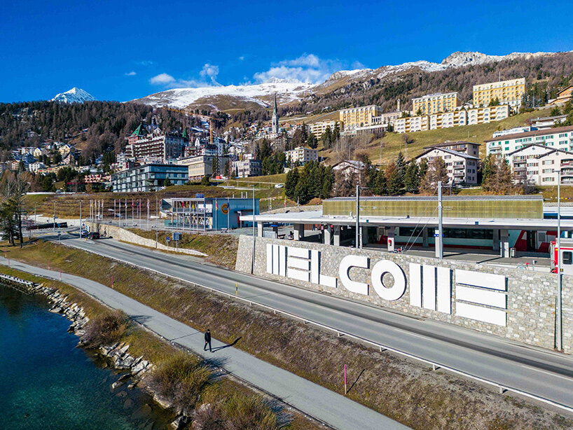
Standing nearly four meters tall and stretching twenty-nine meters wide, ‘Welcome’ incorporates the designer’s minimal ‘BSS Alphabet,’ and invites viewers to interact with each letter. This Supergraphic is a hybrid of lettering and architecture that creates an impressive spatial effect which will greet visitors to St. Moritz until April 2023.
 Welcome by Barbara Stauffacher Solomon in St. Moritz | all images courtesy the artist & von Bartha
image © fotoswiss by Giancarlo Cattaneo. Drone images with permission from Airport Samedan
The work was coordinated by Barbara Stauffacher Solomon’s Galerie von Bartha of Basel, along with Serpentine artistic director Hans Ulrich Obrist; Catherine Caratsch of St. Moritz Tourism, as well as Lady Elena Foster — a curator, publisher of Ivory Press, chair of Serpentine Council, and wife of architect Sir Norman Foster. It was also made possible by the Thomas and Doris Ammann Foundation. This past January, the installation was spotlighted at the Engadin Art Talks.
Barbara Stauffacher Solomon, photo by Chris Grunder, December 2020
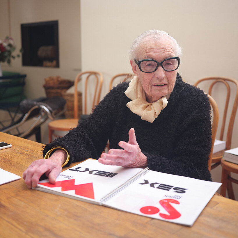
The 1928-born artist now lives in her hometown of San Francisco, a city whose radical spirit harmonized with her modernist training in Switzerland. designboom spoke with Solomon to discover how her background and philosophies led her to become a influential figure in the world of design and architecture with her floor-to-ceiling graphic work.
LEARNING GRAPHIC DESIGN AND MEETING HELVETICA
It was between 1956 and 1959, after the death of her husband just six years into their marriage, that Barbara Stauffacher Solomon moved to Basel, Switzerland to study graphic design at the Basel Art Institute. At this arts-focused ‘Kunstgewerbeschule,’ she studied under Armin Hofmann, whose meticulous design methods informed her rigor for modernist typeface of readability and clean, bold lines.
designboom (DB): You once said, the entire first year at the Kunstgewerbeschule was spent working on a Helvetica alphabet. Why was that so?
Barbara Stauffacher Solomon (BSS): Yes! We could do the letterforms skinny or fat or square. But other than that, you just did it until you could do it perfectly with Armin [Hoffmann] looking over your shoulder. It sounds boring, but we all learned so much. We learned how to see every little millimeter of the black against the white, and the white spaces in the letter forms.
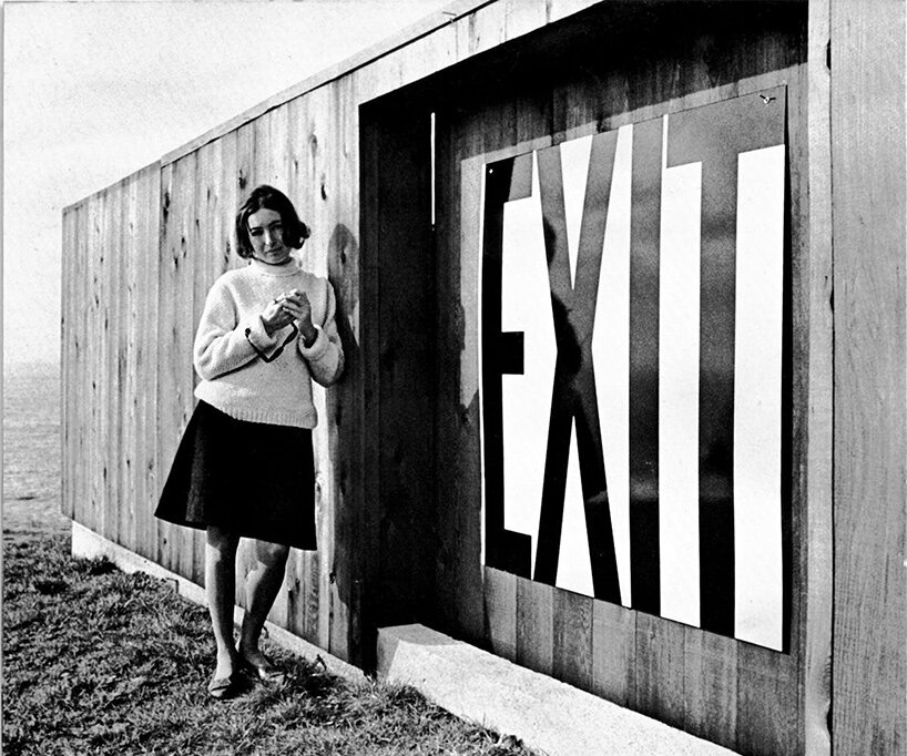 Barbara Stauffacher Solomon with ‘Exit’ sign mock-up at Demonstration House
image courtesy Journey to the Sea Ranch
DB: You lament that your beloved Helvetica became the typeface of capitalism, not socialism — like modern architecture, initially meant maybe for the less rich, but only the rich can afford. Can you elaborate?
BSS: I don’t lament it, it’s life. But it’s funny that they blame that on me. What I’ve done with it — I’ve turned it into an art form. Now when I write something in my new alphabet, which is even more minimal, it’s called art! Which is crazy. The whole idea of modernism was created so people could have stuff that was beautiful, even though it wasn’t expensive.
The thing is, the rich people had good eyes and they were smart. They liked Helvetica, and they started to use it. It’s like modern architecture. They liked the beautiful little white houses, and they were expensive. The rich were the only ones who could afford them — not the poor people who they were supposed to be for. A nice simple little white house.
 the facade of the offices and side entrance of von Bartha, Basel designed with a Supergraphic by the artist
image courtesy Galerie von Bartha
DB: Do the rich tend toward minimalism over complexity in design?
BSS: Rich people had decoration, when they get a house or when they get fancy lettering with lots of serifs and wiggles. That was for the rich! The people who designed under modernism were not seduced by capitalist decorations. Things you didn’t need. In the old days you had a fancy house with decoration and fancy furniture. Modernists made all that very simple. And much more beautiful.
Supergraphics interiors, image courtesy Galerie von Bartha
DB: Who has influenced your work the most in terms of your taste in color and typographic preferences?
BSS: Armin Hoffman — he was my teacher! And we were very good friends.
DB: What sorts of advice did he give you?
BSS: He was very clever. At one point a guy came over to Switzerland because he wanted me to marry him. Armin said, ‘Well, you know enough to be a housewife…’ And so I didn’t marry him! He would give me all kinds of advice. But his biggest advice was to just learn [graphic design] as a skill. Learn the rules of good typeface.
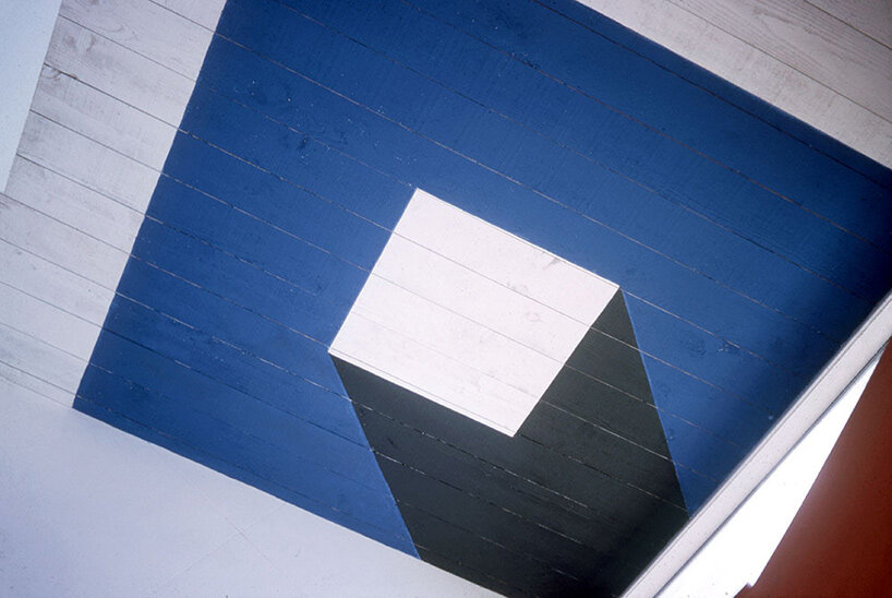
 the Sea Ranch, view of Barbara Stauffacher Solomon’s painted facades
image © Trustees of the University of Pennsylvania, held by the Architectural Archives
paint it up!
In 1962, after her studies in Basel, Barbara Stauffacher Solomon returned to San Francisco in and set up an office as a graphic designer. This pragmatic trajectory was indeed a diversion from her artistic background as a painter and dancer, and led to her becoming a pioneer in the male-dominated world of midcentury design.
DB: What led you to pursue graphic design over painting?
BSS: When my husband died, I needed to make money. So I changed from art to graphic design because you got paid more as a graphic designer in the old days. Nobody paid you to be an artist or woman artist in the 1950s. Women artists knew they were just kind of ridiculous. They certainly didn’t make money. But if I called myself a graphic designer, then I got paid as an architect.
the Sea Ranch, view of Barbara Stauffacher Solomon’s painted facades
image © Trustees of the University of Pennsylvania, held by the Architectural Archives
history tells
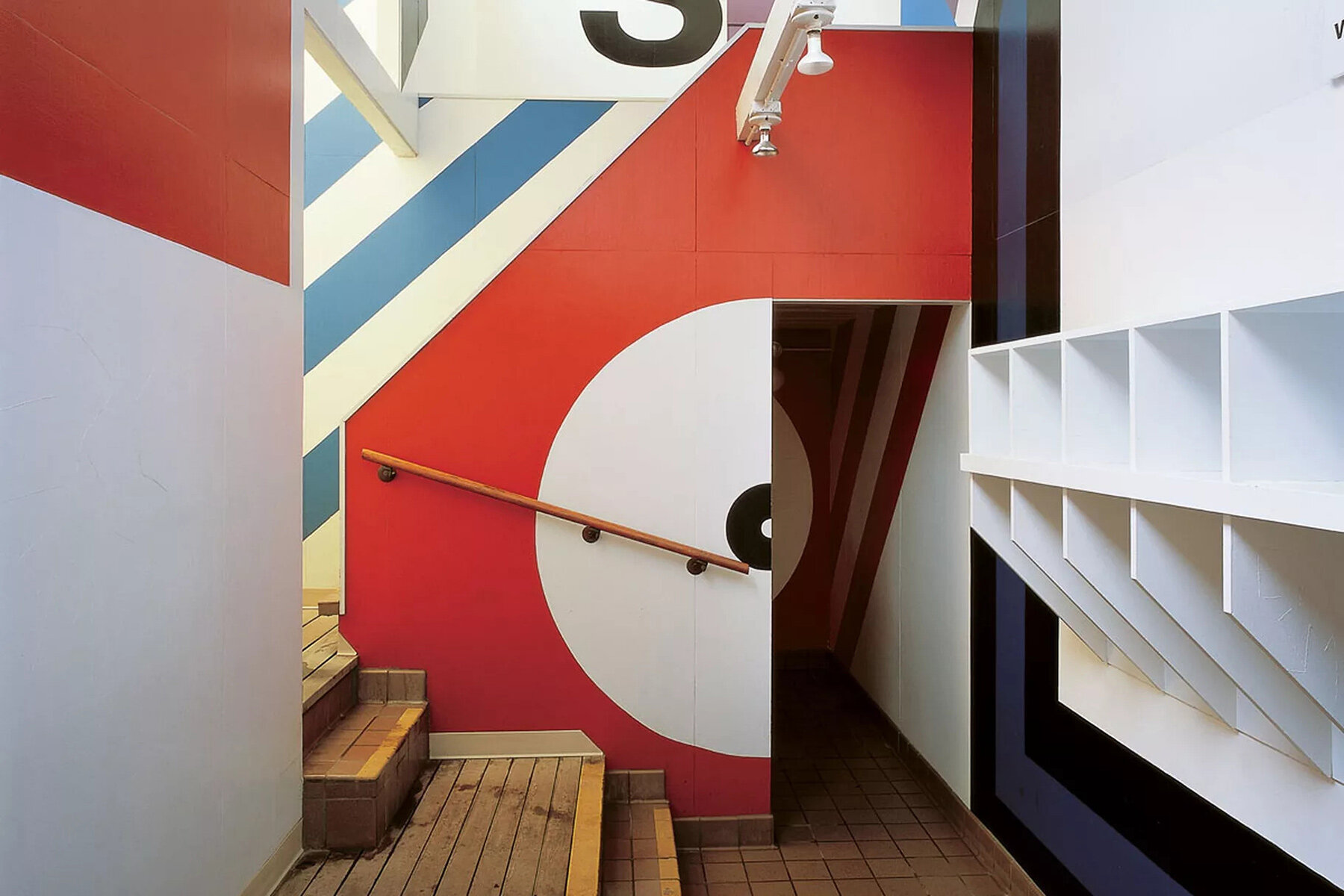
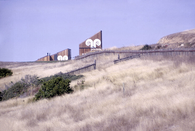
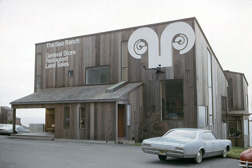
Finally, Solomon invented her oversized Supergraphics at The Sea Ranch, a modernist utopia in Northern California whose architectural significance and resolve to ‘live lightly on the land’ landed it onto the National Register of Historic Places. The style is defined by its bold forms, primary colors, energy, vibrance — all rendered at building scale to create graphics that wrap their architectural canvas. What’s more, the works transform the built space by distorting the viewer’s perspective of its proportions.
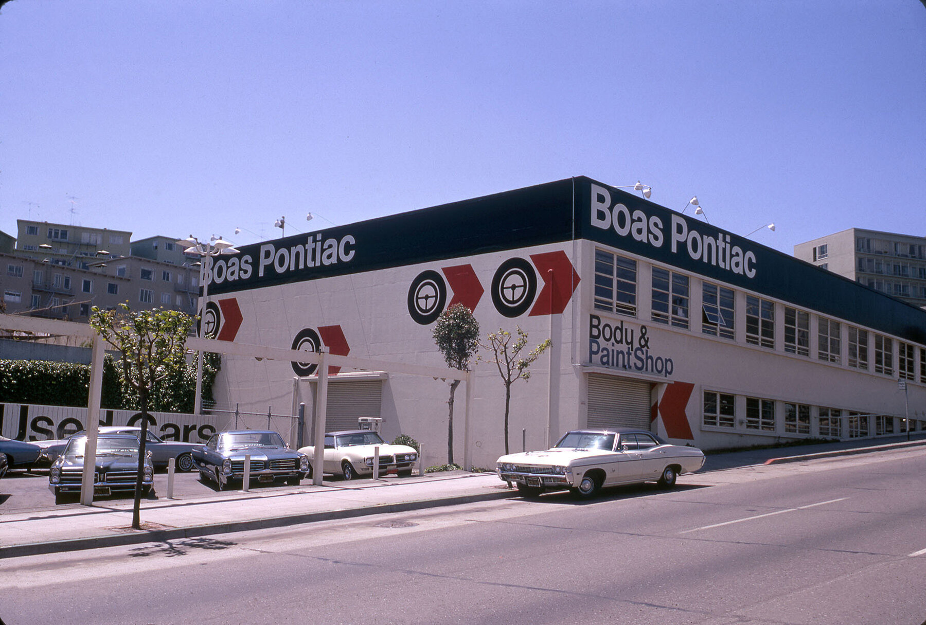
Boas Pontiac Supergraphics by Barbara Stauffacher Solomon Boas Pontiac, San Francisco
image © Trustees of the University of Pennsylvania, held by the Architectural Archives
DB: The history of Supergraphics dates back to the prehistoric cave paintings. Can you elaborate on these influences?
BSS: They do go back to early cave paintings, but nobody talked about that. You did what they taught you to do — there wasn’t much history involved. That’s why when I came back from Switzerland I went to Berkeley. I learned more about the history of modernism. In school in Basel, they just taught you how to do it as a trade. It wasn’t as a historic investigation. You didn’t learn the history of modernism, politically and everything, in Switzerland. I learned that here when I came back.
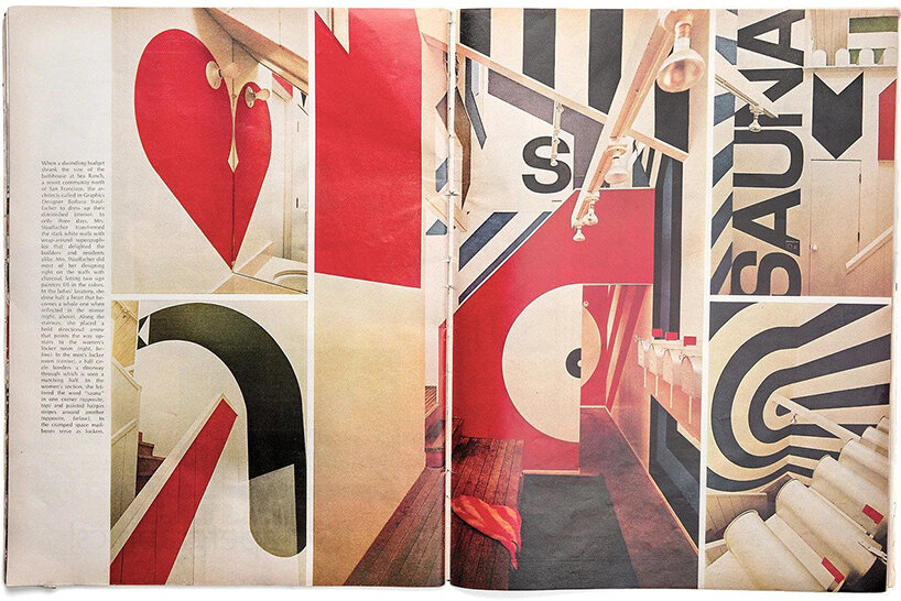 Life Magazine, 1966
Solomon became known for this creative integration of modern art and architecture, making use of vivid graphics to create an atmosphere of harmony with the surrounding natural setting. Her work, completed within a few days, adorned an unfinished building that had gone far beyond its original budget. This coastal community was famous for its distinctive architectural style and Solomon’s logo and striking Supergraphics helped to make it a beloved and celebrated feature amongst designers all around the world.
DB: Why is it that people call your work ‘a cross between Swiss design and California impressionism or west coast pop art?’
BSS: I was a painter here in San Francisco before went to Basel, and in Basel I learned about modernism. But when I came back and work, I mixed the two. That’s what I did at Sea Ranch. When they gave me a big cold building, I automatically painted it as if I were an artist, but I did it the way I had been taught. But also I was doing it with sign painters. And sign painters can only paint signs in straight lines — so they knew how to do letter forms.
 Barbara Stauffacher Solomon’s Supergraphics at Moonraker Athletic Club
image © Trustees of the University of Pennsylvania, held by the Architectural Archives
DB: Were you influenced at all by California’s Hippie movement during this time?
BSS: No, I just did the opposite! I was doing it the same time that they were doing it. But we, I guess, very much did the opposite. I went to those parties, but I very much was not influenced. I totally did the opposite.
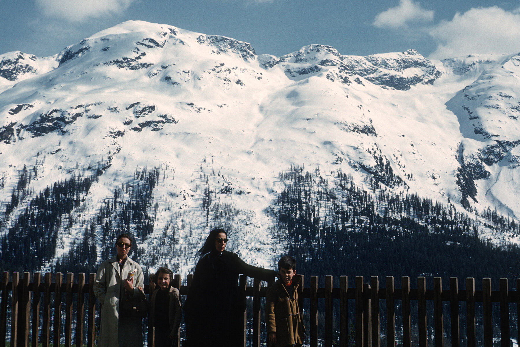
Barbara Stauffacher Solomon, her daughter Chloe, artist Luchita Hurtado and son Matt Mullican
March 1960, St. Moritz
sized-up supergraphics
DB: The term Supergraphics is always linked to architecture, with large graphics slipped on building facades. When used on billboards, they are a very effective means of advertisement. Is it commercial art?
BSS: I was very lucky. I never worked for an agency. The kind of clients I had were architects. When I did do brochures or something, it was it was always for architects. But it wasn’t for an advertisement. Even in Switzerland where they had posters. Advertising was considered kitsch.
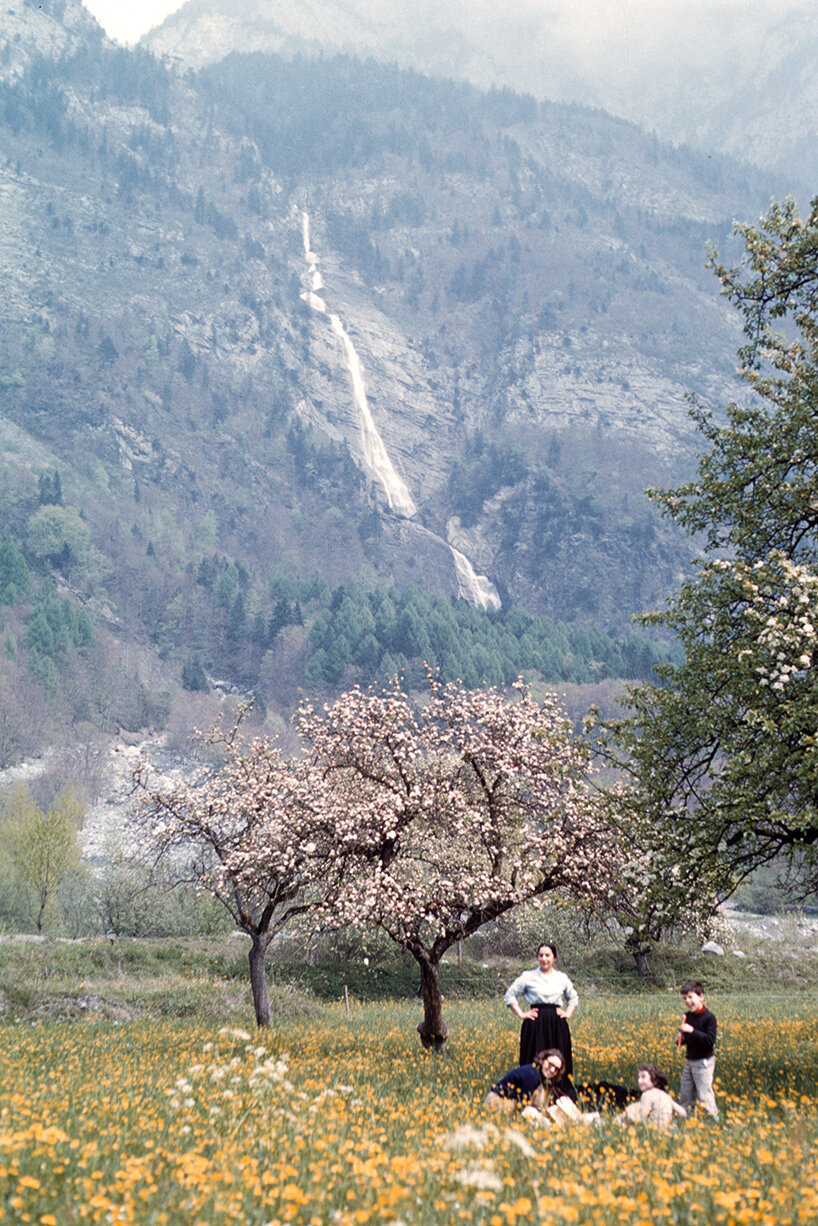
Barbara Stauffacher Solomon, her daughter Chloe, artist Luchita Hurtado and son Matt Mullican, March 1960, near the Italian-Swiss border in the Val Bregaglia
shaping the history of design
A daring expression to transform a conventional built space, Barbara Stauffacher Solomon’s Supergraphics shaped the history of design — and probably later influenced the visual artworks of Barbara Krüger with their text overlays and collage style; or the full-height signage by Shigeru Ban which integrates into its interiors; and the graphic facades and structures by Lotek…
DB: What were your thoughts on the arrival of graffiti?
BSS: I like graffiti! Because I was trained as an artist, and graffiti can be high art.
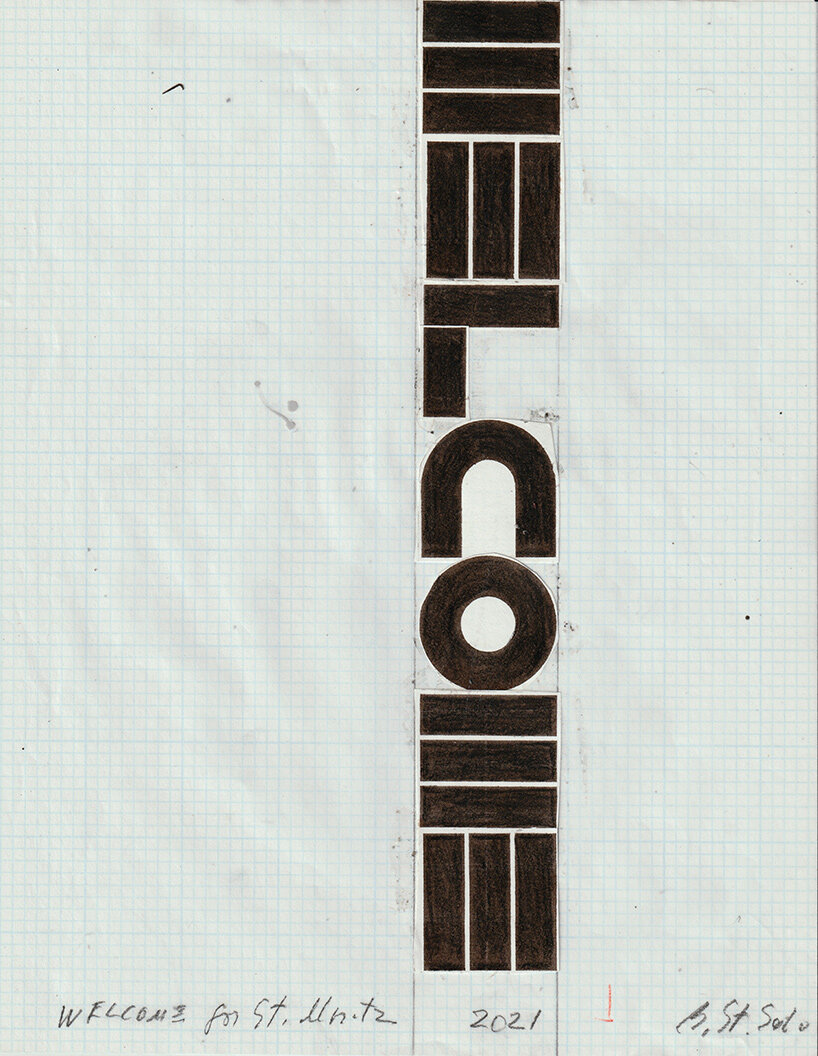
Welcome, sketch by Barbara Stauffacher Solomon, 2021
Following her early works, the designer later studied Architecture at the University of California, Berkeley and graduated in 1981, writing her thesis on Green Architecture & The Agrarian Garden, which is now typically associated with the current vogue for living walls and ‘vertical garden’ skyscrapers. By now, the artist has published six books and is currently working on her seventh.
COMING BACK TO a simple ‘welcome’
As Barbara Stauffacher Solomon puts it, the BSS Alphabet is a stripped-down ‘geometrically minimal’ Helvetica. First developed in 2019 when she was guest designer for Francis Ford Coppola’s Zoetrope magazine, its letterforms are reduced to a minimum: just three horizontal rectangles form the ‘E’; vertically they form both the ‘W’ and ‘M.’
DB: can you elaborate on this ultra-minimal typeface?
BSS: That’s how I designed my alphabet. And sometimes it’s confusing, but usually people get used to it. Even the fact that it’s a little difficult to read at first, they see it as beautiful, which is nice.
DB: what is the best — or worst — piece of advice you have ever been given?
BSS: The only advices I ever listened to – and much – were those by Armin [Hoffmann] in Switzerland. And his advices were all full of rules — that I also broke!
Welcome by Barbara Stauffacher Solomon in St. Moritz
image © fotoswiss by Giancarlo Cattaneo. Drone images with permission from Airport Samedan
architecture in switzerland (240)
 Jun 20, 2024
 Jun 07, 2024
 Jun 03, 2024
 May 30, 2024
 Apr 13, 2024
architecture interviews (267)
 Jun 21, 2024
 Jun 15, 2024
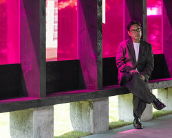 Jun 06, 2024
 May 29, 2024
 Mar 20, 2024
public art (617)
 Jul 26, 2024
 Jul 17, 2024
 Jul 12, 2024
 Jul 11, 2024
typography design (133)
 Sep 13, 2023
 Jan 24, 2023
 Jan 19, 2023
 Dec 09, 2022
PRODUCT LIBRARY
 Jul 23, 2024
 Jul 01, 2024
 Jun 13, 2024
 Jun 06, 2024