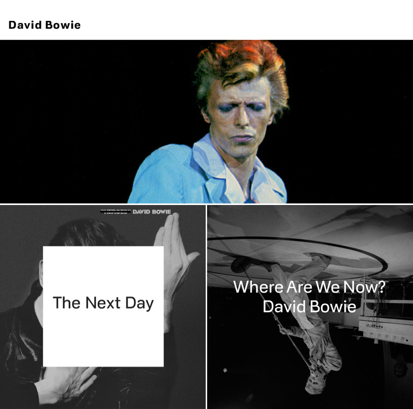
top: bowie website homepage, bottom left: album cover for ‘the next day, bottom right: artwork for the single ‘where are we now?’
jonathan barnbrook has designed a new website for david bowie along with the artwork for his single released yesterday and the forthcoming album ‘the next day’.
in a blog post on his website barnbrook elaborates on some of the design decisions behind the artwork for ‘the next day’, which sees new graphics placed over the top of the cover from david bowie’s 1977 album ‘heroes’.
‘we wanted to do something different with it – very difficult in an area where everything has been done before – but we dare to think this is something new. normally using an image from the past means, ‘recycle’ or ‘greatest hits’ but here we are referring to the title the next day. the “heroes” cover obscured by the white square is about the spirit of great pop or rock music which is ‘of the moment’, forgetting or obliterating the past.’
 left: original cover for ‘heroes’ right: ‘the next day’ artwork by barnbrook
‘however, we all know that this is never quite the case, no matter how much we try, we cannot break free from the past. when you are creative, it manifests itself in every way – it seeps out in every new mark you make (particularly in the case of an artist like bowie). it always looms large and people will judge you always in relation to your history, no matter how much you try to escape it. the obscuring of an image from the past is also about the wider human condition; we move on relentlessly in our lives to the next day, leaving the past because we have no choice but to.’
read barnbrook’s blog post in full – where he answers questions such as ‘why the white square obscuring the image?’ and ‘what is bowie like to work with?’.
 some of the various images shown on the homepage of www.davidbowie.com
in addition to the album and single artwork barnbrook have revamped www.davidbowie.com. the new site is intentionally minimal and works as an easy to use archive of bowie’s work both old and new. barnbrook explained his approach to the site to creative review:
‘we wanted to give it a completely different tone from before. this comes from bowie being somewhat quieter. people have had the chance to be a bit more thoughtful and reflective understanding his positioning in the history of music, and it would be disingenuous to pretend he is the new rocker in town, so the site reflects that. when you are someone like david bowie, you don’t need to shout. we wanted it to be a more definitive place to get bowie’s creative output.’


jonathan barnbrook previously collaborated on artwork for the sleeves of both heathen and reality and will also be producing the publicity material and book that will accompany the david bowie exhibition at the V&A, march 23 – july 28.
david bowie (11)
 Jul 01, 2022
 Jul 12, 2019
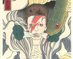 Jun 20, 2018
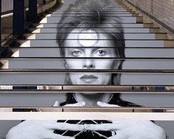 Apr 24, 2018
 Apr 07, 2018
jonathan barnbrook (3)
 May 21, 2010
 Aug 07, 2008
PRODUCT LIBRARY
 Jul 23, 2024
 Jul 01, 2024
 Jun 13, 2024
 Jun 06, 2024