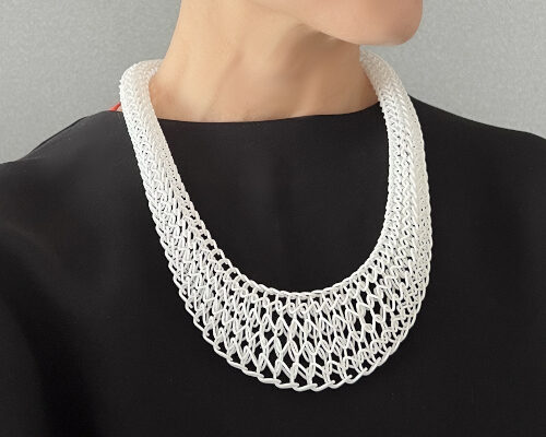

how bethan laura wood uses the impact of color to create fantastic worlds
the designer talks her travels, her attention to bank counter laminates, her relationship to color, and how its come to define her approach to design.
bethan laura wood on color and material
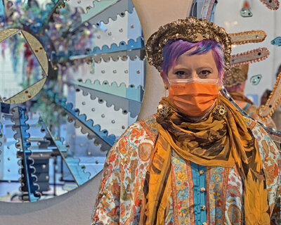
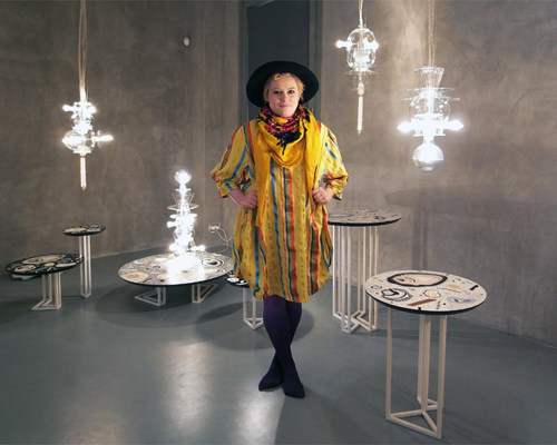
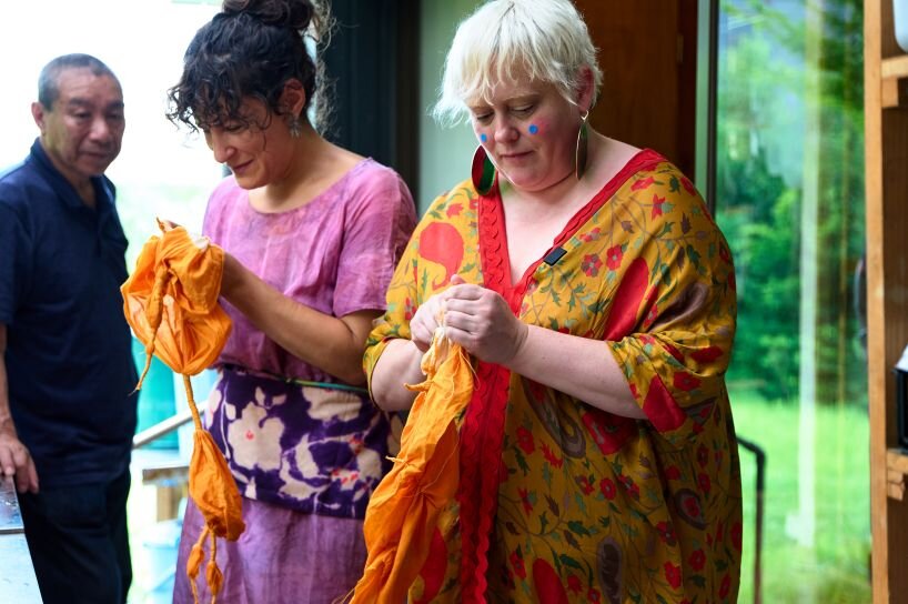
When Bethan Laura Wood comes to mind, the two colorful dots that adorn her cheeks are the first thing one may recall. They give her a sense of whimsy that is instantly recognizable in all her works. When chatting with the designer whose color and pattern-soaked pieces have become a staple of contemporary design, it becomes clear that her work is grounded in a rigorous technical and cultural curiosity. Her interest in laminates had her laser focused on the interiors of banks. While travelling, she was keenly attuned to the types of crates used to carry fruits in each country. In conversation with designboom, Wood reveals her approach to design, discussing how her sensitivity to color and material has come to define her work.
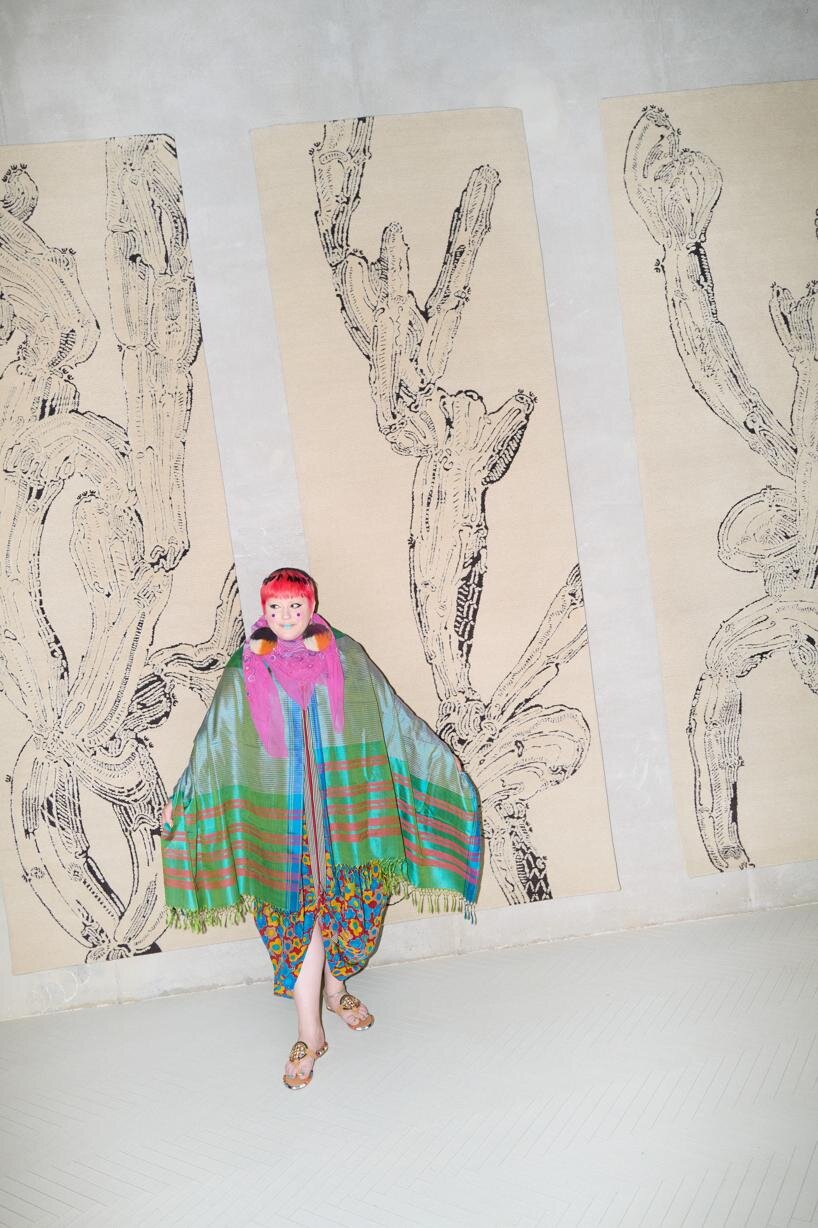
in conversation with bethan laura wood
designboom (DB): A difficult question, but do you have a favorite color at the moment?
Bethan Laura Wood (BLW): All colors are equally beautiful and wonderful. That’s my diplomatic answer around that.
I like colors in combination, so I really enjoy when more than one color is used. I like green as a color. There’s a particular type of green that’s kind of mint latte that I like a lot. I don’t always find that it’s the easiest one to work with. There’s other colors I work with more because they work well in combination. But in general, I’m not one to be restricted to just one color. Life’s too colorful for that!
DB: Do you find that you go through color periods?
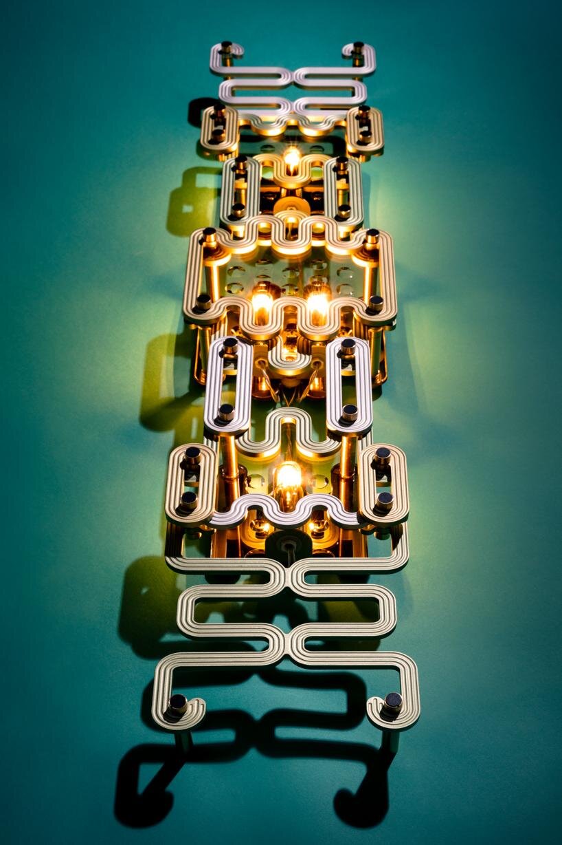
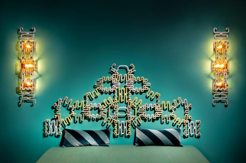
BLW: Yeah, that’s definitely something that you can see within my work, but I also choose to roll with that a bit. Some of my first work I made based on London has a particular palette that’s more connected with the UK, more grays and pastels.
When I first went to Mexico, it had a huge impact on the palettes that I work with and my understanding of complexity of color, like the use of stronger colors as a main color rather than as an accent. My palette definitely shifted a lot post-Mexico. Lots of cities and places have influenced me color-wise or I’ve specifically designed color palettes around them.
For the latest projects for the Uzbekistan Art and Culture Development Foundation (ACDF) installation in Milan, I specifically built a color palette for them. This did have some of my favorite green, well not actually my favorite green, but one that was connected with a green that I found while working there. Their very particular warm orange tone: those for me was the Tashkent lemons, which are these really beautiful flavorful lemons that are quite orangey in their color palette.


radical softness and wood laminates
DB: This month we’re exploring the theme of ‘radical softness’ which can be described as the power of emotional vulnerability, so we were naturally drawn to your sensitive use of colors and materials. Do you remember a moment where you really caught your stride in your aesthetic?
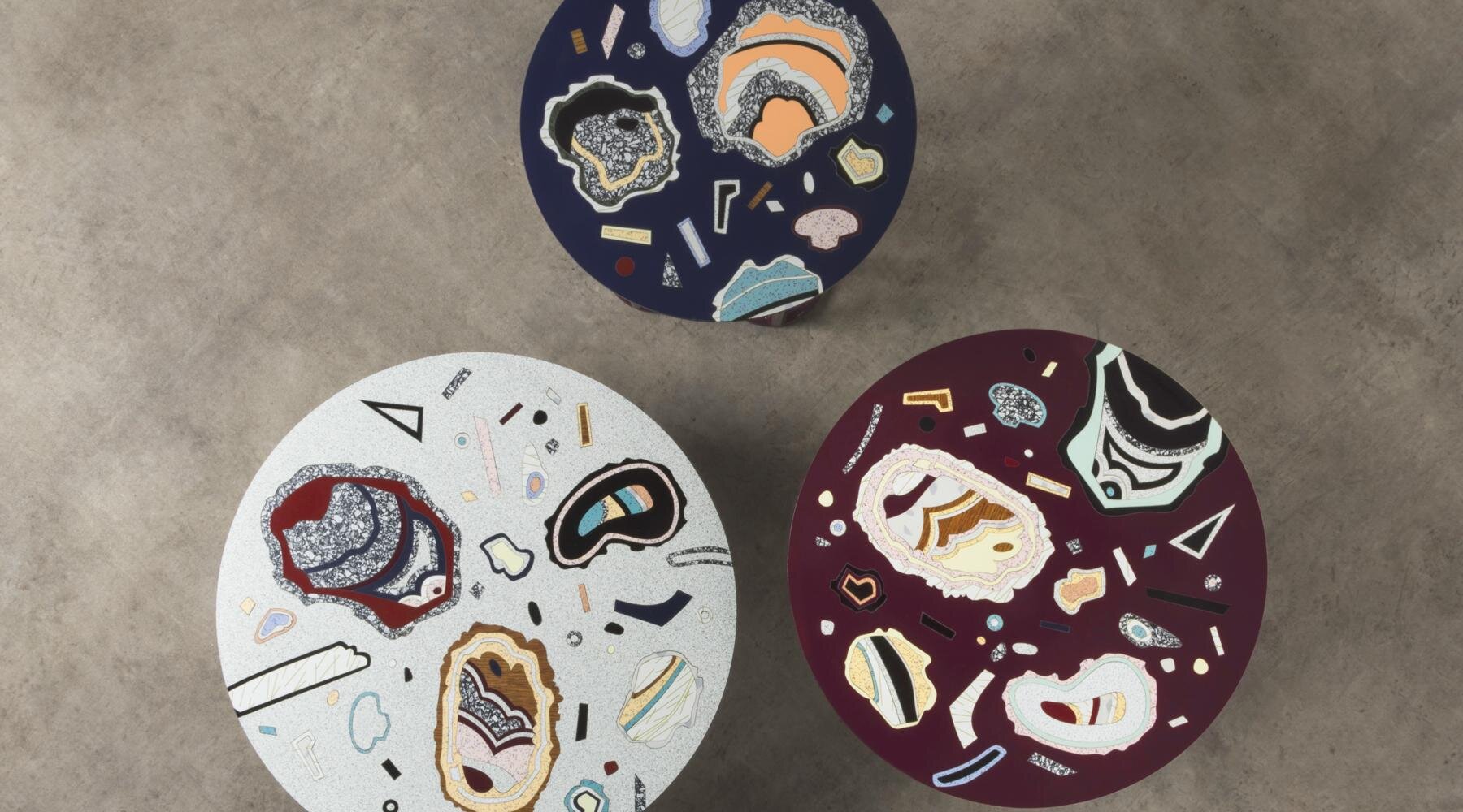
BLW: When I figured out how to work with laminates, that was a really big thing. I’ve been obsessively photographing what I would call ‘public patterns’ and collecting this mashup of patterns I would see from markings on the street to marble on the walls of a launderette to edge veneers in a bank.
I was interested in why certain a bank would go for a hardwood veneer while another would have an edge that pretended to be a plywood – and what that would mean! I was really fascinated with these surfaces that we see as being, well just surfaces. But in actuality, it goes really deep into how we connect emotionally with a space and why certain materials or choices are made.
I realized that I could work with laminate by putting it in conversation with itself. When I did these tests and realized like I could do this marquetery with it, that really opened up this way to celebrate and work with all these existing patterns while also adding a layer of pattern that came from my digestion of it.
It wasn’t just taking these patterns and just like making a mashup. There was there was an editing or a re-making of a different conversation between them by the proportionality of how I used them. You would notice more one laminate that has a slight texture over one that’s say matte or high gloss because, when you put them next to each other, you really see these subtle differences.


mexico city and an evolving design language
DB: You’ve mentioned that Mexico and Mexico City have had a big impact on your design language.
BLW: The stars aligned! I won the W Hotels Designers of the Future Award at Design Miami/Basel [in 2013]. W Hotels sent each winning designer to a different city where they were developing or refurbishing a W Hotel so, potentially, whatever you made could go up in the hotel.
I was very happy they sent me to Mexico. I had an introduction to the city, and at the time, the wonderful designer Fernando Lopos was interning at my studio (I taught him everything he knows about marquetry!) The timing worked out perfectly because he was also going back to Mexico to see his family during the same period. I got to go to Mexico for the first time and have someone like Fernando, who is so enthusiastic about Mexico and Mexico City and so knowledgeable about the history the different art movements, to show me around.
While in the city, I was being asked to make a body of work with the brief: what happens when local is global and global is local. I was looking for a local producer that I could connect with another artisan that I’d work with during a residency just before. I love this idea of working with two people, very specifically local, but in this global soup.
It was really also my first time really outside of Europe. I’d been to Italy, which has a different palette. Especially Venice has a very particular, almost faded palette. But it’s really different when you suddenly go outside of Europe and realize there is a whole world that has different views on color. It’s amazing to go and learn from different ways of seeing and living with color.
soft projects in the future
DB: What are your next projects? Are any of them particularly soft?
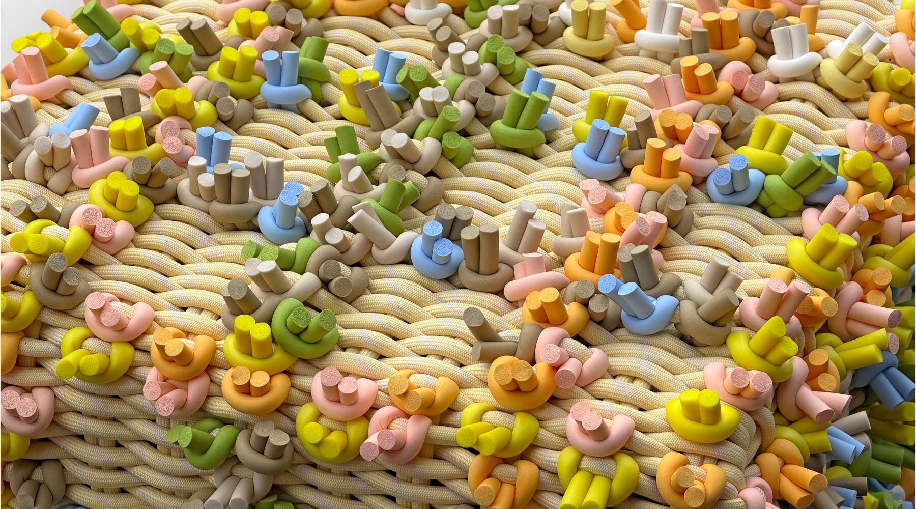
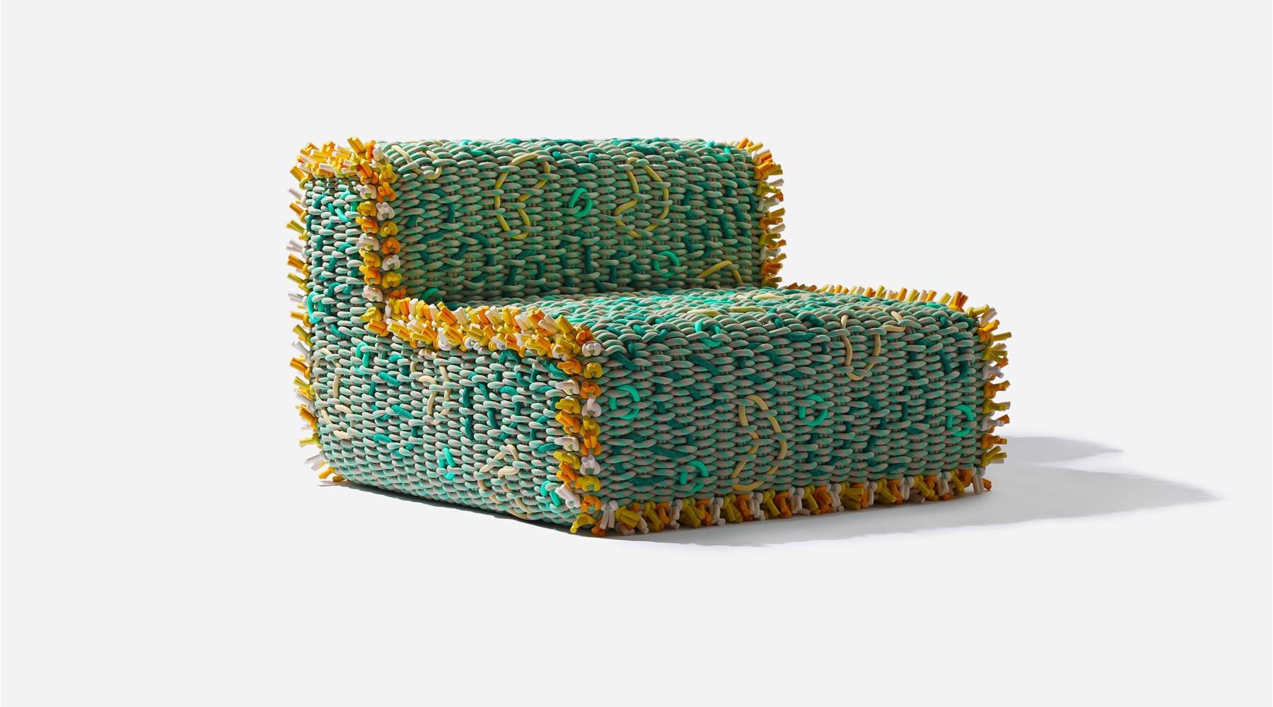
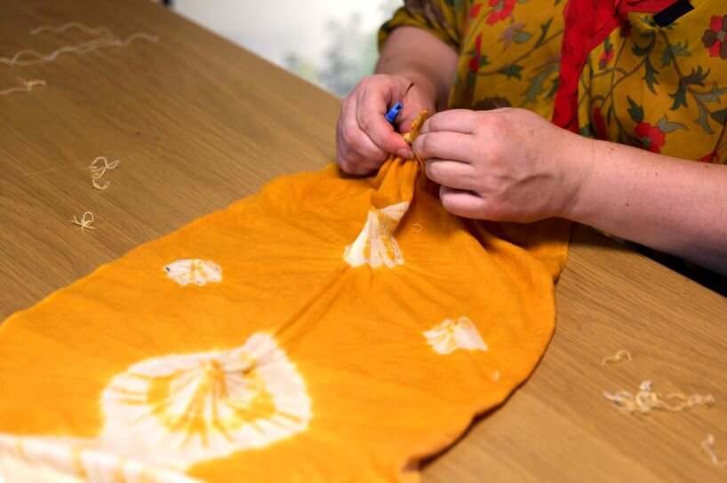
BLW: I’ll have some launches I Japan. I will be launching the Craft x Tech, a collaboration with Hiroyuki Murase from Suzusan, a shibori dying company. I’ve also designed a pop-up for Serapian, which is carrying on my collaboration with them that make these quite soft squishy bags.
project info:
designer: Bethan Laura Wood | @bethanlaurawood
shop
your own online design shop — no sales commission collected