

‘kvarner’ logo
the new visual identity for kvarner county tourism office has been developed by
advertising agency bruketa & zinic. throughout history, kvarner located in croatia
has been known as an intersection of four transport routes. according to bruketa & zinic,
the very name kvarner evokes this quadrant, navigational spatial orientation. this
is why the source of this visual identity proposal begins with the familiar symbol of the
wind rose, which also includes references to navigation, four-sided spatial orientation
and wind direction. this motif is then divided into simple geometrical visual elements,
their simple forms and colors creating a kind of ‘toolbox’ for further development of
the visual identity of the kvarner region and each one of its individual parts.
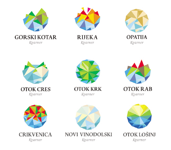
derivation of the kvarner logo for each individual parts of the kvarner region

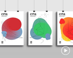
from initial concept images to final branding applications of the new identity
bruketa&zinic (8)
 Jul 04, 2021
 Jul 16, 2013
 Oct 29, 2011
 Sep 17, 2011
 Nov 13, 2010
PRODUCT LIBRARY
 Jul 23, 2024
 Jul 01, 2024
 Jun 13, 2024
 Jun 06, 2024