tile brand ceramic district’s premium-quality, german-made products explicitly address the needs of architects and interior designers, empowering the creation of first-class ceramic architecture.
special selection: ceramic district is a brand of the steuler tile group and explicitly aimed at architects and designers
a poetically shot video created by ceramic district features a sequence of scenes that present a peek behind the walls of a seemingly deserted production plant. natural raw materials such as clay, feldspar, quartz and kaolin are shown going through various manufacturing steps: being scooped up by an excavator, trickling off conveyor belts, flowing through chutes, getting mixed in huge drums, before being fired and finally piled into neatly layered stacks of finished tiles.
the product of high-quality german manufacturing, ceramic district’s material selection enables outstanding ceramic architecture.
in reality, of course, the production of ceramic tiles involves a variety of different people. ceramic district was launched in 2020 as part of the steuler tile group – one of germany’s largest manufacturers of stoneware and porcelain tiles, with its origins in mühlacker in baden-württemberg and family-run for four generations. the know-how of the steuler brands is backed by over 150 years of tradition. with a refined selection of authentic materials, ceramic district directly serves the needs of architects and designers, who are advised and supported in their projects by the company’s team of experts.
the quarzsprung tile design captures the character of a glaze containing titanium dioxide, which is first applied in a viscous consistency and then fired. twelve reproducible patterns were selected for the collection
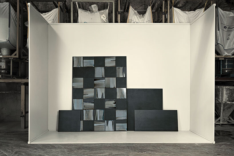
the latest additions to the product range are four interrelated yet individual collections – the first to be expressly designed for the ceramic district portfolio. in developing the collections, the company’s designers and ceramists explored and tested current technical capabilities in order to meet the highest quality – and design demands. each of the four collections features six-mm-thick porcelain stoneware that is processed and refined into serially produced one-off pieces.
with feuergold, for example, real 24-carat gold is digitally printed onto the tile. like a thin film, it overlays the anthracite-colored porcelain surface allowing the original texture of the tile to subtly show through. feuergold is intended for luxurious environments – hotels, spas or exclusive home interiors, where a touch of glamour is desired to make walls shimmer.
for streuwerk, there are four designs: square, mauresk, diamond and the floral pattern stil. customisation is also possible. available in 180×120, 60×120, 60×60, 30×30 and 15×15 cm
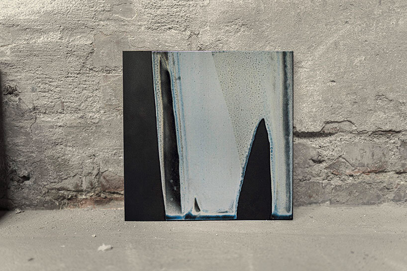
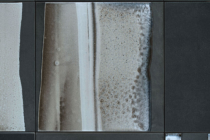
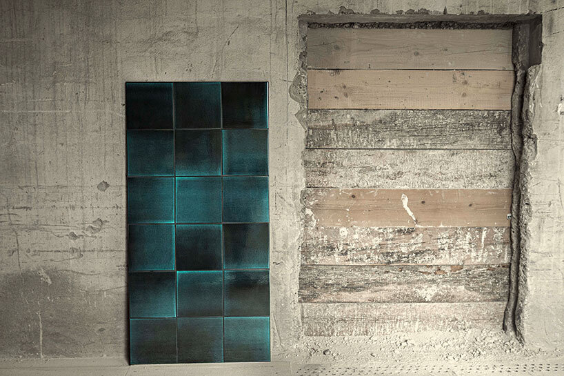
for the quarzsprung collection, the product developers borrowed a term from the production of ceramics. this refers to a critical moment during the heating and cooling of a ceramic mass – the quartz inversion point – when the crystalline structure of quartz changes and alters its specific volume. during production, this material behavior must be taken into account so that the object being fired does not develop cracks or fissures.
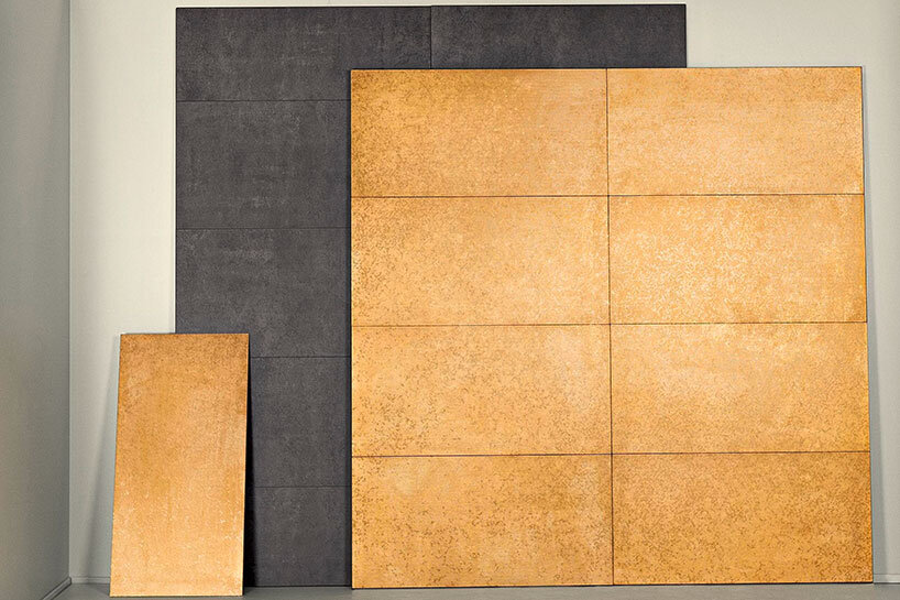
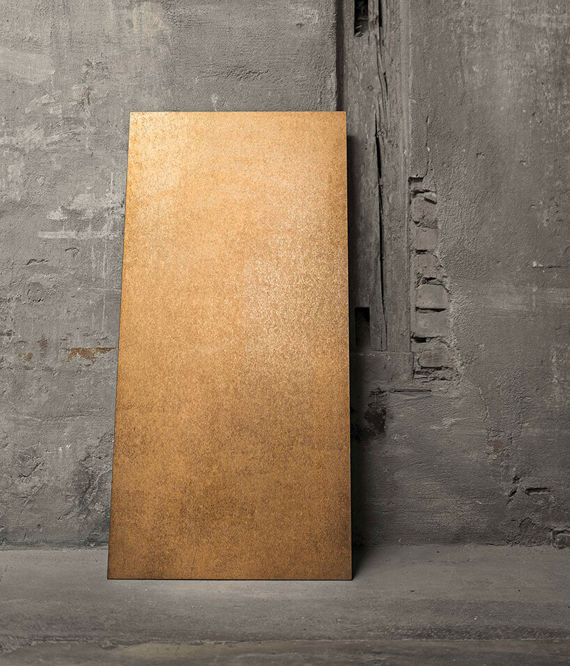
feuergold owes its name to the real 24-carat gold that is digitally printed onto it during production. the underlying texture of the porcelain stoneware tile still appears slightly. available in 60×120 cm
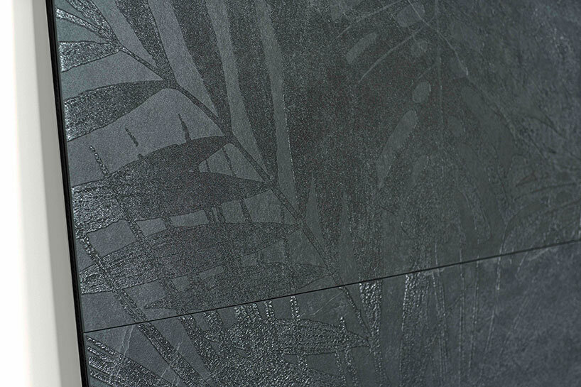
the chemical effect gives the collection its name, but the actual design mimics the flow of viscous glazes. ‘like the other tile collections, the design was created in a production context,’ explains stefan grimmeisen, head of the newly established ceramic district unit. a titanium dioxide glaze was poured onto an anthracite-colored background and then fired. the numerous trials resulted in twelve reproducible patterns. such surfaces are obviously difficult to simulate in a studio and even less so in graphics software. the twelve scanned motifs are digitally printed onto the 30×30 cm tiles and sealed beneath a glassy surface that protects them from mechanical and chemical impacts. slight irregularities such as small hollows and grooves are intentional details of the tile design, which was conceived for wall treatments. in combination with monochrome tiles in anthracite, the quarzsprung series offers an appealing contrast between imperfection and homogeneity.
the wabi-sabi collection has a very similar typology, but each piece is truly one of a kind. during production, a metallic powder is applied with a sieve, which sinks into a ceramic glaze and gets fired at over 1,000 degrees celsius. depending on the incidence of light, this results in uniquely nuanced shadings. three palettes were designed for wabi-sabi, whose tiles can be used in a monochrome color scheme or combined with one other. here, too, small irregularities are intentional, changing color depending on the perspective and incidence of light, with random structures creating captivating tiling layouts.
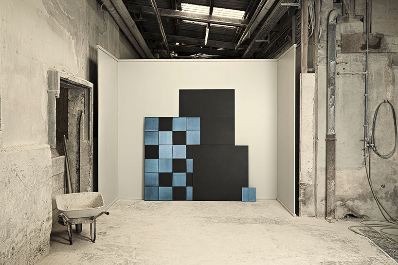
in japanese, wabi-sabi stands for the imperfect. the tile series named after this aesthetic concept does not practice perfection either, but rather allows colors and structures to change depending on the incidence of light
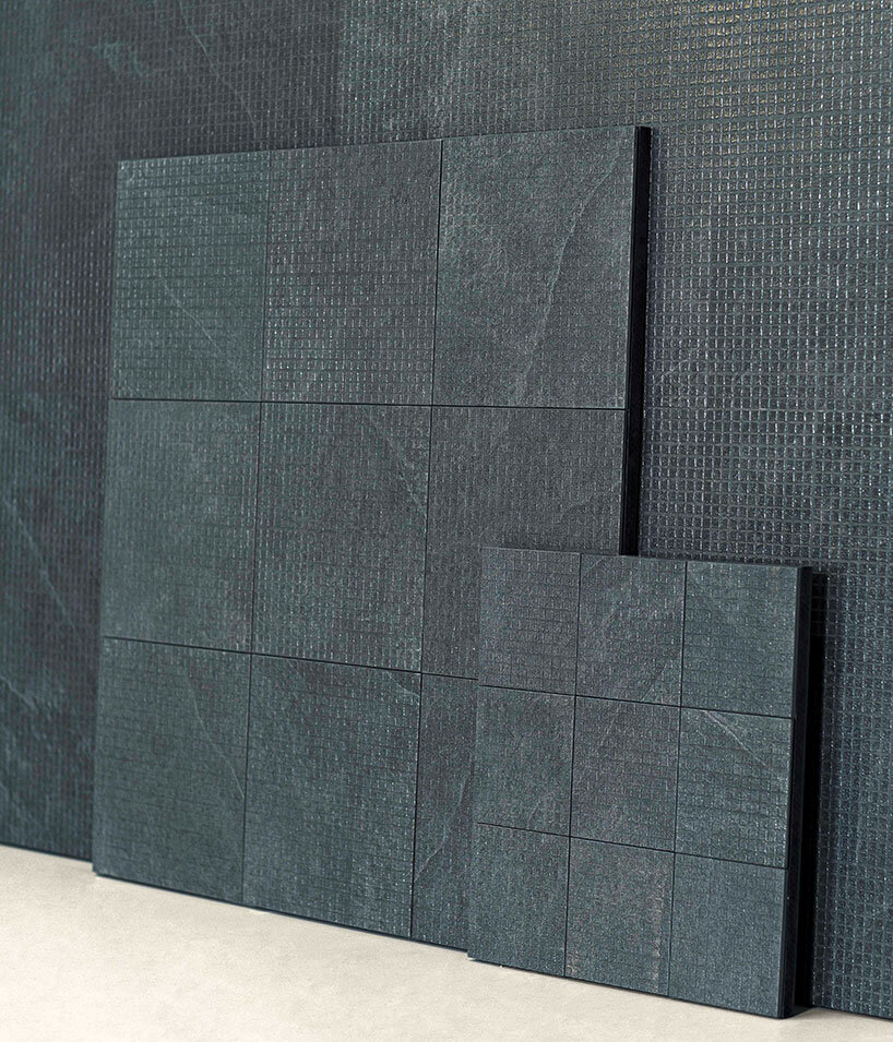
the most contemporary-looking design is the streuwerk series. it is also the most versatile of the four collections. like all collections, it is produced to order and can be easily customized. during production, a fine glass granulate is applied to the pieces, which melts into a pearly, semi-transparent relief pattern during firing. the designers at ceramic district have developed a floral motif as well as three graphic patterns, and can also execute customer-specific motifs upon request. the three-dimensional surface not only generates an elegant reflection of light, it also serves a tactile function if required. ‘for example, attention markings can be integrated on the floor in front of stairways,’ says stefan grimmeisen. in addition, streuwerk is slip-resistant, is suitable for wall and floor installation and comes in five combinable formats.
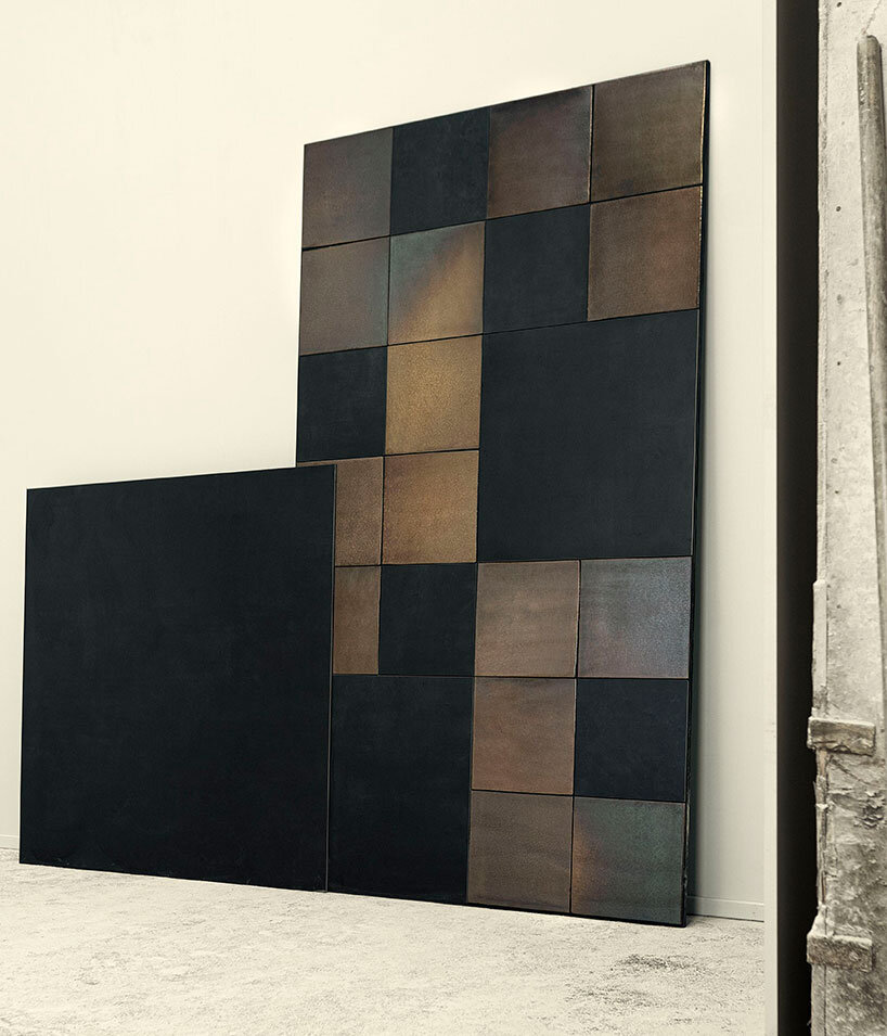
wabi-sabi is available as 30×30 cm tiles in three colors: jade murrina, french blue and vulcano black
‘poetry is truth dwelling in beauty,’ scottish poet robert gilfillan once wrote. ceramic district’s beauty is clear, while truth, in keeping with the message of the short film, can be found in the archaic: in manufacturing processes that still survive today, as well as in raw materials that are, for the most part, sourced regionally.
guest feature by markus hieke / architonic
CERAMIC ART AND DESIGN (152)
 Apr 15, 2024
 Mar 27, 2024
 Mar 11, 2024
 Feb 20, 2024
 Feb 14, 2024
PRODUCT LIBRARY
 Apr 15, 2024
 Apr 12, 2024
 Apr 04, 2024
 Mar 21, 2024