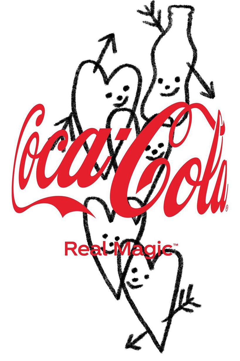
THE NEW COCA-COLA LOGO HAS AN INVISIBLE BOTTLE
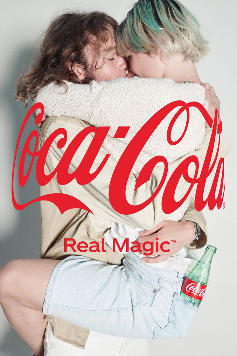
coca-cola has unveiled a new tweaked logo featuring its world-renowned logo wrapped around like an invisible hug. the new design is part of the first new global brand platform for the coke trademark in five years. dubbed real magic, this new brand philosophy is rooted in the insight that ‘magic lives in unexpected moments of connection that elevate the everyday into the extraordinary.’
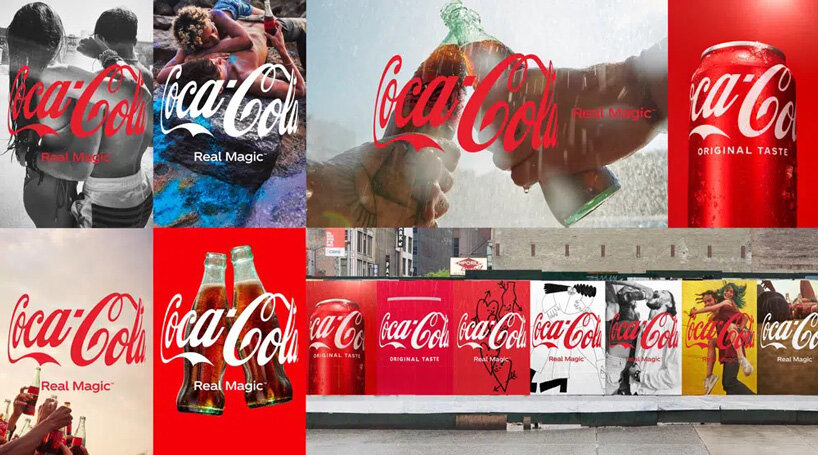
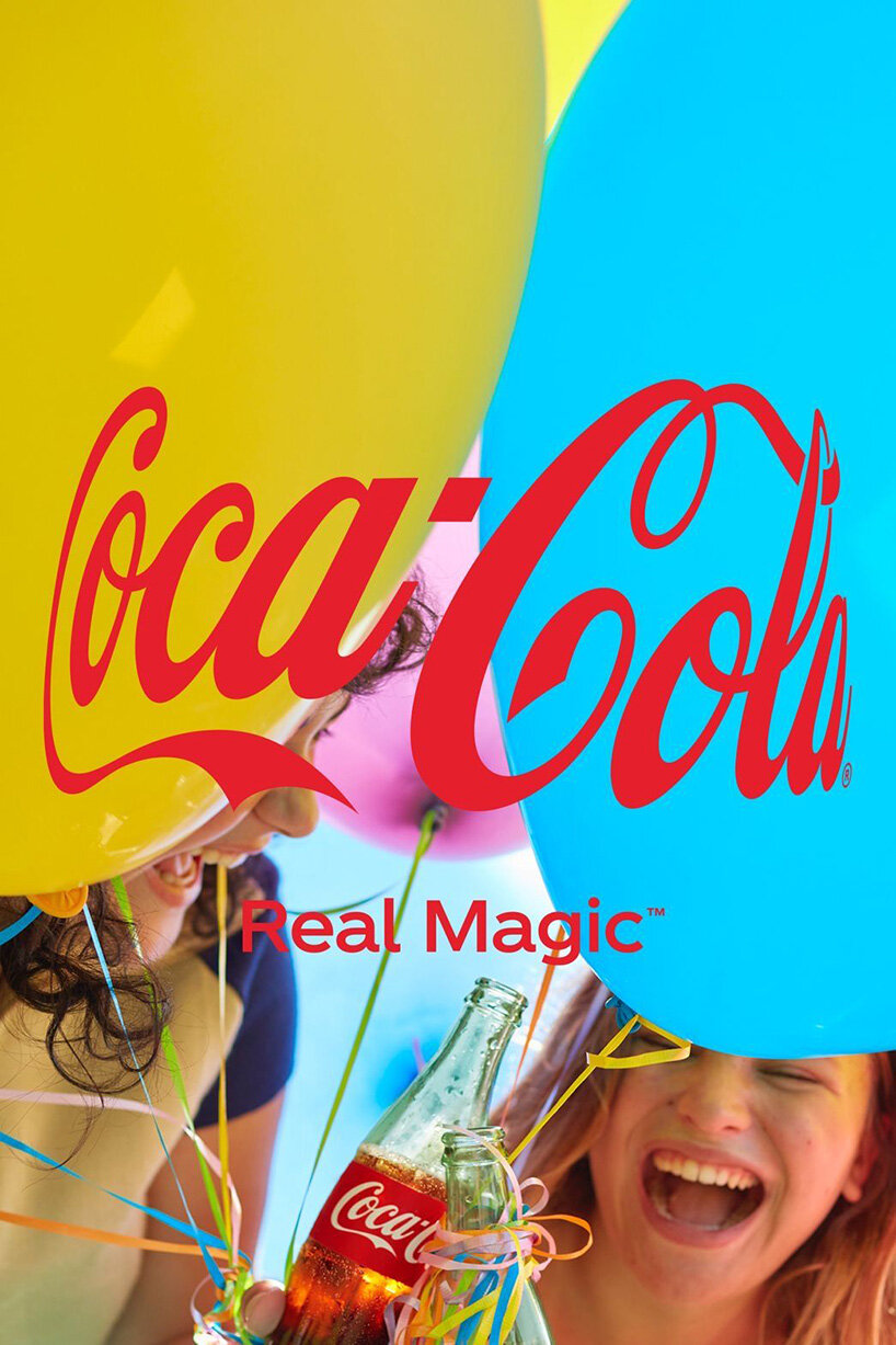
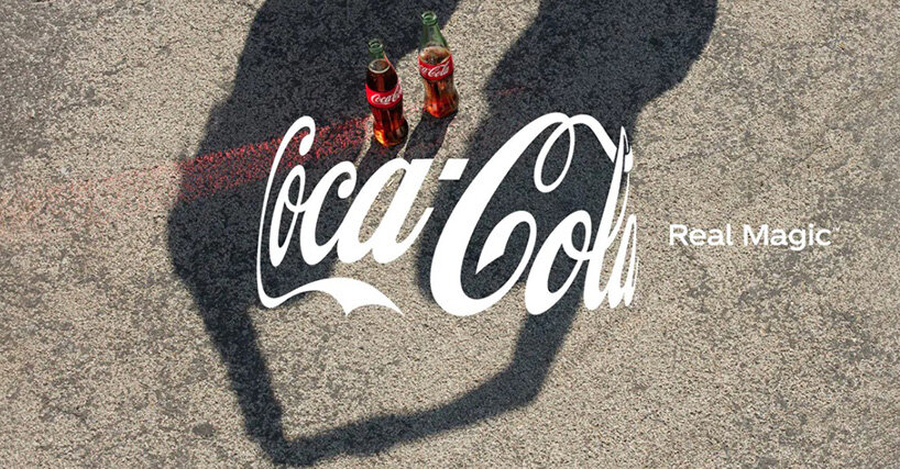
the real magic platform includes a new design identity for the coke trademark, including coca-cola, coca-cola light/diet coke, and coca-cola zero sugar.
images courtesy of coca-cola
THE REAL MAGIC PLATFORM INCLUDES A NEW DESIGN IDENTITY FOR THE COKE TRADEMARK
‘we’re at an inflection point,’ said manolo arroyo, chief marketing officer, the coca-cola company. ‘the last 18 months have disrupted every aspect of life and presented us with a once-in-a-generation choice to go back to a binary, black-and-white way of seeing the world or help make the world a better place. ‘real magic’ is about creating a movement to choose a more human way of doing things by embracing our unique perspectives.’
the new campaign was created by wieden+kennedy london
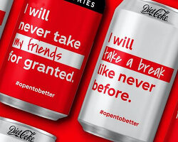
coca-cola’s new hug logo is inspired by iconic coca-cola packages wrapped with the company’s signature trademark and was conceptualized by wieden+kennedy london. coca-cola also engaged KnownUnknown, a global network of independent talent, to craft the visual identity, including all photography, animations and illustrations. in addition, a group of photographers, artists and illustrators will bring the real magic concept to life. their different styles will provide a variety of campaign imagery, with some artists creating more realistic depictions and others offering more abstract variations.
‘this is the most diverse visual representation of the coca-cola brand in our history,’ said rapha abreu, global vice president of design, the coca-cola company. ‘it is diverse not only in the creatives who helped bring ‘real magic’ to life and the people featured in the work, but also in the different photography and illustration styles, colors and treatments used.’
the new logo gives the impression of a hug, the way it wraps around the bottle
coca-cola claims that the goal of the real magic campaign is to increase the coca-cola consumer base through an ecosystem of experiences anchored in consumption occasions, such as meals and breaks, and merged with consumer passion points like music and gaming.
the new logo is part of coca-cola’s real magic platform
‘real magic’ is not just a tagline. we see it as a philosophy that transcends advertising and embodies all that is special about the brand,’ arroyo concluded. ‘it will serve as our north star by shaping all expressions of the coca-cola trademark in its next chapter.’
their different styles will provide a variety of campaign imagery, with some artists creating more realistic depictions and others offering more abstract variations
project info:
name: coca-cola real magic campaign – coca-cola new logo
designed by: wieden+kennedy london
coca cola (27)
logo design (245)
 Jul 03, 2024
 Aug 14, 2023
wieden+kennedy (15)
 May 11, 2021
 Apr 23, 2021
 Sep 11, 2020
 Jun 01, 2020
PRODUCT LIBRARY
 Jul 23, 2024
 Jul 01, 2024
 Jun 13, 2024
 Jun 06, 2024