KEEP UP WITH OUR DAILY AND WEEKLY NEWSLETTERS
running between february 6th and 22nd, the games double as a fashion platform, as athletes wear their sportswear symbolizing their national identities.
connections: +310
as designboom evolves into a creative studio, designboom needs a lab senior editor to manage our branded and organic campaigns.
each chair reflects an individual child’s input and imagination.
connections: +910
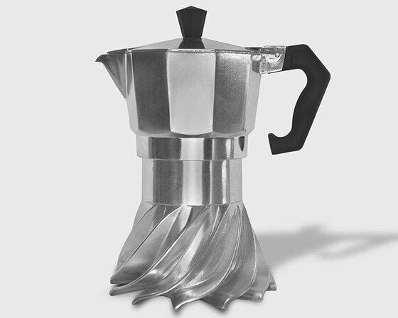
the spiral structure follows principles of fluid dynamics and thermodynamics to optimize heat distribution.
connections: 95


