‘CRTA’ visual identity was created by using artificial intelligence
the students wrote out the name of the institution in their own handwriting, used as input for AI.
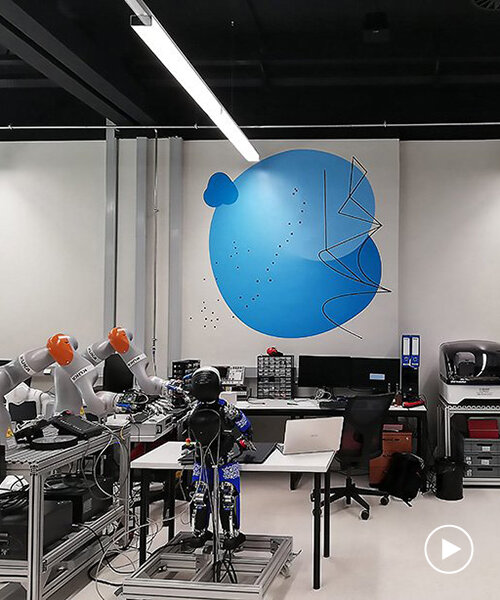
CRTA is a regional center of excellence for robotic technology within the faculty of mechanical engineering and naval architecture at the university of zagreb, croatia. the faculty is responsible for innovations such as RONNA, a robotic system for neurosurgical applications. the ‘CRTA’ visual identity was developed by bruketa&zinic&grey design agency using artificial intelligence (AI).
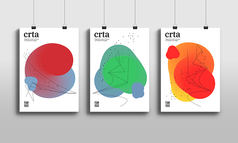 all images courtesy of bruketa&zinic&grey
visual identity applications
students wrote out the name of the institution in their own handwriting, used as an input for AI. the information obtained was processed, resulting in a variety of visual data that provided a basis for visual identity. in croatian, the word CRTA means line. mathematically, it is defined as a set of points in a plane. bruketa&zinic&grey, relying on representations of the concepts contained in the abovementioned definition, point, line and plane, played with the data inputs created by AI.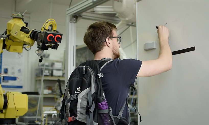 students handwrite the word ‘crta’
the underlying principle of the first element, inspired by point, was the neuron network, an array of interconnected points. the initial C was transformed into a dotted trajectory, thickened randomly to form axis Z, and eventually turned into a new 3D object. the second element, inspired by line, is based on a vector representation of the trajectory followed by the RONNA robotic arm during brain surgery. the third element, inspired by plane, came out of the augmented letter trace. the resulting visual identity is in an interplay of various combinations of the abovementioned elements.
‘the visual representation of the concepts contained in the definition of the word line is a symbolic representation of the process of growth i.e. the trainings provided to the center’s beneficiaries. it is a bridge between the individual – a student or a scholar – and their professional surroundings – be it a corporate, education or academic system, for that matter’ says borjan pavlek, a designer at bruketa&zinic&grey agency.
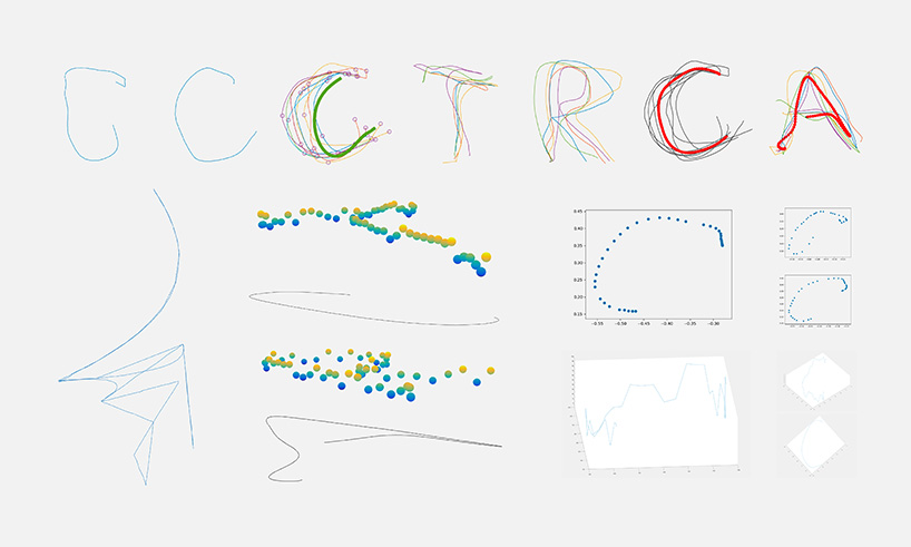
the information obtained from the students’ handwriting was processed, resulting in a variety of visual data that provided a basis for visual identity
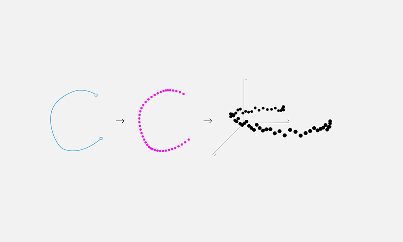
the initial C was transformed into a dotted trajectory
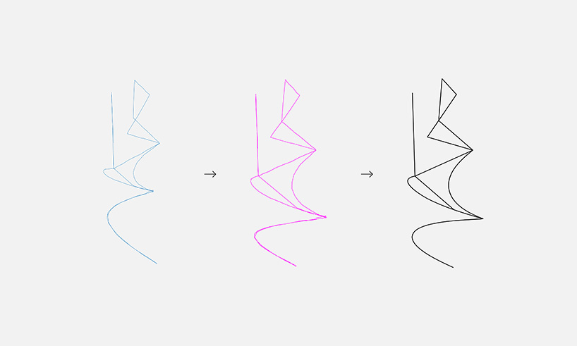
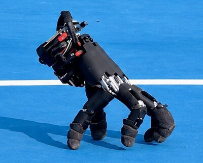
the second element inspired by ‘line’, is based on a vector representation of the trajectory followed by the RONNA robotic arm during brain surgery
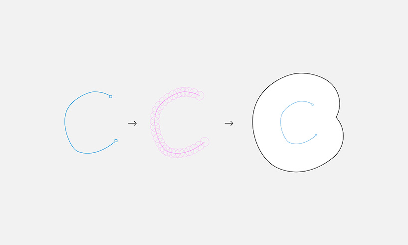
the third element, inspired by plane, came out of the augmented letter trace
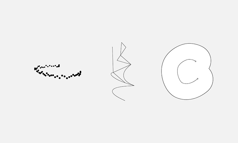
the resulting visual identity is in an interplay of various combinations of the abovementioned elements
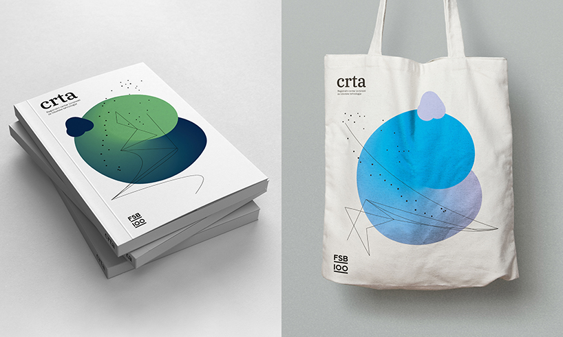
visual identity application
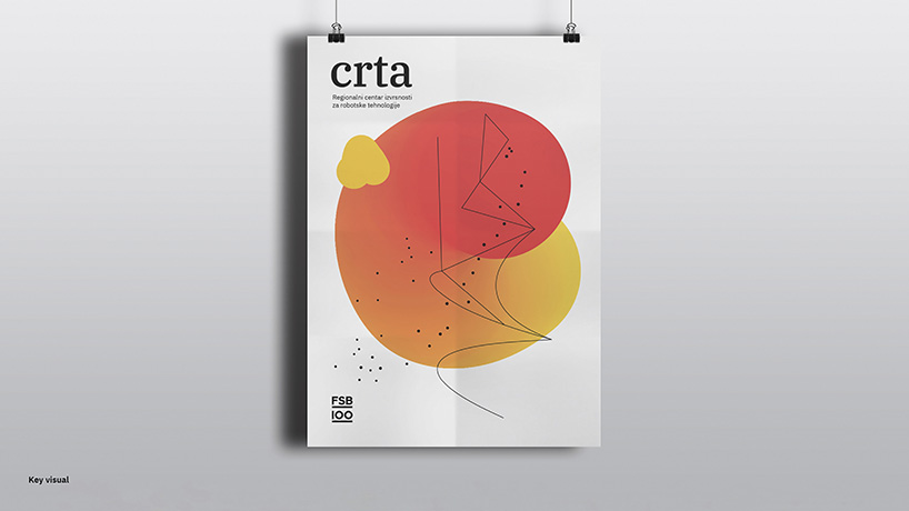
visual identity application
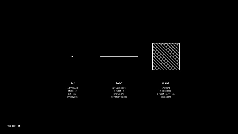
the training provided to the center’s beneficiaries
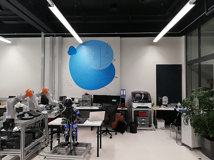
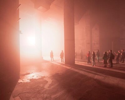
visual identity applications in the faculty’s space
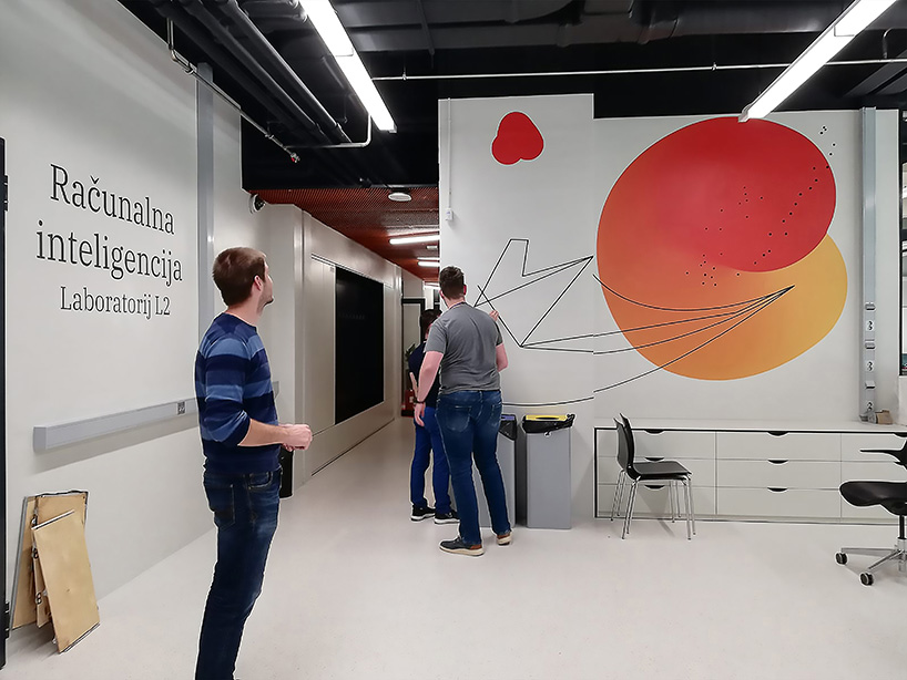
visual identity applications in the faculty’s space
project info:
name: CRTA
design agency: bruketa&zinic&grey
designer: borjan pavlek, bruno bolfan
creative director: davor bruketa
account director: dina borosic
account manager: barbara busic faculty of mechanical engineering
naval architecture: bojan jerbic, marko svaco, filip suligoj, bojan sekoranja and josip vidakovic
designboom has received this project from our ‘DIY submissions‘ feature, where we welcome our readers to submit their own work for publication. see more project submissions from our readers here.
shop
your own online design shop — no sales commission collected