dalton maag launches its oscine font family
dalton maag reintroduces lettering originally intended for use in low resolution TV screens, now updated for technologies of the 21st century.
dalton maag launches its oscine font family
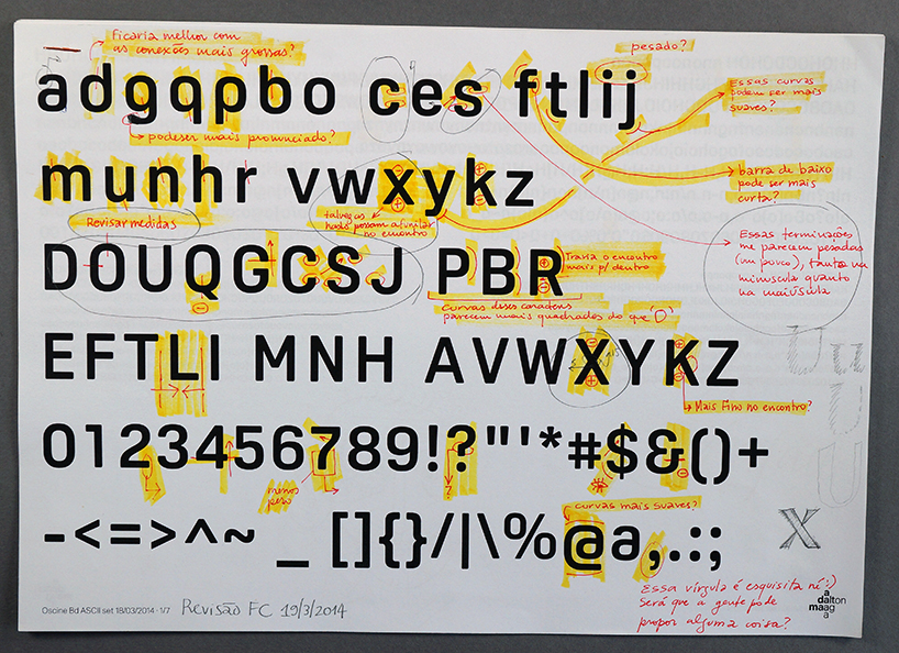
dalton maag updates the font ‘oscine’, originally intended for use in low resolution TV screens by bruno maag and ron carpenter. ‘oscine’ has been tweaked and optimised for today’s print and high resolution digital environments, and is now available in two weights, regular and bold.
‘the missing spurs on the lower case, in particular the ‘a’ are very unusual, but give the font a lot of character, which was the intention. oscine was originally designed for low resolution screen environment. with today’s improved screen resolution in mind this update has simply tightened up the design without changing the feel of the typeface.’ – bruno maag, chairman of dalton maag
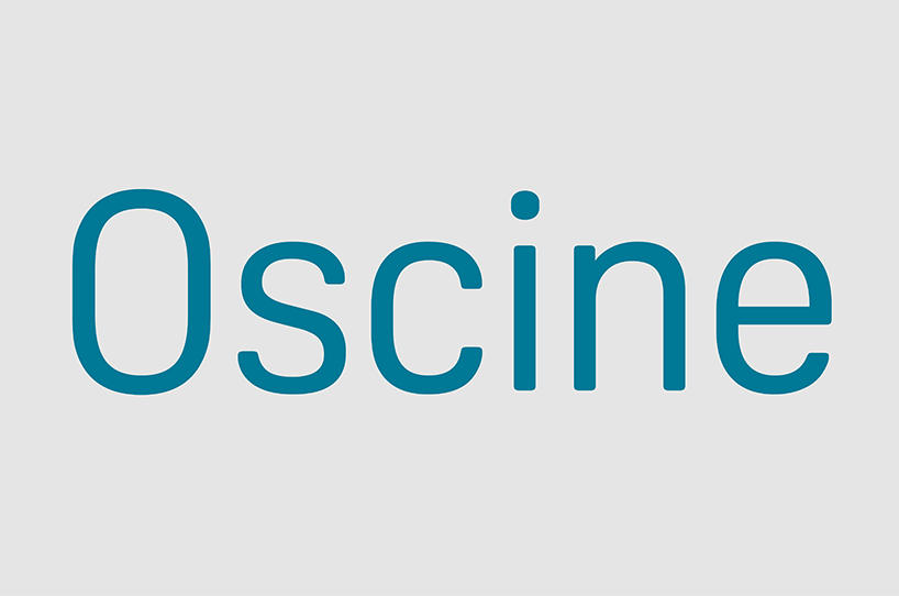
this new font family has a condensed feel and a geometrical design expression. it combines a highly unusual lowercase with more conventional capitals to achieve functionality with just the right amount of character. the differentiation between weights is subtle and carefully set for optimum on-screen impact and clarity at large sizes. the square letter shapes give oscine its basic style, and the corners of the characters are rounded to make this a more friendly design.
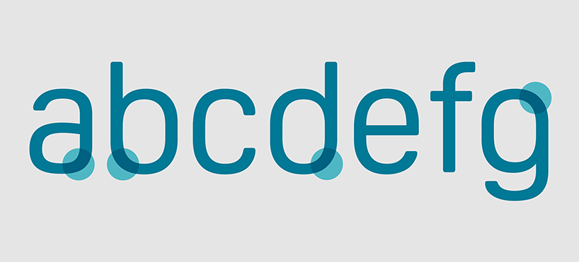
‘oscine has great potential for use in branding, display and advertising. in the lowercase, the missing spurs may not be what people are used to seeing, particularly in the ‘a’. however, this strong design feature, which some may say doesn’t 100% fit, is what makes it quite cool as a brand font.’ – bruno maag
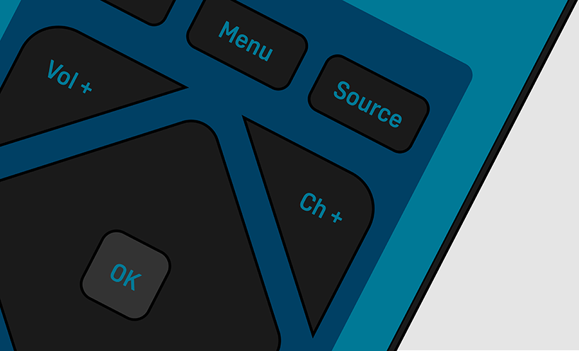
the condensed proportions and high x-height make it a perfect choice for wayfinding, while refined draughtsmanship, shortened descenders and a strong personality ensure its suitability for headlines and titles. an unconventional lowercase gives oscine its instant recognition factor. the characters are bold in their execution and the missing tails and spurs on selected letters (a, b, d, p, and q) render them delightfully idiosyncratic.
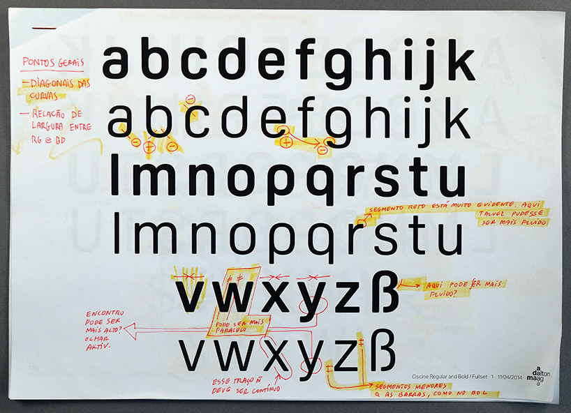
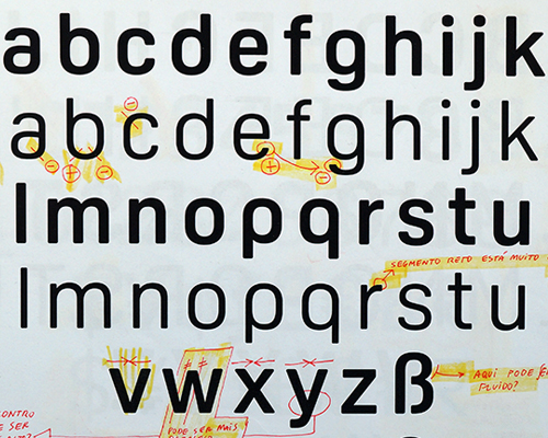
development of the oscine typeface
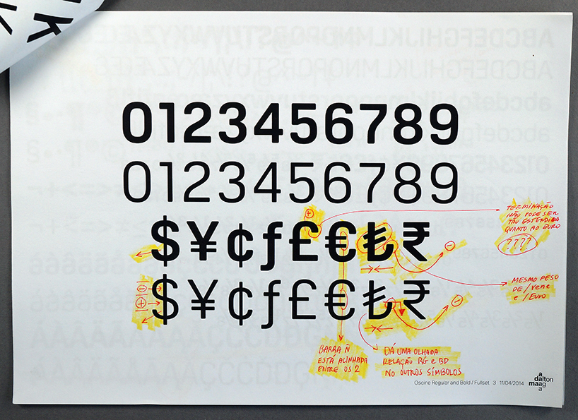
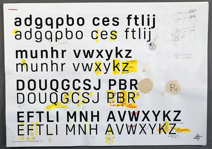
oscine is available to license from the dalton maag website and adobe typekit, fontshop, fontworks, monotype, myfonts, and other platforms.