daniel britton stunts reading ability with dyslexia typeface
all images courtesy of daniel britton
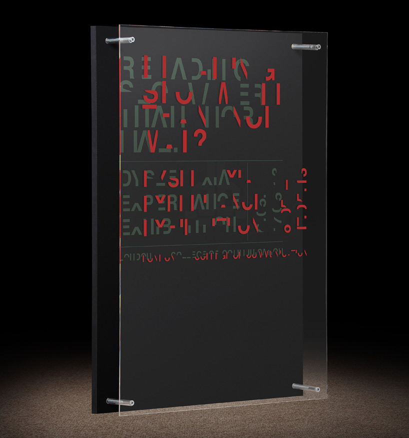
dyslexia is an everyday issue for british graphic design daniel britton. the condition — difficulty in the use and processing of linguistic and symbolic codes — affects on average one in ten in the UK. one of the most common learning disabilities, it is at this time still greatly misunderstood, and even more so miscommunicated. britton’s ‘dyslexia’ typeface attempts to show those without just how impairing it can be.
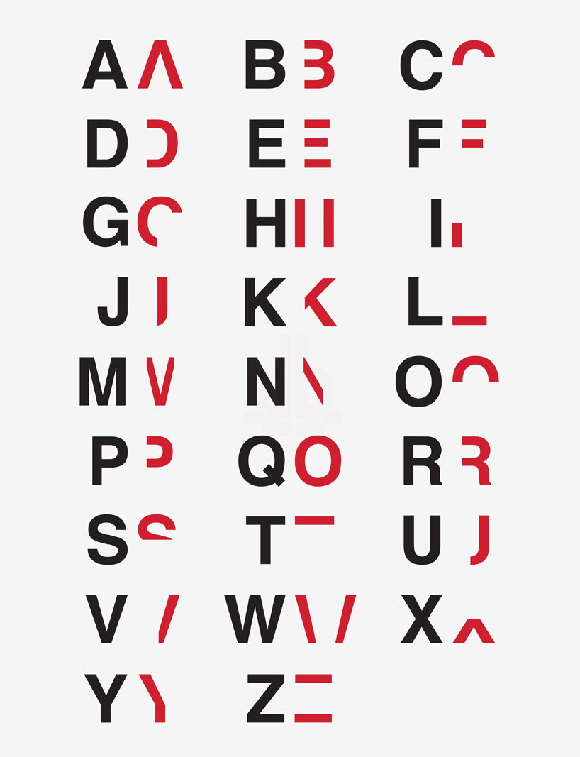
layer one and layer two (red) of the dyslexic alphabet
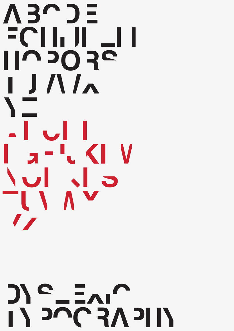
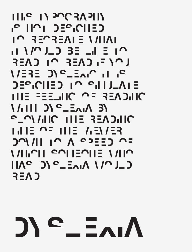
the typeface breaks down the reading time of non-dyslexics to roughly the same speed as someone who struggles with the issue. letters are split into two, with only one section provided at a time. in two-dimensions, reading any text is extremely difficult. in the third dimension, britton stacks both parts directly on top of the other. from straight on, the text is perfectly legible. however, a slight move to the left or right quickly confuses the words. by forcing the viewer to have to physically work to read a simple poster, britton hopes to convey the aggravation, stress, effort, and embarrassment that dyslexics face on a daily basis.
layer one sample text
3D poster from straight ahead

viewed from side
with steep viewing angle

deconstructing the alphabet
designboom has received this project through its ‘DIY submissions’ feature, which welcomes readers to submit their own work for publication. see more designboom readers submissions here.
edited by: nick brink | designboom
typography design (133)
 Sep 13, 2023
 Feb 23, 2023
 Jan 24, 2023
 Jan 19, 2023
PRODUCT LIBRARY
 Jul 23, 2024
 Jul 01, 2024
 Jun 13, 2024
 Jun 06, 2024