
— the following is an example of a lesson from the upcoming packaging course:
actualization – refreshing the look
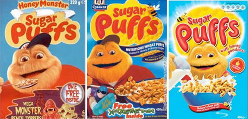 quaker’s sugar puffs have slowly become more simple in their image too. note the increased importance that milk is given as awareness to the cereal’s unhealthy sugar levels have risen.
marketers regularly monitor the health of their brands and track the impact of their advertising. but when it comes to packaging, major decisions to change or update a brand’s appearance are often made on the basis of intuition (’it feels outdated.’) or in response to competitive activity (’they changed, so maybe we should as well’). as a result sometimes packaging changes come several years too late, after the brand has already started to decline.
subtle changes you can continuously update brands without having to touch on the content and change in package graphics is usually very subtle. tinkering with the look of an existing product requires a careful, disciplined approach. often it will simply involve things such as: • color changes • new materials or container types • use of a more modern typeface • application of effects or filters (think of the web 2.0 trend) • new slogans (in keeping with social / consumer trends)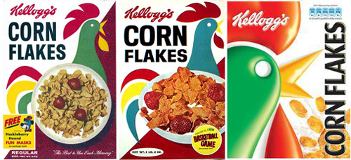 corn flakes UK packaging has undergone slight changes on a regular basis. in recent years they seem to have caught the web 2.0 ‘shiny’ bug.
broadening a product’s consumer base is one of the key motivations behind most package actualizing projects. many products have reached their ‘saturation point’ and are only being noticed by the original consumers they were targeted at. brands are also looking to win over the next generation – elderly buyers of long standing products like kellogg’s corn-flakes might not even notice the new shiny cockerel but younger buyers will notice the contemporary feel even if it’s only on a subconscious level.
progressive packaging the makeover of a packaging usually means a change only in graphic design. most companies are opt to alter the look of their packaging than switch to a new type of package. the number of basic container options for food and beverage products are rather limited, whereas the graphic design possibilities are not.
that said occasionally brands may be forced into following trends and utilizing new materials. recently a handful of brands have changed their core packaging for ecological purposes knowing that people are more willing to buy products which show some level of awareness on such matters. new package formats might also be launched due to the introduction of new portion sizes or unique selling points.
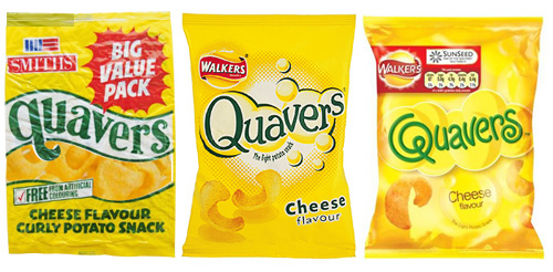 quavers potato chips from the UK have gone through a number of logo changes but their yellow pack remains the same. you’ll notice that as with the cereal packs – nutrition info is now stated clearly on the front of packaging.
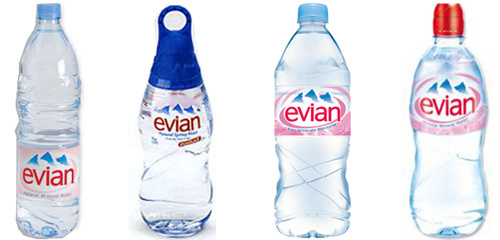 as well as promoting the brand through numerous special edition bottles each year, evian also changes it’s 500ml bottle’s form and label ever so slightly on a regular basis to keep it looking fresh and modern.
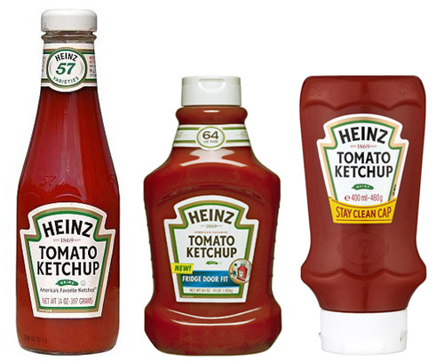
heinz have hardly changed their ketchup label, instead new bottle forms and materials helped keep the product fresh and rival newer brands through their long established success.
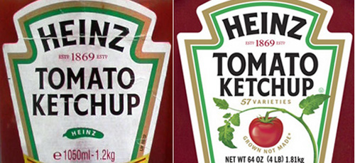 in 2009 heinz decided to replace the pickle that had been on their labels for over 100 years with something that is actually in the product: a tomato.
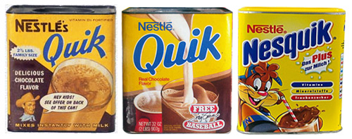 nesquik – evolution of the chocolate powder packaging
moving with the times if we look to the number of brands that have began to use supposedly sustainable packaging as a selling point over the value of their product we can begin to understand the role that image plays on sales.
the wave packages claimed to be made from recycled goods are often decoys to hide the fact that the products have been flown half way around to get to you. as designers it’s quite easy to see through the actualization of brands but that doesn’t mean that the methods employed by brands don’t work.
you only have to look at the number of brands jumping on the bandwagon to see that people are buying into the myth of a new greener brand all because of a slight change in their corporate message and packaging.
another trend that has greatly influenced rebranding and actualization of late is personal diets, just think back ten years or o when every chocolate bar was telling you how ‘rich’ or ‘lots and lots’ of sweetness they packed via bold strap-lines and chunky forms.
today you’re more likely to see the exact same brand boasting about it’s how ‘fun’ it is or that it should be consumed as ‘part of a balanced diet’, graphics becoming more organic and light in their feel. the change in product shots in the food market is also remarkable – whereas at one time sugary children’s cereal would have images of numerous children chomping the product down indulgently – now you’re more likely to see it surround by fruit and a jug of fresh orange juice.
refreshing package designs as a rule of thumb, companies should probably update their design every three to five years but we can see that companies are frequently tweaking their designs even more often. sometimes only a small adjustment is necessary, perhaps to reposition a product against its competition. in some categories, you really have to keep up with things on an annual basis- for example mineral water bottle labels change each year almost. if a brand is selling well and doesn’t look out of date changes in anyway are not advise – they can be a huge waste of resources and risk confusing or alienating the brand’s loyal customers.
häagen dazs in 1991 häagen-dazs underwent their first packaging update in the company’s 30-year history. the new graphics on all pints, quarts and novelties were designed to strengthen brand identity and unify the entire product line. extensive consumer research was used to find out which package elements should be kept and which ones should be changed.
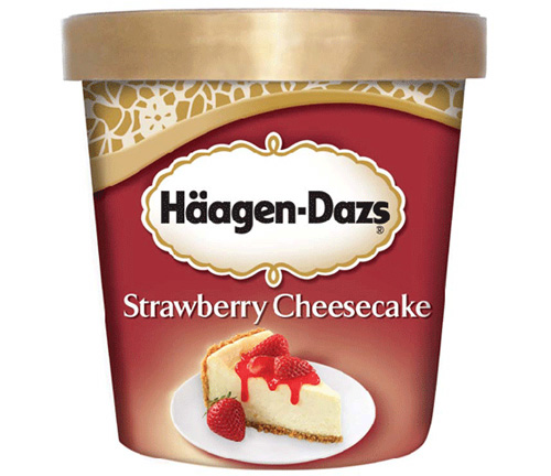
based on the research, häagen-dazs decided to eliminate the silver plate depicted on its ice cream novelty cartons. the plate was thought to imply a usage situation that was too formal and too specialized, they used a gold line drawing instead. häagen-dazs products at that time already appealed to a wider spectrum of consumers than they did several years ago, reason why the elitist silver plate image had to go.
coca-cola in 2006 the branding agency turner duckworth worked with the original coke brand to revitalize it’s image. their aim was simple: clarity. the firm distilled the brand to its essence. presenting it in a an unexpected way that hawked back to it’s original red and white color scheme and echoed originality instantly.
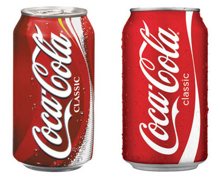
‘simplicity clarifies brand relationships, if something doesn’t add anything take it away’. their idea of coke was that it brings joy and using the iconic elements of coke: its hand-written logotype and bottle shape they plan to build on the idea of simple is best. after winning numerous design awards tuner-duckworth were invited to help coke develop other drinks in their range resulting in the biggest graphics clean up we’ve seen in some time and one that made all rival soft-drinks look old-hat and messy instantly.
pepsi pesi, coca-cola’s main rival has also undergone change recently. the brand underwent numerous small changes throughout the early 2000s with subtle graphic patterns applied to its cans and various hues of blue and red used. the brand has always sat in the shadow of it’s global competitor and the traits used to market their aluminum cans were often in a similar guise to what coke were doing.
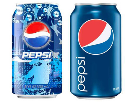
this didn’t stop when coca-cola launched a new brand image in 2006/7 when they simplified their branding – by 2008 pepsi had followed suit, only their new logo received more criticism than the obvious reasons for minimizing their drinks range. since the change sales have apparently been falling quicker than ever before – it might not be too long before we see some noise added back to the pepsi catalogue.
— exercise next time you visit the supermarket look for a package which hasn’t been refreshed in a while, and show us how you would update its image. remember you are ‘updating the look’ not re-branding it!
enroll for this course
— this course is now closed
DESIGN AEROBICS 2011 (12)
 Nov 10, 2010
 Oct 31, 2010 Oct 31, 2010
PRODUCT LIBRARY
 Apr 17, 2024
 Apr 15, 2024
 Apr 15, 2024
 Apr 12, 2024