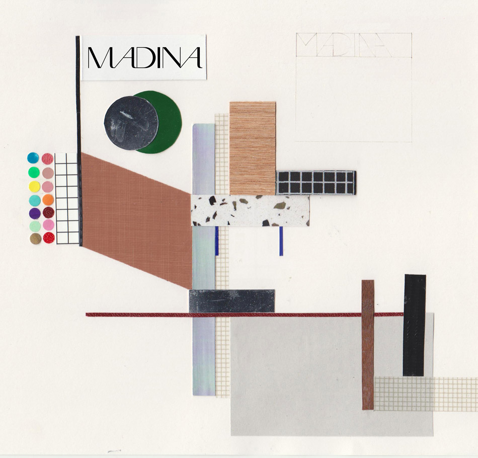
doshi levien’s rebrand of madina is not about intimidating glamour
just over a year ago london studio doshi levien was asked by italian make-up company madina, to re-envision the interiors for their stores. however, after initial talks and studying the company’s existing identity, the duo felt that the logo, packaging and product made-up the spatial aspects of madina’s retail outlets, and proposed to completely overhaul the beauty label’s image. designboom speaks to nipa doshi and jonathan levien about their collaboration with madina and the challenge they faced conceiving a spatial design that is at once sanitary, but inviting so that clients feel at ease; while proudly displaying a visual offering of the available products and treatments in a self-serving retail environment.
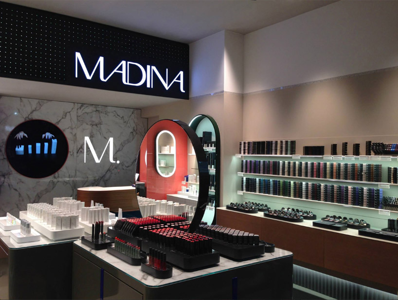
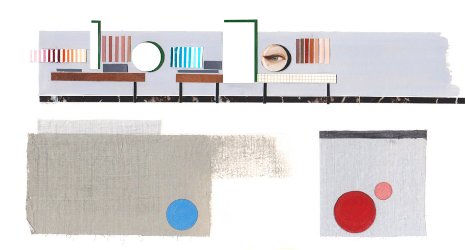
warm wood is employed in the cabinets while surfaces are realized in sleek marble
‘when you look at make-up and skincare, the product is really what is making the interior, so you can’t develop these two entities separately. we wanted to really be sure that if we did interiors for the brand, that the packaging and overall feeling of its merchandise was something that we were also involved in developing,’ says nipa doshi. ‘one of the most interesting things for me, is that they wanted a woman designer on board, which totally makes sense, because it is us who normally go to buy make-up and skincare items,’ she continues. ‘although most of us wear it, make-up essentially feels that it is not good for you, so there is that feeling that when you enter a cosmetics shop, you always feel that it’s a bit dirty – it doesn’t feel right for us [women]. it was very important to understand that older women who buy makeup are generally more concerned about their skin than 20 somethings. the madina brand brings together makeup and skincare and our aim was to express an identity that is not intimidating, but more natural and authentic, yet quintessentially modern. the authenticity had to reflect itself not only in the product, but one’s experience of the space where it is displayed. I think we brought a lot of our experience in working with product, interior and furniture into the new brand and stores in terms of materiality, creating something that is contemporary without being patronizing.’
the colors of the products are on the packaging, so when stacked the create patterns within the store interior
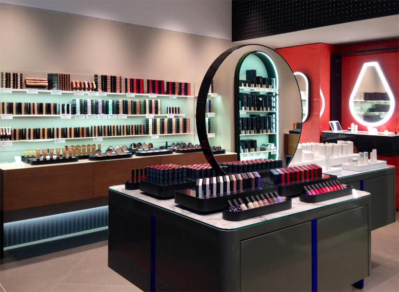
typically most make-up stores are conceived as basic black or stark white interiors that are often harsh and a bit bleak in terms of atmosphere. with their overall scheme for madina, doshi levien had an aesthetic of warmth and precision in mind. the bespoke counters and display furniture have been realized in wood, with marble surfaces evoking a sleek cool finish in contrast. in addition, the packaging of the make-up is not a hard black as is normally seen, but rather a slightly warmer tone that is reminiscent of stone, thus expressing the sense of a more natural environment. jonathan levien elaborates on the layout of the store and the goods within:
‘the first objective we had was to remove the clutter that you find in nearly every cosmetic store – little boxes with foundation that have cracked bottoms. they’re smudgy and dirty, and seem almost as if someone hasn’t really considered the material implications of what the shelves are built of. we imagined a scenario where all of the store testers are presented on trays, almost like a feast; or a nicely laid out table where everything is out on these platters. wherever you are in the store, a member of staff can easily pick-up one of those trays and bring you a selection of foundations, or blushes…‘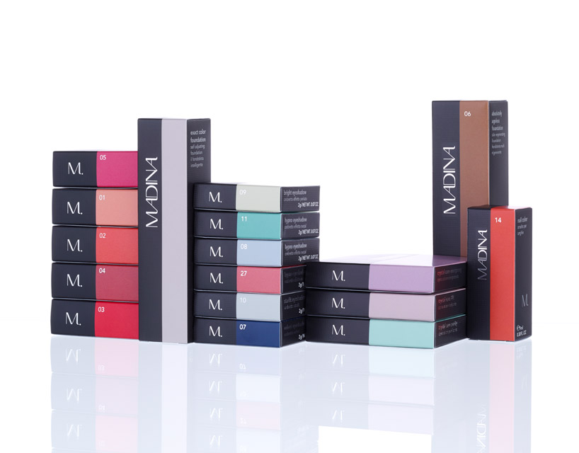
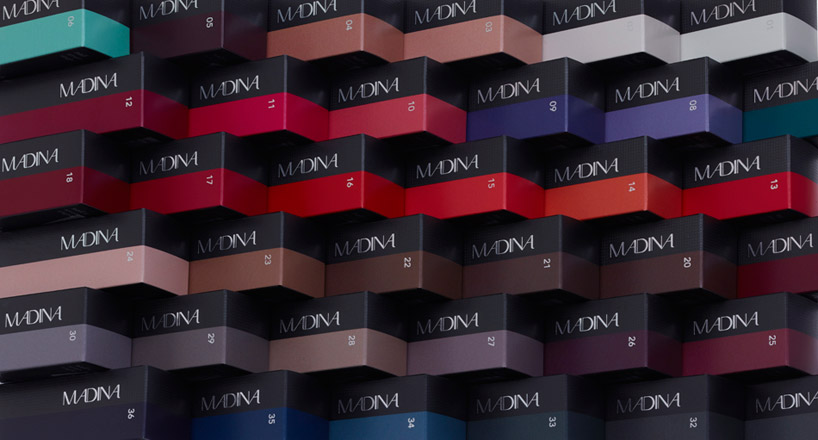
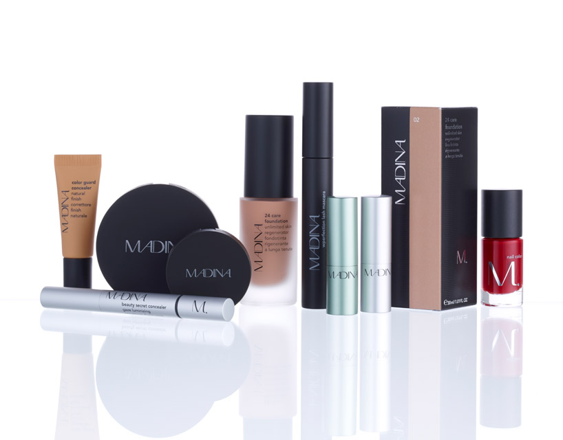
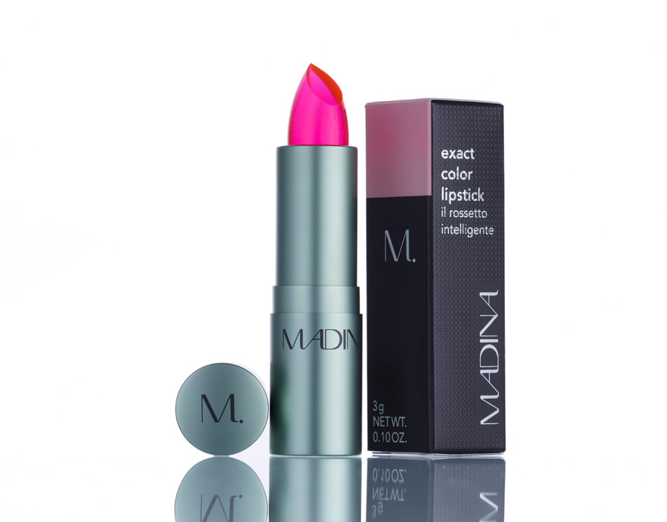
doshi levien’s packaging concept for madina
the idea of the trays came from the important factor of hygiene and the typical way in which a shop is laid out, as make-up retailers usually feel dirty as everything is fitted and built-in. doshi levien wanted to introduce a sense of casual organization that could easily be cleaned, offering a sense of tidiness and order. from an aesthetics point of view these trays can also be seen as a palette, a surface of color, which is essentially what applying maquillage is about.
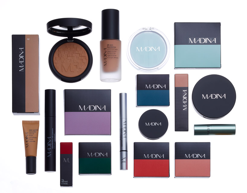
the renewed look of madina products
‘there are many barriers created in the beauty industry that are about who we are, and so I think in some ways we’ve got to start working with the idea that make-up is about color, about a texture, it’s almost about surface. it’s not about intimidating glamour. we came up with a very wholesome approach to beauty. of course, make-up is make-up at the end of the day, but I also like the idea that the brand is really for a modern woman. I say that in a way that speaks to the reality of it, so at no point you feel it’s ‘not for me’.’ – nipa doshi
like in make-up, texture and color were considered in the doshi levien-designed madina packaging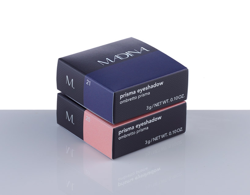
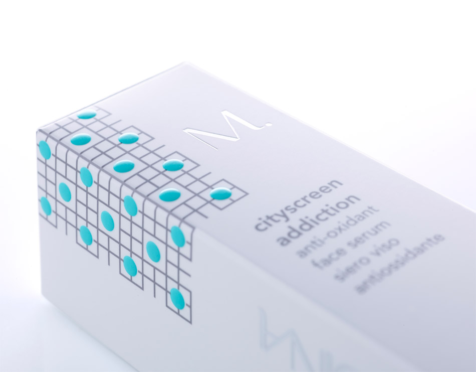
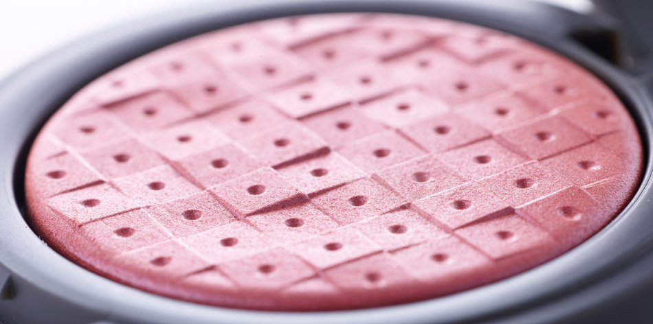
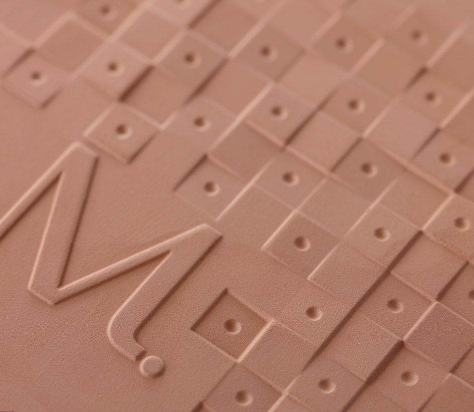
detail of the subtle square and circle texture on the product boxes
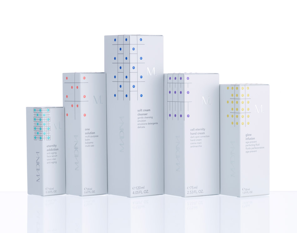
doshi levien’s renewed spatial organization of madina’s boutiques has been carefully considered to compliment the packaging they have conceptualized for its make-up and skincare lines – proposing make-up as surface and skincare as structure. nipa and jonathan have drafted the make-up boxes in a way that sees the colors of each product represented on their exterior. this decision was made so that when stacked, the various hues and tones on the cartons generate patterns and bands of color, enhancing the space visually. the appearance and texture of the palettes themselves have also been thought about, with a square and circle motif that is three-dimensional creating the surface of each prisma, reflecting the texture that is expressed on the packaging itself.
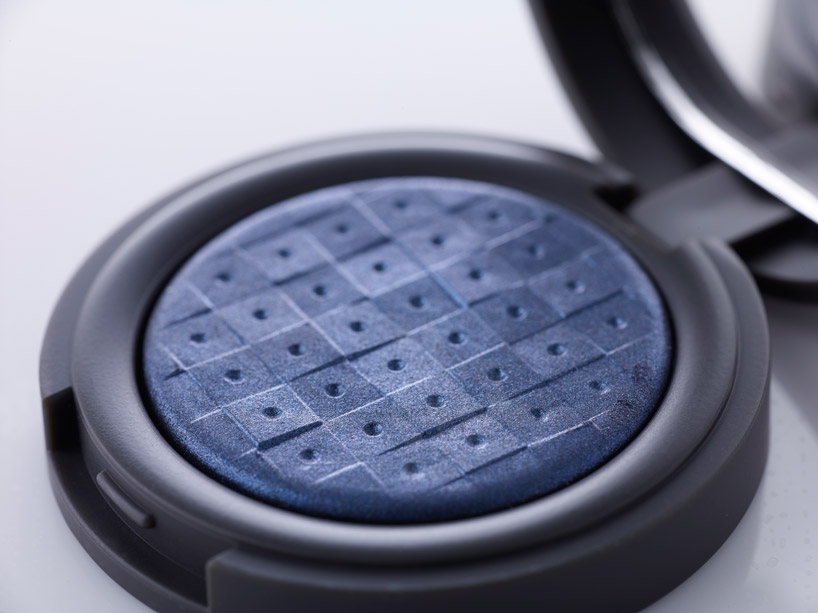
even the surface of the prisma has been realized as an architectural surface
with the skincare collection, the graphic approach was more mathematical and scientific. the base of the bottles and boxes are a porcelain white grey, featuring various grids with small, playful, pigmented circles that are representative of dots of serum, or plant extracts. each color for the dots represents one of five product families.
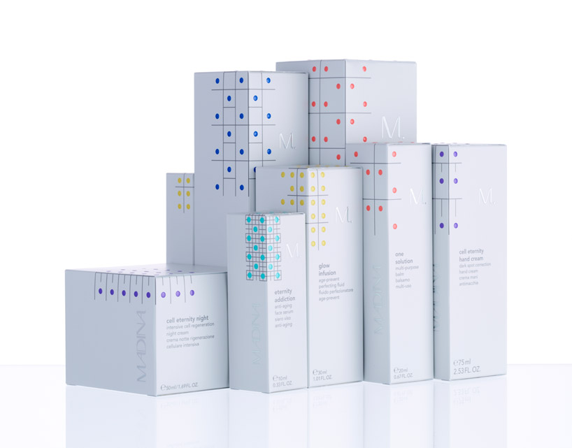
the graphics for the skincare line look more scientific featuring a gridded base and small circles that represent dots of serum or extract
to round out the entire endeavour, doshi levien also designed the uniform for madina employees – a wrap skirt in which assistants would be happy to wear to work. each garment is custom made for staff members, so that it suits all female body types. carefully modeled pockets are integrated for carrying brushes, while the texture of the fabric again ties in with the packaging, marked with a very simple madina badge of an ‘M.’.

a fresh look has been given to the skincare products that is clean and playful in appearance
on working with the cult brand, nipa states, ‘it’s been fun because looking at it in some ways branding, packaging and retail interiors can be quite superficial and they can be quite cosmetic in their approach. I think we really wanted to create a sense of an experience which within that industry is also authentic and really considered.’
‘it’s architectural, but elegant. for us that was the balance to strike. how do you do something that is feminine but is not, you know, a flower? that was the challenge. creating something appealing that you love when you see it, but is also quite strong and modern and architectural,’ concludes jonathan.


DOSHI LEVIEN (11)
 Feb 04, 2018
 Jan 22, 2018
 Jan 23, 2017
 Apr 17, 2016
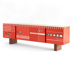 Nov 13, 2014
RETAIL INTERIORS (650)
 Apr 14, 2024
 Apr 13, 2024
 Apr 04, 2024
 Apr 04, 2024
 Apr 03, 2024
PRODUCT LIBRARY
 Apr 15, 2024
 Apr 15, 2024
 Apr 12, 2024
 Apr 04, 2024