dotsies: a digitized alphabet by craig muth
dotsies is a typeface developed primarily for use on electronic devices such as computers and smartphones, tablets, etc to make more efficient use of screen space, converting the latin alphabet to compressed characters comprised of five dots.
the first introduction to ‘dotsies’ typeface by craig muth, 2012
american designer craig muth has developed the shape-based alphabet system, ‘dotsies‘. his new typeface utilizes a series configurations formed from five dots rather than the twenty-six characters found in the latin alphabet. the designer muses, ‘the latin alphabet (abc…) was created thousands of years ago, and is optimized for writing, not reading. about time for an update, no? dotsies is optimized for [screen] reading. the letters in each word smoosh together, so words look like shapes‘. muth created the braille-like typeface for english in what he sees as an effort to save both time reading as well as space upon a screen space, as the latin alphabet was developed for ease of handwriting, rather than expedited comprehension. this design proposes a potential answer to how to improve efficiency of writing and reading on the internet.
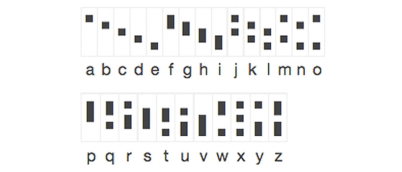 each letter in dotsies has been developed from 5 dots arranged as either on or off in black and white space
muth teaches dotsies webpage visitors how to read the dot-formed characters by slowly introducing them to the idea of this new alphabet. as the user scrolls down the page, the designer slowly clarifies the mystery of these cryptic shapes. firstly, the reader is introduced to the concept of dotsies through chart depicting the alphabet– muth identifies each of the 26 roman characters converted to dotsies in a small graphic. following this first encounter with the typeface, the user may scroll down the page, taking in the progression of typeface by reading from left to right these compressed horizontal lines.
explore this new alphabet system at dotsies.org and memorize here.
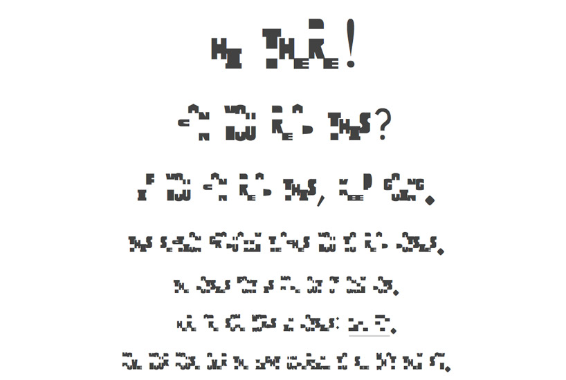
 the second segment starts off where the introductory installment left off
as pictured above, muth says, ‘from here on out, some letters will be in dotsies. move your mouse over their underlines when you need to. if you can get all the way to the bottom, you’ll be reading the dotsies font. believe it or not, you’ve already made a lot of progress! you are on your way to doing what only a few people have done. the top dot means an a, right? let’s them away. and the bottom dot is an e, so let’s hide them too. these gray underlines are getting cluttered, so let’s remove them’.
 just as one would read text on the internet written in the roman alphabet, hyperlinks viewed in converted-to-dotsies text is highlighted in blue to alert the reader to an additional reading portal

designboom’s experimentation with the ‘send a message‘ in dotsies option on the site
the text above reads, ”again, you can’t connect the dots looking forward; you can only connect them looking backwards. so you have to trust that the dots will somehow connect in your future. you have to trust in something – your gut, destiny, life, karma, whatever. this approach has never let me down, and it has made all the difference in my life.‘ -steve jobs’
 designboom DESIGN TIME BREIL exhibition + party announcement article after the dotsies bookmarklet has been instated
muth also offers the opportunity to convert any text on the internet to dotsies typeface. he has accomplished this function by creating an application accessed by the user either dragging a highlighted bookmarklet on the designer’s webpage entitled ‘dotsies’ to his/her web browser toolbar or in clicking on the link in order to translate the existing dotsies site.
to convert this page into dotsies, click here. to try this function on an additional site, drag this dotsies link to your webbrowser’s toolbar, clicking on the icon after visiting a new web address. this action will convert all english text on the page into the shape of dotsies characters.
shop
your own online design shop — no sales commission collected