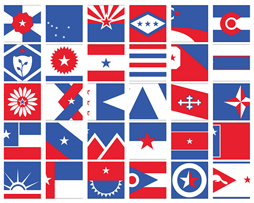
ed mitchell gives 50 US state flags a unified redesign
mitchell embarked on a project to redesign all fifty state flags, paying homage to the collective spirit that has led the united states forward throughout history.
prefer designboom on google[FEATURED]
ed mitchell gives 50 US state flags a unified redesign
all images courtesy of bresslergroup
after listening to a radio special about the design of a city flag, industrial designer ed mitchell of philadelphia-based bresslergroup was led to a creative study of state flags. ‘I was immediately bothered by how discordant they are as a group, and I wasn’t surprised to learn they break just about every rule of flag design’ mitchell says. ‘when you look at them all together, there’s no indication they come from the same nation.’
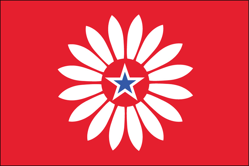
kansas: the state flower (sunflower) is used as the main element, and the middle star represents the state itself
mitchell embarked on a project to redesign all fifty state flags, paying homage to the collective spirit that has led the united states forward throughout history. ‘united we stand’ is a graphic reinterpretation of geography, culture, society and history into symbols, colors and compositions.
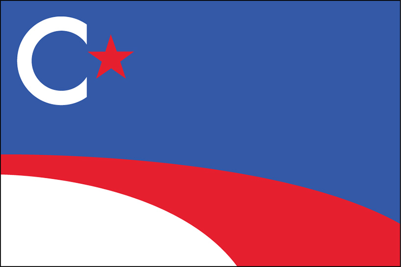
california: the only flag with curves — mitchell wanted to convey the feeling of driving along the coastline
to begin to create a cohesive group of designs, mitchell first stripped away all symbolism (like civil war symbols) that was a reminder of a once-divided nation. ‘I removed the numbers that indicated a state’s induction into the union.’ he says. ‘it might sound silly, but I aimed to get rid of anything that could point to rivalry, or who came first.’
next, he created a unique symbolic code, sourcing geography, historic events, state mottos, flowers and animals. a visual language emerges through the connection between color and motif: blue represents water or sky; a sideways triangle represents hills and valleys; a standard triangle represents mountains; a sunburst is the sun; and stars became place holders for the states themselves.
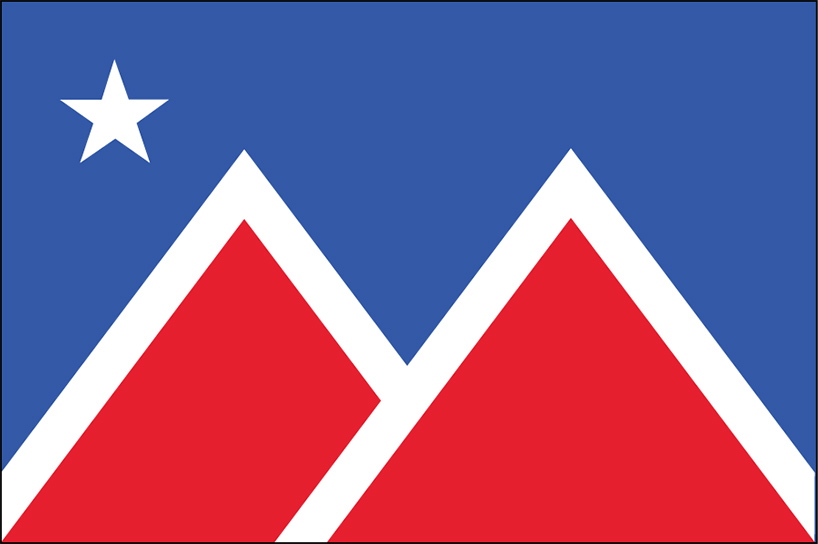
montana: means ‘mountains’ in spanish. the two forms create an abstract letter ‘M’
a secondary unifying element is proportion: the official american flag is 1 by 1.9., but mitchell’s design is slightly smaller. ‘I chose 1 by 1.5 because of its visually pleasing proportion — it is close to the golden ratio, but standard enough to produce easily.’

washington D.C: the flag, based on george washington’s coat of arms, remains the same but with changed colors
finally, mitchell implemented the two-dimensional graphics into the real world. ‘as a product designer, I’m used to working with physical objects and I know that anything you make that’s graphic needs to be able to live in the physical world’. car decals, stickers, posters and even a flag made up of smaller flags show the context of the of graphics within an everyday environment.
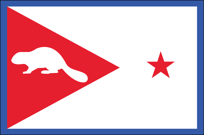
oregon: the red triangle on the left represents the hills of oregon and the state animal is a beaver
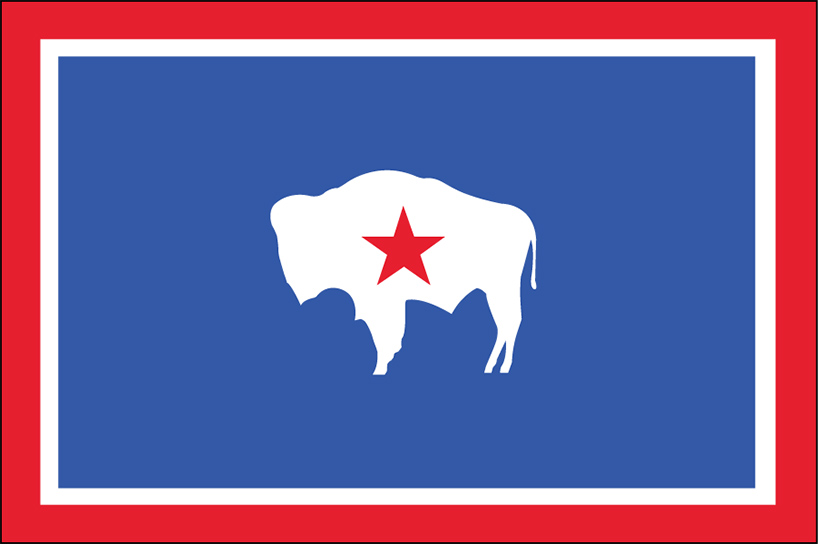
wyoming: mitchell replaced the state seal with a star representing the state itself
designboom wishes all our readers a happy fourth of july!
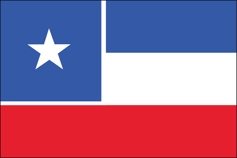
north carolina:mitchell changed the blue to red, restoring the flag back to its original 1775 state
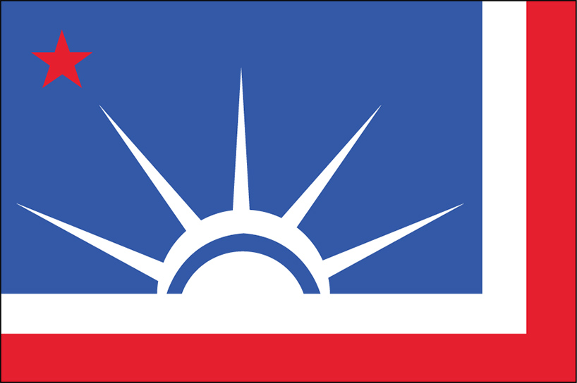
new york: the statue of liberty’s crown has five points representing the five bordering states and the boroughs
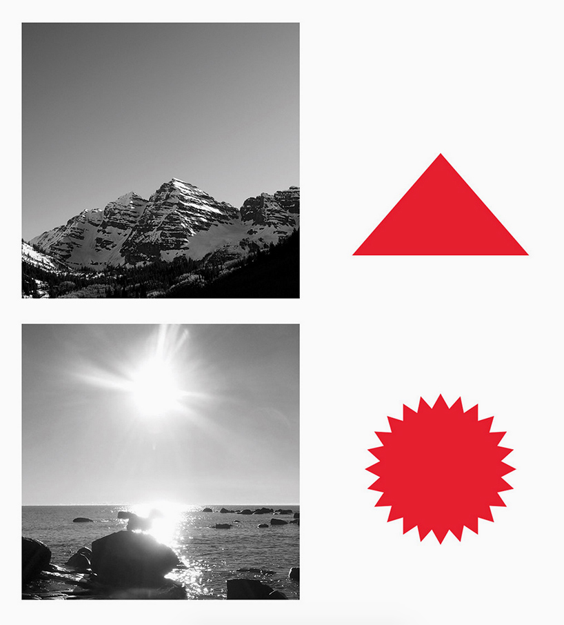
a standard triangle represents mountains and a sunburst symbolizes the sun
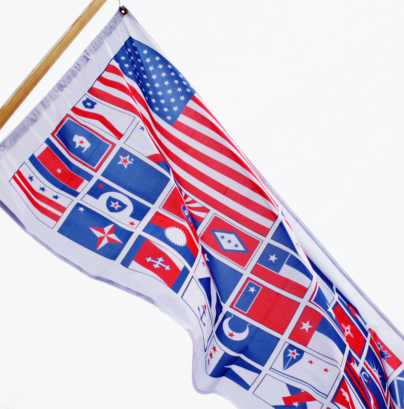
the ‘united we stand’ state flag design
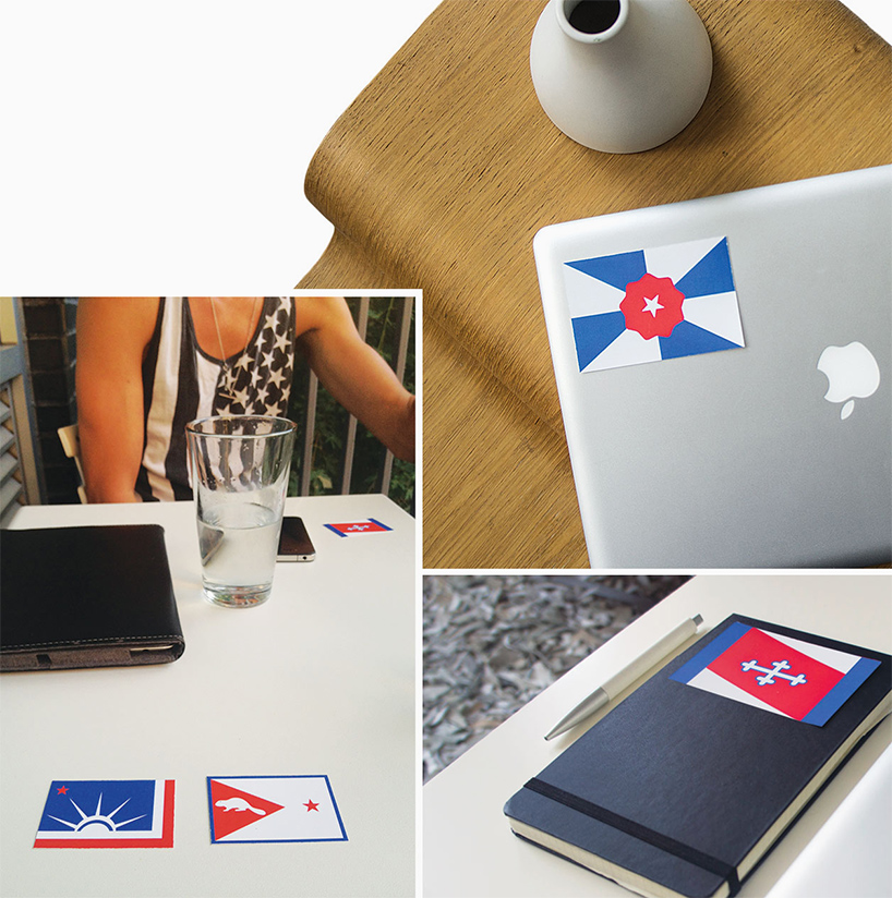
the designs implemented in a real world scenario
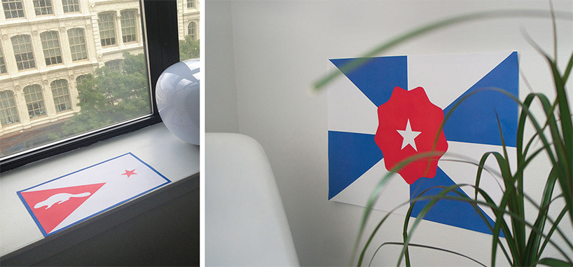
the graphics live in the physical world
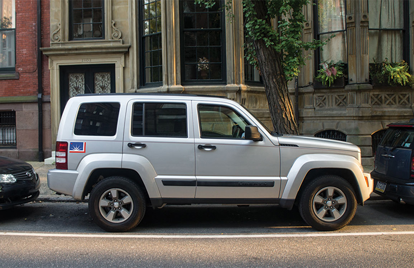
the new york state flag applied as a sticker on the side of a car
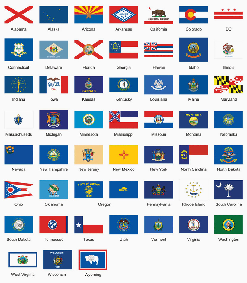
the US flags as they currently are designed
shop
your own online design shop — no sales commission collected