erretres channels japanese pop culture for philippe starck’s natsuki restaurant in madrid
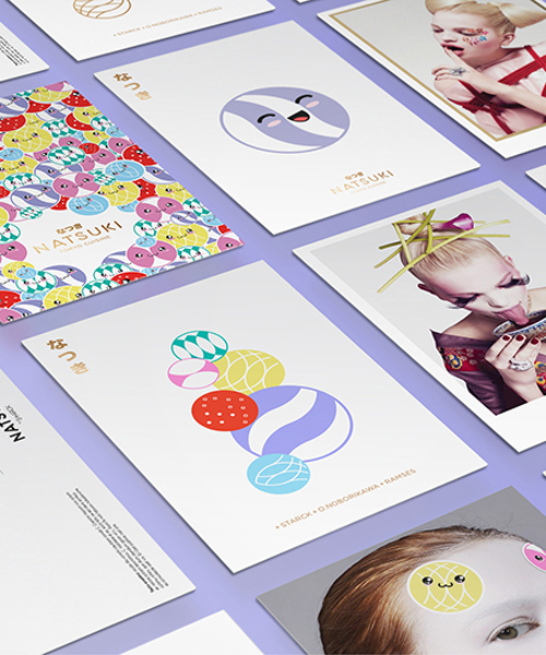
the identity design highlights motifs and visual elements such as modern geishas, cutting-edge technology, kawaii, and neon lights.
prefer designboom on google[FEATURED]
erretres channels japanese pop culture for philippe starck’s natsuki restaurant in madrid
all images courtesy of erretres
the ‘ramses life‘ concept by designer philippe starck is a series of eating venues and events located within the spanish capital of madrid. each of these restaurants is devoted to providing a distinct and immersive gastronomic experience for its guests.
erretres, a local consulting firm focused on branding and design, has recently completed the graphic identity of ‘natsuki’. this newly opened venues features a bold culinary fusion that blends japan with flavors from across the world. the brief called for the design team to create, develop, and implement a concept that united the qualities associated with both traditional and contemporary japanese culture. after a trip to toyko, the team at erretres identified three factors that would be the most significant parts of the the design: value, art, and experience. these key themes span motifs and visual elements such as modern geishas, cutting-edge technology, kawaii, and neon lights.

the interiors of ‘natsuki’ reflect the identity designed by erretres
as part of the branding project, a grid influenced by the neon lights of tokyo and the phases of the moon resulted in a symbolic design proposal. this also helped inform the typeface and the related animations and cartoon personalities, which are shown on numerous interactive screens throughout the restaurant. a series of applications share the same concept, such as coasters, business cards, chopsticks, tableware — as well as the publicity and communication campaign in general.
for the store’s interiors, the team collaborated with japanese artist houxo que who brought the venue to life with fluorescent paint. the room was transformed into a panoramic viewing experience intended to make diners feel as if they were in a japanese metropolis.
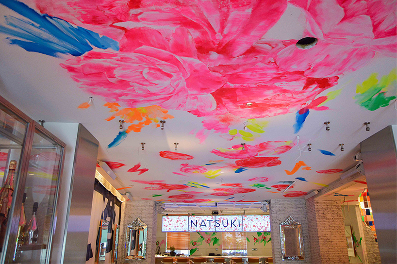
japanese artist houxo que brought the venue to life with fluorescent paint
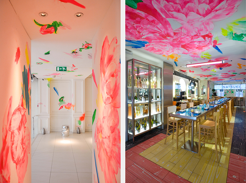
the room was transformed into a panoramic viewing experience
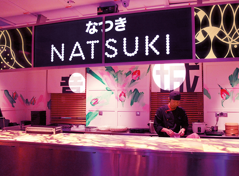
the interior design intends to make diners feel as if they are in a japanese metropolis
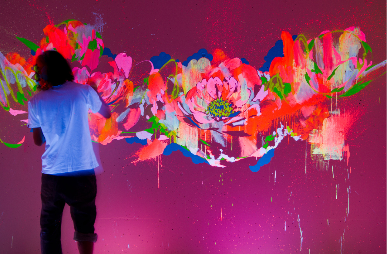
artist houxo que’s use of fluorescent paint illuminates the interior of the restaurant
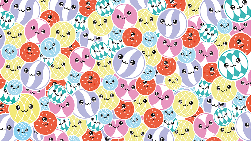
colorful neon lights informed the character and identity design
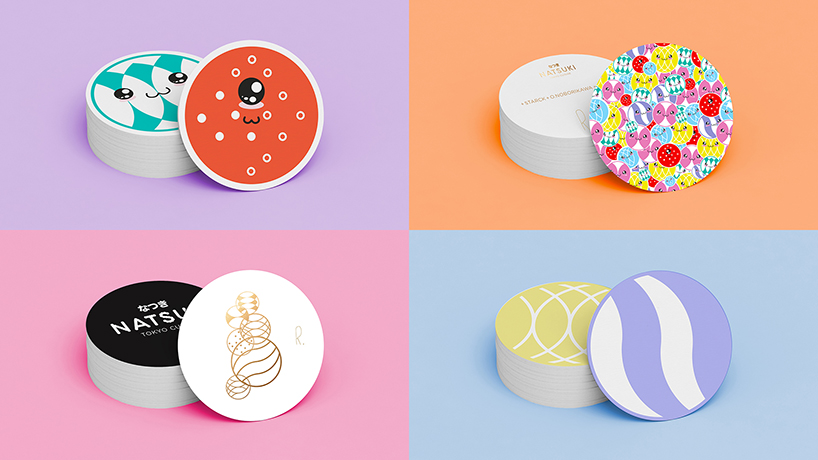
coasters are treated with faces of characters and graphic elements
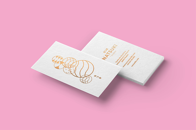
various graphic emblems are implemented onto business cards with gold foil
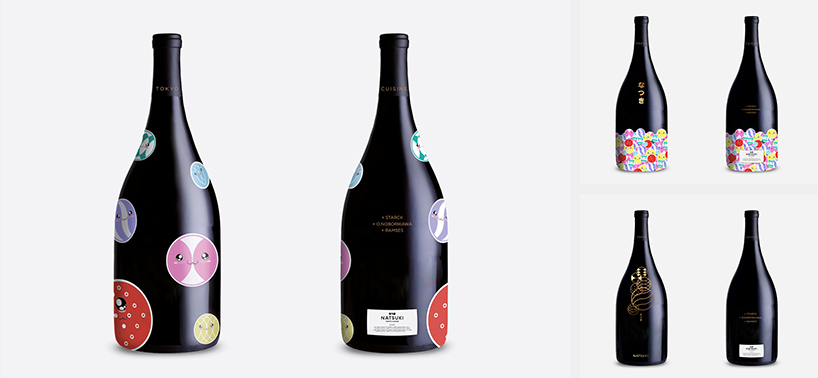
bottles receive the branding colors and characters designed by erretres
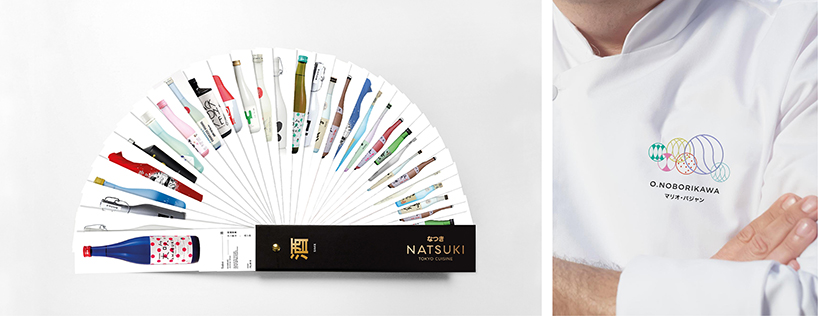
further graphic implementation includes chef uniforms and the wine list
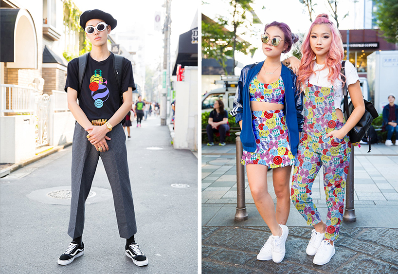
the characters applied to japanese street style
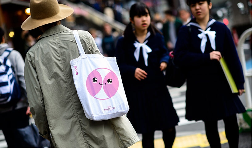
the animated moon character applied to a tote bag
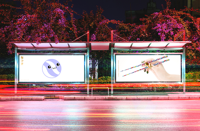
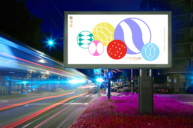
the publicity and communication campaign
the visual elements combine motifs from modern geishas to technology and neon lights
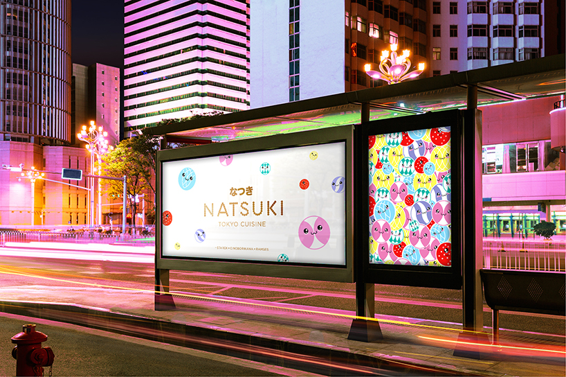
a ‘natsuki’ billboard proposal
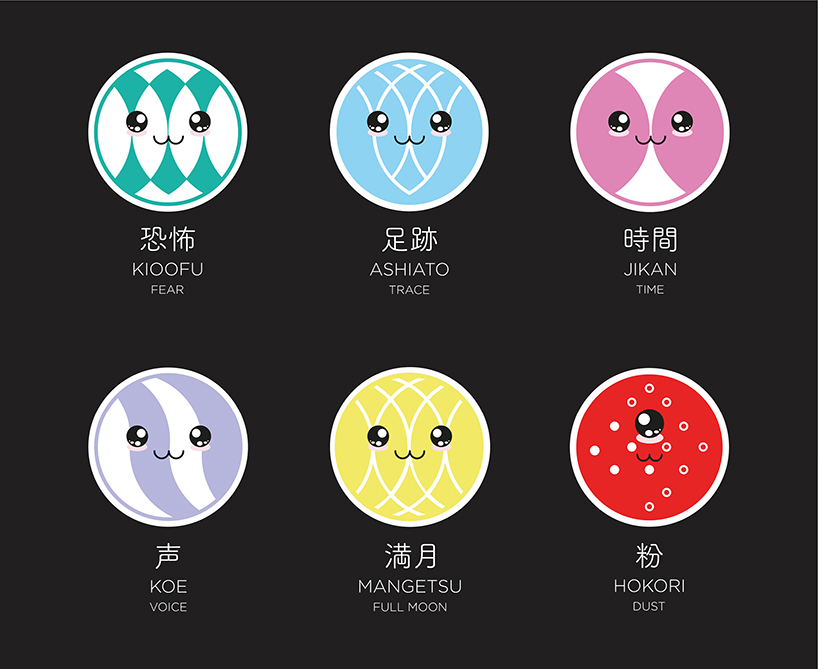
the ‘cute’ kawaii culture has influenced the design of the emblem
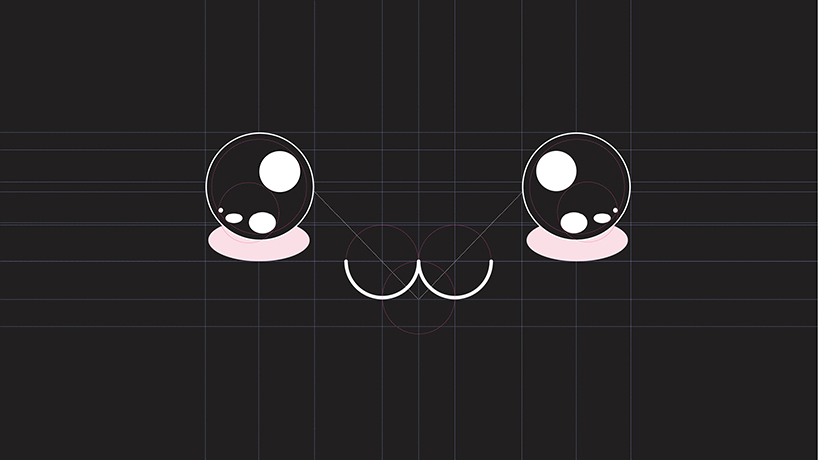
the character design as applied to a grid
shop
your own online design shop — no sales commission collected