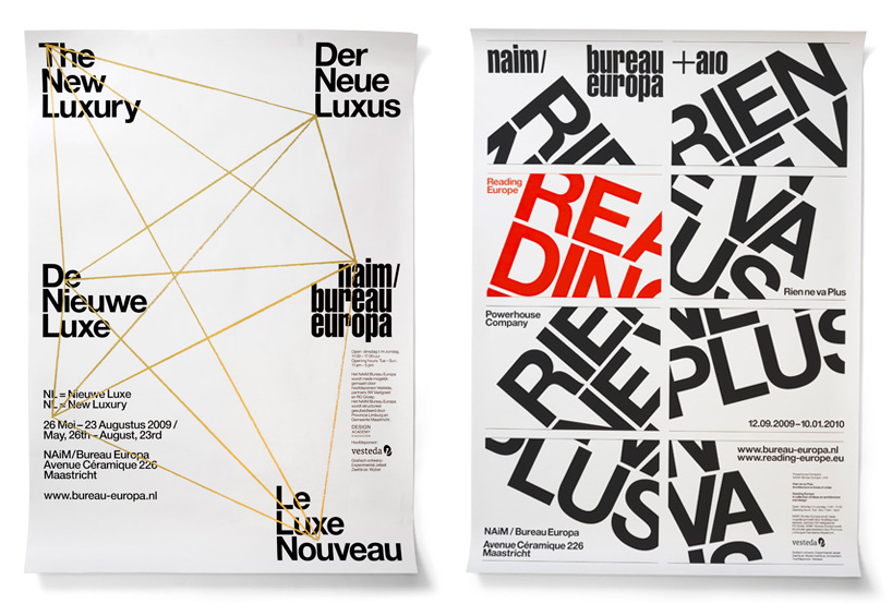
‘the new luxury’ (2009), A0-sized screenprinted poster for naim / bureau europa‘rien ne va plus’ (2009), A0-sized screenprinted poster for naim / bureau europa
experimental jetset is a small, independent, amsterdam-based graphic design studio consisting of marieke stolk, erwin brinkers and danny van den dungen. designboom spoke to them about writing, johan cruijff and the myth that they ‘always’ use helvetica.
DB: please could you tell us about the evolution of your studio?
EJ: we all met at the rietveld academy, when we were students. at their graduation project, marieke and danny were working on the redesign of blvd (a dutch pop-culture magazine, now defunct), and they asked erwin who was in another class (a year below), to help them out. this all happened in 1997.
in general the three of us do everything together. we aren’t really proper football fans, but as a model for the studio, we always have to think about an interview we once saw on dutch TV, in which legendary player johan cruijff explained the concept of ‘totaal voetbal’ (‘total football’), and that was really inspirational. total football is a system where a player who moves out of his position can be replaced by any other player from the same team. so the roles aren’t fixed; any player has the ability to be attacker, defender or midfielder.
in short, our ideal is to stay away from fixed roles. when dealing with stress and deadlines, we sometimes fall back into certain roles, but we try very hard to avoid that. our intention is that the workload is divided equally, and that each one of us has more or less the same set of skills.
 ‘antibodies’ (2010), A0-sized screenprinted poster for naim / bureau europa‘clip/stamp/fold’ (2010), A0-sized screenprinted poster for naim / bureau europa
DB: which have been your most satisfying projects to date?
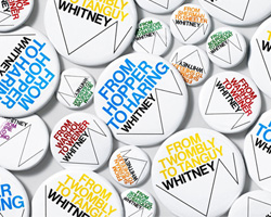
EJ: right now, we would the say that the two projects that really pushed our boundaries have been the exhibition ‘two or three things I know about provo‘, and the graphic identity of the whitney museum. these two projects have been the most satisfying, in the sense that they both required us to function to our full abilities. writing, reading, researching, designing for printed matter and signage, even working with sound and moving image – in both projects, we did all that.
 ‘two or three things I know about provo / brno edition’ (2012), installation view
we worked on both projects during the same period (the years of 2011 and 2012), and in retrospect, they have a lot in common. sure, at first sight, they seem worlds apart – developing the graphic identity for the whitney was a very strict process, involving dozens of meetings and presentations, while curating ‘two or three things I know about provo’ was a much more improvised, low-budget affair; and while ‘two or three things’ dealt with a subject that was very close to our heart, our role at the whitney project was basically that of relative outsiders – but despite these differences, both projects did require the same level of energy, the same kind of intensity.
 whitney ‘periodic table’, part of the whitney graphic identity manual (2012)
also, both projects were very city-specific. ‘two or three things’ was an exhibition about provo, an anarchist movement that was very much shaped by the city of amsterdam (by the same token, amsterdam was shaped by provo). and the graphic identity of the whitney was very much grounded in the city of new york – in the sense that, during the design process, it became clear to us that the shape of the ‘zigzag’ could refer to things such as the ziggurat-shape of the architecture (of both the current and future building of the whitney), or the iconic fire-escape stairs in the streets of new york, or the zigzag-like path of the whitney museum through manhattan, throughout the years. also, we did a lot of research into the history of the whitney museum, and the history of american modernism in general – the specific moment that europe stopped being the center of modern art, and new york became the new capital. so, in the whitney project as well as in ‘two or three things’, we really tried to explore this notion of ‘city-specificity’.
 ‘panels’ (2010), A0-sized screenprinted poster for naim / bureau europa‘club céramique’ (2010), A0-sized screenprinted poster for naim / bureau europa
DB: helvetica features frequently in your portfolio – is there a reason why you find yourself drawn to using this typeface for many different purposes? and was there a reason why you decided not to use the typeface in your recent re-design of the whitney identity?
EJ: it’s obviously not true that we always use helvetica – but nevertheless, we can’t deny that the late-modernist graphic landscape in which we grew up (we’re talking about the netherlands in the ’70s here) had a big influence on us. as a consequence, we feel as if this late-modernist vocabulary (of which helvetica is undeniably a part) has become our authentic language, our mother tongue. it’s our everyday way of talking, our natural tone of voice. and it’s only logical that this late-modernist dialect can be detected all throughout our work. we’re simply not the kind of people who feel it’s necessary to suppress one’s own dialect.
but that doesn’t mean we always use the same typeface. especially when you look at the graphic identities we designed for museums and cultural institutes, you’ll notice that we have used various typefaces, often for very specific conceptual reasons. for example, for the graphic identity we designed in 2004 for stedelijk museum CS (SMCS), we specifically used univers, to refer to the history of the institute. and for the graphic identity we created in 2007 for le cent quatre (104), we used futura, so that the 104 logo could really be ’embedded’ in the typeface. in other words, it’s a total myth that we always use helvetica – but it’s an amusing myth, we have to admit.
as for the specific version of neue haas grotesk (NHG) that we used for the graphic identity of the whitney… we met christian schwartz back in 2009, during a type conference in wellington, new zealand; and during our conversation, christian mentioned the version of nhg he was working on. two years later, when we started to work on the whitney, we remembered this conversation, and realized that NHG might be the right typeface for this project.
we thought there was quite a fascinating link to be found between the two projects. on the one hand, there’s christian schwartz, an american designer working on his interpretation of an european typeface. and on the other hand, there’s us, a european design studio, working on our interpretation of the graphic identity of an american museum. we saw a really intriguing parallel there, an interesting ‘zigzag’ between europe and the united states. we figured this could be an interesting extra little storyline to add to the graphic identity, as a sort of sub-sub-plot.
there were also more pragmatic reasons to use NHG. it’s a typeface that comes with a very wide variety of weights, style and special characters – it can be used for all kinds of purposes (text, display, etc.), while still maintaining a consistent, graphic tone. (it was especially important for us that the word ‘whitney’ would appear in the same typeface as the headline text, and the body text – we didn’t want a logo that would behave as a sort of alien element, completely separated from the rest of the text).
as it turned out, hilary greenbaum, head of the design department of the whitney, knew christian schwartz personally, which also turned out to be a really happy coincidence. it was an ideal situation, as the design department could contact christian schwartz directly, to work out technical and practical details (for example, for the whitney, christian worked on a special digital version of NHG, which is used on the whitney website).
 ‘out of fashion’ (2011), A0-sized screenprinted poster for naim / bureau europa‘re-action’ (2011), A0-sized screenprinted poster for naim / bureau europa
DB: do you think it’s important for a graphic designer to be able to draw?
EJ: that fully depends on one’s definition of drawing. in a way, we would argue that creating a typographic composition is a form of drawing as well – in the same way that drawing is essentially a form of writing. what is interesting about graphic design is exactly the fact that it is a field in which it is impossible to distinguish between writing and drawing, between the verbal and the visual.
this is already encapsulated in the etymology of the word ‘graphic’ – originally, the word is derived from the proto-indo-european base-word ‘grebh’, which simply means ‘to carve’ or ‘to scratch’; but in greek times, the word ‘graphikos’ referred both to the act of drawing and writing. in a sense, we do believe that the current practice of graphic design still refers to this classic notion – the idea that writing is a form of drawing, and drawing is a form of writing.
 ‘common grounds’ (2011), A0-sized screenprinted poster for naim / bureau europa‘the art of inhabitation’ (2011), A0-sized screenprinted poster for naim / bureau europa
DB: what do you think the most significant developments in graphic design have been in the last five years?
EJ: the crisis we currently find ourselves in. and we’re not talking about an aesthetic or conceptual crisis in graphic design – in fact, we think the work created by young graphic designers nowadays is more interesting than it was in previous decades. we’re really talking about the economic and political crisis that is taking place in society at large. and obviously, this crisis has a very dramatic effect on the current cultural landscape.
there used to be a time when cultural institutes and museums would really support independent studios, and young designers. but nowadays (mainly because of the whole mixture of neo-liberalism, privatization and populism that is currently forced upon us), a lot of cultural institutes (even the smaller ones) simply decide to play it safe, and choose to work with large branding and advertising agencies instead. in turn, these large advertising agencies then just hire some young designers, to do the ‘cultural work’ for them – and just discard these young designers after the work is done. after all, for these large agencies, these cultural projects serve primarily to add some ‘depth’ to their corporate portfolios – but they wouldn’t want to actually invest in those cultural projects, in any intellectual or ideological way.
we feel there’s a really strange discrepancy going on – while young designers seem to be getting more and more intellectual and progressive, a lot of cultural institutes are actually trying to achieve a more populist tone, and getting more conservative. they seem to move in opposite directions – and we have no idea how this rift can ever be solved.
young designers are currently producing a lot of very interesting work – but this production takes place on a more subcultural, isolated level: in the spheres of self-publishing, small exhibitions, underground projects. to survive, these young designers are either forced to work (or worse, to intern for free) for large corporate agencies, or they have to find a ‘day-time job’, outside of the field of graphic design. there seem to be fewer and fewer opportunities nowadays for young designers to just start their own small, independent studios, and inject their ideas straight into the public space – and we think that’s a real shame.
in harsh times like these, we think it’s really important for independent designers and small studios to stick together, and keep an open mind towards each other. above all, we should maintain some sense of solidarity, of dignity. we might have our aesthetic or conceptual differences, but in the end, we’re all in the same boat. it’s so easy to constantly attack each other, but all this energy can be better put to use trying to actually survive.
 ‘zoo, or the letter z’ (2012), A0-sized screenprinted poster for naim / bureau europa‘playboy architecture’ (2012), A0-sized screenprinted poster for naim / bureau europa
DB: besides graphic design / visual communication what are each of you passionate about?
EJ: music plays a large role in our life, and in our work. in previous interviews, we often mention the influence of punk – although we were too young to actively participate in the original punk explosion of 1977, we could still hear the echoes of this explosion throughout the ’80s, and it really inspired us. as teenagers, we were involved in all kinds of post-punk subcultures (two-tone ska, psychobilly, new wave, garage rock, mod, american hardcore, etc.), and all these movements shaped us in the most profound way. (in fact, it were post-punk relics such as record sleeves, buttons/badges, patches, DIY fanzines, mix-tapes, t-shirts and xeroxed mini-comics that made us aware of graphic design in the first place).
so in our work, we really try to synthesize all these (seemingly conflicting) influences: the language of late-modernism of the ’70s (which shaped us in an almost subconscious way, during our childhood years) and the post-punk landscape of the ’80s (which inspired us in a much more explicit way, during our teenage years). during the ’90s, we were in our twenties, and went to art academy while grunge was going on, which left some traces as well (don’t forget that our studio is named after a ’90s album by sonic youth).

DB: is there any piece of advice you’ve been given that you remember often?
an advice that comes to mind is ‘never excuse, never explain’, which isn’t really an advice that someone actually gave to us – it’s more a sort of general remark we once came across. the quote is attributed to a lot of different people (sometimes also appearing as ‘never complain, never explain’), and we actually wouldn’t know if we’d consider it ‘good’ or ‘bad’ advice. but for some reason, we have been thinking a lot about this phrase, lately.
we write a lot about our work – not as an explanation, and certainly not as an excuse, but more because the activity of writing enables us to reflect on our own work, to look at our work from a bit of a distance. it’s really just a way of organizing our own thoughts. so when, around 2005, we decided to make our first proper website, we thought it would be interesting to include texts like these. mainly because we don’t necessarily see our website as a portfolio, attracting possible clients – we see it more as a diary, or a personal archive. in fact, our texts would sooner scare away clients than attract them. our website was always intended for the tiny group of people who were really interested in our work, in the stories behind it. our writing, our tone of voice, is simply not for everyone – it’s a ‘stream-of-consciousness’, long-winding, free-associating way of talking. the simple truth is, we aren’t proper writers, or professional academics, or real intellectuals – for us, the texts are just by-products of the labour of design. nothing more (but certainly nothing less). so in that sense, we feel we have nothing to be embarrassed about.

on the other hand, we also realize that, by writing, we are basically handing out ammunition to our critics. it’s funny – many critics always argue that ‘designers should write more’, but the moment you actually write a text, critics are the first to immediately tear it apart, isolating every single sentence to ridicule your text. so we know we are making ourselves very vulnerable with these texts.
that’s why, sometimes, the idea of simply not writing anymore sounds very attractive. when we hear about authors or musicians who never do interviews, and never appear in public – we always find that quite fascinating. it sometimes makes us doubt whether we did the right thing, being so open and honest about our practice from the very beginning.
it seems too late to change direction now – although we sometimes do fantasize about removing all text from our website. we probably won’t do this anytime soon – but the people who are indeed interested in our texts, might start storing them, just to be on the safe side.
experimental jetset (2)
graphic studio interviews (193)
 Nov 21, 2022
 Feb 10, 2019
 Jun 21, 2018
 May 17, 2018
 Oct 04, 2017
logo design (245)
 Jul 03, 2024
 Aug 14, 2023
PRODUCT LIBRARY
 Jul 23, 2024
 Jul 01, 2024
 Jun 13, 2024
 Jun 06, 2024