facebook introduces new all-caps logo following promises of more transparency
following problematic issues like the capitol hill hearings and the cambridge analytica scandal, the tech giant is looking to reinvent itself.
prefer designboom on google[FEATURED]
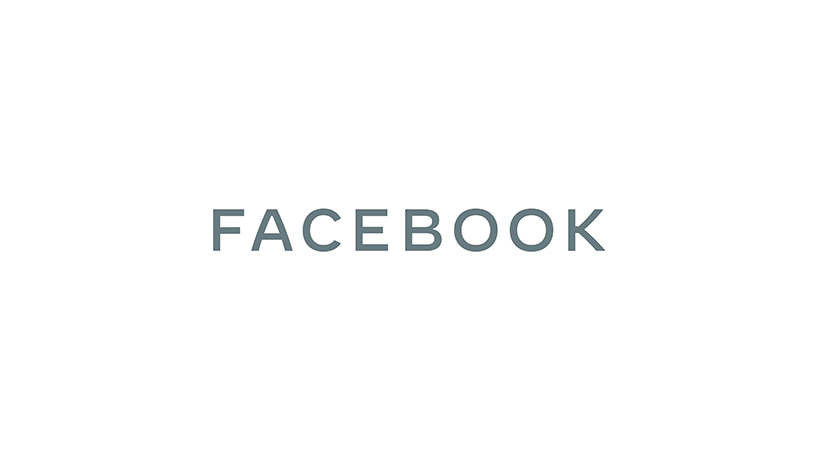
facebook has introduced a new all-caps logo in an attempt ’to be clearer about the products that come from facebook,’ as stated on their official press release. following problematic issues like the capitol hill hearings and the cambridge analytica scandal, the tech giant is looking to reinvent itself and the first step was obviously the logo, which has many confused and most laughing.

all images courtesy of facebook
facebook, a company that started fifteen years ago as a single app, now offers an ample portfolio of products and services — some their own, others they have acquired. with the rebranding, the company wants to better all their services and put them together under one big umbrella, representing their diversity.

‘people should know which companies make the produces they use,’ continues the press release. ‘our main services include the facebook app, messenger, instagram, WhatsApp, oculus, workplace, portal and calibra. these apps and technologies have shared infrastructure for years and the teams behind them frequently work together.’
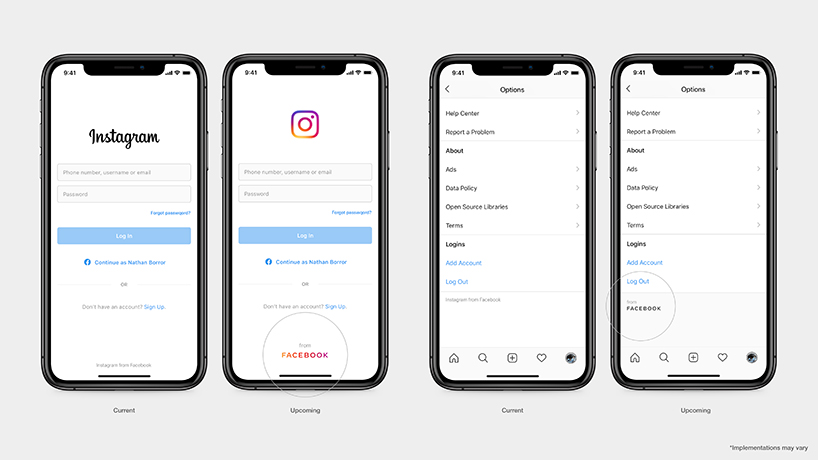
in an attempt to distinguish the facebook company from the facebook app, the logo features an all-caps treatment. it has been built on a stable structure through the use of consistent stroke width, harmonised capital letters and a horizontal emphasis while generous spaces and open letterforms allow clarity at small sizes. the subtle softening of corners and diagonals — in facebook’s words — adds a sense of optimism.
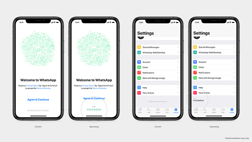
the brand has also been designed to be responsive in order to allow each individual brand take over. this results in a clearer relationship between the company and the products they build. ‘we continue to be inspired by the communities and people who use our products every day,’ concludes facebook. ‘the brand system was born out of a commitment to be clear, empathetic and create space for people’s stories to shine through. as the company continues to evolve, we hope this brand can help us better communicate the progress we’re making.’