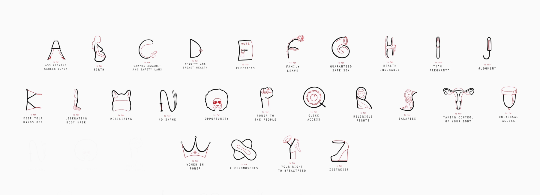
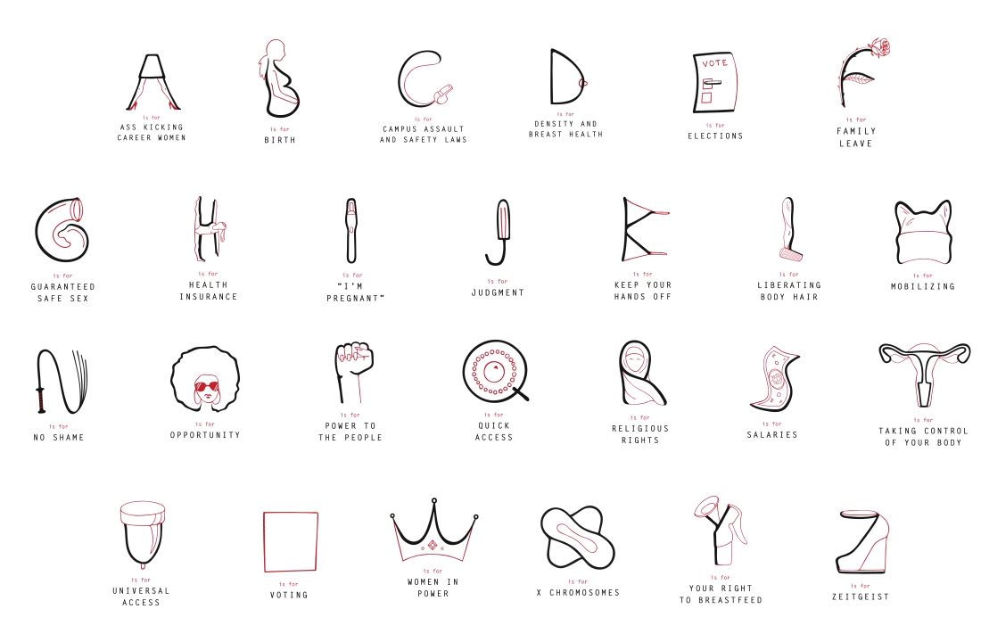
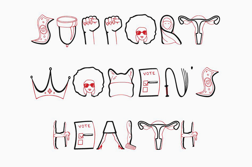
‘A is for ass kicking career women’; ‘B is for birth; ‘C is for campus assault and safety laws’ — the ABC’s like you’ve never seen them before. international advertising agency young & rubicam devised a typographic project coined ‘the feminist letters’, ‘to amplify the message advocating for gender equality’. each letterform has been specifically envisioned with purpose, raising awareness around issues of equal pay, reproductive rights, women’s health, women in politics, and campus assault laws.
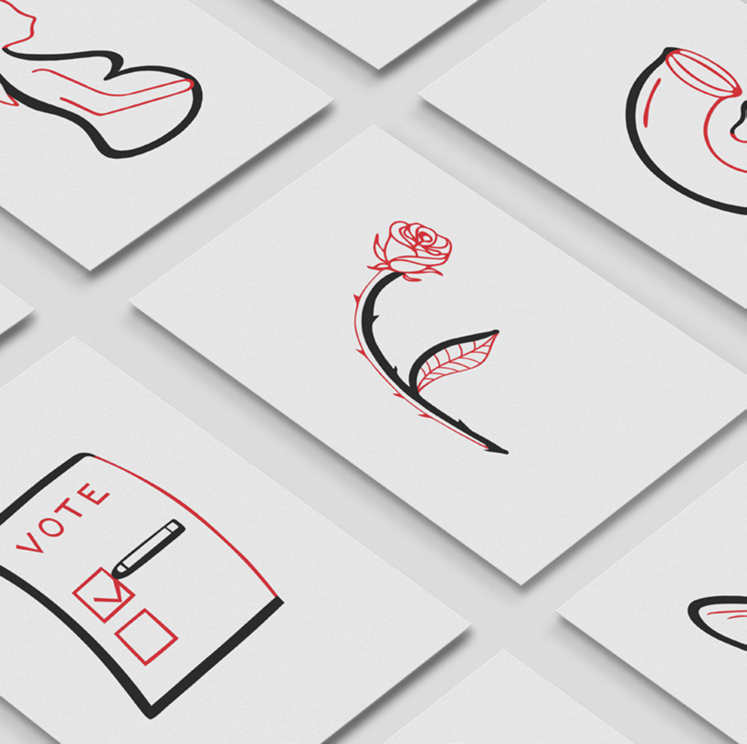
animated, the typeface is at once humorous and significant
the downloadable typeface can be explored through an interactive website that offers insight into each letter’s social message. ‘Q for quick access’, for example, tells us that ‘in some states, pharmacists can refuse to provide contraception prescriptions if they have a moral or religious objection.’ ‘W for women in power’ offers the statistic that ‘only 4.2% of fortune 500 CEO’s are women, and .4% are women of color.’ in the era of movements like #timesup and #metoo, the ‘feminist letters’ offer a new way of communicating a powerful message.
each letterform has been specifically envisioned with purpose
the letters aim to raise awareness around issues of equal pay, and reproductive rights, for example
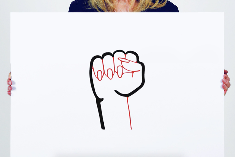
‘P is for power to the people’
typography design (135)
 Oct 23, 2025
 Jul 24, 2025
 Sep 13, 2023
 Feb 23, 2023
 Mar 10, 2026
 Mar 08, 2026
 Mar 04, 2026
 Feb 24, 2026