design indaba: fred gelli is the founder of brazilian multidisciplinary firm tátil based in rio de janeiro and sao paolo. with a background in biomimicry, gelli often imitates nature’s solutions and processes to solve human problems; thus creating sustainable connections between people and brands. the agency’s latest achievement, and probably its most significant project, was designing the visual identity of the rio 2016 olympics and paralympic games.
gelli is also acting as the creative director of the paralympic opening and closing ceremony.
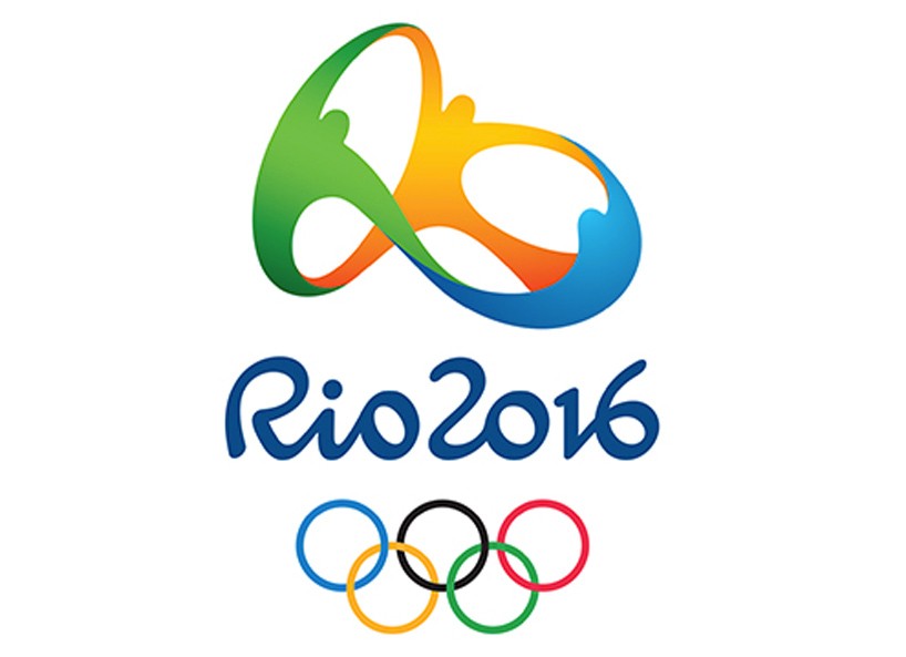
tátil beat out almost 140 other competitors for the design of the logo of rio 2016
image © tátil / rio 2016
during the annual design indaba conference hosted in cape town, designboom sat down with fred gelli / tátil, one of the keynote speakers, to discuss the connection between his work and nature, the creative industry in brazil, and details about his firm’s most important projects to date.
DESIGNBOOM: can you please elaborate on how nature influences your work?
FRED GELLI: the inspiration of working with nature comes from when I was 20 years old and still in university. the way of learning design, and the design principles themselves opposed those that I could see in nature; and so I changed my creative approach at design to mimic nature in order to realize solutions to human problems. I have been studying design for 25 years and teaching it for the last 15 years. I am not merely trying to bring the shape of a leaf to an object. instead, I am constantly trying to understand how nature thinks and approaches each different challenge. my creative team even includes a biologist – we want to understand how nature works in order to make business.
making of the rio 2016 logo
video by tátil design de ideias
DB: how does nature relate to business business?
FG: nature makes business based on a share-value principle. you can think of an ecosystem as an amazing business environment, where individuals exchange information and services. looking at this gives us a lot of inspiration on new ways to think about business. we would like to generate value not only for the project owner’s pocket, but for everybody living in that particular ecosystem.
known for blending nature into his projects, gelli keeps qualified biologists on his team
image © tátil / rio 2016
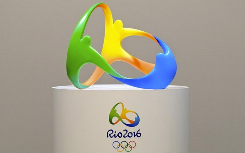
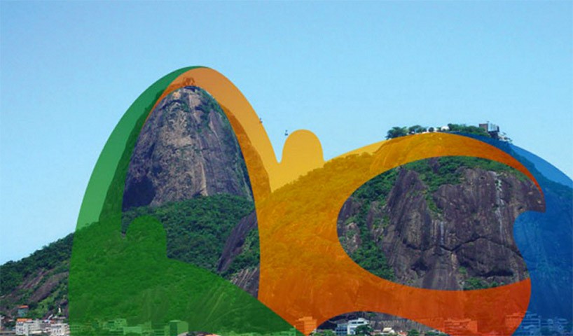
DB: so how did nature influence the design of the rio 2016 olympics logo?
FG: first of all we felt that it should be a human logo. we chose a strong icon of people hugging because it’s a symbol that everybody can understand. when we created the 3D shape, we tried to find the best balance between the idea of people embracing and the shape of our topography, in particular that of sugarloaf mountain which is our most famous panoramic view in rio. funny fact is that the shapes that you can find in the logo can be seen in many mountains around the country.
read designboom’s previous feature on the development of the rio 2016 logo here
image © tátil
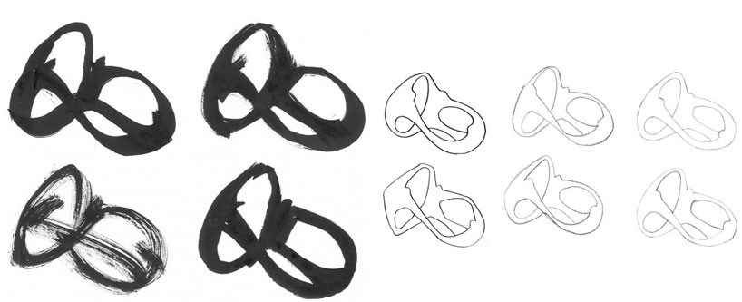
DB: how many different designs did you develop before coming up with the final logo?
FG: wow, a lot! maybe around fifty. we employed the entire team (around one hundred people) to work together on its development. we were constantly asking our employees — from the IT team to the receptionists — to give their feedback on the concepts, and we put away an idea when we felt that those people were not understanding it. it’s not a logo conceived only for designers or for a private company, but for everybody on this planet.
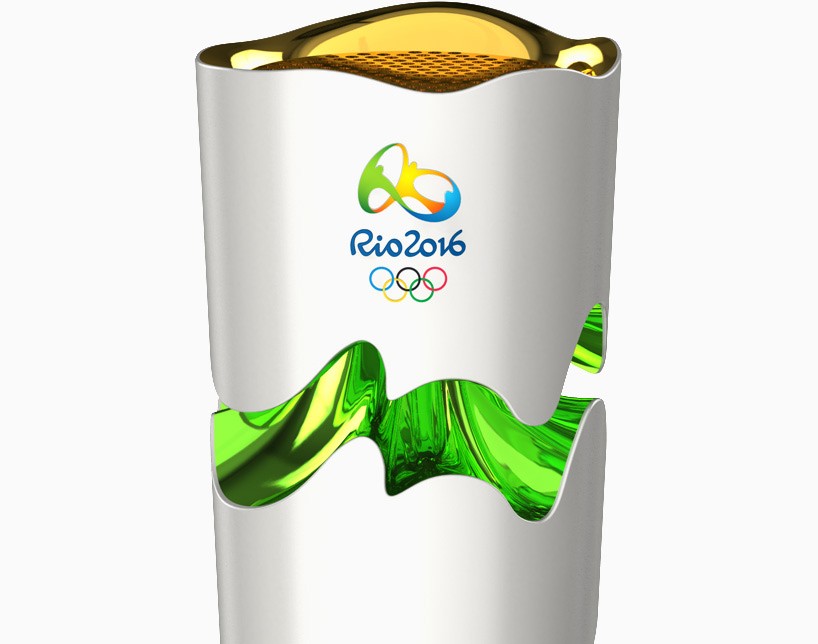
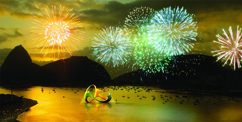
the olympic torch with the logo colored with tones influenced by the brazilian environment
image © tátil / rio 2016
DB: what changes and developments do you see, or hope to see, for brazil in the future?
FG: the future of brazil is in the creative industry, so the country should invest in its creative capacity because on a whole we are an innovative group of people. we should not offer other countries our raw materials, but rather our creative intelligence. doing more with less is what the world will eventually need to do. when you don’t have many resources around you, you have to be creative; and optimization is the goal.
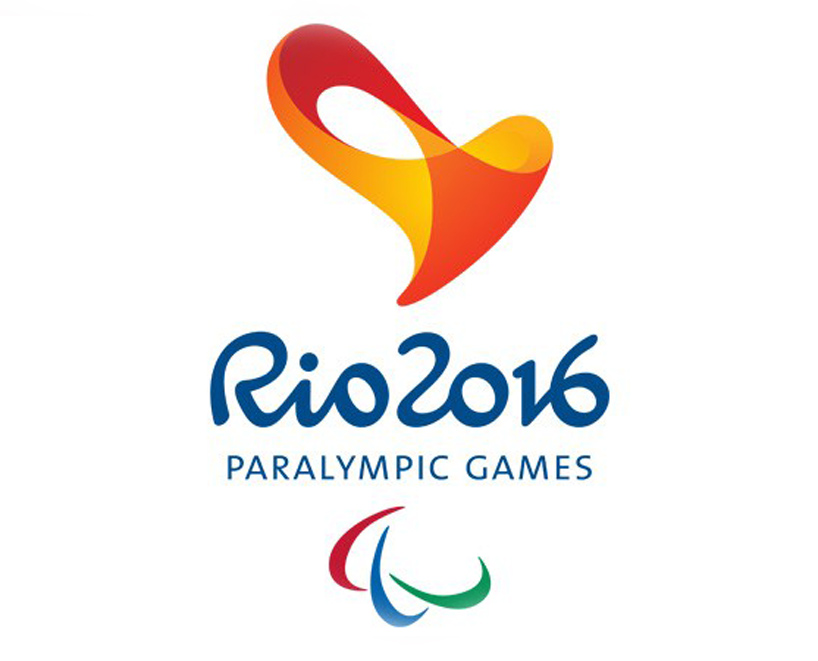
a similar heart shaped design has been interpreted for the use for the paralympic games
read our article on the paralympic logo here
image © tátil / rio 2016
Rio 2016 Multisensory Paralympic Brand from Tátil Design de Ideias on Vimeo.
the creative development behind the rio 2016 multisensory paralympic brand
video courtesy of tátil design de ideias
rio!
image © tátil / rio 2016
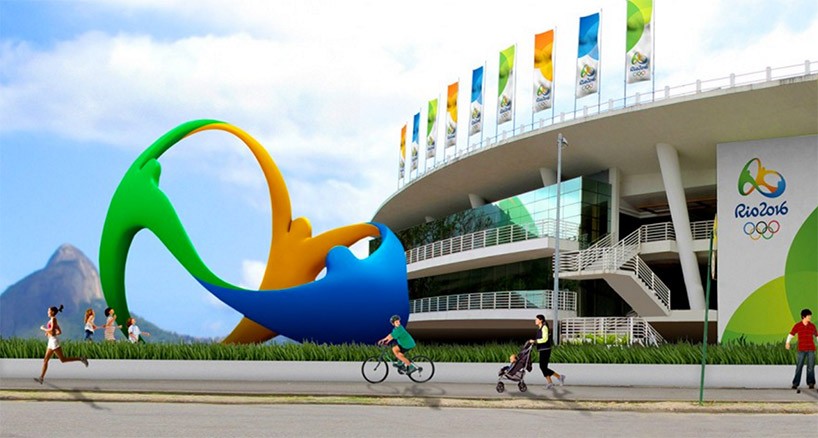
rio 2016 branding
image © tátil / rio 2016
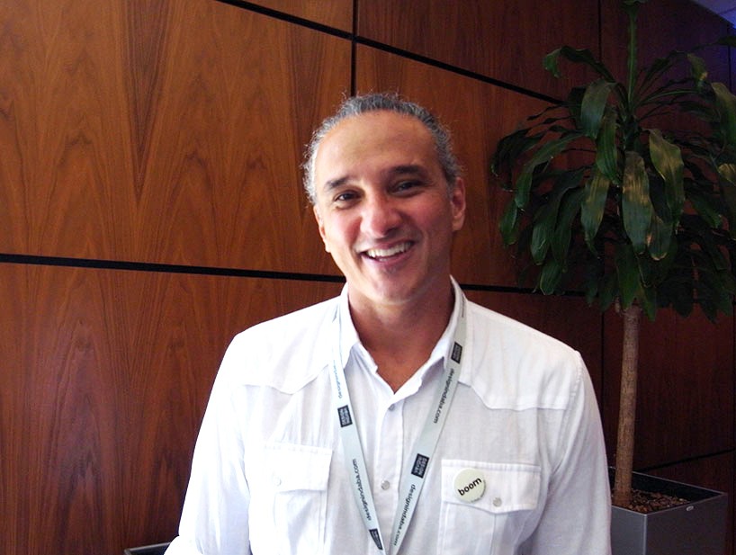
fred gelli loves designboom!
we interviewed him at the amazing design indaba conference 2016 in cape town.
image © designboom
—
![]()
design indaba
is a multifaceted platform committed to a better world through creativity. the south-african online publication hosts an annual festival and social impact do tank in cape town. the design indaba festival has been created by ravi naidoo in 1995, with focus on african and global creativity, through the lens of the work and ideas of leading thinkers and doers, opinion formers, trendsetters and industry experts.
design indaba conference 2016
is a three-day event (february 17 – 19) in cape town and is all about illustrating how design, creativity and innovation can positively impact the world. so much more than a ‘how-to’ conference, this is a forum fueled by inspiration that breeds ideas, ingenuity and innovation. the conference is an opportunity to listen to the world’s foremost creatives, entrepreneurs and trendsetters. it’s the not-to-be-missed creative event in africa.
see designboom’s coverage of the 2015 design indaba conference here.
design indaba 2016 (9)
 Aug 15, 2016
 Aug 09, 2016
 Aug 02, 2016
 Jul 29, 2016
 Jul 26, 2016
fred gelli / tátil (3)
rio 2016 olympics (25)
 Dec 02, 2016
 Sep 05, 2016
 Aug 23, 2016
 Aug 17, 2016
 Aug 15, 2016
PRODUCT LIBRARY
 Jul 23, 2024
 Jul 01, 2024
 Jun 13, 2024
 Jun 06, 2024