evolution of NIVEA’s new global design by yves béhar / fuseprojectall images courtesy of NIVEA
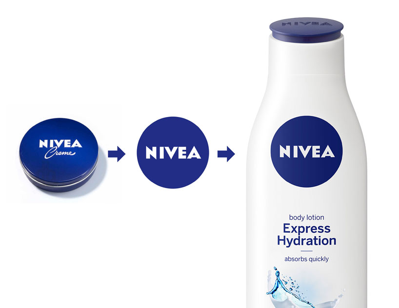
beiersdorf AG who owns NIVEA, has collaborated with yves béhar / fuseproject to develop a new design language for their products which offers a refreshed look for the world’s largest skincare brand, while still embodying their traditional brand values. for the redevelopment of the company’s logo, béhar drew on NIVEA’s blue tin, which has long been an iconic symbol of their cosmetic line, encompassing something that is recognizable while at the same time updated to be applied across their entire range. the updated logo utilizes the crème tin as its trademark, while looking to its shape to inform the rounded contours of the renewed packaging – reduced blue and white colors are also elements of the improved design. the round lids of the bottles now tilt towards the customer and are embossed with the NIVEA logo, reflecting clear similarities of the classic NIVEA blue tin.
‘design is important because it adds value to an object’s function,’ said yves béhar. ‘unlike many other skincare brands, NIVEA isn’t geared to a specific culture, gender or age group. I was particularly drawn to this project by the vast emotional potential of the NIVEA brand and its 100-year heritage,’ he continued.
 new packaging in reduced blue and white colors
presenting a consistent visual language across all channels – from product packaging, through to point of sale, to advertising – the new global design increases the consumers’ identification of the brand’s products, and encourages them to use other goods.
‘NIVEA stands for skin care, trust, quality and value for money. these are the values that our consumers all over the world appreciate. we have to ensure that our brand identity reflects these values, one aspect of which is our product design,’ explained ralph gusko, executive board member for brands & supply chain at beiersdorf. ‘around two-thirds of all purchase decisions are made directly in front of the shelf. the new NIVEA design’s high recognition value will make it easier for consumers around the world to find the NIVEA products they are looking for.’
 the rounded lids of the new bottles tilt towards customers and are embossed with the NIVEA logo
 NIVEA’s new global design by yves béhar / fuseproject
 the skincare brand’s iconic blue tin was the basis of the updated design language
 profile of NIVEA’s blue créme tin
 the tin has been a part of the company’s visual language since 1925
 concept development of the new NIVEA global design
 prototypes and concept sketches of the new packaging
 process documentation
yves béhar on redeveloping NIVEA’s brand image video courtesy of NIVEA
 the original NIVEA creme tin packaing, 1911
 evolution of the NIVEA creme tin over time
 vintage NIVEA creme powdered soap advertising, germany 1924
 left: postwar advertising, germanyright: the NIVEA ‘fun in the sun’ advertising, germany, 1967
 left: postwar advertising, ‘to protect the skin’, germanyright: NIVEA commerical, UK, 1958 (top); sun tanning oil advertisement, ‘against the biting cold and wind’, france (bottom)
logo design (245)
 Jul 03, 2024
 Aug 14, 2023
yves béhar (82)
 Nov 15, 2023
 Jul 20, 2022
 Jun 21, 2021
 Oct 25, 2020
 Jul 22, 2020
PRODUCT LIBRARY
 Jul 23, 2024
 Jul 01, 2024
 Jun 13, 2024
 Jun 06, 2024