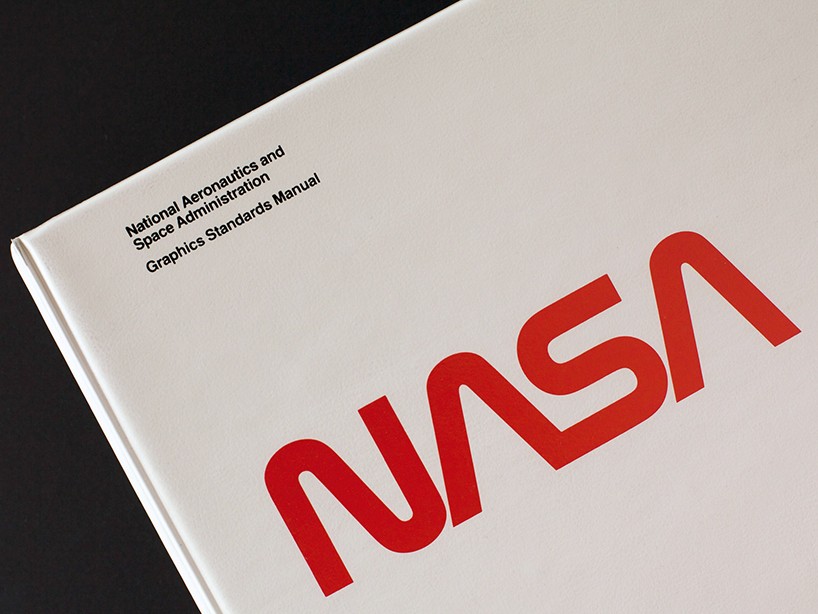
hamish smyth and jesse reed discuss the 1975 NASA graphics standards manual
following their highly successful kickstarter campaign to republish the 1970 NYC transit authority identity manual, pentagram’s hamish smyth and jesse reed have decided to do the same with the rescinded NASA ‘worm’ graphics standards manual , designed by danne & blackburn in 1975.
the campaign has secured more than four times the funds it needed with four weeks still left to pledge – highlighting the huge popularity of the NASA worm logo, which was taken out of use in 1992 and replaced with the NASA ‘meatball’.
the kickstarter campaign video for the republication of the NASA graphics standards manual
designboom spoke to hamish and jesse to learn more about the project and why NASA worm remains so popular….
designboom: following the successful project to reprint the NYC subway design guidelines, what made you choose the NASA worm guidelines as your next project?
hamish: apart from the obviously sexy appeal of space travel, we chose the NASA guidelines for a couple of reasons.
first, it represents a shift in american graphic design that brought us up to par with the rest of the world, particularly europe. the federal graphics improvement program initiated by the NEA (national endowment for the arts) selected NASA to be one of first organizations to completely rethink its graphic identity—in turn, the work influenced numerous other agencies to follow suit.
second, it’s a learning tool for young designers and professionals. the language used to articulate every decision within the graphics program is extradorinaiy. not a single question is left unanswered, and we think it’s important that this type of design thinking be available for everyone to experience.
lastly, and more simply, we feel a deep responsibility to see that this great work lives on. when the program was rescinded in 1992, it wasn’t because the identity was falling apart, on the contrary, it was a decision made on a whim (which makes it such a hard pill to swallow). all of the work put into creating a program like this is monumental, something we both deal with in our professional lives, and to see it thrown away forever wasn’t right. hopefully we’re getting back some of the justice that the danne and blackburn deserve.
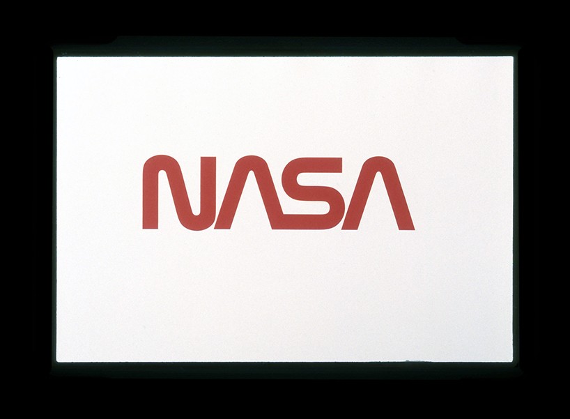
NASA ‘worm’ logo designed by danne & blackburn, 1972
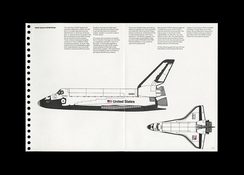
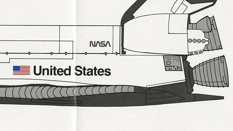
scan from the original guidelines indicating placement of logo on the discovery space shuttle
image credit: danne & blackburn
detail
designboom: where were you and what were you doing in the 70s and 80s when the logo was in use? what’s your personal affiliation to the worm logo and identity system?
jesse: I’m slightly embarrassed to say that neither of us were around to see the 70s. however, we both have fond memories of the shuttle program as children. when I think NASA, I think of the shuttles in the 80s, with their big orange fuel tank and powerful boosters. and more than that, I remember the worm logo. it was everything that represented NASA to me. I didn’t know what design was at the tine, but I remember thinking how damn cool they looked. I pity the children of the 90s who had to grow up with a meatball!
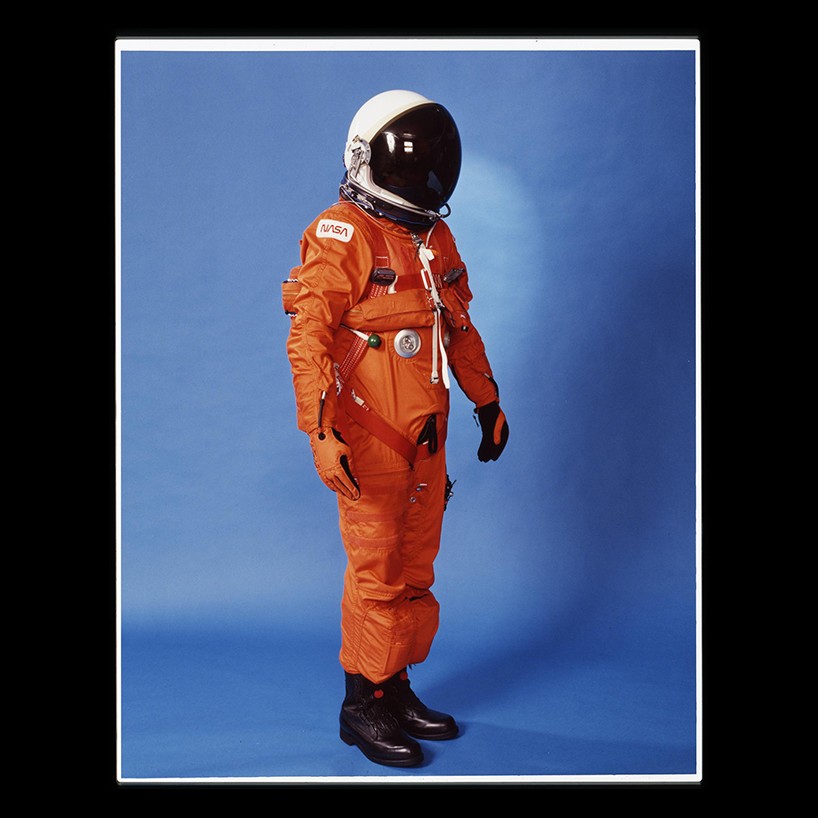
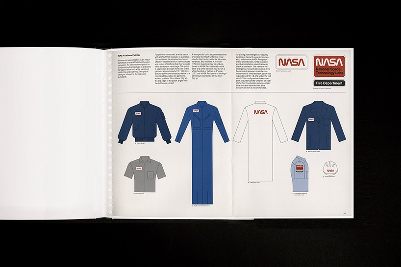
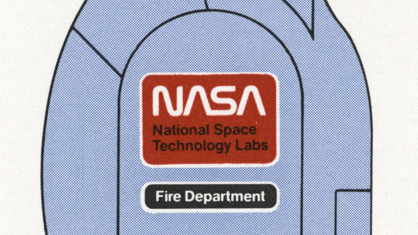
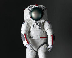
logo applied to spacesuit
image credit: danne & blackburn
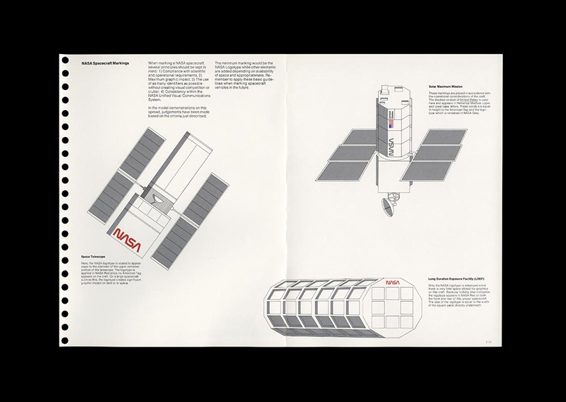
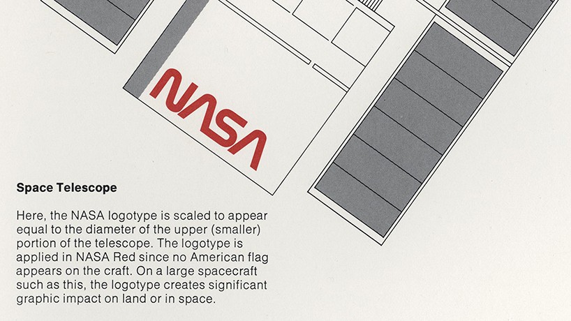
scan showing how the logo should be applied to telescopes
image credit: danne & blackburn
detail
designboom: as graphic designers, what do you like most about the NASA worm identity and the guidelines created for it?
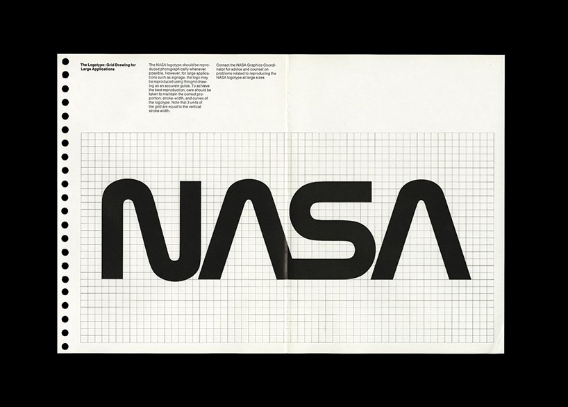
hamish: as designers, we thing what makes the worm so effective is it’s simplicity. at the base level, the logo consists of 3 lines, bend and curved to create 4 characters. this simplicity achieves tremendous clarity—you can read this thing from miles away. compare that to the meatball, with it’s overlapping elements, jumbled composition, and type overlaid on an object, and all that simplicity and clarity is lost.
the meatball is a very literal representation of what NASA does: ‘we fly rockets in space, there are stars and planets, and aerodynamic shapes involved.’ the worm, on the other hand, represents what NASA is: a futuristic, forward-thinking organization at the cutting edge of space exploration. where the meat ball feels slow, old, cartoon-like—the worm feels like it really belongs to a space agency.
jesse: as designers, we love to embed meaning in a wordmark. danne and blackburn did this with a deft touch. each of the 4 NASA characters in the worm reference sweeping aerodynamic shapes, and the two A’s suggest the nosecone of a rocket. it;s a beautiful, subtle nod to what NASA does, achieved in a much less ham-fisted way than the meatball.
we do think there is a place for the meatball—it represents the great history of the agency—but we don’t think it should be used as the agencies’ primary logo.
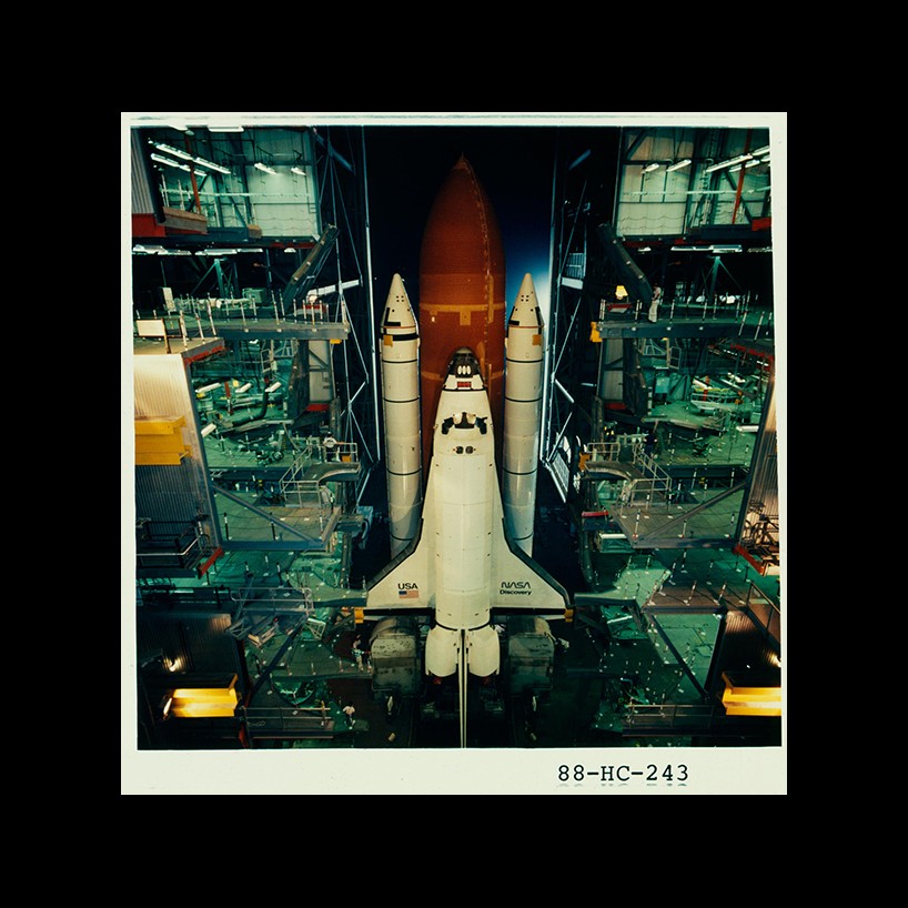
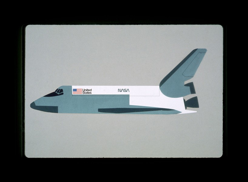
the NASA worm logo on the NASA discovery shuttle
image credit: danne & blackburn
original identity presentation board by danne & blackburn – how they imagined the identity could be applied to a shuttle
designboom: is there something you saw in the document that you’ve learned from?
jesse: what we’ve taken from this manual is the sense of pride that was taken in the work. as richard danne puts it, ‘it really was important work’—a service to the nation. not many jobs these days carry that level of prestige, and we think that comes across when you read the manual.
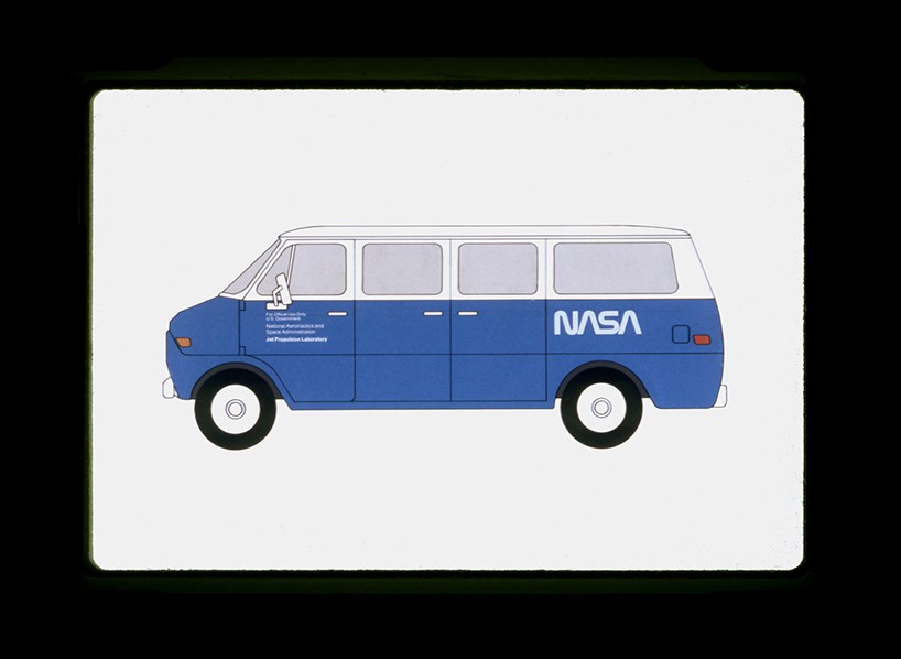
original identity presentation board by danne & blackburn – livery application
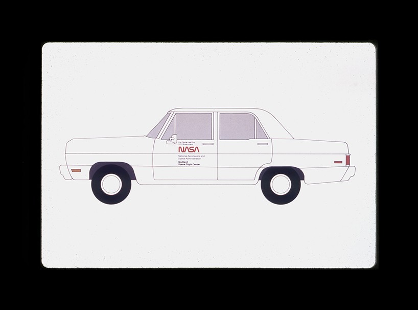
original identity presentation board by danne & blackburn – livery application
designboom: how does this project compare with the NYC subway design guidelines reissue? what did you learn from that experience that has helped with this endeavour?
hamish: our experience on the NYCTA book has been a huge help this time around. just knowing what had to be done to get the kickstarter campaign up and running was really beneficial. we learnt that the video is the most important aspect, so we focused a lot of energy on that and were really happy with the result.
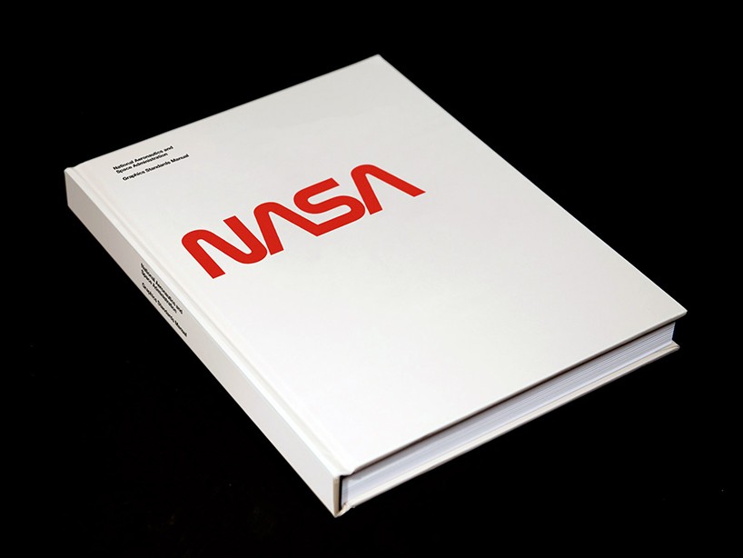
rendering of how the new reissue of the NASA identity guidelines will look
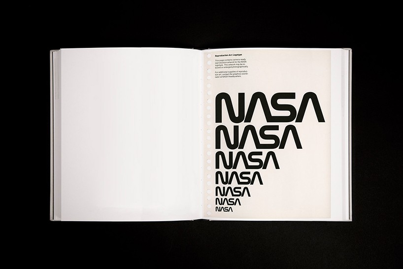
spread from the new book – NASA logo scaling
designboom: having well exceeded the level of backing to complete the reprint, how do you feel with the response you’ve had?
hamish: we’re overwhelmed with the support so far. we have more backers than at the same point in the NYCTA campaign, so we are really happy about that.
but probably the most satisfying things has been seeing how happy richard danne has been at the outpouring of support. we are honored to be able to have his support and show him how many people care about danne and blackburn’s work—even 40 years later.
example of a gatefold in the new book
designboom: what are the next steps?when and where will it be made, sent out etc. ?
jesse: we’ve already started production. christopher bonanos is working on the essay, and richard danne has handed in his draft of the foreword. we’re in continuous communication with our printer in italy, and hamish visited them a few weeks ago to discuss the project (while he was printing his NYC subway poster project). they are a crucial partner in figuring our how to, for example, get 4 consecutive gatefolds in the book (there are 11 gatefolds total). they are really talented problem solvers and we’re lucky to have them at hand.
the next step for us is to make the high-resolution scans of each page, and do the spot color ink extractions. lots of photoshop ahead!
we’ve not yet set the printing schedule, but it’s looking like we’ll print in november or december this year. after that we ship the EU books from a distribution center in central europe, and the US/rest of the world books make their way by sea to NYC. our delivery deadline is march, so we’re confident we’ll hit that date (or better).
the NASA worm logo is now considered an icon of modernist graphic design, it was used by NASA from 1972 – 1992
designboom: any hints on what the theme of your next publishing project might be?
hamish: we have some ideas, but unfortunately nothing that’s ready to be mentioned! watch this space.
more
back the project to reprint the NASA graphics standards manual here »
logo design (246)
 Aug 09, 2024
 Jul 03, 2024
NASA (175)
 Oct 17, 2024
 May 15, 2024
 Apr 03, 2024
 Mar 05, 2024
 Jan 15, 2024
PRODUCT LIBRARY
 Sep 07, 2024
 Sep 02, 2024
 Aug 29, 2024
 Aug 21, 2024