hari ramachandran rebrands microsoft in just one day
following the CEO's vision as the 'do more company' a viable rebranding solution has been created in just one day.
prefer designboom on google[FEATURED]
hari ramachandran rebrands microsoft in just one day
all images courtesy of hari ramachandran
following microsoft CEO, satya nadella’s vision as the ‘do more company’, american designer hari ramachandran woke up one saturday morning and rebranded it. referring to the book ‘positioning’ by jack trout, the redesign offers a viable solution that stays true to the market principles and history of the technology brand.
the development to the original logo shows a natural progression into a simplified, more geometric outline that can be applied across a range of products. also rethinking the packaging, the existing bright primary colors are used in combination with the abstract logo.
‘I deiced the new mircosoft should be based on a sense of renewal. I wanted to give a new look, while keeping some of the traditional elements like the four ionic colors,’ says hari ramachandran.

the brief for the rebranding project

quote from satya nadella
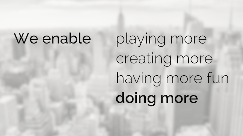
guiding principles
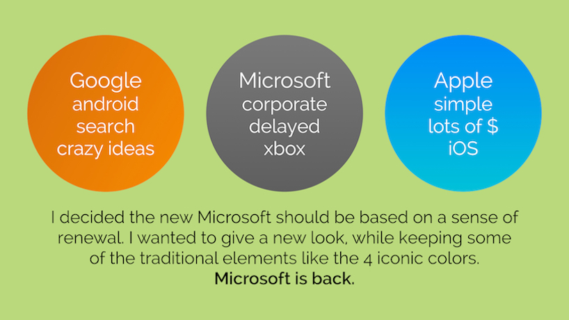
market strategy
the basis for redesigning the microsoft logo

the process of generating the new logo

the final logo

the new logo applied to marketing material
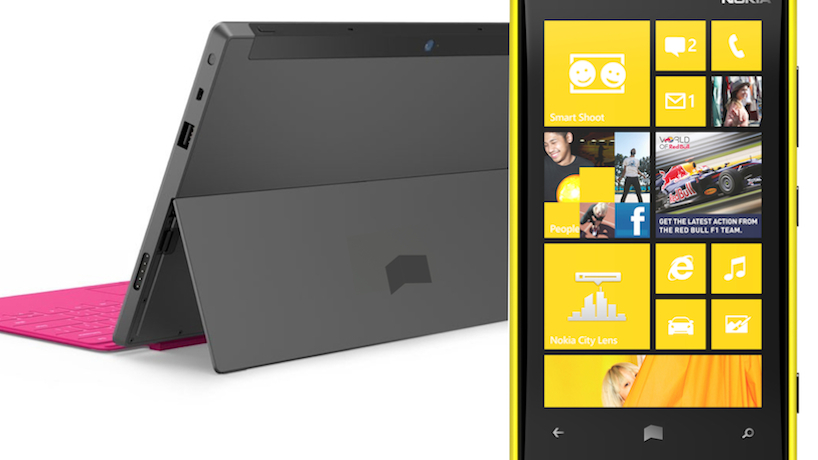
the logo placed onto products
the idea for new packaging design
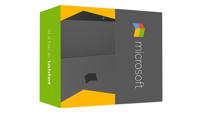
the final packaging
designboom has received this project from our ‘DIY submissions‘ feature, where we welcome our readers to submit their own work for publication. see more project submissions from our readers here.
shop
your own online design shop — no sales commission collected